Benvenuto nelle Font Più Popolari — dove popolarità e qualità si incontrano. Qui trovi i font più scaricati e usati dell'anno. Se cerchi scelte sicure per logo, web o social, inizia da qui.
Ogni font top si distingue per equilibrio, leggibilità e versatilità. Troverai sans serif moderne, script eleganti, serif vintage e display minimalisti.
-
( Fonts by www.typodermicfonts.com - Ray Larabie )
A bold, geometric font with playful and dynamic character designs.
 Scaricare 507 Downloads@WebFont
 -
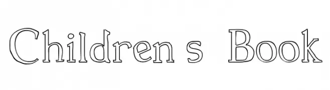
( Fonts by Galdino Otten - galdinootten.com )
A playful, hand-drawn font with outlined letters and a whimsical style.
![Children s Book font caratteri gratis]() Scaricare 506 Downloads@WebFont
Scaricare 506 Downloads@WebFont -
( Fonts by Galdino Otten - galdinootten.com )
A futuristic and geometric font with sharp angles and smooth curves.
![O 10 Type font caratteri gratis]() Scaricare 506 Downloads@WebFont
Scaricare 506 Downloads@WebFont -
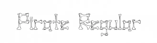
( Fonts by Altsys Metamorphosis )
A playful, bone-themed font perfect for pirate or Halloween designs.
![Pirate Regular font caratteri gratis]() Scaricare 506 Downloads@WebFont
Scaricare 506 Downloads@WebFont -
( Fonts by Klaus Johansen - www.listemageren.dK )
Illustrations of various aeroplanes in a structured grid format.
![Aeroplanes font caratteri gratis]() Scaricare 506 Downloads@WebFont
Scaricare 506 Downloads@WebFont -
-
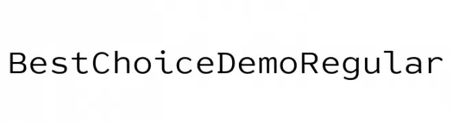
( Fonts by Dharma Type )
A modern, geometric sans-serif font with clean lines and uniform strokes.
![Best Choice Demo Regular font caratteri gratis]() Scaricare 506 Downloads@WebFont
Scaricare 506 Downloads@WebFont -
![A Scratched Remix font caratteri gratis]() Scaricare 506 Downloads@WebFont
Scaricare 506 Downloads@WebFont -
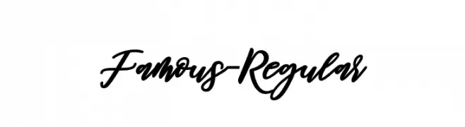
( Fonts by Mr Letters - https://www.creativefabrica.com/designer/mrletters/ - Personal-use only. For commercial use please contact owner. )
A modern, cursive font with elegant, flowing letters and moderate contrast.
![Famous-Regular font caratteri gratis]() Scaricare 506 Downloads@WebFont
Scaricare 506 Downloads@WebFont -
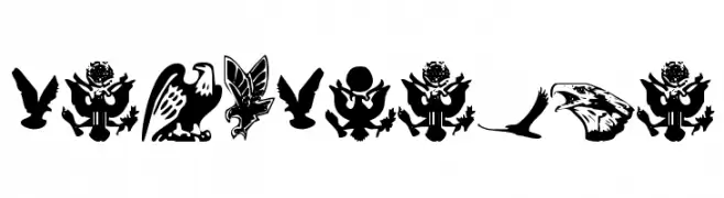
( Fonts by Daniel Zadorozny - www.iconian.com )
Bold eagle and bird icon set with varied styles and strong contrast.
![Eaglemania font caratteri gratis]() Scaricare 506 Downloads@WebFont
Scaricare 506 Downloads@WebFont -
( Fonts by Jonathan S. Harris )
A bold, dripping font with a spooky, fluid design.
![Slimed font caratteri gratis]() Scaricare 506 Downloads@WebFont
Scaricare 506 Downloads@WebFont


Quali sono i font più popolari adesso?
Poppins, Roboto, Montserrat, Open Sans e Lato sono molto usati per le forme pulite e l'ampia applicabilità — dall'identità di marca alle landing page e ai poster.
Quali font si usano spesso nei loghi?
Le sans serif geometriche (es. Poppins, famiglie in stile Gotham) sono scelte comuni per un branding pulito e scalabile. Per un tocco personale restano valide script e stili manoscritti. Abbina un display deciso per i titoli a un corpo testo neutro per riconoscibilità ed equilibrio.
Ogni quanto si aggiorna la lista?
Con regolarità, in base ai download e all'attività reale. Torna spesso per scoprire in anticipo le nuove preferite.
💡 Consiglio: aggiungi ai preferiti — le tendenze cambiano in fretta e i font top di oggi possono ispirare il rebranding di domani.