Benvenuto nelle Font Più Popolari — dove popolarità e qualità si incontrano. Qui trovi i font più scaricati e usati dell'anno. Se cerchi scelte sicure per logo, web o social, inizia da qui.
Ogni font top si distingue per equilibrio, leggibilità e versatilità. Troverai sans serif moderne, script eleganti, serif vintage e display minimalisti.
-
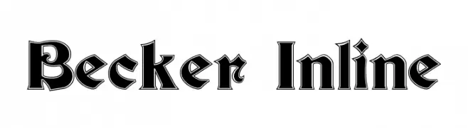
( Fonts by Dieter Steffmann )
A bold, decorative font with an inline design and angular serifs.
 Scaricare 506 Downloads@WebFont
 -
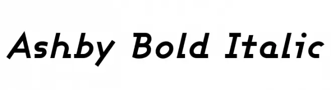
( Fonts by Apostrophic Lab )
A bold, italicized font with a modern and dynamic style.
![Ashby Bold Italic font caratteri gratis]() Scaricare 506 Downloads@WebFont
Scaricare 506 Downloads@WebFont -
( Fonts by Darrell Flood )
A bold, playful font with italicized, cartoonish characters.
![Comic Queens Italic font caratteri gratis]() Scaricare 505 Downloads@WebFont
Scaricare 505 Downloads@WebFont -
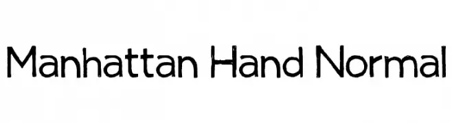
( Fonts by Taylor Baybutt - ikon3.com - Free for personal use only )
A hand-drawn, casual font with a playful and approachable style.
![Manhattan Hand Normal font caratteri gratis]() Scaricare 505 Downloads@WebFont
Scaricare 505 Downloads@WebFont -
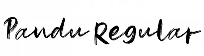
( Fonts by Mr Letters - https://www.creativefabrica.com/designer/mrletters/ - Personal-use only. For commercial use please contact owner. )
A bold, expressive handwritten font with a brush-like texture.
![Pandu-Regular font caratteri gratis]() Scaricare 505 Downloads@WebFont
Scaricare 505 Downloads@WebFont -
-
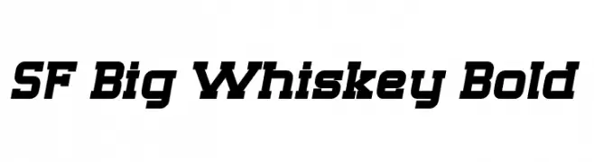
( Fonts by ShyFonts )
A bold, dynamic font with a slight slant and strong geometric influence.
![SF Big Whiskey Bold font caratteri gratis]() Scaricare 505 Downloads@WebFont
Scaricare 505 Downloads@WebFont -
( Fonts by Alexis Hunt )
A playful, handwritten font with tall, narrow letters and a casual style.
![lex font caratteri gratis]() Scaricare 505 Downloads@WebFont
Scaricare 505 Downloads@WebFont -
( Roland Huse Design - Roland Huse - rolandhuse.com )
A whimsical and decorative font with playful curls and ornate details.
![TeachDemo-Regular font caratteri gratis]() Scaricare 505 Downloads@WebFont
Scaricare 505 Downloads@WebFont -
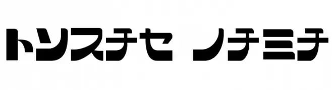
![SCRAP KANA font caratteri gratis]() Scaricare 505 Downloads@WebFont
Scaricare 505 Downloads@WebFont -
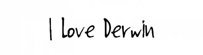
( Free for a personal use. For a commercial use please visit www.kevinandamanda.com )
A playful, handwritten font with uneven strokes and a casual, organic flow.
![I Love Derwin font caratteri gratis]() Scaricare 505 Downloads@WebFont
Scaricare 505 Downloads@WebFont


Quali sono i font più popolari adesso?
Poppins, Roboto, Montserrat, Open Sans e Lato sono molto usati per le forme pulite e l'ampia applicabilità — dall'identità di marca alle landing page e ai poster.
Quali font si usano spesso nei loghi?
Le sans serif geometriche (es. Poppins, famiglie in stile Gotham) sono scelte comuni per un branding pulito e scalabile. Per un tocco personale restano valide script e stili manoscritti. Abbina un display deciso per i titoli a un corpo testo neutro per riconoscibilità ed equilibrio.
Ogni quanto si aggiorna la lista?
Con regolarità, in base ai download e all'attività reale. Torna spesso per scoprire in anticipo le nuove preferite.
💡 Consiglio: aggiungi ai preferiti — le tendenze cambiano in fretta e i font top di oggi possono ispirare il rebranding di domani.