Benvenuto nelle Font Più Popolari — dove popolarità e qualità si incontrano. Qui trovi i font più scaricati e usati dell'anno. Se cerchi scelte sicure per logo, web o social, inizia da qui.
Ogni font top si distingue per equilibrio, leggibilità e versatilità. Troverai sans serif moderne, script eleganti, serif vintage e display minimalisti.
-
( London's Letters - www.londonsletters.com/ )
A decorative font with bold letters and cardinal bird illustrations, perfect for festive designs.
 Scaricare 79 Downloads@WebFont
 -
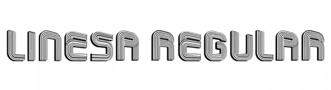
( Fonts by Vladimir Nikolic )
A decorative, multi-line font with a modern and geometric style.
![Linesa Regular font caratteri gratis]() Scaricare 79 Downloads@WebFont
Scaricare 79 Downloads@WebFont -
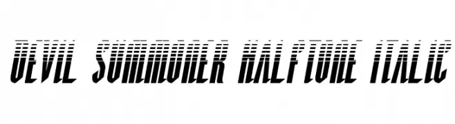
( Fonts by Daniel Zadorozny - www.iconian.com )
A bold, italicized font with a halftone effect, perfect for dynamic and edgy designs.
![Devil Summoner Halftone Italic font caratteri gratis]() Scaricare 79 Downloads@WebFont
Scaricare 79 Downloads@WebFont -
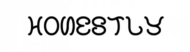
( Fonts by Wino S Kadir - weknow - www.revolge.com/shop/weknow/ - Personal-use only. For commercial use please contact owner. )
A playful, bold font with rounded, flowing strokes and a whimsical design.
![honestly font caratteri gratis]() Scaricare 79 Downloads@WebFont
Scaricare 79 Downloads@WebFont -
( Fonts by wep - Wahyu Eka Prasetya - Personal-use only. For commercial use please contact owner. )
A bold, brush-style font with dynamic, fluid strokes and a handwritten feel.
![Berlari font caratteri gratis]() Scaricare 79 Downloads@WebFont
Scaricare 79 Downloads@WebFont -
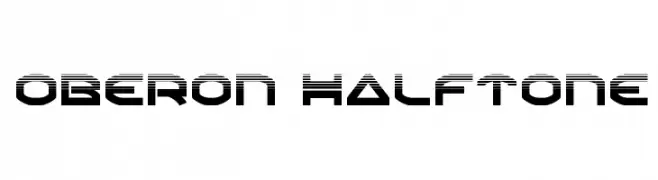
( Iconian Fonts - Daniel Zadorozny - www.iconian.com )
A bold, geometric font with a halftone effect, perfect for modern and digital themes.
![Oberon Halftone font caratteri gratis]() Scaricare 79 Downloads@WebFont
Scaricare 79 Downloads@WebFont -
( Noto is a trademark of Google Inc. Noto fonts are open source. All Noto fonts are published under the SIL Open Font License, Version 1.1 )
A thin, semi-condensed serif font with a modern and elegant style.
![Noto Serif Tamil SemiCondensed Thin font caratteri gratis]() Scaricare 79 Downloads@WebFont
Scaricare 79 Downloads@WebFont -
( Fonts by Helotype - Yudi Setiawan - Personal-use only. For commercial use please contact owner. )
A playful handwritten font with rounded edges and a casual style.
![Snowfun Regular font caratteri gratis]() Scaricare 79 Downloads@WebFont
Scaricare 79 Downloads@WebFont -
( Fonts by Typodermic Fonts - Raymond Larabie - Personal-use only. For commercial use please contact owner. )
A modern, geometric sans-serif typeface with uniform stroke widths.
![JesayaBk-Regular font caratteri gratis]() Scaricare 79 Downloads@WebFont
Scaricare 79 Downloads@WebFont -
( Zetafonts - www.zetafonts.com )
A light, italic typeface with elegant curves and a classic aesthetic.
![Florentia Light Italic font caratteri gratis]() Scaricare 79 Downloads@WebFont
Scaricare 79 Downloads@WebFont -
( Letterhend Studio - Hendry Juanda - creativemarket.com/letterhend )
A smooth, flowing monoline script font with elegant and consistent strokes.
![Kadisoka-Monoline font caratteri gratis]() Scaricare 79 Downloads@WebFont
Scaricare 79 Downloads@WebFont -
( Fonts by GGBot - www.ggbot.net - Personal-use only. For commercial use please contact owner. )
A bold, geometric font with rounded edges and a modern, futuristic style.
![Audex font caratteri gratis]() Scaricare 79 Downloads@WebFont
Scaricare 79 Downloads@WebFont -
( Fonts by www.junkohanhero.com - Personal-use only. For commercial use please contact owner. )
A bold, distressed font with a vintage, rugged appearance.
![Takapiru2 font caratteri gratis]() Scaricare 79 Downloads@WebFont
Scaricare 79 Downloads@WebFont -
( Fonts by R Sutarna - Personal-use only. For commercial use please contact owner. )
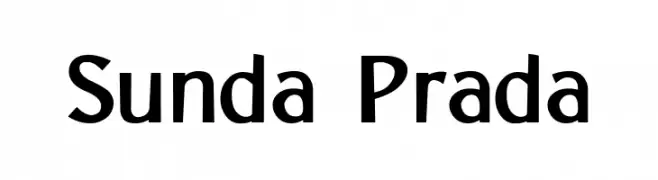
A modern, bold sans-serif font with a clean and slightly condensed style.
![Sunda Prada font caratteri gratis]() Scaricare 79 Downloads@WebFont
Scaricare 79 Downloads@WebFont -
( Fonts by CannotIntoSpaceFonts - KineticPlasma Fonts - Personal-use only. For commercial use please contact owner. )
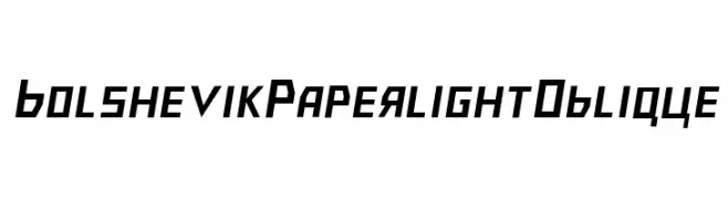
A bold, geometric oblique font with sharp angles and a modern aesthetic.
![Bolshevik Paperlight Oblique font caratteri gratis]() Scaricare 79 Downloads@WebFont
Scaricare 79 Downloads@WebFont -
( weknow - Wino S Kadir - www.creativefabrica.com/designer/weknow/ )
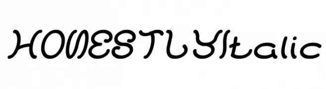
A playful, handwritten-style font with smooth, flowing curves and a casual feel.
![HONESTLY Italic font caratteri gratis]() Scaricare 79 Downloads@WebFont
Scaricare 79 Downloads@WebFont -
( Fonts by Daniel Zadorozny - www.iconian.com - Personal-use only. For commercial use please contact owner. )
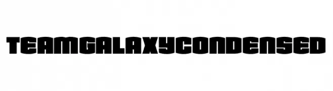
A bold, condensed font with a geometric and impactful style.
![Team Galaxy Condensed font caratteri gratis]() Scaricare 79 Downloads@WebFont
Scaricare 79 Downloads@WebFont -
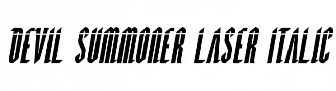
( Fonts by Daniel Zadorozny - www.iconian.com )
A bold, italic font with a futuristic and dynamic style.
![Devil Summoner Laser Italic font caratteri gratis]() Scaricare 79 Downloads@WebFont
Scaricare 79 Downloads@WebFont -
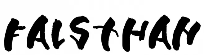
( Fonts by Leonard Posavec - leosupply.co - Personal-use only. For commercial use please contact owner. )
A bold, hand-painted style font with dynamic, textured strokes.
![Falsthan font caratteri gratis]() Scaricare 79 Downloads@WebFont
Scaricare 79 Downloads@WebFont -
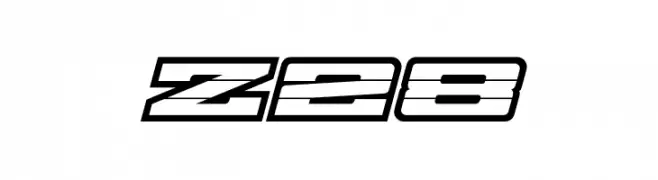
( Fonts by Jayde Garrow - Personal-use only. For commercial use please contact owner. )
A bold, futuristic font with geometric and three-dimensional elements.
![Z28 font caratteri gratis]() Scaricare 79 Downloads@WebFont
Scaricare 79 Downloads@WebFont -
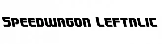
( Fonts by Daniel Zadorozny - www.iconian.com - Free for personal use )
A bold, angular font with a leftward slant, combining retro and modern elements.
![Speedwagon Leftalic font caratteri gratis]() Scaricare 79 Downloads@WebFont
Scaricare 79 Downloads@WebFont -
( Fonts by Lemonthe - Dwi Ahidian - Personal-use only. For commercial use please contact owner. )
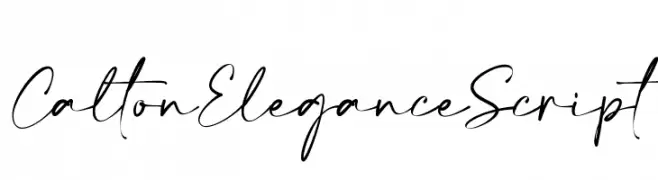
An elegant script font with flowing lines and graceful curves, ideal for sophisticated designs.
![Calton Elegance Script font caratteri gratis]() Scaricare 79 Downloads@WebFont
Scaricare 79 Downloads@WebFont -
Caratteri di Sabrcreative. For commercial use please contact the owner.
( Natalisa )
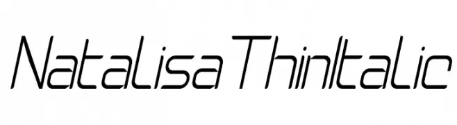
A sleek, modern, thin italic font with a streamlined, angular design.
![Natalisa Thin Italic font caratteri gratis]() Scaricare 79 Downloads@WebFont
Scaricare 79 Downloads@WebFont -
( Fonts by Khurasan - Syaf Rizal - Personal-use only. For commercial use please contact owner. )
A playful, narrow font with rounded edges and consistent stroke thickness.
![Tamarind Days font caratteri gratis]() Scaricare 79 Downloads@WebFont
Scaricare 79 Downloads@WebFont -
( Fonts by David Espinosa [Type Sailor] - www.facebook.com/typesailor - Personal-use only. For commercial use please contact owner. )
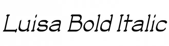
A bold and italicized font with a dynamic and elegant style.
![Luisa Bold Italic font caratteri gratis]() Scaricare 79 Downloads@WebFont
Scaricare 79 Downloads@WebFont -
( Fonts by Nurf Designs - Personal-use only. For commercial use please contact owner. )
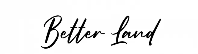
A dynamic and flowing script font with elegant cursive letterforms.
![Better Land font caratteri gratis]() Scaricare 79 Downloads@WebFont
Scaricare 79 Downloads@WebFont -
( Fonts by Billy Argel Fonts - www.billyargel.com - Personal-use only. For commercial use please contact owner. )
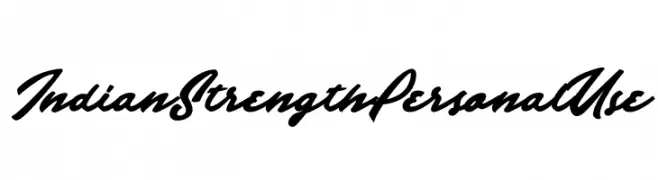
A bold, flowing script font with a modern yet vintage charm.
![Indian Strength Personal Use font caratteri gratis]() Scaricare 79 Downloads@WebFont
Scaricare 79 Downloads@WebFont -
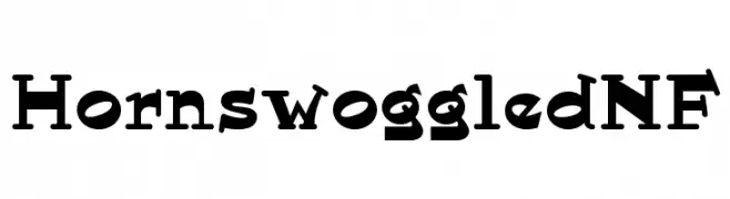
( Fonts by Nick Curtis - Personal-use only. For commercial use please contact owner. )
A playful and quirky serif font with exaggerated serifs and unique character shapes.
![HornswoggledNF font caratteri gratis]() Scaricare 79 Downloads@WebFont
Scaricare 79 Downloads@WebFont -
( Fonts by Vladimir Nikolic - https://www.creativefabrica.com/product/educated-deers/ref/144265/ - Personal-use only. For commercial use please contact owner. )
A bold, geometric font with high contrast and unique negative space design.
![Demode Negative font caratteri gratis]() Scaricare 79 Downloads@WebFont
Scaricare 79 Downloads@WebFont -
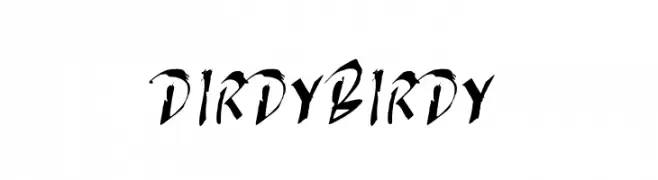
( Thor Christopher Arisland - www.tcarisland.com )
A dynamic, brush-style font with expressive strokes and artistic flair.
![DIRDY BIRDY font caratteri gratis]() Scaricare 79 Downloads@WebFont
Scaricare 79 Downloads@WebFont -
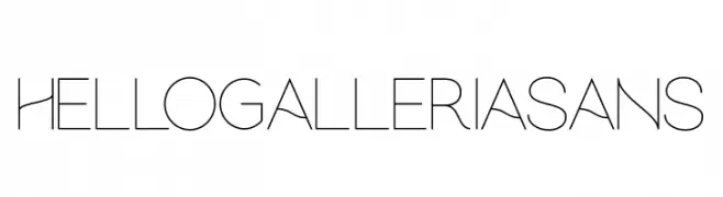
( Fonts by Andika Fez - Personal-use only. For commercial use please contact owner. )
A sleek, modern font with clean, geometric lines and a minimalist style.
![hellogalleriasans font caratteri gratis]() Scaricare 79 Downloads@WebFont
Scaricare 79 Downloads@WebFont -
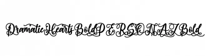
( Fonts by Mans Greback - Personal-use only. For commercial use please contact owner. )
An ornate, decorative script font with heart motifs and bold, flowing strokes.
![Dramatic Hearts Bold PERSONAL Bold font caratteri gratis]() Scaricare 79 Downloads@WebFont
Scaricare 79 Downloads@WebFont -
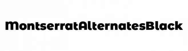
( Fonts by Julieta Ulanovsky )
A bold, modern font with a geometric and impactful design.
![Montserrat Alternates Black font caratteri gratis]() Scaricare 79 Downloads@WebFont
Scaricare 79 Downloads@WebFont -
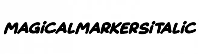
( Fonts by Darrell Flood )
A bold, italicized handwritten font with a playful and friendly style.
![Magical Markers Italic font caratteri gratis]() Scaricare 79 Downloads@WebFont
Scaricare 79 Downloads@WebFont -
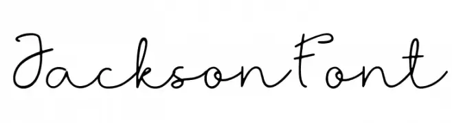
( Fonts by I Putu Gede Krisna - Personal-use only. For commercial use please contact owner. )
A flowing, cursive font with elegant loops and a handwritten style.
![Jackson Font font caratteri gratis]() Scaricare 79 Downloads@WebFont
Scaricare 79 Downloads@WebFont


Quali sono i font più popolari adesso?
Poppins, Roboto, Montserrat, Open Sans e Lato sono molto usati per le forme pulite e l'ampia applicabilità — dall'identità di marca alle landing page e ai poster.
Quali font si usano spesso nei loghi?
Le sans serif geometriche (es. Poppins, famiglie in stile Gotham) sono scelte comuni per un branding pulito e scalabile. Per un tocco personale restano valide script e stili manoscritti. Abbina un display deciso per i titoli a un corpo testo neutro per riconoscibilità ed equilibrio.
Ogni quanto si aggiorna la lista?
Con regolarità, in base ai download e all'attività reale. Torna spesso per scoprire in anticipo le nuove preferite.
💡 Consiglio: aggiungi ai preferiti — le tendenze cambiano in fretta e i font top di oggi possono ispirare il rebranding di domani.