Benvenuto nelle Font Più Popolari — dove popolarità e qualità si incontrano. Qui trovi i font più scaricati e usati dell'anno. Se cerchi scelte sicure per logo, web o social, inizia da qui.
Ogni font top si distingue per equilibrio, leggibilità e versatilità. Troverai sans serif moderne, script eleganti, serif vintage e display minimalisti.
-
( Iconian Fonts - Daniel Zadorozny - www.iconian.com )
A bold, italicized font with sharp angles and high contrast, perfect for impactful designs.
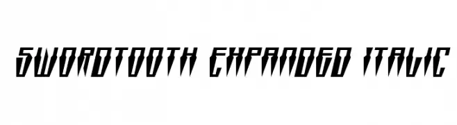 Scaricare 79 Downloads@WebFont
 -
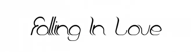
( Fonts by Wino S Kadir - weknow - www.revolge.com/shop/weknow/ - Personal-use only. For commercial use please contact owner. )
A flowing, elegant cursive font with modern and classic elements.
![Falling In Love font caratteri gratis]() Scaricare 79 Downloads@WebFont
Scaricare 79 Downloads@WebFont -
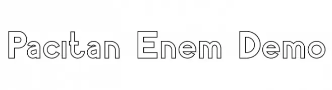
( Fonts by nariswari_creative - Taufik Dwi Purnomo - Personal-use only. For commercial use please contact owner. )
A bold, outlined font with geometric shapes and modern style.
![Pacitan Enem Demo font caratteri gratis]() Scaricare 79 Downloads@WebFont
Scaricare 79 Downloads@WebFont -
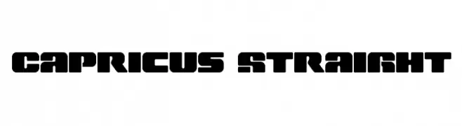
( Iconian Fonts - Daniel Zadorozny - www.iconian.com )
A bold, geometric font with a modern, industrial style.
![Capricus Straight font caratteri gratis]() Scaricare 79 Downloads@WebFont
Scaricare 79 Downloads@WebFont -
( Lettersiro Studio - Muhammad Sirojuddin - creativemarket.com/Lettersiro )
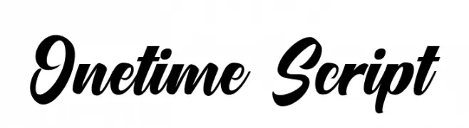
A bold, flowing script font with interconnected letters and a dynamic style.
![Onetime Script font caratteri gratis]() Scaricare 79 Downloads@WebFont
Scaricare 79 Downloads@WebFont -
( madeDeduk )
A versatile font combining vintage decorative script with bold, distressed uppercase letters.
![Draconian font caratteri gratis]() Scaricare 79 Downloads@WebFont
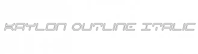
Scaricare 79 Downloads@WebFont -
![Kaylon Outline Italic font caratteri gratis]() Scaricare 79 Downloads@WebFont
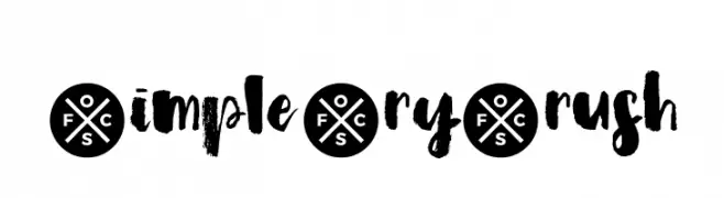
Scaricare 79 Downloads@WebFont -
![Simple Dry Brush font caratteri gratis]() Scaricare 79 Downloads@WebFont
Scaricare 79 Downloads@WebFont -
( Fonts by Edric Studio - Personal-use only. For commercial use please contact owner. )
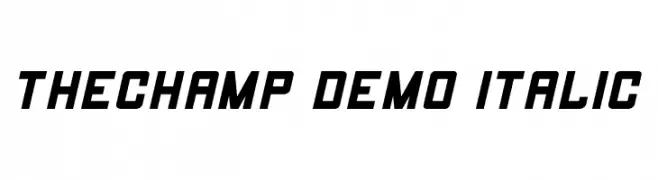
A bold, italic font with a sporty and modern design.
![THECHAMP DEMO Italic font caratteri gratis]() Scaricare 79 Downloads@WebFont
Scaricare 79 Downloads@WebFont -
( Fonts by Sharkshock - Dennis Ludlow - Personal-use only. For commercial use please contact owner. )
A bold, condensed font with strong vertical emphasis and modern appeal.
![Deutschlander 2.0 font caratteri gratis]() Scaricare 79 Downloads@WebFont
Scaricare 79 Downloads@WebFont -
( Fonts by nariswari_creative - Taufik Dwi Purnomo - Personal-use only. For commercial use please contact owner. )
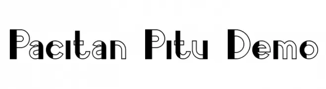
A bold, modern font with dual-tone geometric design.
![Pacitan Pitu Demo font caratteri gratis]() Scaricare 79 Downloads@WebFont
Scaricare 79 Downloads@WebFont -
( Fonts by Daniel Zadorozny - www.iconian.com - Free for personal use )
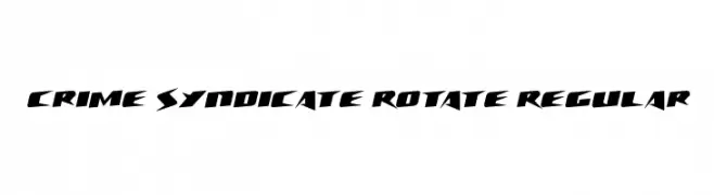
A bold, angular font with a futuristic and dynamic style.
![Crime Syndicate Rotate Regular font caratteri gratis]() Scaricare 79 Downloads@WebFont
Scaricare 79 Downloads@WebFont -
( Fonts by nariswari_creative - Taufik Dwi Purnomo - Personal-use only. For commercial use please contact owner. )
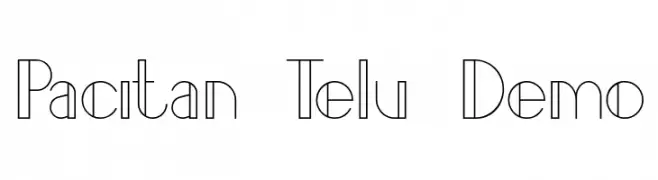
A modern, elegant font with thin, elongated letterforms and a sleek, sophisticated style.
![Pacitan Telu Demo font caratteri gratis]() Scaricare 79 Downloads@WebFont
Scaricare 79 Downloads@WebFont -
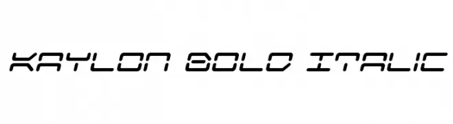
![Kaylon Bold Italic font caratteri gratis]() Scaricare 79 Downloads@WebFont
Scaricare 79 Downloads@WebFont -
( Fonts by Woodcutter Manero - http://www.woodcutter.es - Personal-use only. For commercial use please contact owner. )
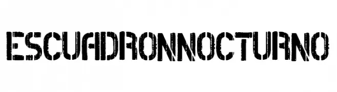
A bold, distressed font with a rugged, textured appearance.
![Escuadron Nocturno font caratteri gratis]() Scaricare 79 Downloads@WebFont
Scaricare 79 Downloads@WebFont -
( Fonts by Adam Jagosz - Personal-use only. For commercial use please contact owner. )
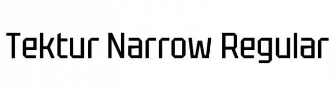
A geometric, angular font with a modern and technical aesthetic.
![Tektur Narrow Regular font caratteri gratis]() Scaricare 79 Downloads@WebFont
Scaricare 79 Downloads@WebFont -
( Fonts by Kat`s Fun Fonts - Personal-use only. For commercial use please contact owner. )
A decorative font with letters inside birthday cakes, ideal for festive designs.
![KR Nght's Birthday font caratteri gratis]() Scaricare 79 Downloads@WebFont
Scaricare 79 Downloads@WebFont -
( Fonts by sronstudio - Yusron Billah - Personal-use only. For commercial use please contact owner. )
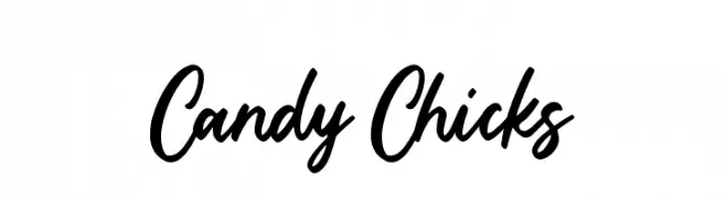
A lively, handwritten script font with a playful and dynamic style.
![Candy Chicks font caratteri gratis]() Scaricare 79 Downloads@WebFont
Scaricare 79 Downloads@WebFont -
( Halim Antoni - fontbundles.net/halimstudio )
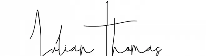
An expressive, cursive font with fluid, artistic strokes.
![Julian Thomas font caratteri gratis]() Scaricare 79 Downloads@WebFont
Scaricare 79 Downloads@WebFont -
( Fonts by Kat`s Fun Fonts - Personal-use only. For commercial use please contact owner. )
A whimsical, decorative font with witch-themed elements.
![KR Witchyrella font caratteri gratis]() Scaricare 79 Downloads@WebFont
Scaricare 79 Downloads@WebFont -
( Rahsia Design )
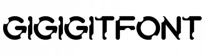
A bold, geometric font with a futuristic and modern style.
![Gigigit Font font caratteri gratis]() Scaricare 79 Downloads@WebFont
Scaricare 79 Downloads@WebFont -
( Zetafonts - www.zetafonts.com )
A sleek, modern, light italic font with smooth strokes and balanced proportions.
![KabrioSoft-LightItalic font caratteri gratis]() Scaricare 79 Downloads@WebFont
Scaricare 79 Downloads@WebFont -
( Fonts by Pizzadude )
A bold, hand-drawn font with outlined characters and a playful style.
![Overskrift DEMO Regular font caratteri gratis]() Scaricare 79 Downloads@WebFont
Scaricare 79 Downloads@WebFont -
( Fonts by Scratchones )
Playful handwritten font with a casual style.
![Simple And Minimalis font caratteri gratis]() Scaricare 79 Downloads@WebFont
Scaricare 79 Downloads@WebFont -
( Fonts by Situjuh Nazara - 7ntypes.com - Personal-use only. For commercial use please contact owner. )
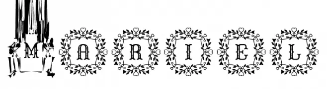
An ornate decorative font with uppercase letters in floral wreaths.
![Mariel font caratteri gratis]() Scaricare 79 Downloads@WebFont
Scaricare 79 Downloads@WebFont -
( Fonts by Sugartype - Rezha Pradipta Dewanto - Personal-use only. For commercial use please contact owner. )
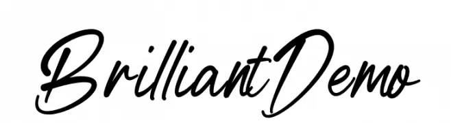
A dynamic, cursive font with fluid strokes and a handwritten appeal.
![BrilliantDemo font caratteri gratis]() Scaricare 79 Downloads@WebFont
Scaricare 79 Downloads@WebFont -
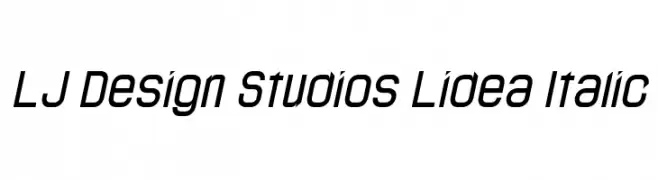
( LJ Design Studios - www.ljdesignstudios.com )
A modern, italicized font with a sleek and futuristic design.
![LJ Design Studios Lidea Italic font caratteri gratis]() Scaricare 79 Downloads@WebFont
Scaricare 79 Downloads@WebFont -
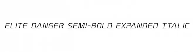
( Fonts by Iconian Fonts )
A modern, semi-bold, expanded italic font with a sleek and dynamic style.
![Elite Danger Semi-Bold Expanded Italic font caratteri gratis]() Scaricare 79 Downloads@WebFont
Scaricare 79 Downloads@WebFont -
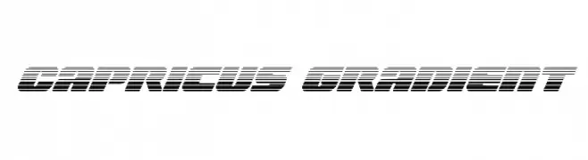
( Iconian Fonts - Daniel Zadorozny - www.iconian.com )
A bold, futuristic font with horizontal gradient lines and a slanted, dynamic style.
![Capricus Gradient font caratteri gratis]() Scaricare 79 Downloads@WebFont
Scaricare 79 Downloads@WebFont -
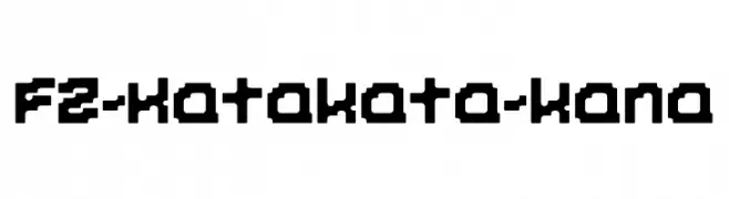
( Fonts by zone108.main.jp - Personal-use only. For commercial use please contact owner. )
A bold, pixelated font with a retro digital aesthetic.
![FZ-Katakata-kana font caratteri gratis]() Scaricare 79 Downloads@WebFont
Scaricare 79 Downloads@WebFont -
( Fonts by Din Studio - Donis Miftahudin - Personal-use only. For commercial use please contact owner. )
A bold, classic serif font with elegant and slightly condensed letterforms.
![Chicago Makers Personal use font caratteri gratis]() Scaricare 79 Downloads@WebFont
Scaricare 79 Downloads@WebFont -
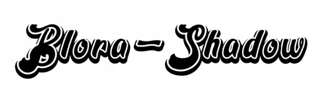
( Fonts by Emanes Dsign - Personal-use only. For commercial use please contact owner. )
A bold script font with a dynamic shadow effect, perfect for impactful designs.
![Blora-Shadow font caratteri gratis]() Scaricare 79 Downloads@WebFont
Scaricare 79 Downloads@WebFont -
( Fonts by Irfan Hidayat - Personal-use only. For commercial use please contact owner. )
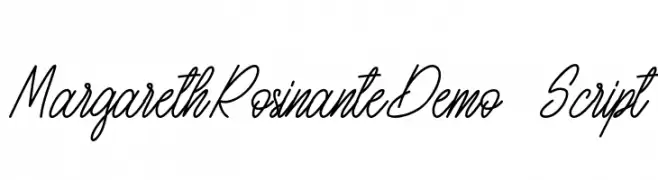
A graceful and fluid script font with elegant, flowing lines.
![MargarethRosinanteDemo-Script font caratteri gratis]() Scaricare 79 Downloads@WebFont
Scaricare 79 Downloads@WebFont -
( weknow - Wino S Kadir - www.creativefabrica.com/designer/weknow/ )
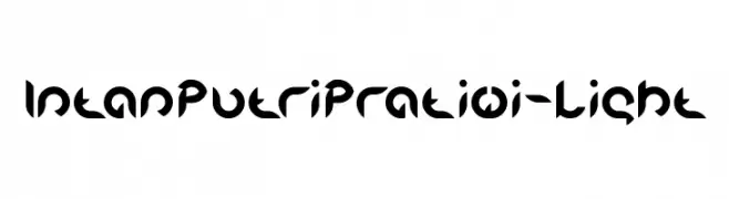
A bold, geometric font with a futuristic and modern design.
![Intan Putri Pratiwi-Light font caratteri gratis]() Scaricare 79 Downloads@WebFont
Scaricare 79 Downloads@WebFont -
( Fonts by Trequartista Studio - Personal-use only. For commercial use please contact owner. )
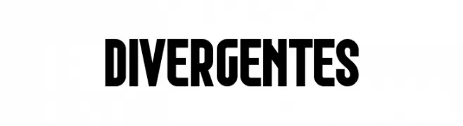
Bold, blocky font with a modern and assertive style.
![Divergentes font caratteri gratis]() Scaricare 79 Downloads@WebFont
Scaricare 79 Downloads@WebFont


Quali sono i font più popolari adesso?
Poppins, Roboto, Montserrat, Open Sans e Lato sono molto usati per le forme pulite e l'ampia applicabilità — dall'identità di marca alle landing page e ai poster.
Quali font si usano spesso nei loghi?
Le sans serif geometriche (es. Poppins, famiglie in stile Gotham) sono scelte comuni per un branding pulito e scalabile. Per un tocco personale restano valide script e stili manoscritti. Abbina un display deciso per i titoli a un corpo testo neutro per riconoscibilità ed equilibrio.
Ogni quanto si aggiorna la lista?
Con regolarità, in base ai download e all'attività reale. Torna spesso per scoprire in anticipo le nuove preferite.
💡 Consiglio: aggiungi ai preferiti — le tendenze cambiano in fretta e i font top di oggi possono ispirare il rebranding di domani.