Benvenuto nelle Font Più Popolari — dove popolarità e qualità si incontrano. Qui trovi i font più scaricati e usati dell'anno. Se cerchi scelte sicure per logo, web o social, inizia da qui.
Ogni font top si distingue per equilibrio, leggibilità e versatilità. Troverai sans serif moderne, script eleganti, serif vintage e display minimalisti.
-
( Fonts by a Neale Davidson - www.pixelsagas.com. Personal-use only. For commercial use please contact owner. )
A bold, geometric font with a futuristic, tech-inspired design.
 Scaricare 1782 Downloads@WebFont
 -
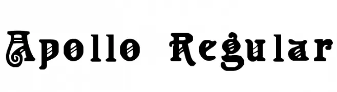
![Apollo Regular font caratteri gratis]() Scaricare 1782 Downloads@WebFont
Scaricare 1782 Downloads@WebFont -
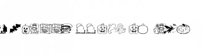
![AEZ halloween dingbats font caratteri gratis]() Scaricare 1782 Downloads@WebFont
Scaricare 1782 Downloads@WebFont -
( Alexander Pravdin )
A modern, semi-expanded typeface with uniform stroke widths and excellent readability.
![SONGERSemiExpanded-Medium font caratteri gratis]() Scaricare 1781 Downloads@WebFont
Scaricare 1781 Downloads@WebFont -
( Fonts by Castcraft Software - opti.netii.net - check the website before use )
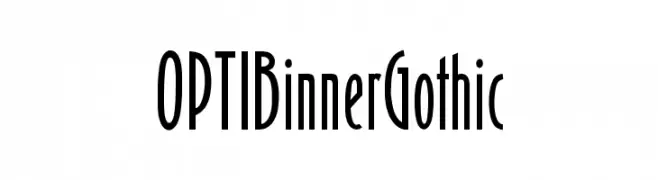
A tall, narrow, and modern font with a sleek, elongated design.
![OPTIBinnerGothic font caratteri gratis]() Scaricare 1781 Downloads@WebFont
Scaricare 1781 Downloads@WebFont -
( Fonts by Daniel Zadorozny - www.iconian.com )
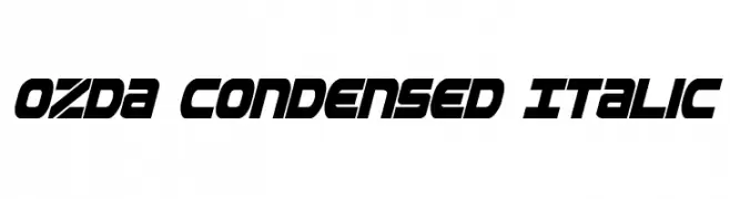
A bold, italicized, and condensed font with a modern, futuristic style.
![Ozda Condensed Italic font caratteri gratis]() Scaricare 1781 Downloads@WebFont
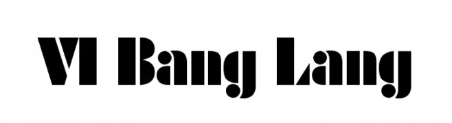
Scaricare 1781 Downloads@WebFont -
![VI Bang Lang font caratteri gratis]() Scaricare 1781 Downloads@WebFont
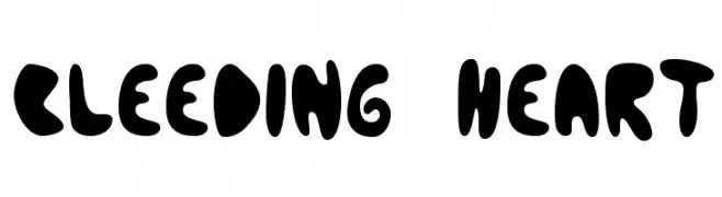
Scaricare 1781 Downloads@WebFont -
![Bleeding Heart font caratteri gratis]() Scaricare 1781 Downloads@WebFont
Scaricare 1781 Downloads@WebFont -
![Kenyan Coffee Bold Italic font caratteri gratis]() Scaricare 1781 Downloads@WebFont
Scaricare 1781 Downloads@WebFont -
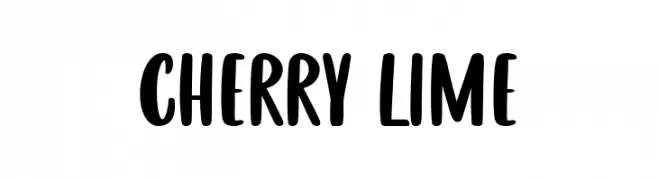
( Fonts by Fikryal studio )
A bold, playful handwritten font with rounded edges and dynamic style.
![CHERRY LIME font caratteri gratis]() Scaricare 1780 Downloads@WebFont
Scaricare 1780 Downloads@WebFont -
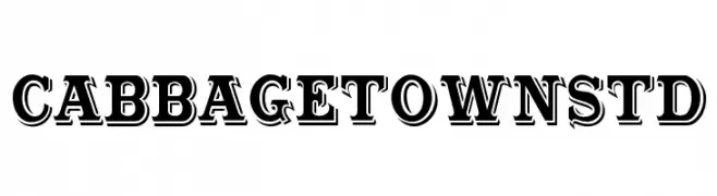
( Fonts by Bobistheowl - Personal-use only. For commercial use please contact owner. )
A bold, decorative font with a three-dimensional effect and pronounced serifs.
![CabbagetownStd font caratteri gratis]() Scaricare 1780 Downloads@WebFont
Scaricare 1780 Downloads@WebFont -
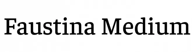
( Copyright 2016 The Faustina Project Authors (omnibus.type@gmail.com) )
A classic serif font with medium weight, offering elegance and readability.
![Faustina Medium font caratteri gratis]() Scaricare 1780 Downloads@WebFont
Scaricare 1780 Downloads@WebFont -
( Font by Jayvee D. Enaguas - grandchaos9000.deviantart.com )
A bold, italicized font with a dynamic and modern style.
![Capital Daren Italic font caratteri gratis]() Scaricare 1780 Downloads@WebFont
Scaricare 1780 Downloads@WebFont -
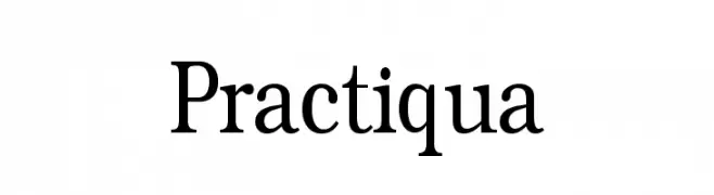
( Fonts by Manfred Klein. Free for private and charity use. Free for commercial with donation to organizations )
A classic serif typeface with elegant and traditional design elements.
![Practiqua font caratteri gratis]() Scaricare 1780 Downloads@WebFont
Scaricare 1780 Downloads@WebFont -
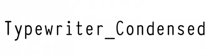
![Typewriter_Condensed font caratteri gratis]() Scaricare 1780 Downloads@WebFont
Scaricare 1780 Downloads@WebFont -
( Fonts by LeFly Fonts - lefly.vepar.nl )
A handwritten, pen-like font with a casual and fluid style.
![Blokletters Balpen font caratteri gratis]() Scaricare 1780 Downloads@WebFont
Scaricare 1780 Downloads@WebFont -
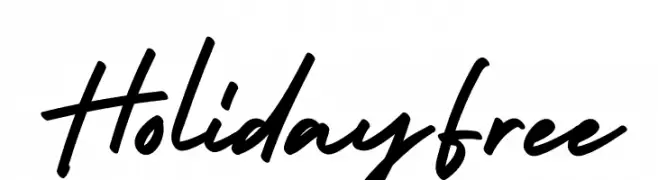
( Fonts by alphArtype - Agung Rohmat - Personal-use only. For commercial use please contact owner. )
A dynamic, cursive script font with a lively, handwritten style.
![HolidayFree font caratteri gratis]() Scaricare 1779 Downloads@WebFont
Scaricare 1779 Downloads@WebFont -
( Fonts by TipTopTyp )
A dynamic, handwritten-style font with smooth curves and a slight slant.
![Ranga Regular font caratteri gratis]() Scaricare 1778 Downloads@WebFont
Scaricare 1778 Downloads@WebFont -
( Scott Simpson )
A bold, italicized font with strong contrast and dynamic style.
![Merit Italic font caratteri gratis]() Scaricare 1778 Downloads@WebFont
Scaricare 1778 Downloads@WebFont -
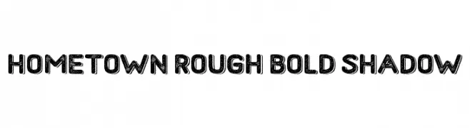
( Fonts by fey design )
A bold, rough-textured font with shadow effects, perfect for vintage-themed designs.
![Hometown Rough Bold Shadow font caratteri gratis]() Scaricare 1778 Downloads@WebFont
Scaricare 1778 Downloads@WebFont -
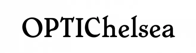
( Fonts by Castcraft Software - opti.netii.net - check the website before use )
A classic serif font with elegant curves and a traditional appearance.
![OPTIChelsea font caratteri gratis]() Scaricare 1778 Downloads@WebFont
Scaricare 1778 Downloads@WebFont -
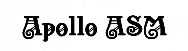
( Fonts by www.peter-wiegel.de. Personal-use only. For commercial use please contact owner. )
A bold, decorative font with intricate swirls and flourishes.
![Apollo ASM font caratteri gratis]() Scaricare 1778 Downloads@WebFont
Scaricare 1778 Downloads@WebFont -
![Lovecraft-s-Diary font caratteri gratis]() Scaricare 1778 Downloads@WebFont
Scaricare 1778 Downloads@WebFont -
( Fonts by Regenerated by Nadim Shaikli - Personal-use only. For commercial use please contact owner. )
A modern, clean sans-serif font with uniform strokes and excellent readability.
![Hor font caratteri gratis]() Scaricare 1777 Downloads@WebFont
Scaricare 1777 Downloads@WebFont -
( Fonts by Vladimir Nikolic - https://www.creativefabrica.com/product/educated-deers/ref/144265/ - Personal-use only. For commercial use please contact owner. )
A futuristic, geometric font with outlined characters and a modern aesthetic.
![Illusion Regular font caratteri gratis]() Scaricare 1777 Downloads@WebFont
Scaricare 1777 Downloads@WebFont -
( weknow - Wino S Kadir - www.creativefabrica.com/designer/weknow/ )
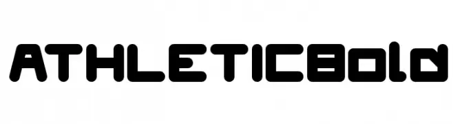
A bold, geometric font with rounded edges, perfect for modern and athletic designs.
![ATHLETIC Bold font caratteri gratis]() Scaricare 1777 Downloads@WebFont
Scaricare 1777 Downloads@WebFont -
( Fonts by Rokas Cicenas - www.roci.lt )
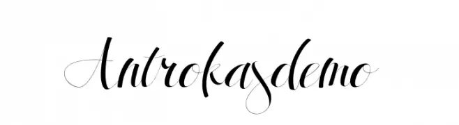
An elegant and flowing script font with graceful curves and sophisticated flair.
![Antrokasdemo font caratteri gratis]() Scaricare 1777 Downloads@WebFont
Scaricare 1777 Downloads@WebFont -
![Freak font caratteri gratis]() Scaricare 1777 Downloads@WebFont
Scaricare 1777 Downloads@WebFont -
( Fonts by Vladimir Nikolic - www.creativefabrica.com/designer/vladimirnikolic/ - Personal-use only. For commercial use please contact owner. )
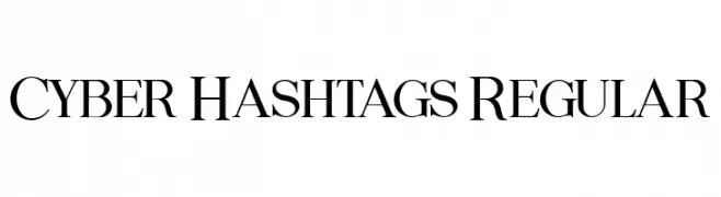
A classic serif font with elegant strokes and balanced proportions.
![Cyber Hashtags Regular font caratteri gratis]() Scaricare 1776 Downloads@WebFont
Scaricare 1776 Downloads@WebFont -
( Personal-use only. For commercial use please contact owner. )
A clean, modern sans-serif font with consistent stroke width and excellent readability.
![LibraSans font caratteri gratis]() Scaricare 1776 Downloads@WebFont
Scaricare 1776 Downloads@WebFont -
![CooperHewitt-BoldItalic font caratteri gratis]() Scaricare 1776 Downloads@WebFont
Scaricare 1776 Downloads@WebFont -
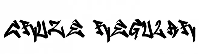
![CRUZE2 Regular font caratteri gratis]() Scaricare 1776 Downloads@WebFont
Scaricare 1776 Downloads@WebFont -
( SDFonts. http://www.angelfire.com/scifi2/sdfonts/index.html )
A bold, pixelated font with an 80s cyberpunk vibe.
![80's Cyberpunk Revival font caratteri gratis]() Scaricare 1776 Downloads@WebFont
Scaricare 1776 Downloads@WebFont -
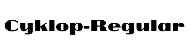
![Cyklop-Regular font caratteri gratis]() Scaricare 1776 Downloads@WebFont
Scaricare 1776 Downloads@WebFont -
( Font by SnatchSoft )
A pictorial font using gun and ammunition silhouettes as glyphs.
![GUNBATS font caratteri gratis]() Scaricare 1776 Downloads@WebFont
Scaricare 1776 Downloads@WebFont


Quali sono i font più popolari adesso?
Poppins, Roboto, Montserrat, Open Sans e Lato sono molto usati per le forme pulite e l'ampia applicabilità — dall'identità di marca alle landing page e ai poster.
Quali font si usano spesso nei loghi?
Le sans serif geometriche (es. Poppins, famiglie in stile Gotham) sono scelte comuni per un branding pulito e scalabile. Per un tocco personale restano valide script e stili manoscritti. Abbina un display deciso per i titoli a un corpo testo neutro per riconoscibilità ed equilibrio.
Ogni quanto si aggiorna la lista?
Con regolarità, in base ai download e all'attività reale. Torna spesso per scoprire in anticipo le nuove preferite.
💡 Consiglio: aggiungi ai preferiti — le tendenze cambiano in fretta e i font top di oggi possono ispirare il rebranding di domani.