Benvenuto nelle Font Più Popolari — dove popolarità e qualità si incontrano. Qui trovi i font più scaricati e usati dell'anno. Se cerchi scelte sicure per logo, web o social, inizia da qui.
Ogni font top si distingue per equilibrio, leggibilità e versatilità. Troverai sans serif moderne, script eleganti, serif vintage e display minimalisti.
-
( Fonts by Plamen Motev - www.fontfabric.com - Personal-use only. For commercial use please contact owner. )
A modern, geometric sans-serif typeface with a clean and condensed appearance.
 Scaricare 12812 Downloads@WebFont
 -
( Fonts by Levi Szekeres - www.loremipsum.ro. Personal-use only. For commercial use please contact owner. )
A bold, distressed font with a rough, vintage texture.
![HighVoltage Rough font caratteri gratis]() Scaricare 12811 Downloads@WebFont
Scaricare 12811 Downloads@WebFont -
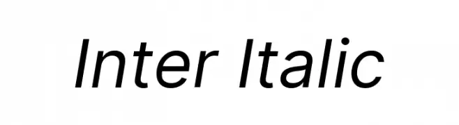
( Fonts by The Inter Project Authors - This Font Software is licensed under the SIL Open Font License. )
A modern, italicized font with clean lines and excellent legibility.
![Inter Italic font caratteri gratis]() Scaricare 12810 Downloads@WebFont
Scaricare 12810 Downloads@WebFont -
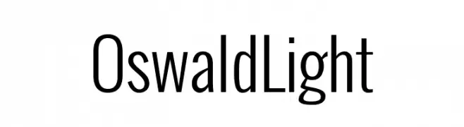
( Copyright 2016 The Oswald Project Authors (https://github.com/googlefonts/OswaldFont) )
A modern, tall, and narrow sans-serif font with a clean and professional look.
![Oswald Light font caratteri gratis]() Scaricare 12806 Downloads@WebFont
Scaricare 12806 Downloads@WebFont -
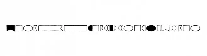
( Fonts by Adam Ladd )
A playful decorative dingbat font with geometric shapes, banners, arrows, and dividers.
![Garlic Salt Extras Regular font caratteri gratis]() Scaricare 12801 Downloads@WebFont
Scaricare 12801 Downloads@WebFont -
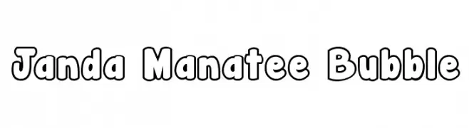
( Fonts by www.kimberlygeswein.com - Kimberly Geswein )
A playful, bubble-outlined font with bold, rounded characters.
![Janda Manatee Bubble font caratteri gratis]() Scaricare 12785 Downloads@WebFont
Scaricare 12785 Downloads@WebFont -
![Federation font caratteri gratis]() Scaricare 12771 Downloads@WebFont
Scaricare 12771 Downloads@WebFont -
![Audrey Normal font caratteri gratis]() Scaricare 12769 Downloads@WebFont
Scaricare 12769 Downloads@WebFont -
( Copyright (c) 2011, Carolina Trebol
A modern, geometric sans-serif font with balanced spacing and clear readability.
![Marvel-Regular font caratteri gratis]() Scaricare 12736 Downloads@WebFont
Scaricare 12736 Downloads@WebFont -
( Copyright (c) 2008, Haley Fiege (haley@kingdomofawesome.com), )
A playful, rounded font with smooth curves and a friendly appearance.
![Sniglet Regular font caratteri gratis]() Scaricare 12687 Downloads@WebFont
Scaricare 12687 Downloads@WebFont -
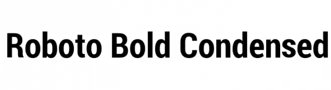
( Fonts by developer.android.com )
A bold, condensed typeface with a modern and clean aesthetic.
![Roboto Bold Condensed font caratteri gratis]() Scaricare 12685 Downloads@WebFont
Scaricare 12685 Downloads@WebFont -
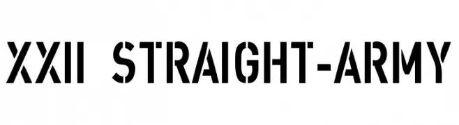
( Fonts by Lecter Johnson - doubletwostudios.tumblr.com )
A bold, military-inspired stencil font with a strong, geometric design.
![XXII STRAIGHT-ARMY font caratteri gratis]() Scaricare 12685 Downloads@WebFont
Scaricare 12685 Downloads@WebFont -
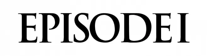
( Fonts by Boba Fonts )
A bold, serif font with sharp angles and strong vertical strokes, perfect for impactful headlines.
![EPISODE I font caratteri gratis]() Scaricare 12681 Downloads@WebFont
Scaricare 12681 Downloads@WebFont -
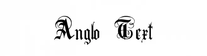
( Fonts by www.houseoflime.com )
A decorative blackletter font with intricate flourishes and a gothic style.
![Anglo Text font caratteri gratis]() Scaricare 12681 Downloads@WebFont
Scaricare 12681 Downloads@WebFont -
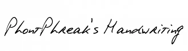
( Fonts by PhontPhreak )
A casual, handwritten font with fluid strokes and a personal touch.
![PhontPhreak's Handwriting font caratteri gratis]() Scaricare 12679 Downloads@WebFont
Scaricare 12679 Downloads@WebFont -
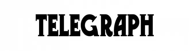
( Fonts by www.gliphmaker.com. Personal-use only. For commercial use please contact owner. )
A bold, high-contrast serif font with a vintage yet modern appeal.
![Telegraph font caratteri gratis]() Scaricare 12677 Downloads@WebFont
Scaricare 12677 Downloads@WebFont -
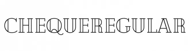
( Fonts by Mirela Belova - www.fontfabric.com - Personal-use only. For commercial use please contact owner. )
A modern, geometric font with distinct vertical bisecting lines.
![Cheque Regular font caratteri gratis]() Scaricare 12671 Downloads@WebFont
Scaricare 12671 Downloads@WebFont -
( Fonts by Daniel Zadorozny - www.iconian.com - Free for personal use )
A futuristic, geometric font with a condensed and bold design.
![Dodger Condensed font caratteri gratis]() Scaricare 12667 Downloads@WebFont
Scaricare 12667 Downloads@WebFont -
( Fonts by MissinkLab Studio - creativemarket.com/Missinklabstudio - Personal-use only. For commercial use please contact owner. )
A lively and dynamic script font with elegant loops and playful bounce.
![Salma font caratteri gratis]() Scaricare 12666 Downloads@WebFont
Scaricare 12666 Downloads@WebFont -
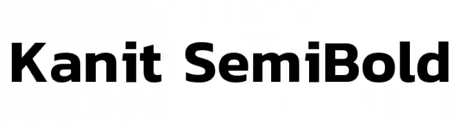
( Copyright (c) 2015, Cadson Demak (info@cadsondemak.com) )
A modern, semi-bold sans-serif font with excellent legibility and versatility.
![Kanit SemiBold font caratteri gratis]() Scaricare 12666 Downloads@WebFont
Scaricare 12666 Downloads@WebFont -
( Copyright (c) 2012, Brian J. Bonislawsky DBA Astigmatic (AOETI) (astigma@astigmatic.com), with Reserved Font Names "Audiowide" )
A futuristic, geometric font with bold, rounded characters and a modern appeal.
![Audiowide Regular font caratteri gratis]() Scaricare 12664 Downloads@WebFont
Scaricare 12664 Downloads@WebFont -
( Fonts by a kmzero font foundry - www.zetafonts.com. Personal-use only. For commercial use please contact owner. )
A bold, modern sans-serif font with geometric shapes and consistent stroke width.
![COCOGOOSE font caratteri gratis]() Scaricare 12658 Downloads@WebFont
Scaricare 12658 Downloads@WebFont -
![Puckfont font caratteri gratis]() Scaricare 12657 Downloads@WebFont
Scaricare 12657 Downloads@WebFont -
![.Helvetica Neue Interface Medium P4 font caratteri gratis]() Scaricare 12652 Downloads@WebFont
Scaricare 12652 Downloads@WebFont -
![Vera Humana 95 Bold font caratteri gratis]() Scaricare 12650 Downloads@WebFont
Scaricare 12650 Downloads@WebFont -
![Babylon5 font caratteri gratis]() Scaricare 12637 Downloads
Scaricare 12637 Downloads -
![Alte Haas Grotesk font caratteri gratis]() Scaricare 12625 Downloads@WebFont
Scaricare 12625 Downloads@WebFont -
( Copyright (c) 2014-2015 Wei Huang (wweeiihhuuaanngg@gmail.com) )
A bold, modern sans-serif font with clean lines and strong presence.
![Work Sans Bold font caratteri gratis]() Scaricare 12624 Downloads@WebFont
Scaricare 12624 Downloads@WebFont -
( imagex - www.imagex-fonts.com )
A star-themed decorative font with diverse star icons for each character.
![Starz 2 font caratteri gratis]() Scaricare 12611 Downloads@WebFont
Scaricare 12611 Downloads@WebFont -
![Drogowskaz font caratteri gratis]() Scaricare 12604 Downloads@WebFont
Scaricare 12604 Downloads@WebFont -
( Fonts by Khrys Bosland )
A playful, handwritten font with smooth, rounded strokes and a casual, informal style.
![KBWritersBlock font caratteri gratis]() Scaricare 12601 Downloads@WebFont
Scaricare 12601 Downloads@WebFont -
![Segoe Boot Semilight font caratteri gratis]() Scaricare 12586 Downloads@WebFont
Scaricare 12586 Downloads@WebFont -
( Fonts by Rick Mueller )
A whimsical, flowing font with script and decorative elements.
![Dragonfly font caratteri gratis]() Scaricare 12585 Downloads@WebFont
Scaricare 12585 Downloads@WebFont -
![R&C Demo font caratteri gratis]() Scaricare 12573 Downloads@WebFont
Scaricare 12573 Downloads@WebFont -
Caratteri di LOMBAXRATCHET. For commercial use please contact the owner.
![Lane A font caratteri gratis]() Scaricare 12558 Downloads@WebFont
Scaricare 12558 Downloads@WebFont


Quali sono i font più popolari adesso?
Poppins, Roboto, Montserrat, Open Sans e Lato sono molto usati per le forme pulite e l'ampia applicabilità — dall'identità di marca alle landing page e ai poster.
Quali font si usano spesso nei loghi?
Le sans serif geometriche (es. Poppins, famiglie in stile Gotham) sono scelte comuni per un branding pulito e scalabile. Per un tocco personale restano valide script e stili manoscritti. Abbina un display deciso per i titoli a un corpo testo neutro per riconoscibilità ed equilibrio.
Ogni quanto si aggiorna la lista?
Con regolarità, in base ai download e all'attività reale. Torna spesso per scoprire in anticipo le nuove preferite.
💡 Consiglio: aggiungi ai preferiti — le tendenze cambiano in fretta e i font top di oggi possono ispirare il rebranding di domani.