Benvenuto nelle Font Più Popolari — dove popolarità e qualità si incontrano. Qui trovi i font più scaricati e usati dell'anno. Se cerchi scelte sicure per logo, web o social, inizia da qui.
Ogni font top si distingue per equilibrio, leggibilità e versatilità. Troverai sans serif moderne, script eleganti, serif vintage e display minimalisti.
-
 Scaricare 81 Downloads@WebFont
 -
( Fonts by Kat`s Fun Fonts - Personal-use only. For commercial use please contact owner. )
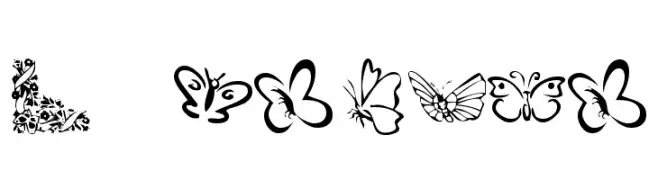
A decorative font with diverse butterfly illustrations.
![KR Butterflies font caratteri gratis]() Scaricare 81 Downloads@WebFont
Scaricare 81 Downloads@WebFont -
( Iconian Fonts - Daniel Zadorozny - www.iconian.com )
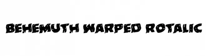
A bold, warped, and dynamic font with a playful, chaotic aesthetic.
![Behemuth Warped Rotalic font caratteri gratis]() Scaricare 81 Downloads@WebFont
Scaricare 81 Downloads@WebFont -
( Pathero Studio - www.patherostudio.com )
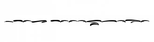
An elegant, flowing script font with swash elements and dynamic contrast.
![Swash Passengers font caratteri gratis]() Scaricare 81 Downloads@WebFont
Scaricare 81 Downloads@WebFont -
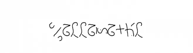
![manna-saxon font caratteri gratis]() Scaricare 81 Downloads@WebFont
Scaricare 81 Downloads@WebFont -
( Fonts by Darrell Flood - Personal-use only. For commercial use please contact owner. )
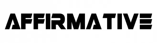
A bold, geometric font with a modern, futuristic style.
![Affirmative font caratteri gratis]() Scaricare 81 Downloads@WebFont
Scaricare 81 Downloads@WebFont -
( Fonts by typeformerstudio.com - Personal-use only. For commercial use please contact owner. )
A tall, condensed font with a modern and sleek appearance.
![Brigers font caratteri gratis]() Scaricare 81 Downloads@WebFont
Scaricare 81 Downloads@WebFont -
( Fonts by Fontfabric - Svetoslav Simov - Personal-use only. For commercial use please contact owner. )
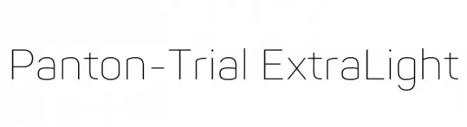
A modern, extra-light sans-serif font with a clean and geometric design.
![Panton-Trial ExtraLight font caratteri gratis]() Scaricare 81 Downloads@WebFont
Scaricare 81 Downloads@WebFont -
( Fonts by wep )
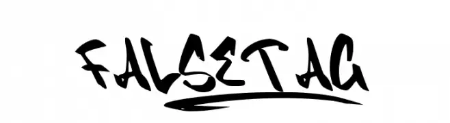
A bold, graffiti-inspired font with sharp angles and dynamic curves.
![FALSETAG_ font caratteri gratis]() Scaricare 81 Downloads@WebFont
Scaricare 81 Downloads@WebFont -
![DaemonicusExpanded Italic font caratteri gratis]() Scaricare 81 Downloads@WebFont
Scaricare 81 Downloads@WebFont -
( Fonts by Attype Studio - Fadli Ramadhan Iskandar - Personal-use only. For commercial use please contact owner. )
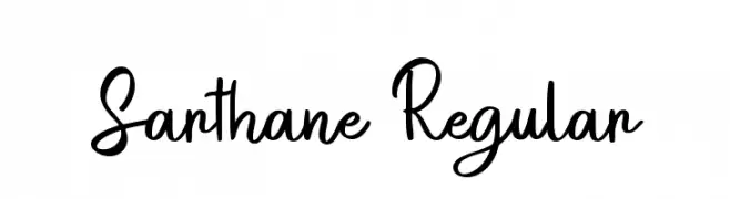
A playful and flowing script font with elegant curves and a handwritten appeal.
![Sarthane Regular font caratteri gratis]() Scaricare 81 Downloads@WebFont
Scaricare 81 Downloads@WebFont -
( Fonts by Wino S Kadir - weknow - www.revolge.com/shop/weknow/ - Personal-use only. For commercial use please contact owner. )
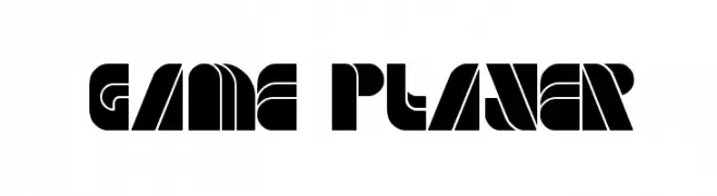
A bold, geometric font with a futuristic and modern aesthetic.
![GAME PLAYER font caratteri gratis]() Scaricare 81 Downloads@WebFont
Scaricare 81 Downloads@WebFont -
( Fonts by Kat`s Fun Fonts - Personal-use only. For commercial use please contact owner. )
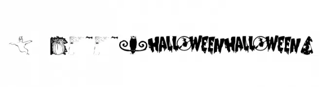
A Halloween-themed decorative font with playful and spooky elements.
![KR Booville font caratteri gratis]() Scaricare 81 Downloads@WebFont
Scaricare 81 Downloads@WebFont -
( Fonts by www.chequered.ink - Chequered Ink - Personal-use only. For commercial use please contact owner. )
A geometric, angular font with a modern and futuristic style.
![Whisperer font caratteri gratis]() Scaricare 81 Downloads@WebFont
Scaricare 81 Downloads@WebFont -
( Antipixel - Julia Martínez Diana - www.antipixel.com.ar/ )
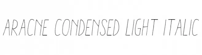
A delicate, condensed, and light italic font with a graceful and dynamic appearance.
![Aracne Condensed Light Italic font caratteri gratis]() Scaricare 81 Downloads@WebFont
Scaricare 81 Downloads@WebFont -
( Hazel Abbiati - diamondidiocy.tumblr.com )
A pixelated, retro-style font with a digital, blocky appearance.
![PlopDumpAlias font caratteri gratis]() Scaricare 81 Downloads@WebFont
Scaricare 81 Downloads@WebFont -
( typelinestudio - Yadhie Setiawan - creativemarket.com/typeline )
A whimsical cursive font with ornate swashes and loops.
![winteria font caratteri gratis]() Scaricare 81 Downloads@WebFont
Scaricare 81 Downloads@WebFont -
( Noto is a trademark of Google Inc. Noto fonts are open source. All Noto fonts are published under the SIL Open Font License, Version 1.1 )
A modern, clean sans-serif font with a slightly condensed style.
![Noto Sans Arabic ExtraCondensed font caratteri gratis]() Scaricare 81 Downloads@WebFont
Scaricare 81 Downloads@WebFont -
( Fonts by ndiscovered - Personal-use only. For commercial use please contact owner. )
A sleek, modern, extra-light italic font with a dynamic and elegant style.
![Exo Extra Light Italic font caratteri gratis]() Scaricare 81 Downloads@WebFont
Scaricare 81 Downloads@WebFont -
( Fonts by twinletter )
A bold, dramatic font with modern and vintage elements.
![RekixBlack-Regular font caratteri gratis]() Scaricare 81 Downloads@WebFont
Scaricare 81 Downloads@WebFont -
( Fonts by Situjuh Nazara - 7ntypes.com - Personal-use only. For commercial use please contact owner. )
A modern, clean sans-serif font with a slightly condensed style.
![Tangiang font caratteri gratis]() Scaricare 81 Downloads@WebFont
Scaricare 81 Downloads@WebFont -
( Fonts by www.typodermicfonts.com - Ray Larabie )
A bold, geometric font with a three-dimensional shadow effect.
![MisirlouDay-Regular font caratteri gratis]() Scaricare 81 Downloads@WebFont
Scaricare 81 Downloads@WebFont -
( Fonts by Peter Olexa - www.dealjumbo.com - Personal-use only. For commercial use please contact owner. )
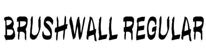
A bold, hand-drawn brush-style font with an energetic and artistic flair.
![brushwall regular font caratteri gratis]() Scaricare 81 Downloads@WebFont
Scaricare 81 Downloads@WebFont -
( Vladimir Nikolic - www.coroflot.com/vladimirnikolic )
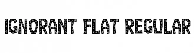
A bold, playful font with decorative spiral patterns on each character.
![Ignorant Flat Regular font caratteri gratis]() Scaricare 81 Downloads@WebFont
Scaricare 81 Downloads@WebFont -
( Fonts by Pinisiart )
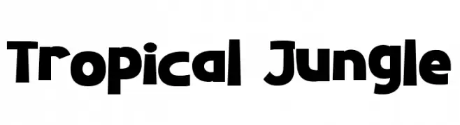
A bold, playful font with a chunky, rounded design and a whimsical, tropical vibe.
![Tropical Jungle font caratteri gratis]() Scaricare 81 Downloads@WebFont
Scaricare 81 Downloads@WebFont -
( Iconian Fonts - Daniel Zadorozny - www.iconian.com )
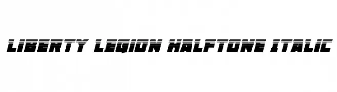
A bold, italicized font with a halftone effect, perfect for dynamic and futuristic designs.
![Liberty Legion Halftone Italic font caratteri gratis]() Scaricare 81 Downloads@WebFont
Scaricare 81 Downloads@WebFont -
( Misti's Fonts - mistifonts.com/ )
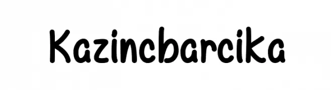
A playful, rounded handwritten font with a casual and friendly style.
![Kazincbarcika font caratteri gratis]() Scaricare 81 Downloads@WebFont
Scaricare 81 Downloads@WebFont -
( Fonts by zone108.main.jp - Personal-use only. For commercial use please contact owner. )
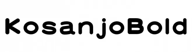
A bold, rounded font with smooth curves and a modern, friendly appearance.
![Kosanjo Bold font caratteri gratis]() Scaricare 81 Downloads@WebFont
Scaricare 81 Downloads@WebFont -
( Fonts by Daniel Zadorozny - www.iconian.com )
A bold, italicized font with a futuristic, chrome-like appearance and striped design.
![Trans-America Chrome Italic font caratteri gratis]() Scaricare 81 Downloads@WebFont
Scaricare 81 Downloads@WebFont -
( Fonts by a Max Infeld - XEROGRAPHER FONTS - xerographer.blogspot.com . Personal-use only. For commercial use please contact owner. )
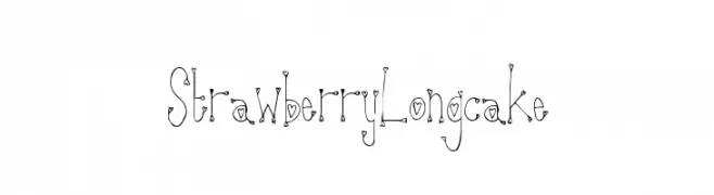
A whimsical, heart-embellished decorative font with a playful, hand-drawn style.
![StrawberryLongcake font caratteri gratis]() Scaricare 81 Downloads@WebFont
Scaricare 81 Downloads@WebFont -
( Fonts by GorillaBlu - Personal-use only. For commercial use please contact owner. )
The image contains decorative icons, not a font.
![Mickey Ears Extra font caratteri gratis]() Scaricare 81 Downloads@WebFont
Scaricare 81 Downloads@WebFont -
( Fonts by Michael Moss )
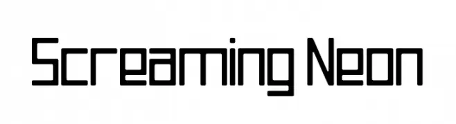
A geometric, modern font with uniform line thickness and a futuristic appeal.
![Screaming Neon font caratteri gratis]() Scaricare 81 Downloads@WebFont
Scaricare 81 Downloads@WebFont -
( Fonts by Anton Moglia - Personal-use only. For commercial use please contact owner. )
A bold, modern font with geometric cut-out elements.
![Coupeur Bricoleur UP font caratteri gratis]() Scaricare 81 Downloads@WebFont
Scaricare 81 Downloads@WebFont -
( Fonts by Mitch Greer )
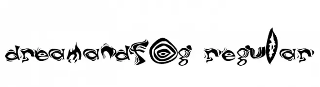
A decorative and abstract font with swirling, dynamic patterns and high contrast.
![DreamAndFog Regular font caratteri gratis]() Scaricare 81 Downloads@WebFont
Scaricare 81 Downloads@WebFont -
( Fonts by Graphicfresh - Personal-use only. For commercial use please contact owner. )
A playful, hand-drawn font with tall, narrow letters and a whimsical style.
![Kenzira font caratteri gratis]() Scaricare 81 Downloads@WebFont
Scaricare 81 Downloads@WebFont


Quali sono i font più popolari adesso?
Poppins, Roboto, Montserrat, Open Sans e Lato sono molto usati per le forme pulite e l'ampia applicabilità — dall'identità di marca alle landing page e ai poster.
Quali font si usano spesso nei loghi?
Le sans serif geometriche (es. Poppins, famiglie in stile Gotham) sono scelte comuni per un branding pulito e scalabile. Per un tocco personale restano valide script e stili manoscritti. Abbina un display deciso per i titoli a un corpo testo neutro per riconoscibilità ed equilibrio.
Ogni quanto si aggiorna la lista?
Con regolarità, in base ai download e all'attività reale. Torna spesso per scoprire in anticipo le nuove preferite.
💡 Consiglio: aggiungi ai preferiti — le tendenze cambiano in fretta e i font top di oggi possono ispirare il rebranding di domani.