Benvenuto nelle Font Più Popolari — dove popolarità e qualità si incontrano. Qui trovi i font più scaricati e usati dell'anno. Se cerchi scelte sicure per logo, web o social, inizia da qui.
Ogni font top si distingue per equilibrio, leggibilità e versatilità. Troverai sans serif moderne, script eleganti, serif vintage e display minimalisti.
-
( Vladimir Nikolic - www.coroflot.com/vladimirnikolic )
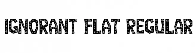
A bold, playful font with decorative spiral patterns on each character.
 Scaricare 82 Downloads@WebFont
 -
( Fonts by Pinisiart )
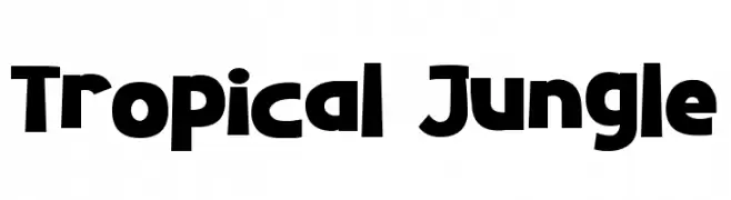
A bold, playful font with a chunky, rounded design and a whimsical, tropical vibe.
![Tropical Jungle font caratteri gratis]() Scaricare 82 Downloads@WebFont
Scaricare 82 Downloads@WebFont -
( Fonts by www.chequered.ink - Chequered Ink - Personal-use only. For commercial use please contact owner. )
A playful, bold font with rounded, organic shapes and consistent stroke width.
![Zealousy font caratteri gratis]() Scaricare 82 Downloads@WebFont
Scaricare 82 Downloads@WebFont -
( Fonts by Typefar - Farul Arjianto - Personal-use only. For commercial use please contact owner. )
A bold, expressive handwritten font with fluid strokes and dynamic curves.
![Honest font caratteri gratis]() Scaricare 82 Downloads@WebFont
Scaricare 82 Downloads@WebFont -
( Misti's Fonts - mistifonts.com/ )
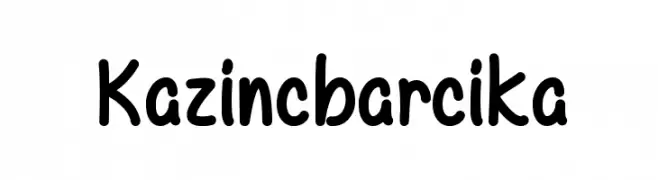
A playful, rounded handwritten font with a casual and friendly style.
![Kazincbarcika font caratteri gratis]() Scaricare 82 Downloads@WebFont
Scaricare 82 Downloads@WebFont -
( Fonts by zone108.main.jp - Personal-use only. For commercial use please contact owner. )
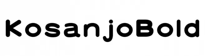
A bold, rounded font with smooth curves and a modern, friendly appearance.
![Kosanjo Bold font caratteri gratis]() Scaricare 82 Downloads@WebFont
Scaricare 82 Downloads@WebFont -
( Fonts by Daniel Zadorozny - www.iconian.com )
A bold, italicized font with a futuristic, chrome-like appearance and striped design.
![Trans-America Chrome Italic font caratteri gratis]() Scaricare 82 Downloads@WebFont
Scaricare 82 Downloads@WebFont -
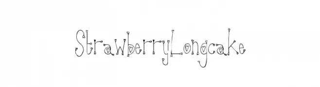
( Fonts by a Max Infeld - XEROGRAPHER FONTS - xerographer.blogspot.com . Personal-use only. For commercial use please contact owner. )
A whimsical, heart-embellished decorative font with a playful, hand-drawn style.
![StrawberryLongcake font caratteri gratis]() Scaricare 82 Downloads@WebFont
Scaricare 82 Downloads@WebFont -
( Fonts by GorillaBlu - Personal-use only. For commercial use please contact owner. )
The image contains decorative icons, not a font.
![Mickey Ears Extra font caratteri gratis]() Scaricare 82 Downloads@WebFont
Scaricare 82 Downloads@WebFont -
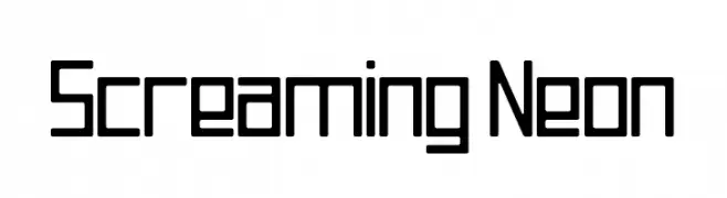
( Fonts by Michael Moss )
A geometric, modern font with uniform line thickness and a futuristic appeal.
![Screaming Neon font caratteri gratis]() Scaricare 82 Downloads@WebFont
Scaricare 82 Downloads@WebFont -
( Fonts by Anton Moglia - Personal-use only. For commercial use please contact owner. )
A bold, modern font with geometric cut-out elements.
![Coupeur Bricoleur UP font caratteri gratis]() Scaricare 82 Downloads@WebFont
Scaricare 82 Downloads@WebFont -
( Fonts by Eko Bimantara - Personal-use only. For commercial use please contact owner. )
A bold, italic serif font with a dynamic and elegant style.
![HornbillPersonalUse-BoldIta font caratteri gratis]() Scaricare 82 Downloads@WebFont
Scaricare 82 Downloads@WebFont -
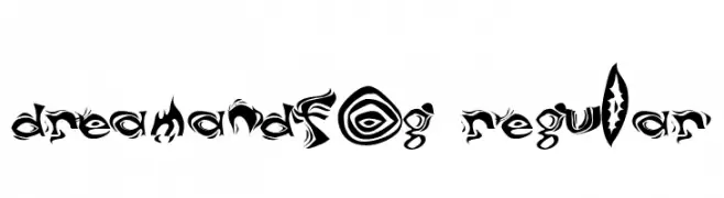
( Fonts by Mitch Greer )
A decorative and abstract font with swirling, dynamic patterns and high contrast.
![DreamAndFog Regular font caratteri gratis]() Scaricare 82 Downloads@WebFont
Scaricare 82 Downloads@WebFont -
( Fonts by Graphicfresh - Personal-use only. For commercial use please contact owner. )
A playful, hand-drawn font with tall, narrow letters and a whimsical style.
![Kenzira font caratteri gratis]() Scaricare 82 Downloads@WebFont
Scaricare 82 Downloads@WebFont -
( Fonts by Khurasan - Syaf Rizal - Personal-use only. For commercial use please contact owner. )
A bold, brush-style font with dynamic strokes and artistic flair.
![Stefont font caratteri gratis]() Scaricare 82 Downloads@WebFont
Scaricare 82 Downloads@WebFont -
( Fonts by Beautypes - Bhakti Al Akbar Pasaribu - Personal-use only. For commercial use please contact owner. )
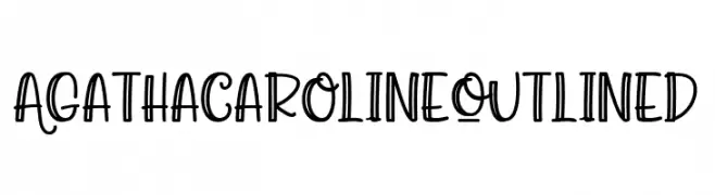
A playful, outlined font with a whimsical, hand-drawn style.
![Agatha Caroline Outlined font caratteri gratis]() Scaricare 82 Downloads@WebFont
Scaricare 82 Downloads@WebFont -
( Gregoryfonts - www.geocities.com/soho/coffeehouse/9609/fonts/fonts.html )
A whimsical and playful font with elongated ascenders and descenders.
![Harumph Normal font caratteri gratis]() Scaricare 82 Downloads@WebFont
Scaricare 82 Downloads@WebFont -
( Fonts by Belleve Invis - Personal-use only. For commercial use please contact owner. )
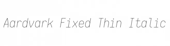
A thin, italicized monospaced font with a modern and minimalist design.
![Aardvark Fixed Thin Italic font caratteri gratis]() Scaricare 82 Downloads@WebFont
Scaricare 82 Downloads@WebFont -
( Fonts by Linafis Studio - Ahmad Fashihullisan - Personal-use only. For commercial use please contact owner. )
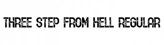
A bold, cracked font with a distressed, edgy appearance.
![THREE STEP FROM HELL Regular font caratteri gratis]() Scaricare 82 Downloads@WebFont
Scaricare 82 Downloads@WebFont -
( Fonts by Md Shohail Bhuian - Personal-use only. For commercial use please contact owner. )
A playful, rounded font with a casual and informal style.
![Night Owl font caratteri gratis]() Scaricare 82 Downloads@WebFont
Scaricare 82 Downloads@WebFont -
( Fonts by benoitsjoholm.blogspot.com - Benoit Sjoholm - Personal-use only. For commercial use please contact owner. )
A modern, geometric font with clean lines and rounded edges.
![Julie01 font caratteri gratis]() Scaricare 82 Downloads@WebFont
Scaricare 82 Downloads@WebFont -
( BitmapMania - bitmapmania.m78.com/ )
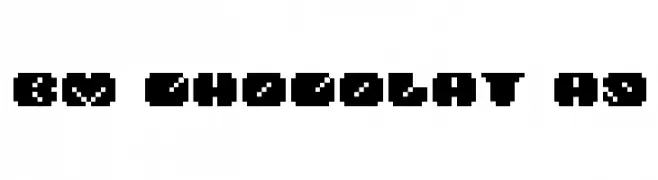
A bold, pixelated font with a retro, digital style.
![BM chocolat A9 font caratteri gratis]() Scaricare 82 Downloads@WebFont
Scaricare 82 Downloads@WebFont -
( Jecko Development - www.jeckodevelopment.com )
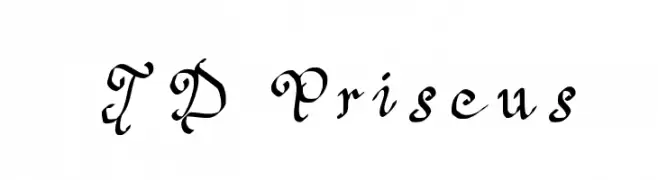
An ornate and decorative font with intricate, flowing letterforms.
![JD Priscus font caratteri gratis]() Scaricare 82 Downloads@WebFont
Scaricare 82 Downloads@WebFont -
( Fonts by Yahdi Kumala )
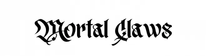
A bold, intricate Blackletter font with dramatic, historical elegance.
![Mortal Claws font caratteri gratis]() Scaricare 82 Downloads@WebFont
Scaricare 82 Downloads@WebFont -
( Fonts by Wino S Kadir - weknow - www.revolge.com/shop/weknow/ - Personal-use only. For commercial use please contact owner. )
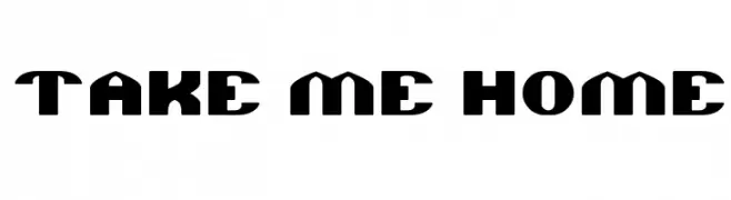
A bold, geometric font with a strong, blocky appearance.
![TAKE ME HOME font caratteri gratis]() Scaricare 82 Downloads@WebFont
Scaricare 82 Downloads@WebFont -
( weknow - Wino S Kadir - www.creativefabrica.com/designer/weknow/ )
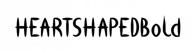
A playful, heart-themed font with bold, dynamic strokes.
![HEART SHAPED Bold font caratteri gratis]() Scaricare 82 Downloads@WebFont
Scaricare 82 Downloads@WebFont -
( Fonts by Letterena Studios )
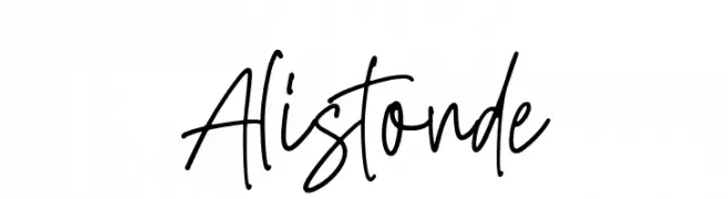
A dynamic and lively handwritten font with fluid strokes.
![Alistonde font caratteri gratis]() Scaricare 82 Downloads@WebFont
Scaricare 82 Downloads@WebFont -
( Fonts by Amarlettering - Takiy - Amarlettering - Takiy - Personal-use only. For commercial use please contact owner. )
A cursive, elegant font with a handwritten style and smooth, flowing letters.
![hawthorn font caratteri gratis]() Scaricare 82 Downloads@WebFont
Scaricare 82 Downloads@WebFont -
( Fonts by Craft Supply Co - Personal-use only. For commercial use please contact owner. )
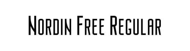
A modern, geometric font with clean lines and a slightly condensed form.
![Nordin Free Regular font caratteri gratis]() Scaricare 82 Downloads@WebFont
Scaricare 82 Downloads@WebFont -
( Typodermic Fonts - Ray Larabie - www.typodermicfonts.com/ )
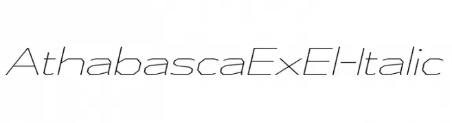
A modern, geometric italic font with clean, angular lines and subtle contrast.
![AthabascaExEl-Italic font caratteri gratis]() Scaricare 82 Downloads@WebFont
Scaricare 82 Downloads@WebFont -
( Jeni Pleskow - rois.org/ )
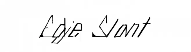
A dynamic, slanted font with angular, handwritten characteristics.
![Edje Slant font caratteri gratis]() Scaricare 82 Downloads@WebFont
Scaricare 82 Downloads@WebFont -
( Misti's Fonts - mistifonts.com/ )
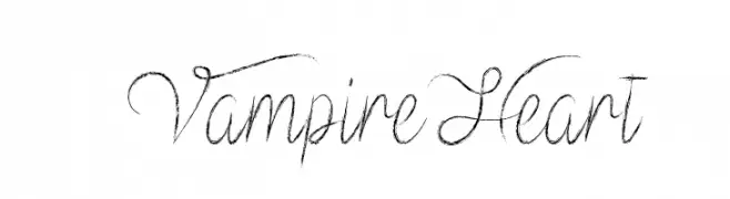
An elegant, flowing script font with delicate, connected strokes.
![Vampire Heart font caratteri gratis]() Scaricare 82 Downloads@WebFont
Scaricare 82 Downloads@WebFont -
( Fonts by GFR Creative )
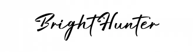
A stylish, handwritten script font with a modern, casual look.
![Bright Hunter font caratteri gratis]() Scaricare 82 Downloads@WebFont
Scaricare 82 Downloads@WebFont -
( Out Of Step Font Company - outofstepfontco.com )
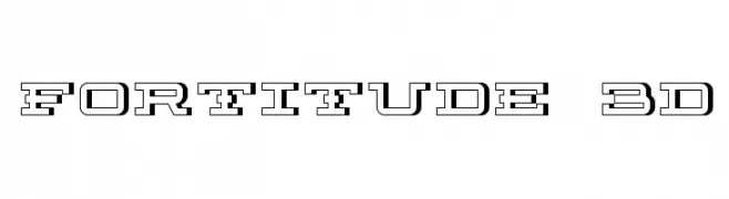
A bold, 3D geometric font with a strong, modern aesthetic.
![Fortitude 3D font caratteri gratis]() Scaricare 82 Downloads@WebFont
Scaricare 82 Downloads@WebFont -
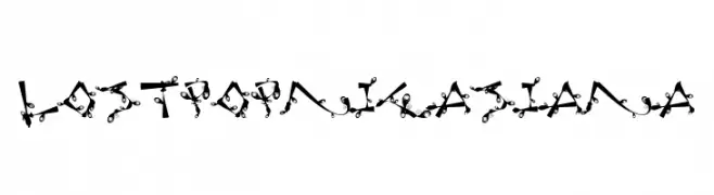
![Lost Popnicasiana font caratteri gratis]() Scaricare 82 Downloads@WebFont
Scaricare 82 Downloads@WebFont


Quali sono i font più popolari adesso?
Poppins, Roboto, Montserrat, Open Sans e Lato sono molto usati per le forme pulite e l'ampia applicabilità — dall'identità di marca alle landing page e ai poster.
Quali font si usano spesso nei loghi?
Le sans serif geometriche (es. Poppins, famiglie in stile Gotham) sono scelte comuni per un branding pulito e scalabile. Per un tocco personale restano valide script e stili manoscritti. Abbina un display deciso per i titoli a un corpo testo neutro per riconoscibilità ed equilibrio.
Ogni quanto si aggiorna la lista?
Con regolarità, in base ai download e all'attività reale. Torna spesso per scoprire in anticipo le nuove preferite.
💡 Consiglio: aggiungi ai preferiti — le tendenze cambiano in fretta e i font top di oggi possono ispirare il rebranding di domani.