Benvenuto nelle Font Più Popolari — dove popolarità e qualità si incontrano. Qui trovi i font più scaricati e usati dell'anno. Se cerchi scelte sicure per logo, web o social, inizia da qui.
Ogni font top si distingue per equilibrio, leggibilità e versatilità. Troverai sans serif moderne, script eleganti, serif vintage e display minimalisti.
-
( Font by Jonathan Harris - www.tattoowoo.com )
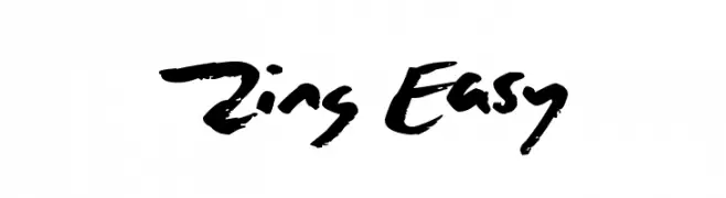
A bold, expressive handwritten font with dynamic brush-like strokes.
 Scaricare 491 Downloads@WebFont
 -
![Jaggy Fries font caratteri gratis]() Scaricare 491 Downloads@WebFont
Scaricare 491 Downloads@WebFont -
( Fonts by Erik Studio )
A bold, playful font with rounded edges and a bubbly appearance.
![Circle font caratteri gratis]() Scaricare 491 Downloads@WebFont
Scaricare 491 Downloads@WebFont -
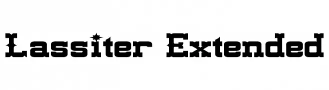
( Fonts by a Neale Davidson - www.pixelsagas.com. Personal-use only. For commercial use please contact owner. )
A bold, Western-inspired font with sharp, decorative elements.
![Lassiter Extended font caratteri gratis]() Scaricare 491 Downloads@WebFont
Scaricare 491 Downloads@WebFont -
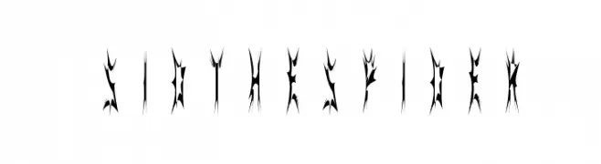
( Fonts by Marty Bee - www.martybee.com )
A gothic, spider web-inspired decorative font with sharp, jagged edges.
![SidTheSpider font caratteri gratis]() Scaricare 491 Downloads@WebFont
Scaricare 491 Downloads@WebFont -
-
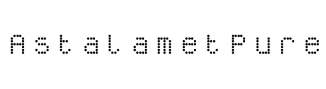
( Fonts by Bartek Nowak - www.nowak.tv/fontoholic/ )
A modern, dotted font with a geometric and digital aesthetic.
![AstalametPure font caratteri gratis]() Scaricare 491 Downloads@WebFont
Scaricare 491 Downloads@WebFont -
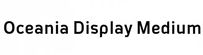
![Oceania Display Medium font caratteri gratis]() Scaricare 491 Downloads
Scaricare 491 Downloads -
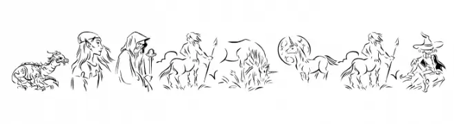
( Fonts by Manfred Klein - manfred-klein.ina-mar.com )
Ornate fantasy-themed pictorial font with mythical creatures.
![Fabulous font caratteri gratis]() Scaricare 491 Downloads@WebFont
Scaricare 491 Downloads@WebFont -
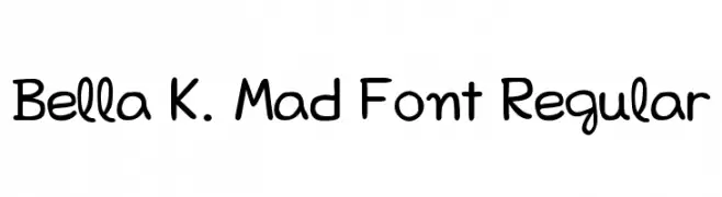
( Fonts by Izabela de Lima - elfadophotoscape.blogspot.com.br )
A playful, hand-drawn font with rounded edges and a whimsical style.
![Bella K. Mad Font Regular font caratteri gratis]() Scaricare 491 Downloads@WebFont
Scaricare 491 Downloads@WebFont -
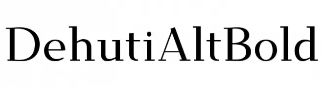
( Fonts by T. Christopher White - Personal-use only. For commercial use please contact owner. )
A modern serif font with elegant, refined letterforms and excellent readability.
![Dehuti Alt Bold font caratteri gratis]() Scaricare 491 Downloads@WebFont
Scaricare 491 Downloads@WebFont


Quali sono i font più popolari adesso?
Poppins, Roboto, Montserrat, Open Sans e Lato sono molto usati per le forme pulite e l'ampia applicabilità — dall'identità di marca alle landing page e ai poster.
Quali font si usano spesso nei loghi?
Le sans serif geometriche (es. Poppins, famiglie in stile Gotham) sono scelte comuni per un branding pulito e scalabile. Per un tocco personale restano valide script e stili manoscritti. Abbina un display deciso per i titoli a un corpo testo neutro per riconoscibilità ed equilibrio.
Ogni quanto si aggiorna la lista?
Con regolarità, in base ai download e all'attività reale. Torna spesso per scoprire in anticipo le nuove preferite.
💡 Consiglio: aggiungi ai preferiti — le tendenze cambiano in fretta e i font top di oggi possono ispirare il rebranding di domani.