Benvenuto nelle Font Più Popolari — dove popolarità e qualità si incontrano. Qui trovi i font più scaricati e usati dell'anno. Se cerchi scelte sicure per logo, web o social, inizia da qui.
Ogni font top si distingue per equilibrio, leggibilità e versatilità. Troverai sans serif moderne, script eleganti, serif vintage e display minimalisti.
-
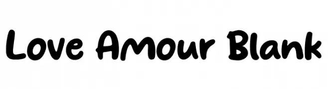
( Fonts by Khurasan )
A bold, playful handwritten font with rounded edges and a casual style.
 Scaricare 1714 Downloads@WebFont
 -
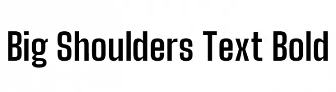
( Copyright 2019 The Big Shoulders Project Authors (https://github.com/xotypeco/big_shoulders) )
A bold, geometric typeface with strong, clean lines and excellent readability.
![Big Shoulders Text Bold font caratteri gratis]() Scaricare 1714 Downloads@WebFont
Scaricare 1714 Downloads@WebFont -
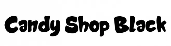
( imagex - www.imagex-fonts.com )
A playful, bold font with rounded, cartoon-like characters.
![Candy Shop Black font caratteri gratis]() Scaricare 1714 Downloads@WebFont
Scaricare 1714 Downloads@WebFont -
![The Martin Garrix Font font caratteri gratis]() Scaricare 1714 Downloads@WebFont
Scaricare 1714 Downloads@WebFont -
( Fonts by Castcraft Software - opti.netii.net - check the website before use )
A bold, classic serif font with elegant and traditional Italian influences.
![OPTIItalianOldstyle-Bold font caratteri gratis]() Scaricare 1714 Downloads@WebFont
Scaricare 1714 Downloads@WebFont -
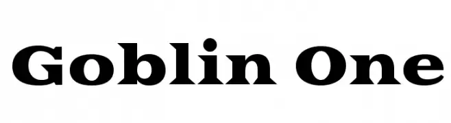
( Copyright (c) 2011 by Sorkin Type Co (www.sorkintype.com) )
A bold, strong font with thick strokes and a commanding presence.
![Goblin One font caratteri gratis]() Scaricare 1714 Downloads@WebFont
Scaricare 1714 Downloads@WebFont -
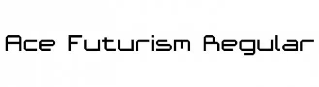
( Fonts by Andrew McCluskey - nalgames.com )
A futuristic, geometric font with angular, block-like letterforms.
![Ace Futurism Regular font caratteri gratis]() Scaricare 1714 Downloads@WebFont
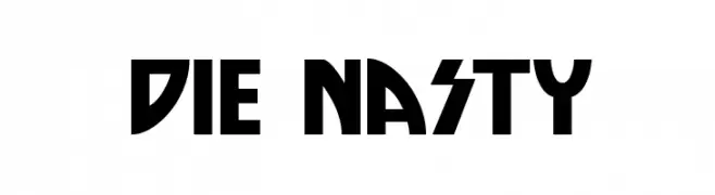
Scaricare 1714 Downloads@WebFont -
![Die Nasty font caratteri gratis]() Scaricare 1714 Downloads@WebFont
Scaricare 1714 Downloads@WebFont -
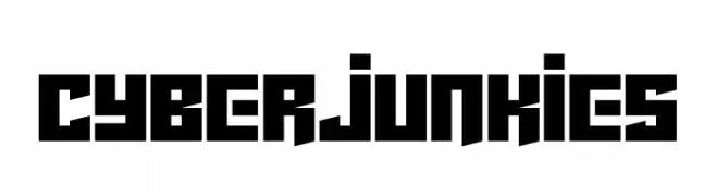
( Fonts by Darrell Flood - Personal-use only. For commercial use please contact owner. )
A bold, geometric font with a futuristic, edgy design.
![Cyberjunkies font caratteri gratis]() Scaricare 1713 Downloads@WebFont
Scaricare 1713 Downloads@WebFont -
( Fonts by K. Mellbach )
A bold, angular font with a hand-crafted, dynamic style.
![Alduur font caratteri gratis]() Scaricare 1713 Downloads@WebFont
Scaricare 1713 Downloads@WebFont -
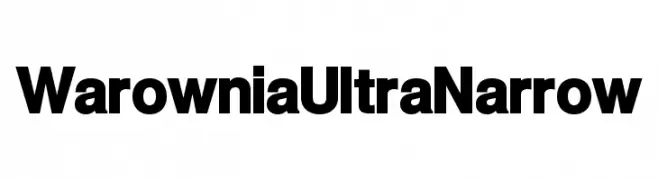
( Fonts by CannotIntoSpaceFonts - KineticPlasma Fonts - Personal-use only. For commercial use please contact owner. )
A bold, ultra-narrow font with a modern and impactful style.
![Warownia Ultra Narrow font caratteri gratis]() Scaricare 1713 Downloads@WebFont
Scaricare 1713 Downloads@WebFont -
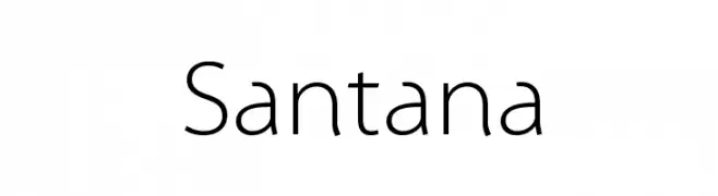
( Fonts by Manfred Klein - manfred-klein.ina-mar.com )
A modern sans-serif font with geometric influences and consistent stroke width.
![Santana font caratteri gratis]() Scaricare 1713 Downloads@WebFont
Scaricare 1713 Downloads@WebFont -
![Big Bad Wolf font caratteri gratis]() Scaricare 1713 Downloads@WebFont
Scaricare 1713 Downloads@WebFont -
![SantasSleighFull Deluxe font caratteri gratis]() Scaricare 1713 Downloads@WebFont
Scaricare 1713 Downloads@WebFont -
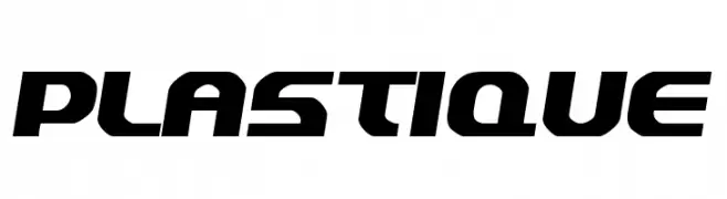
( Fonts by Jacob Fisher - www.pizzadude.dk )
A bold, futuristic font with geometric and dynamic letterforms.
![Plastique font caratteri gratis]() Scaricare 1713 Downloads@WebFont
Scaricare 1713 Downloads@WebFont -
( Fonts by www.chequered.ink - Chequered Ink - Personal-use only. For commercial use please contact owner. )
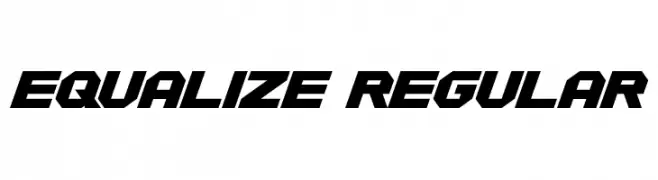
A bold, geometric font with a dynamic and futuristic style.
![Equalize Regular font caratteri gratis]() Scaricare 1712 Downloads@WebFont
Scaricare 1712 Downloads@WebFont -
( Fonts by Lauren Thompson - www.nymfont.com )
An elegant and decorative script font with flowing curves and intricate details.
![Sachiko font caratteri gratis]() Scaricare 1712 Downloads@WebFont
Scaricare 1712 Downloads@WebFont -
![PTF NORDIC Std font caratteri gratis]() Scaricare 1712 Downloads@WebFont
Scaricare 1712 Downloads@WebFont -
( Fonts by Christopher Hansen )
A bold, distressed font with a gritty, punk-inspired aesthetic.
![Punk Kid font caratteri gratis]() Scaricare 1712 Downloads@WebFont
Scaricare 1712 Downloads@WebFont -
![SchwabacherDeutscheReichsbahn font caratteri gratis]() Scaricare 1712 Downloads@WebFont
Scaricare 1712 Downloads@WebFont -
( Fonts by www.aenigmafonts.com )
A bold, playful font with a unique dotted texture, ideal for eye-catching designs.
![Dephunked BRK font caratteri gratis]() Scaricare 1712 Downloads@WebFont
Scaricare 1712 Downloads@WebFont -
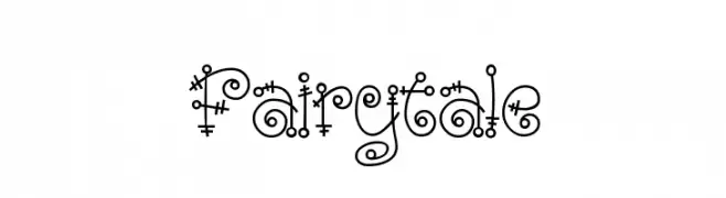
![Fairytale font caratteri gratis]() Scaricare 1712 Downloads@WebFont
Scaricare 1712 Downloads@WebFont -
( Fonts by Khurasan )
A playful, rounded font with bold, bubbly characters.
![Fancake font caratteri gratis]() Scaricare 1711 Downloads@WebFont
Scaricare 1711 Downloads@WebFont -
( Fonts by Vladimir Nikolic - www.creativefabrica.com/designer/vladimirnikolic/ - Personal-use only. For commercial use please contact owner. )
A classic serif font with elegant strokes and balanced proportions.
![Cyber Hashtags Regular font caratteri gratis]() Scaricare 1711 Downloads@WebFont
Scaricare 1711 Downloads@WebFont -
![Rawlings Method font caratteri gratis]() Scaricare 1711 Downloads@WebFont
Scaricare 1711 Downloads@WebFont -
( Fonts by a Bigelow&Holmes . Personal-use only. For commercial use please contact owner. )
A classic serif typeface with elegant, balanced strokes and high readability.
![Luxi Serif Regular font caratteri gratis]() Scaricare 1711 Downloads@WebFont
Scaricare 1711 Downloads@WebFont -
( Copyright (c) 2012 by Sorkin Type Co (www.sorkintype.com), with Reserved Font Name 'Vampiro' )
A bold, angular font with a dynamic and energetic style.
![Vampiro One font caratteri gratis]() Scaricare 1711 Downloads@WebFont
Scaricare 1711 Downloads@WebFont -
( Free for personal use )
A bold, hand-drawn font with textured, shaded characters.
![Mystery font caratteri gratis]() Scaricare 1711 Downloads@WebFont
Scaricare 1711 Downloads@WebFont -
![Phaisarn font caratteri gratis]() Scaricare 1711 Downloads@WebFont
Scaricare 1711 Downloads@WebFont -
![Mal de Ojo font caratteri gratis]() Scaricare 1711 Downloads@WebFont
Scaricare 1711 Downloads@WebFont -
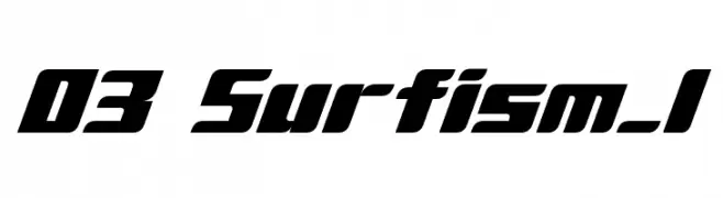
( Fonts by www.DigitalDreamDesign.net )
A bold, italicized font with a futuristic and sporty design.
![D3 Surfism_I font caratteri gratis]() Scaricare 1711 Downloads@WebFont
Scaricare 1711 Downloads@WebFont -
![Country Button font caratteri gratis]() Scaricare 1711 Downloads@WebFont
Scaricare 1711 Downloads@WebFont -
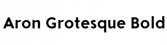
![Aron Grotesque Bold font caratteri gratis]() Scaricare 1710 Downloads@WebFont
Scaricare 1710 Downloads@WebFont -
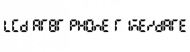
( Fonts by Colonel Sanders )
A segmented, geometric font inspired by classic LCD digital displays.
![LCD AT&T Phone Time/Date font caratteri gratis]() Scaricare 1710 Downloads@WebFont
Scaricare 1710 Downloads@WebFont -
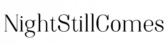
![NightStillComes font caratteri gratis]() Scaricare 1710 Downloads@WebFont
Scaricare 1710 Downloads@WebFont


Quali sono i font più popolari adesso?
Poppins, Roboto, Montserrat, Open Sans e Lato sono molto usati per le forme pulite e l'ampia applicabilità — dall'identità di marca alle landing page e ai poster.
Quali font si usano spesso nei loghi?
Le sans serif geometriche (es. Poppins, famiglie in stile Gotham) sono scelte comuni per un branding pulito e scalabile. Per un tocco personale restano valide script e stili manoscritti. Abbina un display deciso per i titoli a un corpo testo neutro per riconoscibilità ed equilibrio.
Ogni quanto si aggiorna la lista?
Con regolarità, in base ai download e all'attività reale. Torna spesso per scoprire in anticipo le nuove preferite.
💡 Consiglio: aggiungi ai preferiti — le tendenze cambiano in fretta e i font top di oggi possono ispirare il rebranding di domani.