Benvenuto nelle Font Più Popolari — dove popolarità e qualità si incontrano. Qui trovi i font più scaricati e usati dell'anno. Se cerchi scelte sicure per logo, web o social, inizia da qui.
Ogni font top si distingue per equilibrio, leggibilità e versatilità. Troverai sans serif moderne, script eleganti, serif vintage e display minimalisti.
-
( Fonts by Vladimir Nikolic - www.creativefabrica.com/designer/vladimirnikolic/ - Personal-use only. For commercial use please contact owner. )
A bold, geometric font with angular shapes and outlined characters, perfect for modern designs.
 Scaricare 78 Downloads@WebFont
 -
( Fonts by Amarlettering - Takiy - Amarlettering - Takiy - Personal-use only. For commercial use please contact owner. )
A playful and elegant handwritten script font with flowing curves.
![kinsley font caratteri gratis]() Scaricare 78 Downloads@WebFont
Scaricare 78 Downloads@WebFont -
( Fonts by Craft Supply Co - Personal-use only. For commercial use please contact owner. )
A bold, modern italic font with dynamic, slanted letterforms.
![FenordFree-Italic font caratteri gratis]() Scaricare 78 Downloads@WebFont
Scaricare 78 Downloads@WebFont -
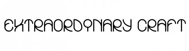
( Fonts by Wino S Kadir - weknow - www.revolge.com/shop/weknow/ - Personal-use only. For commercial use please contact owner. )
A modern, rounded font with a playful and cohesive design.
![EXTRAORDINARY CRAFT font caratteri gratis]() Scaricare 78 Downloads@WebFont
Scaricare 78 Downloads@WebFont -
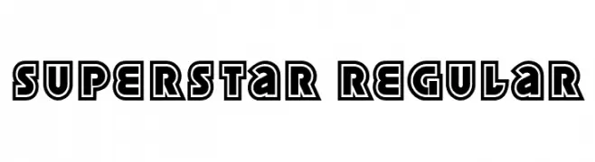
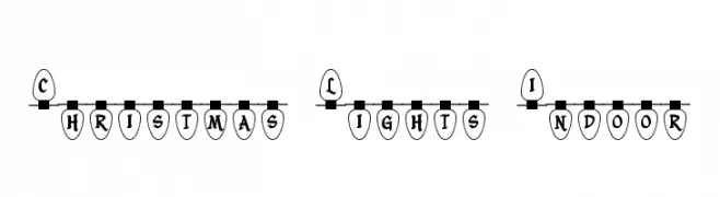
( Fonts by Rich Gast - www.greywolfwebworks.com Commerciali Caratteri )
A festive, decorative font styled as Christmas lights, perfect for holiday-themed projects.
![Christmas Lights Indoor font caratteri gratis]() Scaricare 78 Downloads
Scaricare 78 Downloads -
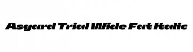
( Fonts by Zetafonts - Personal-use only. For commercial use please contact owner. )
A bold, wide, and italicized font with a modern and dynamic style.
![Asgard Trial Wide Fat Italic font caratteri gratis]() Scaricare 78 Downloads@WebFont
Scaricare 78 Downloads@WebFont -
( Jorge Bedoy )
A modern geometric font with clean lines and angular cuts.
![Yodeb font caratteri gratis]() Scaricare 78 Downloads@WebFont
Scaricare 78 Downloads@WebFont -
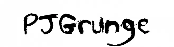
( Perry Johnson - Instagram @perrymaxwelljohnson )
A rugged, hand-drawn font with a grunge aesthetic and irregular, textured strokes.
![PJGrunge font caratteri gratis]() Scaricare 78 Downloads@WebFont
Scaricare 78 Downloads@WebFont -
( Fonts by Rabisco - Estactu - Personal-use only. For commercial use please contact owner. )
A decorative, abstract font with geometric and angular designs.
![Urbana font caratteri gratis]() Scaricare 78 Downloads@WebFont
Scaricare 78 Downloads@WebFont -
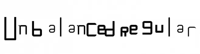
( Fonts by Birds1O6 - Personal-use only. For commercial use please contact owner. )
An eclectic and experimental font with varied, unbalanced letterforms.
![Unbalanced Regular font caratteri gratis]() Scaricare 78 Downloads@WebFont
Scaricare 78 Downloads@WebFont -
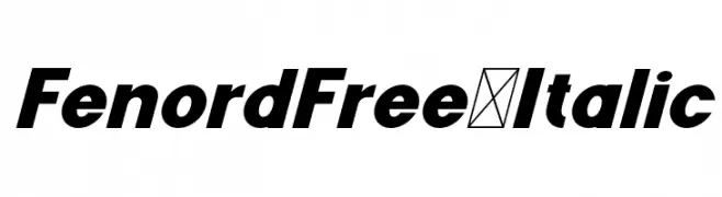
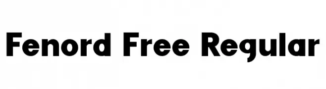
( Fonts by Craft Supply Co - Personal-use only. For commercial use please contact owner. )
A bold, modern sans-serif font with clean lines and balanced spacing.
![Fenord Free Regular font caratteri gratis]() Scaricare 78 Downloads@WebFont
Scaricare 78 Downloads@WebFont -
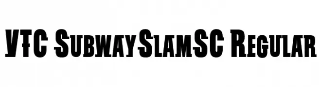
( Fonts by Vigilante Typeface Corporation Larry Yerkes. Personal-use only. For commercial use please contact owner. )
A bold, blocky font with strong, urban-inspired design.
![VTC SubwaySlamSC Regular font caratteri gratis]() Scaricare 78 Downloads@WebFont
Scaricare 78 Downloads@WebFont -
( Fonts by Zeenesia Studio - Doni Purwoko - Personal-use only. For commercial use please contact owner. )
An elegant, flowing script font with a natural handwritten style.
![Sintyabelinda font caratteri gratis]() Scaricare 78 Downloads@WebFont
Scaricare 78 Downloads@WebFont -
( Fonts by sronstudio - Yusron Billah - Personal-use only. For commercial use please contact owner. )
A dynamic, cursive script font with medium contrast and elegant flow.
![Darmogo font caratteri gratis]() Scaricare 78 Downloads@WebFont
Scaricare 78 Downloads@WebFont -
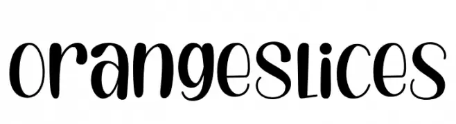
( Fonts by Ghuroba Studio - Personal-use only. For commercial use please contact owner. )
A playful and whimsical font with bold and thin strokes, perfect for creative projects.
![Orange Slices font caratteri gratis]() Scaricare 78 Downloads@WebFont
Scaricare 78 Downloads@WebFont -
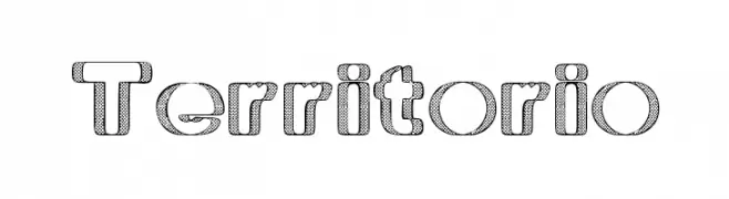
( Fonts by www.woodcutter.es - woodcutter Manero - Personal-use only. For commercial use please contact owner. )
A bold, three-dimensional font with a hatched pattern, perfect for decorative use.
![Territorio font caratteri gratis]() Scaricare 78 Downloads@WebFont
Scaricare 78 Downloads@WebFont -
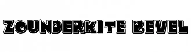
( Iconian Fonts - Daniel Zadorozny - www.iconian.com )
A bold, three-dimensional bevel font with a strong, playful aesthetic.
![Zounderkite Bevel font caratteri gratis]() Scaricare 78 Downloads@WebFont
Scaricare 78 Downloads@WebFont -
( Fonts by Yoga Letter )
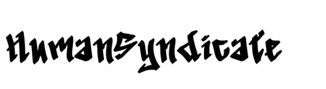
A bold blackletter font with sharp, angular lines and a gothic aesthetic.
![Human Syndicate - 1 font caratteri gratis]() Scaricare 78 Downloads@WebFont
Scaricare 78 Downloads@WebFont -
( weknow - Wino S Kadir - www.creativefabrica.com/designer/weknow/ )
A geometric, hollow font with angular lines and a modern aesthetic.
![HERITAGE-Hollow font caratteri gratis]() Scaricare 78 Downloads@WebFont
Scaricare 78 Downloads@WebFont -
( Fonts by Kreative Korporation - www.kreativekorp.com )
![LisaGuide Paper Raw font caratteri gratis]() Scaricare 78 Downloads@WebFont
Scaricare 78 Downloads@WebFont -
( Fonts by a Neale Davidson - www.pixelsagas.com. Personal-use only. For commercial use please contact owner. )
A bold, decorative font with intricate, mystical letterforms.
![Gargish Bold font caratteri gratis]() Scaricare 78 Downloads@WebFont
Scaricare 78 Downloads@WebFont -
( Fonts by JunCreative - Personal-use only. For commercial use please contact owner. )
A playful and elegant handwritten font with fluid, connected characters.
![Velvet Vanilla font caratteri gratis]() Scaricare 78 Downloads@WebFont
Scaricare 78 Downloads@WebFont -
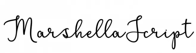
( Fonts by Cut Story )
Elegant handwritten script font.
![MarshellaScript font caratteri gratis]() Scaricare 78 Downloads@WebFont
Scaricare 78 Downloads@WebFont -
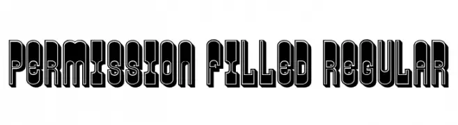
( Fonts by Vladimir Nikolic - https://www.creativefabrica.com/product/educated-deers/ref/144265/ - Personal-use only. For commercial use please contact owner. )
A bold, filled-in font with thick outlines and a strong visual impact.
![Permission Filled Regular font caratteri gratis]() Scaricare 78 Downloads@WebFont
Scaricare 78 Downloads@WebFont -
( Fonts by Yadhie Setiawan - typelinestudio.com - Personal-use only. For commercial use please contact owner. )
A whimsical, handwritten font with elongated, flowing lines.
![North City font caratteri gratis]() Scaricare 78 Downloads@WebFont
Scaricare 78 Downloads@WebFont -
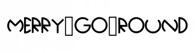
![Merry_Go_Round font caratteri gratis]() Scaricare 78 Downloads@WebFont
Scaricare 78 Downloads@WebFont -
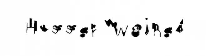
![Hussar Wojna4 font caratteri gratis]() Scaricare 78 Downloads@WebFont
Scaricare 78 Downloads@WebFont -
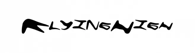
( Fonts by a Max Infeld - XEROGRAPHER FONTS - xerographer.blogspot.com . Personal-use only. For commercial use please contact owner. )
A bold, dynamic font with fluid, hand-drawn strokes and a sense of movement.
![FlyingHigh font caratteri gratis]() Scaricare 78 Downloads@WebFont
Scaricare 78 Downloads@WebFont -
( Fonts by Dmitry Astakhov - www.behance.net/adonis-abe1e - Personal-use only. For commercial use please contact owner. )
A bold, playful font with irregular, whimsical shapes and a decorative style.
![Astakhov Dished F font caratteri gratis]() Scaricare 78 Downloads@WebFont
Scaricare 78 Downloads@WebFont -
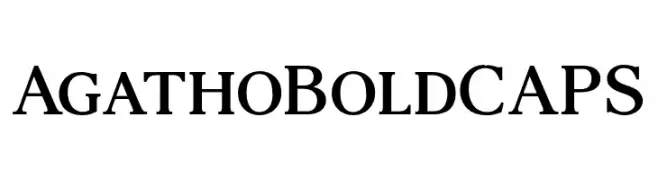
( Fonts by andfonts - Andrii Shevchyk - Personal-use only. For commercial use please contact owner. )
A bold serif font with strong, authoritative strokes and classic design.
![AgathoBoldCAPS font caratteri gratis]() Scaricare 78 Downloads@WebFont
Scaricare 78 Downloads@WebFont -
( Iconian Fonts - Daniel Zadorozny - www.iconian.com )
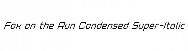
A sleek, condensed, and italicized font with a modern and dynamic appearance.
![Fox on the Run Condensed Super-Italic font caratteri gratis]() Scaricare 78 Downloads@WebFont
Scaricare 78 Downloads@WebFont -
( Fonts by Zetafonts - Personal-use only. For commercial use please contact owner. )
A bold, italicized font with high contrast and tight spacing, perfect for impactful headlines.
![HeadingNow Trial 18 Heavy Italic font caratteri gratis]() Scaricare 78 Downloads@WebFont
Scaricare 78 Downloads@WebFont -
( Iconian Fonts - Daniel Zadorozny - www.iconian.com )
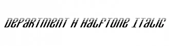
A bold, italic font with a halftone effect, offering a modern and dynamic style.
![Department H Halftone Italic font caratteri gratis]() Scaricare 78 Downloads@WebFont
Scaricare 78 Downloads@WebFont -
( Iconian Fonts - Daniel Zadorozny - www.iconian.com )
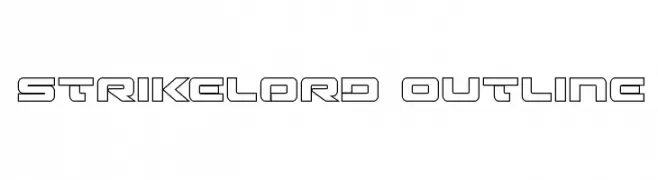
A bold, geometric outline font with a futuristic and modern aesthetic.
![Strikelord Outline font caratteri gratis]() Scaricare 78 Downloads@WebFont
Scaricare 78 Downloads@WebFont -
( Fonts by Muhammad Yafinuha )
A bold, playful font with thick, rounded characters and a bubbly appearance.
![SuperKloud font caratteri gratis]() Scaricare 78 Downloads@WebFont
Scaricare 78 Downloads@WebFont


Quali sono i font più popolari adesso?
Poppins, Roboto, Montserrat, Open Sans e Lato sono molto usati per le forme pulite e l'ampia applicabilità — dall'identità di marca alle landing page e ai poster.
Quali font si usano spesso nei loghi?
Le sans serif geometriche (es. Poppins, famiglie in stile Gotham) sono scelte comuni per un branding pulito e scalabile. Per un tocco personale restano valide script e stili manoscritti. Abbina un display deciso per i titoli a un corpo testo neutro per riconoscibilità ed equilibrio.
Ogni quanto si aggiorna la lista?
Con regolarità, in base ai download e all'attività reale. Torna spesso per scoprire in anticipo le nuove preferite.
💡 Consiglio: aggiungi ai preferiti — le tendenze cambiano in fretta e i font top di oggi possono ispirare il rebranding di domani.