Benvenuto nelle Font Più Popolari — dove popolarità e qualità si incontrano. Qui trovi i font più scaricati e usati dell'anno. Se cerchi scelte sicure per logo, web o social, inizia da qui.
Ogni font top si distingue per equilibrio, leggibilità e versatilità. Troverai sans serif moderne, script eleganti, serif vintage e display minimalisti.
-
( imagex - www.imagex-fonts.com )
A bold, decorative font with a hatched pattern and shadow effect for a dynamic look.
 Scaricare 81 Downloads@WebFont
 -
( Mr Letters - fontbundles.net/mrletters/rel=mur3FT )
An elegant script font with flowing lines and high contrast, perfect for formal uses.
![Humilderegular font caratteri gratis]() Scaricare 81 Downloads@WebFont
Scaricare 81 Downloads@WebFont -
( memesbruh03 - Aaron D. Chand )
A pixelated, blocky font with a retro digital style.
![Savior1 font caratteri gratis]() Scaricare 81 Downloads@WebFont
Scaricare 81 Downloads@WebFont -
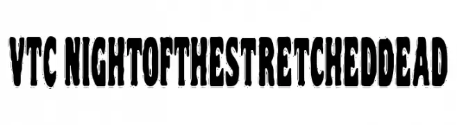
( Fonts by Vigilante Typeface Corporation Larry Yerkes. Personal-use only. For commercial use please contact owner. )
A decorative, distressed font with elongated, eerie letterforms.
![VTC NightOfTheStretchedDead font caratteri gratis]() Scaricare 81 Downloads@WebFont
Scaricare 81 Downloads@WebFont -
( Kerin Edgardo Recinos Lopez )
A smooth, flowing script font with an elegant, dynamic appearance.
![RecinosScript Italic Regular font caratteri gratis]() Scaricare 81 Downloads@WebFont
Scaricare 81 Downloads@WebFont -
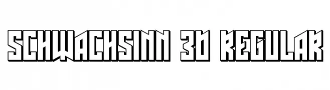
( Vladimir Nikolic - www.coroflot.com/vladimirnikolic )
Bold, 3D geometric font with a futuristic and industrial style.
![Schwachsinn 3D Regular font caratteri gratis]() Scaricare 81 Downloads@WebFont
Scaricare 81 Downloads@WebFont -
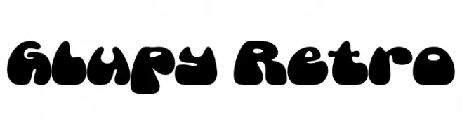
( Fonts by HansCo )
A bold, retro-inspired font with rounded, bubble-like characters.
![Glupy Retro font caratteri gratis]() Scaricare 81 Downloads@WebFont
Scaricare 81 Downloads@WebFont -
( Fonts by Levi Szekeres - Personal-use only. For commercial use please contact owner. )
A bold, hand-drawn marker-style font with a casual and expressive look.
![Marker font caratteri gratis]() Scaricare 81 Downloads@WebFont
Scaricare 81 Downloads@WebFont -
( Noto is a trademark of Google Inc. Noto fonts are open source. All Noto fonts are published under the SIL Open Font License, Version 1.1 )
A bold, modern font with a strong, assertive presence.
![Noto Sans Tamil SemiCondensed Black font caratteri gratis]() Scaricare 81 Downloads@WebFont
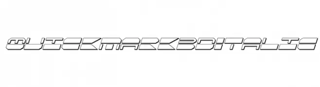
Scaricare 81 Downloads@WebFont -
![QuickMark 3D Italic font caratteri gratis]() Scaricare 81 Downloads@WebFont
Scaricare 81 Downloads@WebFont -
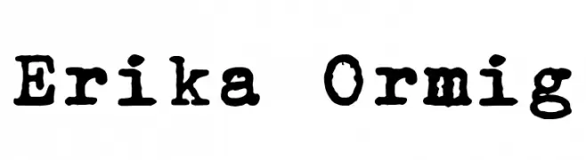
( Fonts by Peter Wiegel - www.peter-wiegel.de - Personal-use only. For commercial use please contact owner. )
A vintage typewriter-style font with a distressed, hand-crafted look.
![Erika Ormig font caratteri gratis]() Scaricare 81 Downloads@WebFont
Scaricare 81 Downloads@WebFont -
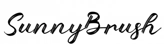
( Fonts by AEN Creative Studio - Agung Eko Nugroho - Personal-use only. For commercial use please contact owner. )
A lively brush script font with bold, dynamic strokes and a hand-painted feel.
![Sunny Brush font caratteri gratis]() Scaricare 81 Downloads@WebFont
Scaricare 81 Downloads@WebFont -
( Fonts by Wino S Kadir - weknow - www.revolge.com/shop/weknow/ - Personal-use only. For commercial use please contact owner. )
A decorative, futuristic font with smooth, continuous curves and abstract shapes.
![graphicdream font caratteri gratis]() Scaricare 81 Downloads@WebFont
Scaricare 81 Downloads@WebFont -
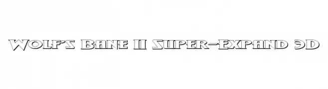
( Donationware - www.iconian.com )
A bold, 3D font with geometric shapes and a shadow effect for a dynamic appearance.
![Wolf's Bane II Super-Expand 3D font caratteri gratis]() Scaricare 81 Downloads@WebFont
Scaricare 81 Downloads@WebFont -
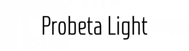
( Fonts by deFharo - Fernando Haro - Personal-use only. For commercial use please contact owner. )
A modern, geometric sans-serif font with a sleek and minimalistic design.
![Probeta Light font caratteri gratis]() Scaricare 81 Downloads@WebFont
Scaricare 81 Downloads@WebFont -
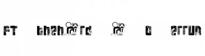
( Fonts by Fenotype - Personal-use only. For commercial use please contact owner. )
A bold, distressed font with a textured, industrial style.
![FT 3 the hard way Overrun font caratteri gratis]() Scaricare 81 Downloads@WebFont
Scaricare 81 Downloads@WebFont -
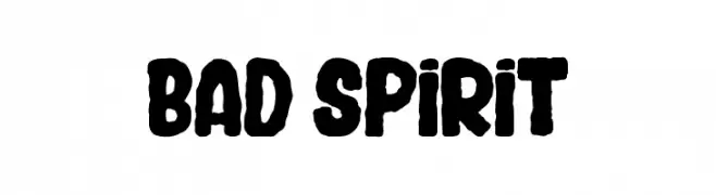
( Fonts by Greg Medina - www.dcoxy.com - Personal-use only. For commercial use please contact owner. )
A bold, rugged font with a hand-drawn, distressed appearance.
![BAD SPIRIT font caratteri gratis]() Scaricare 81 Downloads@WebFont
Scaricare 81 Downloads@WebFont -
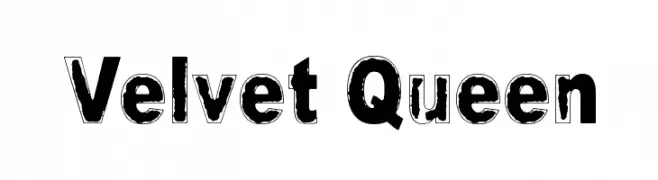
( Fonts by www.junkohanhero.com - Personal-use only. For commercial use please contact owner. )
A bold, distressed font with a vintage, textured appearance.
![Velvet Queen font caratteri gratis]() Scaricare 81 Downloads@WebFont
Scaricare 81 Downloads@WebFont -
( Iconian Fonts - Daniel Zadorozny - www.iconian.com )
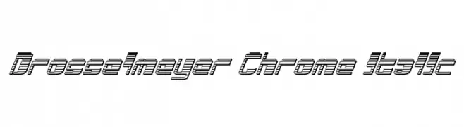
A futuristic, italic font with a three-dimensional line effect.
![Drosselmeyer Chrome Italic font caratteri gratis]() Scaricare 81 Downloads@WebFont
Scaricare 81 Downloads@WebFont -
( London's Letters - www.londonsletters.com/ )
A whimsical font with bold letters and playful squirrel illustrations.
![LMS Nuts About Squirrels font caratteri gratis]() Scaricare 81 Downloads@WebFont
Scaricare 81 Downloads@WebFont -
( Fonts by Edric Studio - Personal-use only. For commercial use please contact owner. )
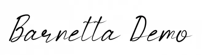
A graceful, cursive script font with elegant, flowing lines.
![Barnetta Demo font caratteri gratis]() Scaricare 81 Downloads@WebFont
Scaricare 81 Downloads@WebFont -
( Fonts by Gartype Studio - Gartype Studio - Personal-use only. For commercial use please contact owner. )
A bold, geometric font with a modern and assertive style.
![Meltland Demo font caratteri gratis]() Scaricare 81 Downloads@WebFont
Scaricare 81 Downloads@WebFont -
( DrJohnDee - www.fontspace.com/profile/drjohndee )
A bold, geometric stencil-style font with unique cutouts.
![CheGuevara Barry Blue font caratteri gratis]() Scaricare 81 Downloads@WebFont
Scaricare 81 Downloads@WebFont -
( Fonts by Almaz Studio )
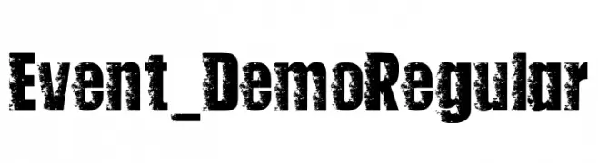
A bold, distressed font with a rugged, textured appearance.
![Event_Demo Regular font caratteri gratis]() Scaricare 81 Downloads@WebFont
Scaricare 81 Downloads@WebFont -
( Fonts by Vladimir Nikolic - www.creativefabrica.com/designer/vladimirnikolic/ - Personal-use only. For commercial use please contact owner. )
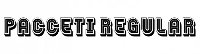
A bold, three-dimensional font with a modern, geometric style.
![Pacceti Regular font caratteri gratis]() Scaricare 81 Downloads@WebFont
Scaricare 81 Downloads@WebFont -
( Fonts by www.junkohanhero.com - Personal-use only. For commercial use please contact owner. )
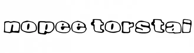
A playful, bold font with a bubble-like outline and cartoonish style.
![Nopee Torstai font caratteri gratis]() Scaricare 81 Downloads@WebFont
Scaricare 81 Downloads@WebFont -
( watesawal.blogspot.com )
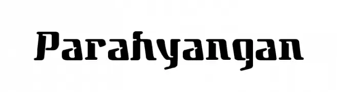
A bold, angular font with a modern, industrial aesthetic.
![Parahyangan font caratteri gratis]() Scaricare 81 Downloads@WebFont
Scaricare 81 Downloads@WebFont -
( Anchor Fonts - Eric Mueller - www.anchorfonts.com )
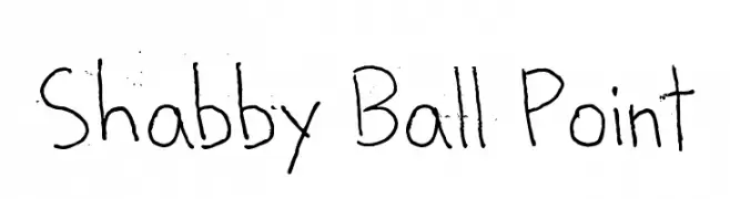
A casual, handwritten-style font with a personal touch.
![Shabby Ball Point font caratteri gratis]() Scaricare 81 Downloads@WebFont
Scaricare 81 Downloads@WebFont -
( Omegaville - B.J. Winzer )
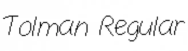
A modern, handwritten-style font with consistent strokes and a slight slant.
![Tolman Regular font caratteri gratis]() Scaricare 81 Downloads@WebFont
Scaricare 81 Downloads@WebFont -
( Fonts by Aisyah - Nur Aisyah Amalia - Personal-use only. For commercial use please contact owner. )
A playful, handwritten font with a casual and friendly style.
![Sleepy Cat Regular font caratteri gratis]() Scaricare 81 Downloads@WebFont
Scaricare 81 Downloads@WebFont -
( Fonts by a Neale Davidson - www.pixelsagas.com. Personal-use only. For commercial use please contact owner. )
A bold, italicized, and decorative font with sharp, angular strokes and a dynamic appearance.
![Iokharic Bold Italic font caratteri gratis]() Scaricare 81 Downloads@WebFont
Scaricare 81 Downloads@WebFont -
( Fonts by Four Lines - zain Fahroni - Personal-use only. For commercial use please contact owner. )
A playful, handwritten font with a casual and friendly style.
![Sugar Booger font caratteri gratis]() Scaricare 81 Downloads@WebFont
Scaricare 81 Downloads@WebFont -
( Iconian Fonts - Daniel Zadorozny - www.iconian.com )
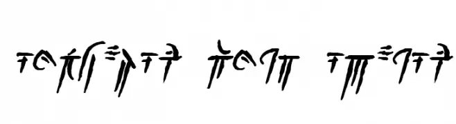
A bold, italicized font with a 3D effect and sharp serifs.
![Achilles 3D Italic font caratteri gratis]() Scaricare 81 Downloads@WebFont
Scaricare 81 Downloads@WebFont -
( imagex - www.imagex-fonts.com )
A playful, decorative font with letters featuring unique facial elements.
![Facelook font caratteri gratis]() Scaricare 81 Downloads@WebFont
Scaricare 81 Downloads@WebFont -
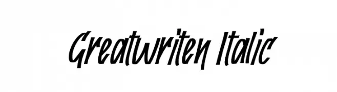
( Fonts by Kong Font - https://fontkong.com/ - Personal-use only. For commercial use please contact owner. )
A bold, italic font with dynamic, sharp angles and high contrast.
![Greatwriten Italic font caratteri gratis]() Scaricare 81 Downloads@WebFont
Scaricare 81 Downloads@WebFont


Quali sono i font più popolari adesso?
Poppins, Roboto, Montserrat, Open Sans e Lato sono molto usati per le forme pulite e l'ampia applicabilità — dall'identità di marca alle landing page e ai poster.
Quali font si usano spesso nei loghi?
Le sans serif geometriche (es. Poppins, famiglie in stile Gotham) sono scelte comuni per un branding pulito e scalabile. Per un tocco personale restano valide script e stili manoscritti. Abbina un display deciso per i titoli a un corpo testo neutro per riconoscibilità ed equilibrio.
Ogni quanto si aggiorna la lista?
Con regolarità, in base ai download e all'attività reale. Torna spesso per scoprire in anticipo le nuove preferite.
💡 Consiglio: aggiungi ai preferiti — le tendenze cambiano in fretta e i font top di oggi possono ispirare il rebranding di domani.