Benvenuto nelle Font Più Popolari — dove popolarità e qualità si incontrano. Qui trovi i font più scaricati e usati dell'anno. Se cerchi scelte sicure per logo, web o social, inizia da qui.
Ogni font top si distingue per equilibrio, leggibilità e versatilità. Troverai sans serif moderne, script eleganti, serif vintage e display minimalisti.
-
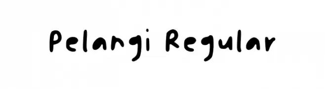
( Fonts by Pelangi Sekar - Personal-use only. For commercial use please contact owner. )
A playful, handwritten font with bold, rounded strokes and a casual, friendly appearance.
 Scaricare 78 Downloads@WebFont
 -
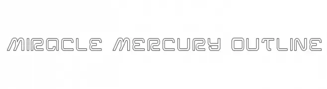
( Iconian Fonts - Daniel Zadorozny - www.iconian.com )
A modern, geometric outline font with clean lines and a futuristic style.
![Miracle Mercury Outline font caratteri gratis]() Scaricare 78 Downloads@WebFont
Scaricare 78 Downloads@WebFont -
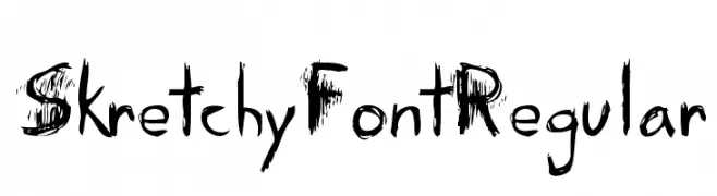
( Kevin Guthrie - www.kevinguthrie.ca )
A textured, hand-drawn style font with a rough, edgy appearance.
![Skretchy FontRegular font caratteri gratis]() Scaricare 78 Downloads@WebFont
Scaricare 78 Downloads@WebFont -
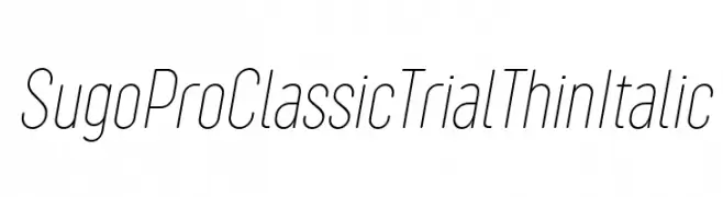
( Zetafonts - www.zetafonts.com )
A sleek, thin, and italicized font with a modern and elegant style.
![Sugo Pro Classic Trial Thin Italic font caratteri gratis]() Scaricare 78 Downloads@WebFont
Scaricare 78 Downloads@WebFont -
( Fonts by I Putu Gede Krisna )
A playful and elegant handwritten font with flowing, interconnected letterforms.
![Christine Stylish font caratteri gratis]() Scaricare 78 Downloads@WebFont
Scaricare 78 Downloads@WebFont -
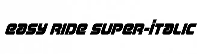
( Fonts by Iconian Fonts - Daniel Zadorozny - Personal-use only. For commercial use please contact owner. )
A bold, italic font with a dynamic and geometric style.
![Easy Ride Super-Italic font caratteri gratis]() Scaricare 78 Downloads@WebFont
Scaricare 78 Downloads@WebFont -
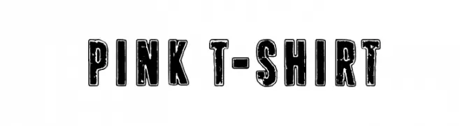
( Fonts by www.junkohanhero.com - Personal-use only. For commercial use please contact owner. )
A bold, distressed font with a vintage, grunge aesthetic.
![Pink T-shirt font caratteri gratis]() Scaricare 78 Downloads@WebFont
Scaricare 78 Downloads@WebFont -
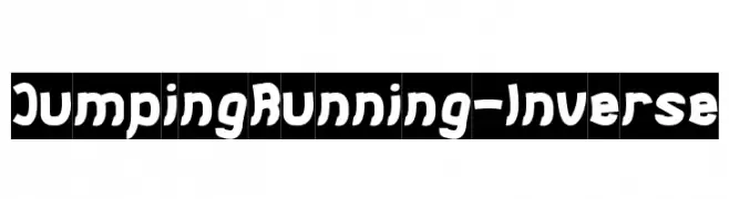
( weknow - Wino S Kadir - www.creativefabrica.com/designer/weknow/ )
A bold, playful font with dynamic, animated character shapes.
![Jumping Running-Inverse font caratteri gratis]() Scaricare 78 Downloads@WebFont
Scaricare 78 Downloads@WebFont -
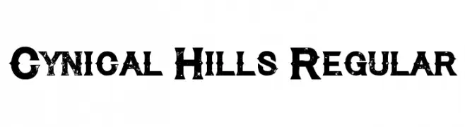
( Font Monger - www.fontmonger.com )
A bold, distressed font with a vintage grunge aesthetic.
![Cynical Hills Regular font caratteri gratis]() Scaricare 78 Downloads@WebFont
Scaricare 78 Downloads@WebFont -
( Hrothiland Bairhteins - airushimmadaga.wordpress.com )
A bold, angular font with a medieval-inspired, decorative style.
![Stibna font caratteri gratis]() Scaricare 78 Downloads@WebFont
Scaricare 78 Downloads@WebFont -
( Fonts by Wino S Kadir - weknow - www.revolge.com/shop/weknow/ - Personal-use only. For commercial use please contact owner. )
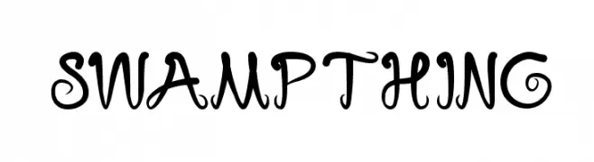
A whimsical and decorative font with playful curves and swirls.
![swampthing font caratteri gratis]() Scaricare 78 Downloads@WebFont
Scaricare 78 Downloads@WebFont -
( Fonts by Iconian Fonts )
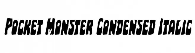
A bold, condensed, and italicized font with a playful, energetic style.
![Pocket Monster Condensed Italic font caratteri gratis]() Scaricare 78 Downloads@WebFont
Scaricare 78 Downloads@WebFont -
( Fonts by www.woodcutter.es - woodcutter Manero - Personal-use only. For commercial use please contact owner. )
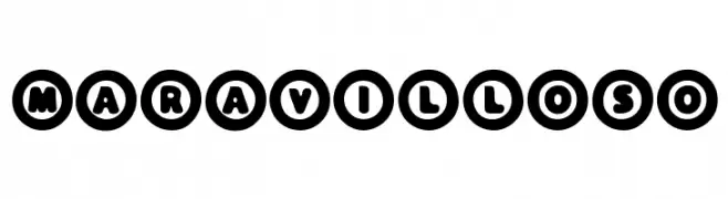
A bold, rounded font with characters enclosed in thick circular outlines.
![Maravilloso font caratteri gratis]() Scaricare 78 Downloads@WebFont
Scaricare 78 Downloads@WebFont -
( Fonts by Letterena Studios - letterena.com - Personal-use only. For commercial use please contact owner. )
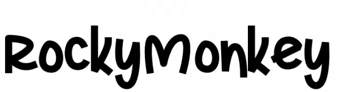
A playful, bold, and hand-drawn style font with a whimsical appearance.
![Rocky Monkey font caratteri gratis]() Scaricare 78 Downloads@WebFont
Scaricare 78 Downloads@WebFont -
( Fonts by Bhadal Studio - Nasruddin Bhadal - Personal-use only. For commercial use please contact owner. )
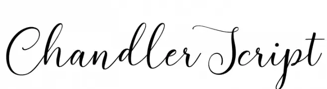
An elegant script font with flowing, cursive letterforms and delicate swashes.
![ChandlerScript font caratteri gratis]() Scaricare 78 Downloads@WebFont
Scaricare 78 Downloads@WebFont -
( Fonts by Mans Greback - Personal-use only. For commercial use please contact owner. )
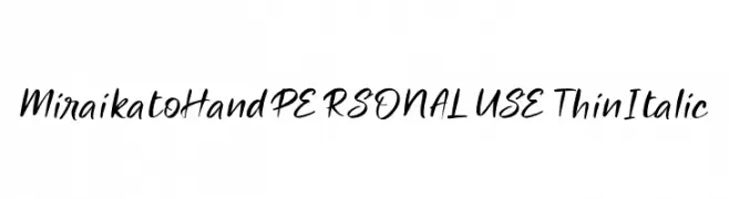
A thin, italicized handwritten font with a dynamic and elegant style.
![Miraikato Hand PERSONAL USE Thin Italic font caratteri gratis]() Scaricare 78 Downloads@WebFont
Scaricare 78 Downloads@WebFont -
( Fonts by Iconian Fonts )
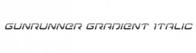
A futuristic, italicized font with gradient stripes and a dynamic appearance.
![Gunrunner Gradient Italic font caratteri gratis]() Scaricare 78 Downloads@WebFont
Scaricare 78 Downloads@WebFont -
![katype loremaster font caratteri gratis]() Scaricare 78 Downloads@WebFont
Scaricare 78 Downloads@WebFont -
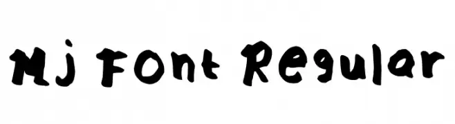
( Fonts by JM Dulay )
A bold, playful handwritten font with an artistic, irregular style.
![Mj Font Regular font caratteri gratis]() Scaricare 78 Downloads@WebFont
Scaricare 78 Downloads@WebFont -
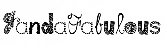
( kimberlygeswein.com )
A playful, decorative font with unique patterns and whimsical embellishments.
![Janda Fabulous font caratteri gratis]() Scaricare 78 Downloads@WebFont
Scaricare 78 Downloads@WebFont -
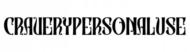
( Fonts by Din Studio - Donis Miftahudin - Personal-use only. For commercial use please contact owner. )
A bold, decorative font with high contrast and ornate serifs.
![Cravery Personal Use font caratteri gratis]() Scaricare 78 Downloads@WebFont
Scaricare 78 Downloads@WebFont -
( Markus Schröppel - www.mschroeppel.de/ )
A pixelated, retro-style font with a blocky, 8-bit appearance.
![LLMystic font caratteri gratis]() Scaricare 78 Downloads@WebFont
Scaricare 78 Downloads@WebFont -
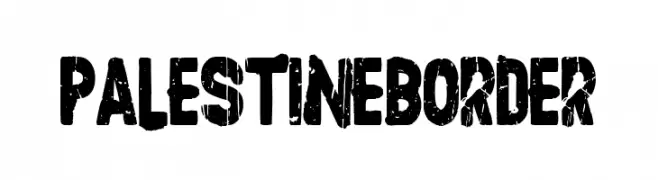
( Fonts by Woodcutter )
A bold, distressed font with a gritty, urban aesthetic.
![Palestine Border font caratteri gratis]() Scaricare 78 Downloads@WebFont
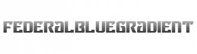
Scaricare 78 Downloads@WebFont -
![Federal Blue Gradient font caratteri gratis]() Scaricare 78 Downloads@WebFont
Scaricare 78 Downloads@WebFont -
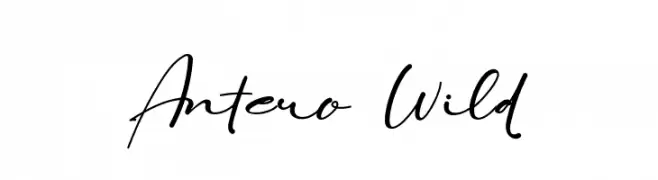
( Fonts by ToniStudio )
Elegant handwritten script font.
![Antero Wild font caratteri gratis]() Scaricare 78 Downloads@WebFont
Scaricare 78 Downloads@WebFont -
( Noto is a trademark of Google Inc. Noto fonts are open source. All Noto fonts are published under the SIL Open Font License, Version 1.1 )
Not a valid font sample for analysis.
![Noto Sans Myanmar SemiCondensed Light font caratteri gratis]() Scaricare 78 Downloads@WebFont
Scaricare 78 Downloads@WebFont -
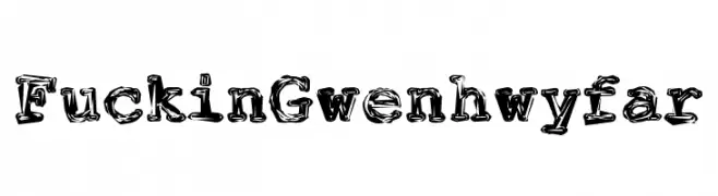
( Fonts by Peter Wiegel - www.peter-wiegel.de - Personal-use only. For commercial use please contact owner. )
A bold, hand-drawn font with a playful and textured appearance.
![FuckinGwenhwyfar font caratteri gratis]() Scaricare 78 Downloads@WebFont
Scaricare 78 Downloads@WebFont -
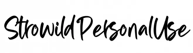
( Fonts by Ditatype - Personal-use only. For commercial use please contact owner. )
A bold, expressive handwritten font with dynamic strokes and playful curves.
![Strowild Personal Use font caratteri gratis]() Scaricare 78 Downloads@WebFont
Scaricare 78 Downloads@WebFont -
( SA - mypegablog.blogspot.ca )
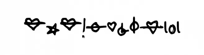
A playful, hand-drawn collection of bold and whimsical symbols.
![SASymbols101 font caratteri gratis]() Scaricare 78 Downloads@WebFont
Scaricare 78 Downloads@WebFont -
( Fonts by Daniel Zadorozny - www.iconian.com - Personal-use only. For commercial use please contact owner. )
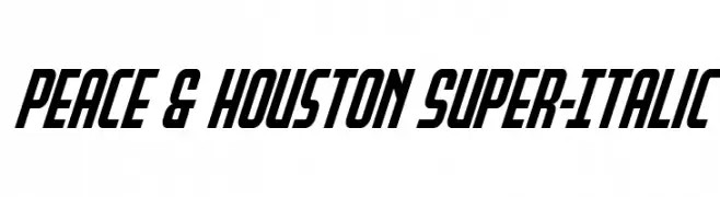
A bold, italicized font with a dynamic and impactful style.
![Peace & Houston Super-Italic font caratteri gratis]() Scaricare 78 Downloads@WebFont
Scaricare 78 Downloads@WebFont -
( Fonts by Greg Medina - www.dcoxy.com - Personal-use only. For commercial use please contact owner. )
A whimsical and decorative font featuring unique cartoonish characters.
![aliendco2 font caratteri gratis]() Scaricare 78 Downloads@WebFont
Scaricare 78 Downloads@WebFont -
( Fonts by Bolt Cutter - www.boltcutterdesign.com - Personal-use only. For commercial use please contact owner. )
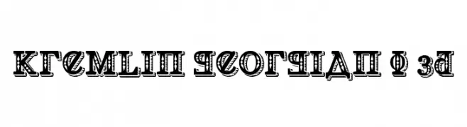
A bold, decorative font with intricate patterns and a three-dimensional effect.
![Kremlin Georgian I 3D font caratteri gratis]() Scaricare 78 Downloads@WebFont
Scaricare 78 Downloads@WebFont -
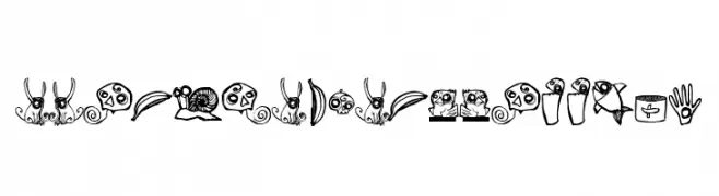
( SAMUTOJJ - www.samutojj.com )
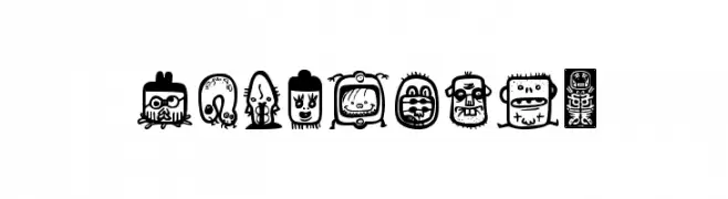
A whimsical, decorative font with nature-inspired illustrations and a playful, hand-drawn style.
![ABOMINAL SAMUTOJJ aim font caratteri gratis]() Scaricare 78 Downloads@WebFont
Scaricare 78 Downloads@WebFont -
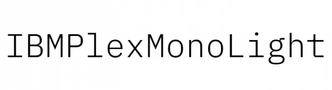
( Fonts by IBM )
A clean, modern monospaced font with equal-width characters and low contrast.
![IBM Plex Mono Light font caratteri gratis]() Scaricare 78 Downloads@WebFont
Scaricare 78 Downloads@WebFont -
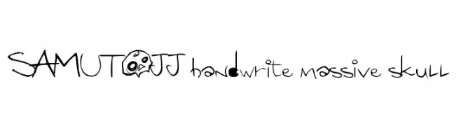
( SAMUTOJJ - www.samutojj.com )
A playful, edgy font with hand-drawn strokes and whimsical skull motifs.
![SAMUTOJJ handwrite massive skull font caratteri gratis]() Scaricare 78 Downloads@WebFont
Scaricare 78 Downloads@WebFont


Quali sono i font più popolari adesso?
Poppins, Roboto, Montserrat, Open Sans e Lato sono molto usati per le forme pulite e l'ampia applicabilità — dall'identità di marca alle landing page e ai poster.
Quali font si usano spesso nei loghi?
Le sans serif geometriche (es. Poppins, famiglie in stile Gotham) sono scelte comuni per un branding pulito e scalabile. Per un tocco personale restano valide script e stili manoscritti. Abbina un display deciso per i titoli a un corpo testo neutro per riconoscibilità ed equilibrio.
Ogni quanto si aggiorna la lista?
Con regolarità, in base ai download e all'attività reale. Torna spesso per scoprire in anticipo le nuove preferite.
💡 Consiglio: aggiungi ai preferiti — le tendenze cambiano in fretta e i font top di oggi possono ispirare il rebranding di domani.