Benvenuto nelle Font Più Popolari — dove popolarità e qualità si incontrano. Qui trovi i font più scaricati e usati dell'anno. Se cerchi scelte sicure per logo, web o social, inizia da qui.
Ogni font top si distingue per equilibrio, leggibilità e versatilità. Troverai sans serif moderne, script eleganti, serif vintage e display minimalisti.
-
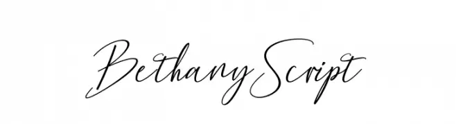
( mightype - creativemarket.com/mightype )
An elegant, flowing script font with a natural handwritten style.
 Scaricare 483 Downloads@WebFont
 -
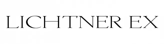
![Lichtner Ex font caratteri gratis]() Scaricare 483 Downloads@WebFont
Scaricare 483 Downloads@WebFont -
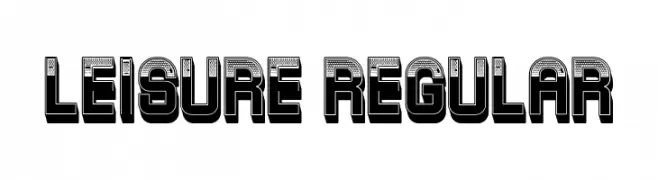
( Fonts by Vladimir Nikolic )
A bold, retro 3D font with a dotted texture and shadow effect.
![Leisure Regular font caratteri gratis]() Scaricare 483 Downloads@WebFont
Scaricare 483 Downloads@WebFont -
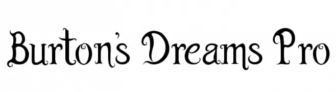
( Xane )
A whimsical and decorative serif font with playful curls and flourishes.
![Burton's Dreams Pro font caratteri gratis]() Scaricare 483 Downloads@WebFont
Scaricare 483 Downloads@WebFont -
( Fonts by Andreas Hofeld - www.fontgrube.de )
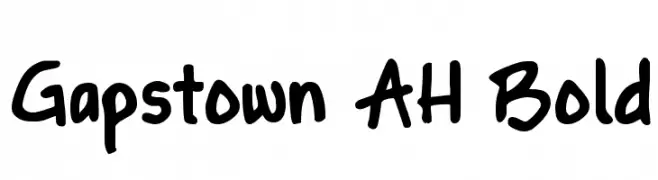
A bold, playful handwritten font with thick strokes and rounded edges.
![Gapstown AH Bold font caratteri gratis]() Scaricare 483 Downloads@WebFont
Scaricare 483 Downloads@WebFont -
-
( THESE ARE SHAREWARE FONTS ! NOT FREEWARE ! PLEASE VISIT www.fuelfonts.com )
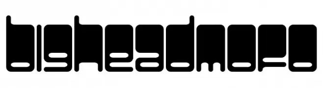
A bold, geometric font with a modern, playful, and artistic style.
![BigHeadMofo font caratteri gratis]() Scaricare 483 Downloads@WebFont
Scaricare 483 Downloads@WebFont -
( Fonts by Graham Meade - GemFonts )
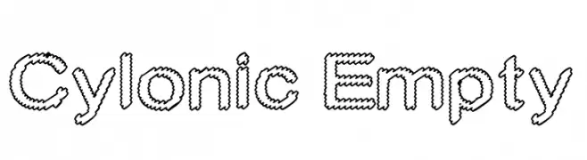
A decorative font with a hollow, zigzag outline for a bold, artistic look.
![Cylonic Empty font caratteri gratis]() Scaricare 483 Downloads@WebFont
Scaricare 483 Downloads@WebFont -
( Fonts by Darrell Flood )
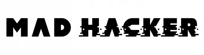
A bold, geometric font with a modern, edgy aesthetic and a unique glitch effect.
![MAD hacker font caratteri gratis]() Scaricare 483 Downloads@WebFont
Scaricare 483 Downloads@WebFont -
( Fonts by Din Studio - Donis Miftahudin - Personal-use only. For commercial use please contact owner. )
A bold, modern font with a condensed and impactful design.
![Moonlite Solid Personal Use font caratteri gratis]() Scaricare 483 Downloads@WebFont
Scaricare 483 Downloads@WebFont -
( Fonts by K_IN Studio )
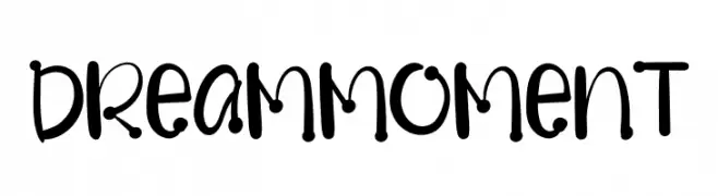
A playful, bubbly font with rounded characters and whimsical embellishments.
![Dream Moment font caratteri gratis]() Scaricare 483 Downloads@WebFont
Scaricare 483 Downloads@WebFont

Quali sono i font più popolari adesso?
Poppins, Roboto, Montserrat, Open Sans e Lato sono molto usati per le forme pulite e l'ampia applicabilità — dall'identità di marca alle landing page e ai poster.
Quali font si usano spesso nei loghi?
Le sans serif geometriche (es. Poppins, famiglie in stile Gotham) sono scelte comuni per un branding pulito e scalabile. Per un tocco personale restano valide script e stili manoscritti. Abbina un display deciso per i titoli a un corpo testo neutro per riconoscibilità ed equilibrio.
Ogni quanto si aggiorna la lista?
Con regolarità, in base ai download e all'attività reale. Torna spesso per scoprire in anticipo le nuove preferite.
💡 Consiglio: aggiungi ai preferiti — le tendenze cambiano in fretta e i font top di oggi possono ispirare il rebranding di domani.