Benvenuto nelle Font Più Popolari — dove popolarità e qualità si incontrano. Qui trovi i font più scaricati e usati dell'anno. Se cerchi scelte sicure per logo, web o social, inizia da qui.
Ogni font top si distingue per equilibrio, leggibilità e versatilità. Troverai sans serif moderne, script eleganti, serif vintage e display minimalisti.
-
( Fonts by Zetafonts - Personal-use only. For commercial use please contact owner. )
A modern, wide sans-serif font with clean lines and balanced spacing.
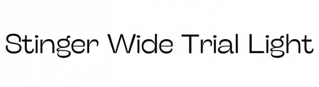 Scaricare 77 Downloads@WebFont
 -
( 7NTypes - Situjuh Nazara - 7ntypes.com )
A fluid and elegant script font with smooth, flowing lines.
![Goday font caratteri gratis]() Scaricare 77 Downloads@WebFont
Scaricare 77 Downloads@WebFont -
( Fonts by falahfont248 )
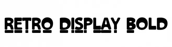
A bold, retro display font with rounded characters and a unique underline effect.
![RETRO DISPLAY Bold font caratteri gratis]() Scaricare 77 Downloads@WebFont
Scaricare 77 Downloads@WebFont -
( Fonts by Daniel Zadorozny - www.iconian.com )
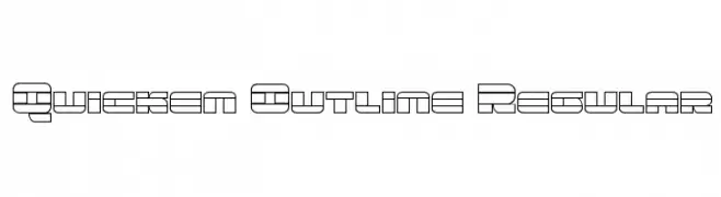
A futuristic, geometric outline font with a modern, tech-inspired design.
![Quicken Outline Regular font caratteri gratis]() Scaricare 77 Downloads@WebFont
Scaricare 77 Downloads@WebFont -
( Fonts by Arterfak Project - Ahmad Ramzi Fahruddin - Personal-use only. For commercial use please contact owner. )
A cursive-inspired font with elegant, flowing strokes and calligraphic flair.
![KhodijahFree font caratteri gratis]() Scaricare 77 Downloads@WebFont
Scaricare 77 Downloads@WebFont -
( Fonts by Gilar Studio - Personal-use only. For commercial use please contact owner. )
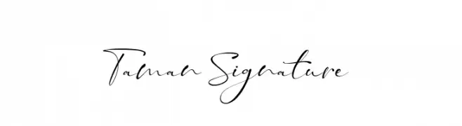
An elegant, flowing script font with a sophisticated, handwritten style.
![Taman Signature font caratteri gratis]() Scaricare 77 Downloads@WebFont
Scaricare 77 Downloads@WebFont -
( Michelle Robb )
A modern, minimalist font with slender, elongated characters and generous spacing.
![Diligent font caratteri gratis]() Scaricare 77 Downloads@WebFont
Scaricare 77 Downloads@WebFont -
( Fonts by StringLabs - stringlabscreative.com - Personal-use only. For commercial use please contact owner. )
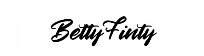
A bold, expressive script font with a handwritten, cursive style.
![Betty Finty font caratteri gratis]() Scaricare 77 Downloads@WebFont
Scaricare 77 Downloads@WebFont -
( Fonts by Vladimir Nikolic )
A playful font with characters as expressive cartoon faces.
![Negative Heads Regular font caratteri gratis]() Scaricare 77 Downloads@WebFont
Scaricare 77 Downloads@WebFont -
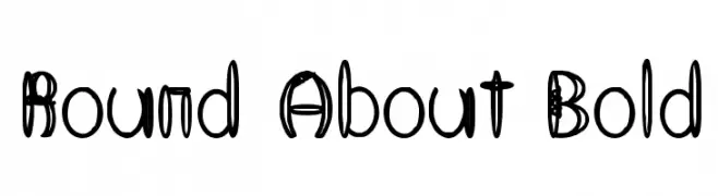
( Fonts by Art Designs by Sue - Personal-use only. For commercial use please contact owner. )
A bold, playful font with rounded characters and unique cut-out details.
![Round About Bold font caratteri gratis]() Scaricare 77 Downloads@WebFont
Scaricare 77 Downloads@WebFont -
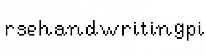
( RynnieJinYeon )
A pixelated, monospaced font with a retro digital aesthetic.
![RSEHandwritingPi font caratteri gratis]() Scaricare 77 Downloads@WebFont
Scaricare 77 Downloads@WebFont -
( weknow - Wino S Kadir - www.creativefabrica.com/designer/weknow/ )
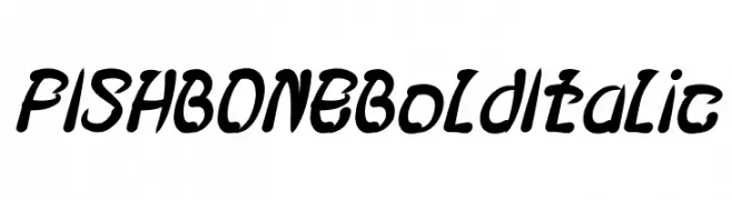
A bold, italicized font with a playful, decorative style and consistent thick strokes.
![FISH BONE Bold Italic font caratteri gratis]() Scaricare 77 Downloads@WebFont
Scaricare 77 Downloads@WebFont -
( Fonts by Misti Hammers - mistifonts.com - Personal-use only. For commercial use please contact owner. )
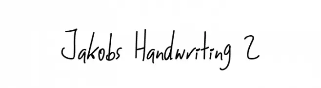
A casual, handwritten font with smooth, fluid strokes and a personal touch.
![Jakobs Handwriting 2 font caratteri gratis]() Scaricare 77 Downloads@WebFont
Scaricare 77 Downloads@WebFont -
( Fonts by Manuel Ramos - www.infinitismo.com - Personal-use only. For commercial use please contact owner. )
A sleek, modern italic font with elongated, uniform strokes and a dynamic appearance.
![Exacta Medium Italic font caratteri gratis]() Scaricare 77 Downloads@WebFont
Scaricare 77 Downloads@WebFont -
( Fonts by Vladimir Nikolic - https://www.creativefabrica.com/product/educated-deers/ref/144265/ - Personal-use only. For commercial use please contact owner. )
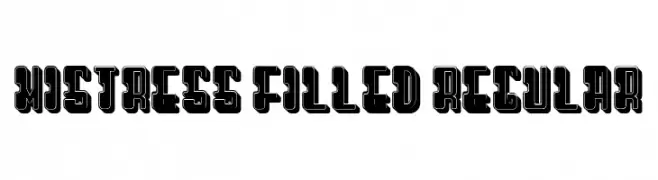
A bold, geometric font with a three-dimensional outline, ideal for display use.
![Mistress Filled Regular font caratteri gratis]() Scaricare 77 Downloads@WebFont
Scaricare 77 Downloads@WebFont -
( CrazeCo.com.au - Craze™ Co - CrazeCo.com.au )
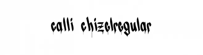
A bold, graffiti-inspired font with a dripping effect, perfect for urban-themed designs.
![CALLI CHIZELRegular font caratteri gratis]() Scaricare 77 Downloads@WebFont
Scaricare 77 Downloads@WebFont -
( Fonts by Haksen Studio )
Playful handwritten script font.
![Honey Sharon - Personal Use font caratteri gratis]() Scaricare 77 Downloads@WebFont
Scaricare 77 Downloads@WebFont -
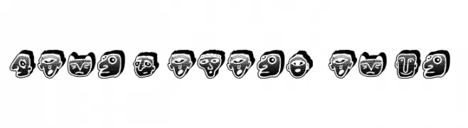
( Fonts by Vladimir Nikolic )
Decorative font featuring cybernetic-themed illustrated portraits for each character.
![Cyborg Regular font caratteri gratis]() Scaricare 77 Downloads@WebFont
Scaricare 77 Downloads@WebFont -
( Fonts by www.junkohanhero.com - Personal-use only. For commercial use please contact owner. )
A bold, distressed font with a grunge, stamped appearance.
![Lumihyeena font caratteri gratis]() Scaricare 77 Downloads@WebFont
Scaricare 77 Downloads@WebFont -
( Fonts by GemFonts - Typotheticals - Graham Meade - Personal-use only. For commercial use please contact owner. )
An elegant, decorative script font with intricate swirls and embellishments.
![A Yummy Apology font caratteri gratis]() Scaricare 77 Downloads@WebFont
Scaricare 77 Downloads@WebFont -
( Fonts by Vigilante Typeface Corporation Larry Yerkes. Personal-use only. For commercial use please contact owner. )
A bold, cartoonish font with wide, rounded characters ideal for playful designs.
![VTC-KomikaHeadLinerTwo Wide font caratteri gratis]() Scaricare 77 Downloads@WebFont
Scaricare 77 Downloads@WebFont -
( Fonts by Fanastudio - Personal-use only. For commercial use please contact owner. )
An elegant and flowing script font with graceful curves and loops.
![Viona font caratteri gratis]() Scaricare 77 Downloads@WebFont
Scaricare 77 Downloads@WebFont -
( Zetafonts - www.zetafonts.com )
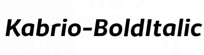
A bold, italicized font with a modern and dynamic style.
![Kabrio-BoldItalic font caratteri gratis]() Scaricare 77 Downloads@WebFont
Scaricare 77 Downloads@WebFont -
( Fonts by MJType )
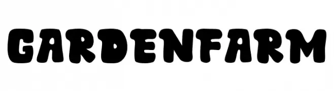
A bold, playful font with rounded edges and a whimsical, hand-drawn style.
![Garden Farm font caratteri gratis]() Scaricare 77 Downloads@WebFont
Scaricare 77 Downloads@WebFont -
( Fonts by Alifinart Studio - Personal-use only. For commercial use please contact owner. )
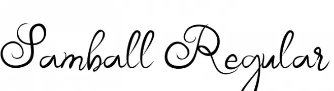
An elegant, flowing script font with intricate loops and flourishes.
![Samball Regular font caratteri gratis]() Scaricare 77 Downloads@WebFont
Scaricare 77 Downloads@WebFont -
( Fonts by Mans Greback - Personal-use only. For commercial use please contact owner. )
A bold, italicized font with high contrast and dynamic style.
![Blaak ExtraBold PERSONAL USE Italic font caratteri gratis]() Scaricare 77 Downloads@WebFont
Scaricare 77 Downloads@WebFont -
( Iconian Fonts - Daniel Zadorozny - www.iconian.com )
A sleek, futuristic, condensed italic font with a modern, tech-oriented design.
![Radio Space Condensed Italic font caratteri gratis]() Scaricare 77 Downloads@WebFont
Scaricare 77 Downloads@WebFont -
( Fonts by Mister Chek - Andrey Chernevich - Personal-use only. For commercial use please contact owner. )
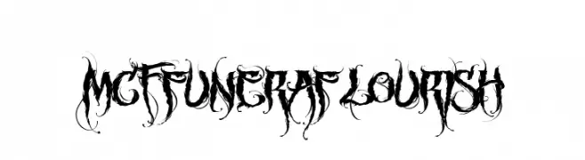
An ornate, gothic-style font with intricate flourishes and bold strokes.
![MCF funera flourish font caratteri gratis]() Scaricare 77 Downloads@WebFont
Scaricare 77 Downloads@WebFont -
( Noto is a trademark of Google Inc. Noto fonts are open source. All Noto fonts are published under the SIL Open Font License, Version 1.1 )
A clean, thin, and modern font ideal for digital interfaces.
![Noto Sans Bengali UI Thin font caratteri gratis]() Scaricare 77 Downloads@WebFont
Scaricare 77 Downloads@WebFont -
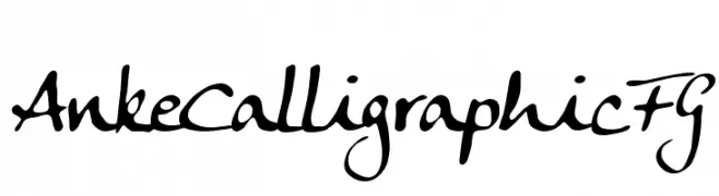
( Fonts by FontGrube AH - Andreas Höfeld - Personal-use only. For commercial use please contact owner. )
A dynamic calligraphic font with elegant, flowing strokes.
![Anke Calligraphic FG font caratteri gratis]() Scaricare 77 Downloads@WebFont
Scaricare 77 Downloads@WebFont -
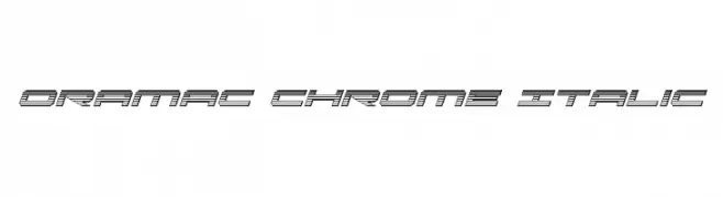
( Iconian Fonts - Daniel Zadorozny - www.iconian.com )
A futuristic, chrome-like italic font with dynamic parallel lines.
![Oramac Chrome Italic font caratteri gratis]() Scaricare 77 Downloads@WebFont
Scaricare 77 Downloads@WebFont -
![Manalatina font caratteri gratis]() Scaricare 77 Downloads@WebFont
Scaricare 77 Downloads@WebFont -
![Electricity Personal Use Regular font caratteri gratis]() Scaricare 77 Downloads@WebFont
Scaricare 77 Downloads@WebFont -
( Fonts by Digital Typeface Studio - Eva Barabasne Olasz - Personal-use only. For commercial use please contact owner. )
An elegant, flowing script font with a modern calligraphic style.
![Arthegos Demo font caratteri gratis]() Scaricare 77 Downloads@WebFont
Scaricare 77 Downloads@WebFont -
( Fonts by weknow - Wino S Kadir - Personal-use only. For commercial use please contact owner. )
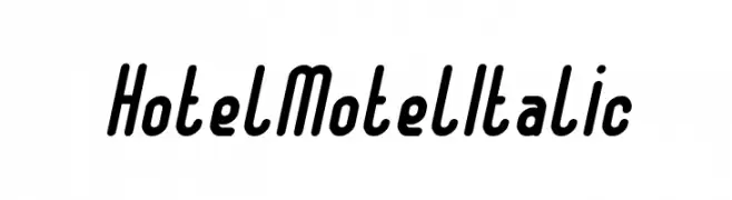
A bold, italic font with rounded, dynamic characters.
![Hotel Motel Italic font caratteri gratis]() Scaricare 77 Downloads@WebFont
Scaricare 77 Downloads@WebFont


Quali sono i font più popolari adesso?
Poppins, Roboto, Montserrat, Open Sans e Lato sono molto usati per le forme pulite e l'ampia applicabilità — dall'identità di marca alle landing page e ai poster.
Quali font si usano spesso nei loghi?
Le sans serif geometriche (es. Poppins, famiglie in stile Gotham) sono scelte comuni per un branding pulito e scalabile. Per un tocco personale restano valide script e stili manoscritti. Abbina un display deciso per i titoli a un corpo testo neutro per riconoscibilità ed equilibrio.
Ogni quanto si aggiorna la lista?
Con regolarità, in base ai download e all'attività reale. Torna spesso per scoprire in anticipo le nuove preferite.
💡 Consiglio: aggiungi ai preferiti — le tendenze cambiano in fretta e i font top di oggi possono ispirare il rebranding di domani.