Benvenuto nelle Font Più Popolari — dove popolarità e qualità si incontrano. Qui trovi i font più scaricati e usati dell'anno. Se cerchi scelte sicure per logo, web o social, inizia da qui.
Ogni font top si distingue per equilibrio, leggibilità e versatilità. Troverai sans serif moderne, script eleganti, serif vintage e display minimalisti.
-
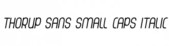
( Dan Thorup - www.danthorup.dk )
A modern, italic sans-serif font with a sleek and dynamic style.
 Scaricare 77 Downloads@WebFont
 -
( Fonts by Kong Font - fontkong.com - Personal-use only. For commercial use please contact owner. )
A bold, geometric font with a futuristic and edgy style.
![Taraka font caratteri gratis]() Scaricare 77 Downloads@WebFont
Scaricare 77 Downloads@WebFont -
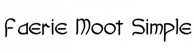
( Font Monkey - www.fontmonkey.com )
A whimsical, hand-drawn font with a playful and dynamic character.
![Faerie Moot Simple font caratteri gratis]() Scaricare 77 Downloads@WebFont
Scaricare 77 Downloads@WebFont -
( Fonts by Vladimir Nikolic - https://www.creativefabrica.com/product/educated-deers/ref/144265/ - Personal-use only. For commercial use please contact owner. )
A bold, condensed font with a shadow effect for a three-dimensional look.
![Hindenburg Condensed Shadow Regular font caratteri gratis]() Scaricare 77 Downloads@WebFont
Scaricare 77 Downloads@WebFont -
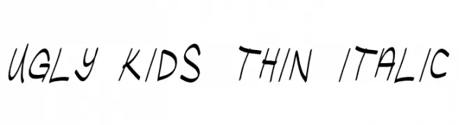
( Fonts by Chris Vile )
A playful, thin, italicized font with a hand-drawn, energetic style.
![Ugly Kids Thin Italic font caratteri gratis]() Scaricare 77 Downloads@WebFont
Scaricare 77 Downloads@WebFont -
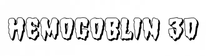
( Iconian Fonts - Daniel Zadorozny - www.iconian.com )
A bold, 3D font with a dripping, horror-themed style.
![Hemogoblin 3D font caratteri gratis]() Scaricare 77 Downloads@WebFont
Scaricare 77 Downloads@WebFont -
( Iconian Fonts - Daniel Zadorozny - www.iconian.com )
A bold, condensed, and italic font with a dynamic and playful style.
![Mister Twisted CondensedItalic font caratteri gratis]() Scaricare 77 Downloads@WebFont
Scaricare 77 Downloads@WebFont -
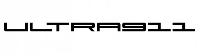
( Fonts by Iconian Fonts - Daniel Zadorozny - Personal-use only. For commercial use please contact owner. )
A futuristic, geometric font with sharp angles and clean lines.
![Ultra 911 font caratteri gratis]() Scaricare 77 Downloads@WebFont
Scaricare 77 Downloads@WebFont -
( imagex - www.imagex-fonts.com )
A bold slab serif font with strong, block-like serifs and uniform character design.
![Tacketil font caratteri gratis]() Scaricare 77 Downloads@WebFont
Scaricare 77 Downloads@WebFont -
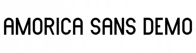
( Fonts by Edric Studio - Personal-use only. For commercial use please contact owner. )
A modern sans-serif font with a clean, balanced design and slightly condensed structure.
![AMORICA SANS DEMO font caratteri gratis]() Scaricare 77 Downloads@WebFont
Scaricare 77 Downloads@WebFont -
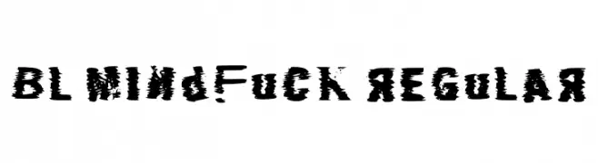
( Fonts by Blobify )
A distressed, chaotic font with irregular edges and varying thicknesses.
![Bl Mindfuck Regular font caratteri gratis]() Scaricare 77 Downloads@WebFont
Scaricare 77 Downloads@WebFont -
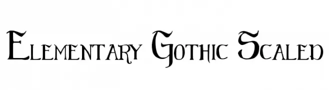
( Fonts by Bill Roach. Personal-use only. For commercial use please contact owner. )
A bold, gothic-style font with sharp, angular lines and medieval flourishes.
![Elementary Gothic Scaled font caratteri gratis]() Scaricare 77 Downloads@WebFont
Scaricare 77 Downloads@WebFont -
( Fonts by ARLILA FOUNDATION - Personal-use only. For commercial use please contact owner. )
An elegant script font with flowing, interconnected letters and ornate flourishes.
![EnglandScript font caratteri gratis]() Scaricare 77 Downloads@WebFont
Scaricare 77 Downloads@WebFont -
( Fonts by Greg Medina - www.dcoxy.com - Personal-use only. For commercial use please contact owner. )
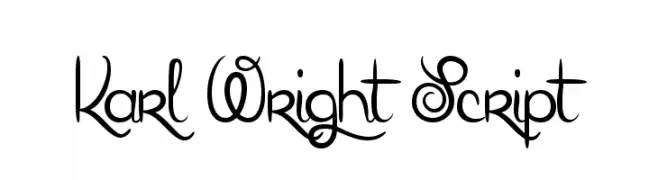
An elegant and decorative script font with flowing, interconnected letters.
![Karl Wright Script font caratteri gratis]() Scaricare 77 Downloads@WebFont
Scaricare 77 Downloads@WebFont -
( Fonts by Letterara - Thomas Aradea - Personal-use only. For commercial use please contact owner. )
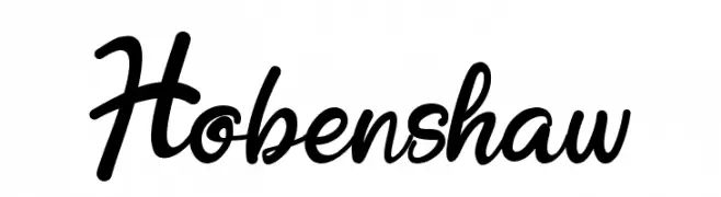
A dynamic and elegant script font with fluid, handwritten characteristics.
![Hobenshaw font caratteri gratis]() Scaricare 77 Downloads@WebFont
Scaricare 77 Downloads@WebFont -
( Fonts by Maulana Creative - Gilang Maulana - Personal-use only. For commercial use please contact owner. )
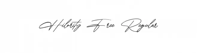
An elegant, flowing script font with a refined and sophisticated look.
![Hilority Free Regular font caratteri gratis]() Scaricare 77 Downloads@WebFont
Scaricare 77 Downloads@WebFont -
( Noto is a trademark of Google Inc. Noto fonts are open source. All Noto fonts are published under the SIL Open Font License, Version 1.1 )
A bold, modern font with strong, thick strokes and high contrast, perfect for impactful headlines.
![Noto Serif Hebrew Black font caratteri gratis]() Scaricare 77 Downloads@WebFont
Scaricare 77 Downloads@WebFont -
( Fonts by VÃt Condák - Personal-use only. For commercial use please contact owner. )
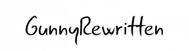
A playful, casual handwritten font with smooth, flowing lines.
![Gunny Rewritten font caratteri gratis]() Scaricare 77 Downloads@WebFont
Scaricare 77 Downloads@WebFont -
( Fonts by Woodcutter Manero - http://www.woodcutter.es - Personal-use only. For commercial use please contact owner. )
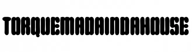
A bold, rounded font with a playful and approachable style.
![Torquemada in da house font caratteri gratis]() Scaricare 77 Downloads@WebFont
Scaricare 77 Downloads@WebFont -
( Fonts by Francis Studio - Francis John - Personal-use only. For commercial use please contact owner. )
A bold, brush-style cursive font with a lively and artistic flair.
![Beautiful Day font caratteri gratis]() Scaricare 77 Downloads@WebFont
Scaricare 77 Downloads@WebFont -
( Fonts by Kong Font - Personal-use only. For commercial use please contact owner. )
A cursive, handwritten font with elegant, flowing lines.
![MirrorPool font caratteri gratis]() Scaricare 77 Downloads@WebFont
Scaricare 77 Downloads@WebFont -
( Fonts by Jetsmax Studio - Khairil Anwar - Personal-use only. For commercial use please contact owner. )
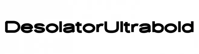
A bold, geometric sans-serif font with a modern and impactful style.
![Desolator Ultrabold font caratteri gratis]() Scaricare 77 Downloads@WebFont
Scaricare 77 Downloads@WebFont -
( Fonts by ejhaa - Afrizal Hidayat - Personal-use only. For commercial use please contact owner. )
A dynamic and expressive handwritten font with fluid strokes and varying thickness.
![Violete font caratteri gratis]() Scaricare 77 Downloads@WebFont
Scaricare 77 Downloads@WebFont -
( Fonts by Manuel Ramos - www.infinitismo.com - Personal-use only. For commercial use please contact owner. )
A whimsical and playful font with artistic curves and swirls.
![Evaow font caratteri gratis]() Scaricare 77 Downloads@WebFont
Scaricare 77 Downloads@WebFont -
( Fonts by Damarletter )
A romantic and elegant script font with flowing, cursive letters.
![Romantyc Paradise font caratteri gratis]() Scaricare 77 Downloads@WebFont
Scaricare 77 Downloads@WebFont -
![SloppyHollow font caratteri gratis]() Scaricare 77 Downloads@WebFont
Scaricare 77 Downloads@WebFont -
( Personal-use only. For commercial use please contact owner. )
A playful, handwritten font with irregular strokes and a casual style.
![Jose font caratteri gratis]() Scaricare 77 Downloads@WebFont
Scaricare 77 Downloads@WebFont -
( Fonts by Edric Studio - Personal-use only. For commercial use please contact owner. )
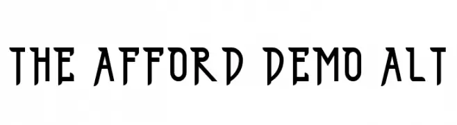
A bold, geometric font with sharp angles and a modern aesthetic.
![THE AFFORD DEMO ALT font caratteri gratis]() Scaricare 77 Downloads@WebFont
Scaricare 77 Downloads@WebFont -
( Fonts by Wino S Kadir - weknow - www.revolge.com/shop/weknow/ - Personal-use only. For commercial use please contact owner. )
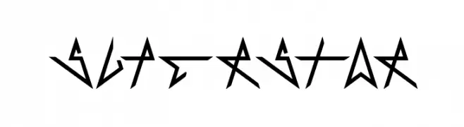
A bold, angular font with a futuristic and edgy design.
![Superstar font caratteri gratis]() Scaricare 77 Downloads@WebFont
Scaricare 77 Downloads@WebFont -
( María José Orellana García )
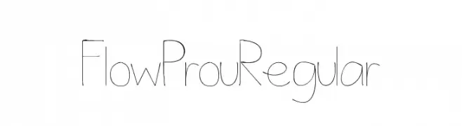
A thin, modern font with elongated strokes and a geometric style.
![FlowProuRegular font caratteri gratis]() Scaricare 77 Downloads@WebFont
Scaricare 77 Downloads@WebFont -
( Pixel Sagas - www.pixelsagas.com )
An angular, italicized font with a runic, ancient script style.
![Dethek Italic font caratteri gratis]() Scaricare 77 Downloads@WebFont
Scaricare 77 Downloads@WebFont -
( Fonts by Excellent Ritma Florendia )
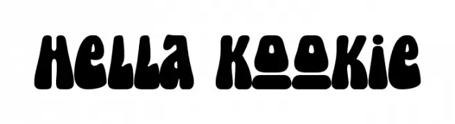
A bold, playful typeface with rounded, bubbly characters.
![Hella Kookie font caratteri gratis]() Scaricare 77 Downloads@WebFont
Scaricare 77 Downloads@WebFont -
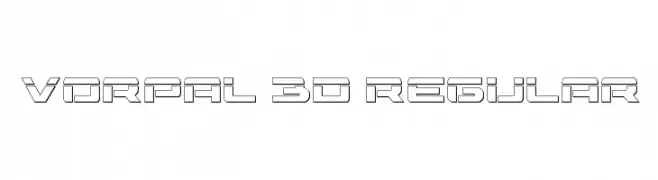
( Fonts by Daniel Zadorozny - www.iconian.com - Free for personal use )
A futuristic, geometric font with a 3D, outlined design.
![Vorpal 3D Regular font caratteri gratis]() Scaricare 77 Downloads@WebFont
Scaricare 77 Downloads@WebFont -
( Fonts by Vladimir Nikolic - www.creativefabrica.com/designer/vladimirnikolic/ - Personal-use only. For commercial use please contact owner. )
A bold, futuristic font with a geometric and stretched design.
![Stretched Book Regular font caratteri gratis]() Scaricare 77 Downloads@WebFont
Scaricare 77 Downloads@WebFont -
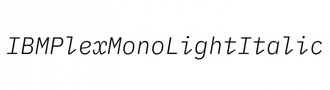
( Fonts by IBM )
A modern, monospaced, light italic font with clean lines and balanced spacing.
![IBM Plex Mono Light Italic font caratteri gratis]() Scaricare 77 Downloads@WebFont
Scaricare 77 Downloads@WebFont


Quali sono i font più popolari adesso?
Poppins, Roboto, Montserrat, Open Sans e Lato sono molto usati per le forme pulite e l'ampia applicabilità — dall'identità di marca alle landing page e ai poster.
Quali font si usano spesso nei loghi?
Le sans serif geometriche (es. Poppins, famiglie in stile Gotham) sono scelte comuni per un branding pulito e scalabile. Per un tocco personale restano valide script e stili manoscritti. Abbina un display deciso per i titoli a un corpo testo neutro per riconoscibilità ed equilibrio.
Ogni quanto si aggiorna la lista?
Con regolarità, in base ai download e all'attività reale. Torna spesso per scoprire in anticipo le nuove preferite.
💡 Consiglio: aggiungi ai preferiti — le tendenze cambiano in fretta e i font top di oggi possono ispirare il rebranding di domani.