Benvenuto nelle Font Più Popolari — dove popolarità e qualità si incontrano. Qui trovi i font più scaricati e usati dell'anno. Se cerchi scelte sicure per logo, web o social, inizia da qui.
Ogni font top si distingue per equilibrio, leggibilità e versatilità. Troverai sans serif moderne, script eleganti, serif vintage e display minimalisti.
-
( Fonts by Mariyana )
A casual, handwritten font with a dynamic and flowing style.
 Scaricare 76 Downloads@WebFont
 -
( Fonts by a Max Infeld - XEROGRAPHER FONTS - xerographer.blogspot.com . Personal-use only. For commercial use please contact owner. )
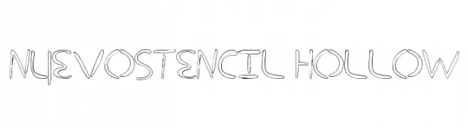
A modern, hollow stencil font with smooth curves and rounded edges.
![nuevostencil hollow font caratteri gratis]() Scaricare 76 Downloads@WebFont
Scaricare 76 Downloads@WebFont -
( Fonts by Rikyozone - Riccardo Zanotti - Personal-use only. For commercial use please contact owner. )
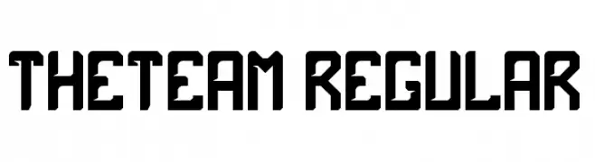
A bold, geometric font with a modern, industrial style.
![theTeam Regular font caratteri gratis]() Scaricare 76 Downloads@WebFont
Scaricare 76 Downloads@WebFont -
( Fonts by findesign7 - zainul arifin - Personal-use only. For commercial use please contact owner. )
A lively, handwritten-style font with fluid, slightly irregular strokes.
![Drawpen font caratteri gratis]() Scaricare 76 Downloads@WebFont
Scaricare 76 Downloads@WebFont -
( Fonts by ingoFonts - Ingo Zimmermann - Personal-use only. For commercial use please contact owner. )
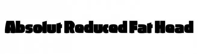
A bold, block-like font with rounded edges for a strong yet approachable look.
![Absolut Reduced Fat Head font caratteri gratis]() Scaricare 76 Downloads@WebFont
Scaricare 76 Downloads@WebFont -
( Antipixel - Julia Martínez Diana - www.antipixel.com.ar/ )
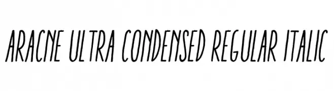
A sleek, ultra-condensed italic font with a modern and dynamic style.
![Aracne Ultra Condensed Regular Italic font caratteri gratis]() Scaricare 76 Downloads@WebFont
Scaricare 76 Downloads@WebFont -
( Darrell Flood - hawtpixel.com )
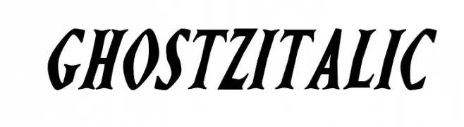
A bold, italic font with high contrast and dynamic, energetic style.
![Ghostz Italic font caratteri gratis]() Scaricare 76 Downloads@WebFont
Scaricare 76 Downloads@WebFont -
( Fonts by Peax Webdesign - www.peax-webdesign.com. Personal-use only. For commercial use please contact owner. )
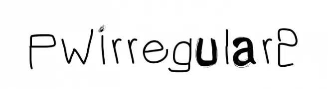
A playful, hand-drawn font with irregular strokes and a whimsical style.
![PWIrregular2 font caratteri gratis]() Scaricare 76 Downloads@WebFont
Scaricare 76 Downloads@WebFont -
( Fonts by GorillaBlu - Personal-use only. For commercial use please contact owner. )
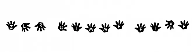
A playful font with characters resembling handprints, ideal for fun and informal projects.
![JLR Gimme Five! font caratteri gratis]() Scaricare 76 Downloads@WebFont
Scaricare 76 Downloads@WebFont -
( Fonts by Typodermic Fonts - Raymond Larabie - Personal-use only. For commercial use please contact owner. )
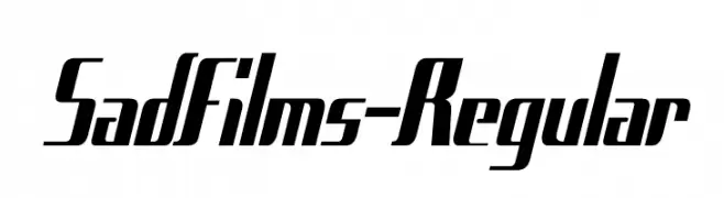
A bold, italic, and modern font with a dynamic, condensed style.
![SadFilms-Regular font caratteri gratis]() Scaricare 76 Downloads@WebFont
Scaricare 76 Downloads@WebFont -
( Fonts by Bangkit Tri Setiadi )
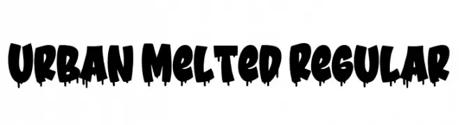
A bold, graffiti-inspired font with a dripping, urban aesthetic.
![Urban Melted Regular font caratteri gratis]() Scaricare 76 Downloads@WebFont
Scaricare 76 Downloads@WebFont -
( Fonts by Dmitry Astakhov - www.behance.net/adonis-abe1e - Personal-use only. For commercial use please contact owner. )
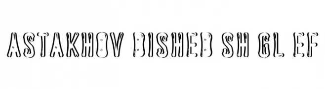
A playful, three-dimensional decorative font with bold, shadowed characters.
![Astakhov Dished Sh Gl EF font caratteri gratis]() Scaricare 76 Downloads@WebFont
Scaricare 76 Downloads@WebFont -
( Fonts by dcoxy - Greg Medina - Personal-use only. For commercial use please contact owner. )
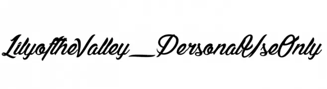
An elegant, flowing script font with cursive, connected letterforms.
![Lily of the Valley_PersonalUseOnly font caratteri gratis]() Scaricare 76 Downloads@WebFont
Scaricare 76 Downloads@WebFont -
( Iconian Fonts - Daniel Zadorozny - www.iconian.com )
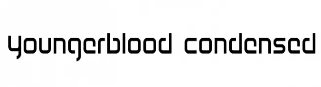
A modern, geometric, and condensed font with a sleek, minimalistic design.
![Youngerblood Condensed font caratteri gratis]() Scaricare 76 Downloads@WebFont
Scaricare 76 Downloads@WebFont -
( weknow - Wino S Kadir - www.creativefabrica.com/designer/weknow/ )
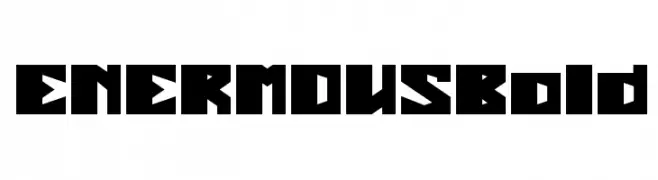
A bold, geometric font with sharp angles and a futuristic feel.
![ENERMOUS Bold font caratteri gratis]() Scaricare 76 Downloads@WebFont
Scaricare 76 Downloads@WebFont -
( Renny Murray - www.rennysniche.com )
A playful, bug-themed decorative font with characters inside beetle shapes.
![RMBuggy font caratteri gratis]() Scaricare 76 Downloads@WebFont
Scaricare 76 Downloads@WebFont -
( Fonts by Kat`s Fun Fonts - Personal-use only. For commercial use please contact owner. )
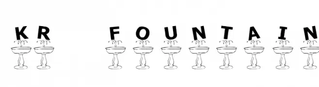
A whimsical and decorative font with characters atop fountain bases, offering a playful and artistic style.
![KR Fountain font caratteri gratis]() Scaricare 76 Downloads@WebFont
Scaricare 76 Downloads@WebFont -
( weknow - Wino S Kadir - www.creativefabrica.com/designer/weknow/ )
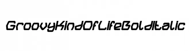
A bold, italic, and geometric font with a modern and dynamic style.
![Groovy Kind Of Life Bold Italic font caratteri gratis]() Scaricare 76 Downloads@WebFont
Scaricare 76 Downloads@WebFont -
( Fonts by Pinisiart )
A bold, geometric font with sharp, angular characters.
![Temple-Jump font caratteri gratis]() Scaricare 76 Downloads@WebFont
Scaricare 76 Downloads@WebFont -
( Renny Murray - www.rennysniche.com )
An ornate, decorative font with vintage-style framed characters.
![RMCalli1 font caratteri gratis]() Scaricare 76 Downloads@WebFont
Scaricare 76 Downloads@WebFont -
( Fonts by Omnibus Type )
A bold, semi-condensed typeface with a modern and clean design.
![Saira SemiCondensed Bold font caratteri gratis]() Scaricare 76 Downloads@WebFont
Scaricare 76 Downloads@WebFont -
( Fonts by Hendrick Rolandez - Personal-use only. For commercial use please contact owner. )
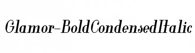
A bold, condensed, and italic font with a modern and elegant style.
![Glamor-BoldCondensedItalic font caratteri gratis]() Scaricare 76 Downloads@WebFont
Scaricare 76 Downloads@WebFont -
( Ferdiansyah - creativemarket.com/ijemrockart )
A bold, playful font with thick, rounded strokes and a hand-drawn feel.
![Kanover font caratteri gratis]() Scaricare 76 Downloads@WebFont
Scaricare 76 Downloads@WebFont -
( Iconian Fonts - Daniel Zadorozny - www.iconian.com )
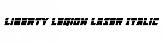
A bold, italic font with a futuristic and dynamic style.
![Liberty Legion Laser Italic font caratteri gratis]() Scaricare 76 Downloads@WebFont
Scaricare 76 Downloads@WebFont -
( Fonts by Kong Font - fontkong.com - Personal-use only. For commercial use please contact owner. )
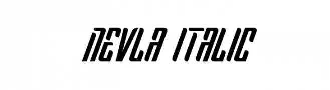
A bold, italicized font with geometric influences and a dynamic appearance.
![Nevla Italic font caratteri gratis]() Scaricare 76 Downloads@WebFont
Scaricare 76 Downloads@WebFont -
( Fonts by Zetafonts - Personal-use only. For commercial use please contact owner. )
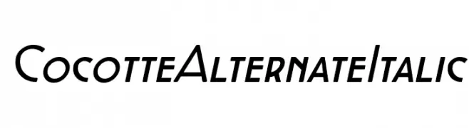
A modern, italicized font with clean lines and a sleek appearance.
![Cocotte Alternate Italic font caratteri gratis]() Scaricare 76 Downloads@WebFont
Scaricare 76 Downloads@WebFont -
( Fonts by Almarkhatype - Abdul Malik Wisnu - Personal-use only. For commercial use please contact owner. )
A playful, handwritten font with a lively and energetic style.
![BananaJuice font caratteri gratis]() Scaricare 76 Downloads@WebFont
Scaricare 76 Downloads@WebFont -
( Fonts by TSA Creative - Personal-use only. For commercial use please contact owner. )
A playful, bold, and rounded handwritten font with a whimsical touch.
![Jessica font caratteri gratis]() Scaricare 76 Downloads@WebFont
Scaricare 76 Downloads@WebFont -
( Fonts by Dan P. Lyons - Personal-use only. For commercial use please contact owner. )
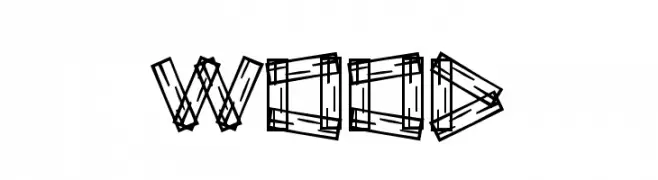
A decorative font with a wooden plank design, offering a rustic and handcrafted aesthetic.
![Wood font caratteri gratis]() Scaricare 76 Downloads@WebFont
Scaricare 76 Downloads@WebFont -
( Antipixel - Julia Martínez Diana - www.antipixel.com.ar/ )
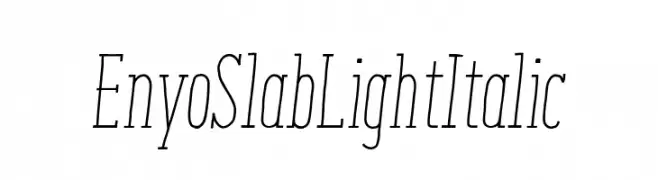
A light, italic serif font with a modern and elegant style.
![EnyoSlabLightItalic font caratteri gratis]() Scaricare 76 Downloads@WebFont
Scaricare 76 Downloads@WebFont -
( Fonts by ilhamtaro )
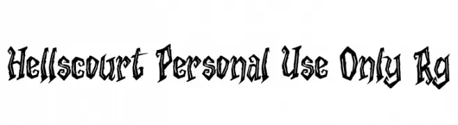
A bold, gothic-inspired font with sharp, angular lines and a rebellious flair.
![Hellscourt Personal Use Only Rg font caratteri gratis]() Scaricare 76 Downloads@WebFont
Scaricare 76 Downloads@WebFont -
( Fonts by Zetafonts - Personal-use only. For commercial use please contact owner. )
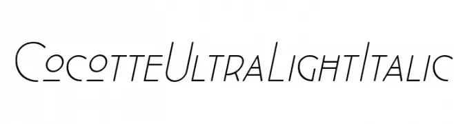
A sleek, ultra-light italic font with modern geometric elements.
![Cocotte UltraLight Italic font caratteri gratis]() Scaricare 76 Downloads@WebFont
Scaricare 76 Downloads@WebFont -
( Fonts by Dmitry Astakhov - www.behance.net/adonis-abe1e - Personal-use only. For commercial use please contact owner. )
A bold, decorative serif font with a shadow effect for a three-dimensional look.
![Astakhov Dished Shadow E Serif font caratteri gratis]() Scaricare 76 Downloads@WebFont
Scaricare 76 Downloads@WebFont -
( Fonts by Kong Font - fontkong.com - Personal-use only. For commercial use please contact owner. )
A bold, geometric font with a modern, industrial style.
![Nevla font caratteri gratis]() Scaricare 76 Downloads@WebFont
Scaricare 76 Downloads@WebFont -
( Fonts by Analogous Studio - Muhammad Ilham - Personal-use only. For commercial use please contact owner. )
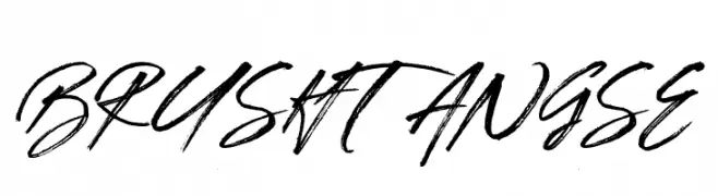
A dynamic, brush-style font with expressive, handwritten strokes.
![BRUSHTANGSE font caratteri gratis]() Scaricare 76 Downloads@WebFont
Scaricare 76 Downloads@WebFont


Quali sono i font più popolari adesso?
Poppins, Roboto, Montserrat, Open Sans e Lato sono molto usati per le forme pulite e l'ampia applicabilità — dall'identità di marca alle landing page e ai poster.
Quali font si usano spesso nei loghi?
Le sans serif geometriche (es. Poppins, famiglie in stile Gotham) sono scelte comuni per un branding pulito e scalabile. Per un tocco personale restano valide script e stili manoscritti. Abbina un display deciso per i titoli a un corpo testo neutro per riconoscibilità ed equilibrio.
Ogni quanto si aggiorna la lista?
Con regolarità, in base ai download e all'attività reale. Torna spesso per scoprire in anticipo le nuove preferite.
💡 Consiglio: aggiungi ai preferiti — le tendenze cambiano in fretta e i font top di oggi possono ispirare il rebranding di domani.