Benvenuto nelle Font Più Popolari — dove popolarità e qualità si incontrano. Qui trovi i font più scaricati e usati dell'anno. Se cerchi scelte sicure per logo, web o social, inizia da qui.
Ogni font top si distingue per equilibrio, leggibilità e versatilità. Troverai sans serif moderne, script eleganti, serif vintage e display minimalisti.
-
 Scaricare 77 Downloads@WebFont
 -
( Fonts by Zanatlija - Personal-use only. For commercial use please contact owner. )
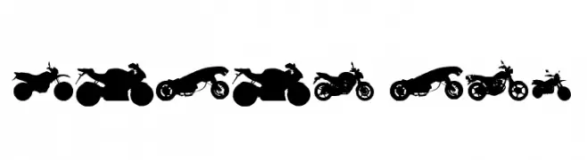
Motorcycle silhouette dingbat font.
![motos tfb font caratteri gratis]() Scaricare 77 Downloads@WebFont
Scaricare 77 Downloads@WebFont -
( madeDeduk )
A bold, cursive font with flowing, interconnected strokes.
![Claiborne font caratteri gratis]() Scaricare 77 Downloads@WebFont
Scaricare 77 Downloads@WebFont -
( Em Nazar )
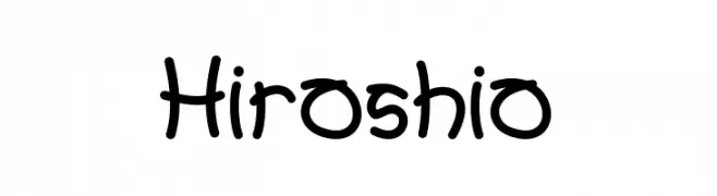
A playful handwritten font with a casual and friendly style.
![Hiroshio font caratteri gratis]() Scaricare 77 Downloads@WebFont
Scaricare 77 Downloads@WebFont -
( Fonts by junkohanhero - Personal-use only. For commercial use please contact owner. )
A bold, eclectic display font with a ransom note style and modern twist.
![Lievidence SQR font caratteri gratis]() Scaricare 77 Downloads@WebFont
Scaricare 77 Downloads@WebFont -
( Fonts by Daniel Zadorozny - www.iconian.com - Personal-use only. For commercial use please contact owner. )
A bold, geometric font with a futuristic and industrial design.
![Arctic Guardian font caratteri gratis]() Scaricare 77 Downloads@WebFont
Scaricare 77 Downloads@WebFont -
( Chequered Ink - chequered.ink/ )
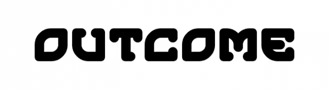
A bold, rounded, geometric font with a modern and futuristic style.
![Outcome font caratteri gratis]() Scaricare 77 Downloads@WebFont
Scaricare 77 Downloads@WebFont -
( Josen Tan - www.roblox.com )
A bold, geometric font with angular letterforms and a strong, modern aesthetic.
![xxjjoosengx33xx Bold font caratteri gratis]() Scaricare 77 Downloads@WebFont
Scaricare 77 Downloads@WebFont -
( Fonts by PutraCetol Studio )
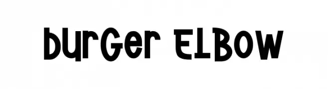
A bold, playful font with rounded, slightly condensed characters.
![Burger Elbow font caratteri gratis]() Scaricare 77 Downloads@WebFont
Scaricare 77 Downloads@WebFont -
( Fonts by Vladimir Nikolic )
A bold, 3D font with a modern, geometric style and shadow effects.
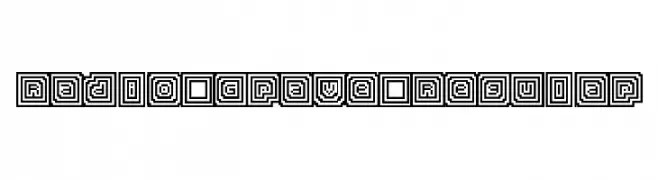
![Portfolio 3D Extravagant Regular font caratteri gratis]() Scaricare 77 Downloads@WebFont
Scaricare 77 Downloads@WebFont -
![Radio Grave Regular font caratteri gratis]() Scaricare 77 Downloads@WebFont
Scaricare 77 Downloads@WebFont -
( Personal-use only. For commercial use please contact owner. )
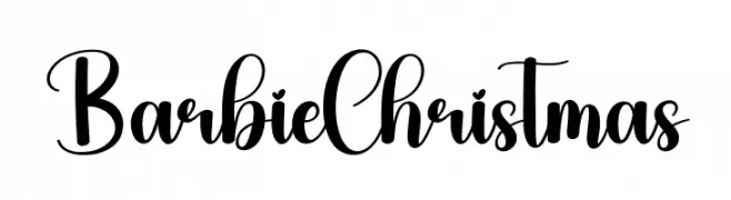
Bold, decorative script with playful swashes and high contrast.
![Barbie Christmas font caratteri gratis]() Scaricare 77 Downloads@WebFont
Scaricare 77 Downloads@WebFont -
( Fonts by Vladimir Nikolic )
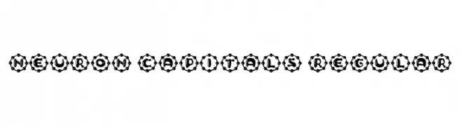
A bold, decorative font with gear-like circular enclosures around each character.
![Neuron Capitals Regular font caratteri gratis]() Scaricare 77 Downloads@WebFont
Scaricare 77 Downloads@WebFont -
( Jaye de Tunis - graffititoonsi.wordpress.com/ )
An abstract, decorative font with intricate loops and curves.
![NELLY FRD Normal font caratteri gratis]() Scaricare 77 Downloads@WebFont
Scaricare 77 Downloads@WebFont -
( London's Letters - www.londonsletters.com/ )
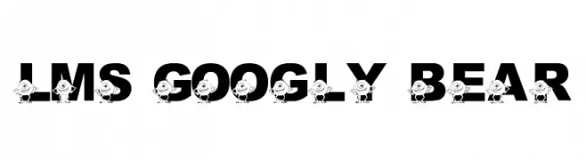
A bold, playful font with cartoon characters embedded in each letter.
![LMS Googly Bear font caratteri gratis]() Scaricare 77 Downloads@WebFont
Scaricare 77 Downloads@WebFont -
( Fonts by Syaf Rizal - Khurasan - Personal-use only. For commercial use please contact owner. )
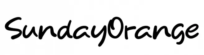
A playful, casual handwritten font with smooth, flowing curves.
![Sunday Orange font caratteri gratis]() Scaricare 77 Downloads@WebFont
Scaricare 77 Downloads@WebFont -
( Fonts by Aluyeah Studio - Personal-use only. For commercial use please contact owner. )
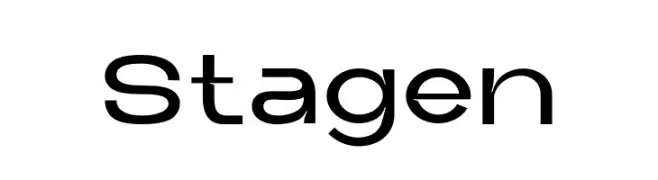
A modern, geometric font with clean lines and a minimalist style.
![Stagen font caratteri gratis]() Scaricare 77 Downloads@WebFont
Scaricare 77 Downloads@WebFont -
( Fonts by Daniel Zadorozny - www.iconian.com )
A decorative and futuristic font with circular accents and geometric shapes.
![Underground Rose Leftalic font caratteri gratis]() Scaricare 77 Downloads@WebFont
Scaricare 77 Downloads@WebFont -
( Fonts by Garisman Studio - Risman Ginarwan - Personal-use only. For commercial use please contact owner. )
An elegant, flowing script font with a handwritten style.
![Sacreditty font caratteri gratis]() Scaricare 77 Downloads@WebFont
Scaricare 77 Downloads@WebFont -
( Fonts by Balpirick Studio - https://www.creativefabrica.com/designer/balpirick/ref/308299/ - Personal-use only. For commercial use please contact owner. )
A lively handwritten font with fluid, dynamic strokes and a playful touch.
![Scholastica font caratteri gratis]() Scaricare 77 Downloads@WebFont
Scaricare 77 Downloads@WebFont -
( Fonts by Wino S Kadir - weknow - www.revolge.com/shop/weknow/ - Personal-use only. For commercial use please contact owner. )
A bold, angular font with geometric and blocky letterforms.
![alot of love font caratteri gratis]() Scaricare 77 Downloads@WebFont
Scaricare 77 Downloads@WebFont -
( Fonts by CannotIntoSpaceFonts - KineticPlasma Fonts - Personal-use only. For commercial use please contact owner. )
A playful, bold handwritten font with a casual and friendly appearance.
![Mew? Black font caratteri gratis]() Scaricare 77 Downloads@WebFont
Scaricare 77 Downloads@WebFont -
( madeDeduk )
A bold, geometric font with a modern, technical style.
![JetPilotRegular font caratteri gratis]() Scaricare 77 Downloads@WebFont
Scaricare 77 Downloads@WebFont -
( Fonts by Leonard Posavec - leosupply.co - Personal-use only. For commercial use please contact owner. )
A bold, playful font with cartoonish, exaggerated characters.
![FunnyTeca font caratteri gratis]() Scaricare 77 Downloads@WebFont
Scaricare 77 Downloads@WebFont -
( Fonts by Kat`s Fun Fonts - Personal-use only. For commercial use please contact owner. )
Elephant-themed decorative dingbat font with assorted illustrations.
![KR Rachel's Elephants font caratteri gratis]() Scaricare 77 Downloads@WebFont
Scaricare 77 Downloads@WebFont -
( Fonts by Perspectype Studio - Personal-use only. For commercial use please contact owner. )
A bold, expressive script font with fluid, interconnected strokes.
![Cinderela font caratteri gratis]() Scaricare 77 Downloads@WebFont
Scaricare 77 Downloads@WebFont -
( Fonts by Creaditive Design )
Casual handwritten script font.
![Unique Surfer font caratteri gratis]() Scaricare 77 Downloads@WebFont
Scaricare 77 Downloads@WebFont -
( Fonts by Wino S Kadir - weknow - www.revolge.com/shop/weknow/ - Personal-use only. For commercial use please contact owner. )
A bold, artistic font with sweeping curves and exaggerated serifs.
![together font caratteri gratis]() Scaricare 77 Downloads@WebFont
Scaricare 77 Downloads@WebFont -
( Fonts by dcoxy - Greg Medina - Personal-use only. For commercial use please contact owner. )
A bold, dynamic script font with flowing strokes and elegant curves.
![Shania & HeinzPersonalUseOnly font caratteri gratis]() Scaricare 77 Downloads@WebFont
Scaricare 77 Downloads@WebFont -
( Fonts by nariswari_creative - Taufik Dwi Purnomo - Personal-use only. For commercial use please contact owner. )
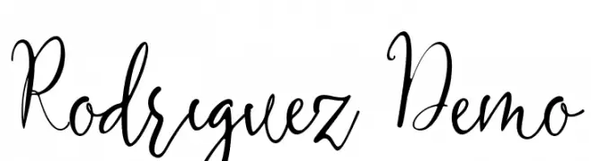
An elegant, flowing script font with smooth, connected strokes.
![Rodriguez Demo font caratteri gratis]() Scaricare 77 Downloads@WebFont
Scaricare 77 Downloads@WebFont -
( Fonts by GGBot - www.ggbot.net - Personal-use only. For commercial use please contact owner. )
A chaotic, vine-like decorative font with jagged, intricate strokes.
![Depres font caratteri gratis]() Scaricare 77 Downloads@WebFont
Scaricare 77 Downloads@WebFont -
( Fonts by Solidtype - Personal-use only. For commercial use please contact owner. )
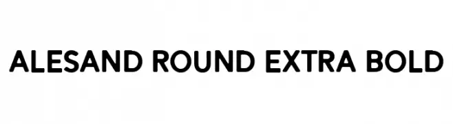
A bold, rounded typeface with smooth curves and consistent stroke weight.
![Alesand Round Extra Bold font caratteri gratis]() Scaricare 77 Downloads@WebFont
Scaricare 77 Downloads@WebFont -
( Fonts by Qwrtype Foundry )
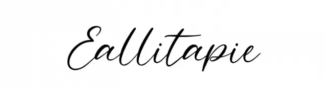
A graceful script font with fluid, cursive strokes and interconnected letters.
![Eallitapie font caratteri gratis]() Scaricare 77 Downloads@WebFont
Scaricare 77 Downloads@WebFont -
( Noto is a trademark of Google Inc. Noto fonts are open source. All Noto fonts are published under the SIL Open Font License, Version 1.1 )
Image contains placeholder glyphs, not a valid font sample.
![Noto Sans Myanmar UI Condensed SemiBold font caratteri gratis]() Scaricare 77 Downloads@WebFont
Scaricare 77 Downloads@WebFont -
( Fonts by Kong Font - fontkong.com - Personal-use only. For commercial use please contact owner. )
A playful, rounded font with bold, consistent strokes and a modern feel.
![Stefanock font caratteri gratis]() Scaricare 77 Downloads@WebFont
Scaricare 77 Downloads@WebFont


Quali sono i font più popolari adesso?
Poppins, Roboto, Montserrat, Open Sans e Lato sono molto usati per le forme pulite e l'ampia applicabilità — dall'identità di marca alle landing page e ai poster.
Quali font si usano spesso nei loghi?
Le sans serif geometriche (es. Poppins, famiglie in stile Gotham) sono scelte comuni per un branding pulito e scalabile. Per un tocco personale restano valide script e stili manoscritti. Abbina un display deciso per i titoli a un corpo testo neutro per riconoscibilità ed equilibrio.
Ogni quanto si aggiorna la lista?
Con regolarità, in base ai download e all'attività reale. Torna spesso per scoprire in anticipo le nuove preferite.
💡 Consiglio: aggiungi ai preferiti — le tendenze cambiano in fretta e i font top di oggi possono ispirare il rebranding di domani.