Benvenuto nelle Font Più Popolari — dove popolarità e qualità si incontrano. Qui trovi i font più scaricati e usati dell'anno. Se cerchi scelte sicure per logo, web o social, inizia da qui.
Ogni font top si distingue per equilibrio, leggibilità e versatilità. Troverai sans serif moderne, script eleganti, serif vintage e display minimalisti.
-
( Fonts by Vladimir Nikolic )
A bold, futuristic font with a 3D effect and textured interior lines.
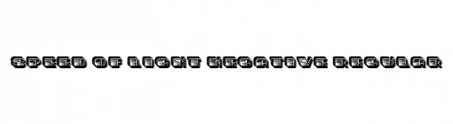 Scaricare 77 Downloads@WebFont
 -
( Creatype Studio - Rian Rahardi - creativemarket.com/creatype )
A lively, expressive script font with a handwritten, artistic style.
![Rathyland font caratteri gratis]() Scaricare 77 Downloads@WebFont
Scaricare 77 Downloads@WebFont -
( Ink creative - creativemarket.com/inkcreativeart/ )
A handwritten-style font with elongated, fluid characters.
![Emmasignature font caratteri gratis]() Scaricare 77 Downloads@WebFont
Scaricare 77 Downloads@WebFont -
( Perry Mason )
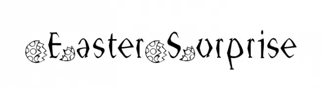
A whimsical, decorative font with floral patterns and unique letter shapes.
![EasterSurprise font caratteri gratis]() Scaricare 77 Downloads@WebFont
Scaricare 77 Downloads@WebFont -
( Fonts by ONG Type )
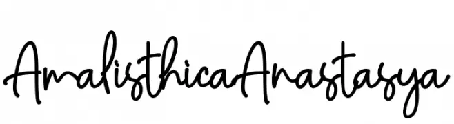
Casual handwritten font with a playful style.
![AmalisthicaAnastasya font caratteri gratis]() Scaricare 77 Downloads@WebFont
Scaricare 77 Downloads@WebFont -
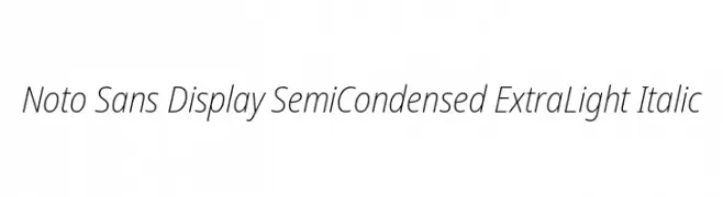
( Noto is a trademark of Google Inc. Noto fonts are open source. All Noto fonts are published under the SIL Open Font License, Version 1.1 )
A modern, extra light, semi-condensed sans-serif font with an elegant italic style.
![Noto Sans Display SemiCondensed ExtraLight Italic font caratteri gratis]() Scaricare 77 Downloads@WebFont
Scaricare 77 Downloads@WebFont -
( Fonts by www.junkohanhero.com - Personal-use only. For commercial use please contact owner. )
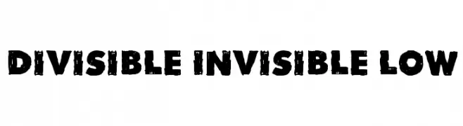
A bold, distressed font with a rugged, vintage appearance.
![Divisible Invisible Low font caratteri gratis]() Scaricare 77 Downloads@WebFont
Scaricare 77 Downloads@WebFont -
( Fonts by Tomasz Skowronski - Personal-use only. For commercial use please contact owner. )
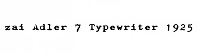
A vintage typewriter-style font with a distressed, authentic look.
![zai Adler 7 Typewriter 1925 font caratteri gratis]() Scaricare 77 Downloads@WebFont
Scaricare 77 Downloads@WebFont -
![FD Stenciluxe font caratteri gratis]() Scaricare 77 Downloads
Scaricare 77 Downloads -
( Zetafonts - www.zetafonts.com )
A bold, rounded, and italicized font with a playful and friendly style.
![KabrioSoft-HeavyItalic font caratteri gratis]() Scaricare 77 Downloads@WebFont
Scaricare 77 Downloads@WebFont -
( imagex - www.imagex-fonts.com )
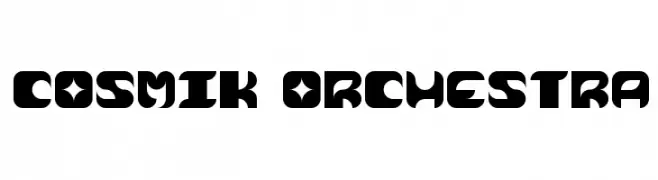
A bold, futuristic font with geometric shapes and sharp angles.
![Cosmik Orchestra font caratteri gratis]() Scaricare 77 Downloads@WebFont
Scaricare 77 Downloads@WebFont -
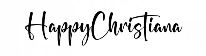
( Fonts by Letterena Studios )
Modern, playful handwritten script with fluid, casual strokes.
![Happy Christiana font caratteri gratis]() Scaricare 77 Downloads@WebFont
Scaricare 77 Downloads@WebFont -
( Fonts by ijem - Ferdiansyah Ferdiansyah - Personal-use only. For commercial use please contact owner. )
A bold, cursive font with a flowing, handwritten style.
![HarpertDemo font caratteri gratis]() Scaricare 77 Downloads@WebFont
Scaricare 77 Downloads@WebFont -
( Iconian Fonts - Daniel Zadorozny - www.iconian.com )
A bold, futuristic font with a unique horizontal line pattern.
![Drone Tracker Gradient font caratteri gratis]() Scaricare 77 Downloads@WebFont
Scaricare 77 Downloads@WebFont -
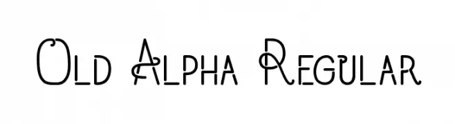
( madeDeduk )
A modern, decorative font with geometric and artistic elements.
![Old Alpha Regular font caratteri gratis]() Scaricare 77 Downloads@WebFont
Scaricare 77 Downloads@WebFont -
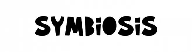
( Fonts by Alpaprana Studio )
A playful, bold, and hand-drawn font with a whimsical, cartoon-like appearance.
![Symbiosis font caratteri gratis]() Scaricare 77 Downloads@WebFont
Scaricare 77 Downloads@WebFont -
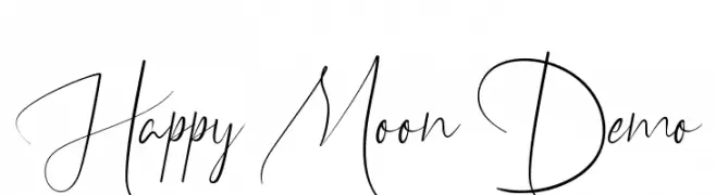
( Fonts by Edric Studio - Personal-use only. For commercial use please contact owner. )
A flowing, elegant cursive font with a modern twist.
![Happy Moon Demo font caratteri gratis]() Scaricare 77 Downloads@WebFont
Scaricare 77 Downloads@WebFont -
![Pointer Extended Oblique font caratteri gratis]() Scaricare 77 Downloads@WebFont
Scaricare 77 Downloads@WebFont -
( Fonts by Letterhend Studio )
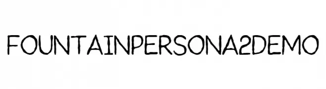
A playful handwritten font with an organic and casual style.
![FountainPersona2Demo font caratteri gratis]() Scaricare 77 Downloads@WebFont
Scaricare 77 Downloads@WebFont -
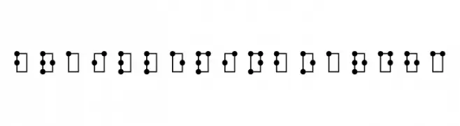
( Fonts by Roberto Mocci )
A tactile Braille system with raised dot patterns for accessibility.
![braille pinboard hc font caratteri gratis]() Scaricare 77 Downloads@WebFont
Scaricare 77 Downloads@WebFont -
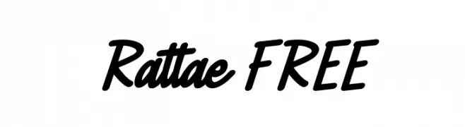
( Fonts by Vunira Design - Personal-use only. For commercial use please contact owner. )
A bold, dynamic script font with fluid, connected letterforms.
![Rattae FREE font caratteri gratis]() Scaricare 77 Downloads@WebFont
Scaricare 77 Downloads@WebFont -
( Fonts by a Max Infeld - XEROGRAPHER FONTS - xerographer.blogspot.com . Personal-use only. For commercial use please contact owner. )
A playful, stitched-style font with a handmade aesthetic.
![SeamingStitchy font caratteri gratis]() Scaricare 77 Downloads@WebFont
Scaricare 77 Downloads@WebFont -
( Fonts by Carlos Daniel Matteoli - Qbotype Fonts - http://carlosmatteoli.wix.com/qbotype. Personal-use only. For commercial use please contact owner. )
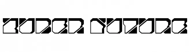
A futuristic, geometric font with bold, angular shapes and uniform spacing.
![Zuber future font caratteri gratis]() Scaricare 77 Downloads@WebFont
Scaricare 77 Downloads@WebFont -
( Fonts by Linecreative - ARI JUANDA - Personal-use only. For commercial use please contact owner. )
A bold, slab serif font with high contrast and strong visual impact.
![Amoba font caratteri gratis]() Scaricare 77 Downloads@WebFont
Scaricare 77 Downloads@WebFont -
( Fonts by Vladimir Nikolic - Personal-use only. For commercial use please contact owner. )
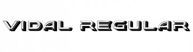
A bold, 3D geometric font with a modern, futuristic style.
![Vidal Regular font caratteri gratis]() Scaricare 77 Downloads@WebFont
Scaricare 77 Downloads@WebFont -
( Fonts by Peter Wiegel - www.peter-wiegel.de - Personal-use only. For commercial use please contact owner. )
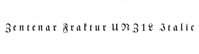
An ornate Blackletter font with italic styling and intricate details.
![Zentenar Fraktur UNZ1L Italic font caratteri gratis]() Scaricare 77 Downloads@WebFont
Scaricare 77 Downloads@WebFont -
( Fonts by Tup Wanders )
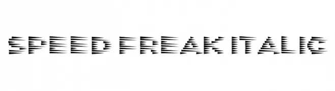
A dynamic, italicized font with sharp, angular cuts, conveying speed and energy.
![Speed Freak Italic font caratteri gratis]() Scaricare 77 Downloads@WebFont
Scaricare 77 Downloads@WebFont -
( Fonts by Attract Studio )
A bold, dynamic font with a playful, retro feel and strong presence.
![Emiken Display Regular font caratteri gratis]() Scaricare 77 Downloads@WebFont
Scaricare 77 Downloads@WebFont -
( Fonts by joorgemoron - Personal-use only. For commercial use please contact owner. )
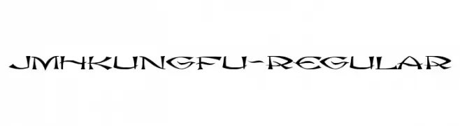
A dynamic, angular font with sharp strokes and a martial arts-inspired style.
![JMHkungfu-Regular font caratteri gratis]() Scaricare 77 Downloads@WebFont
Scaricare 77 Downloads@WebFont -
( Fonts by Bangkit Tri Setiadi - Personal-use only. For commercial use please contact owner. )
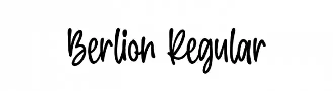
A playful, casual handwritten font with fluid strokes and a friendly appearance.
![Berlion Regular font caratteri gratis]() Scaricare 77 Downloads@WebFont
Scaricare 77 Downloads@WebFont -
( Fonts by nariswari_creative - Taufik Dwi Purnomo - Personal-use only. For commercial use please contact owner. )
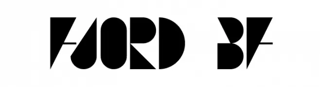
A bold, geometric font with sharp angles and circular forms.
![FJORD BF font caratteri gratis]() Scaricare 77 Downloads@WebFont
Scaricare 77 Downloads@WebFont -
( Fonts by Julián David Medina Mosquera )
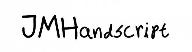
Casual handwritten font with a playful style.
![JM Handscript font caratteri gratis]() Scaricare 77 Downloads@WebFont
Scaricare 77 Downloads@WebFont -
( Fonts by Billy Argel - Personal-use only. For commercial use please contact owner. )
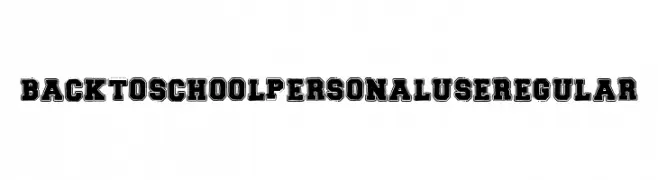
Bold, blocky font with a vintage, distressed look.
![BACK TO SCHOOL PERSONAL USE Regular font caratteri gratis]() Scaricare 77 Downloads@WebFont
Scaricare 77 Downloads@WebFont -
( Fonts by Faqih Fawaji - Personal-use only. For commercial use please contact owner. )
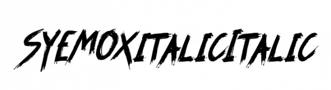
A bold, brush-style font with sharp, angular strokes and a dynamic, slanted design.
![SYEMOX italic Italic font caratteri gratis]() Scaricare 77 Downloads@WebFont
Scaricare 77 Downloads@WebFont -
( Fonts by Wino S Kadir - weknow - www.revolge.com/shop/weknow/ - Personal-use only. For commercial use please contact owner. )
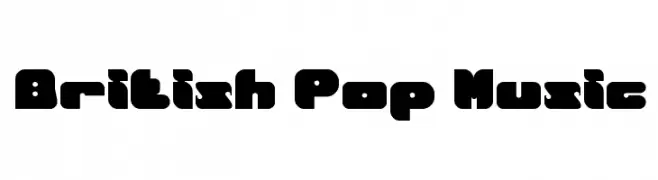
A bold, playful font with rounded edges and a retro pop culture vibe.
![British Pop Music font caratteri gratis]() Scaricare 77 Downloads@WebFont
Scaricare 77 Downloads@WebFont


Quali sono i font più popolari adesso?
Poppins, Roboto, Montserrat, Open Sans e Lato sono molto usati per le forme pulite e l'ampia applicabilità — dall'identità di marca alle landing page e ai poster.
Quali font si usano spesso nei loghi?
Le sans serif geometriche (es. Poppins, famiglie in stile Gotham) sono scelte comuni per un branding pulito e scalabile. Per un tocco personale restano valide script e stili manoscritti. Abbina un display deciso per i titoli a un corpo testo neutro per riconoscibilità ed equilibrio.
Ogni quanto si aggiorna la lista?
Con regolarità, in base ai download e all'attività reale. Torna spesso per scoprire in anticipo le nuove preferite.
💡 Consiglio: aggiungi ai preferiti — le tendenze cambiano in fretta e i font top di oggi possono ispirare il rebranding di domani.