Benvenuto nelle Font Più Popolari — dove popolarità e qualità si incontrano. Qui trovi i font più scaricati e usati dell'anno. Se cerchi scelte sicure per logo, web o social, inizia da qui.
Ogni font top si distingue per equilibrio, leggibilità e versatilità. Troverai sans serif moderne, script eleganti, serif vintage e display minimalisti.
-
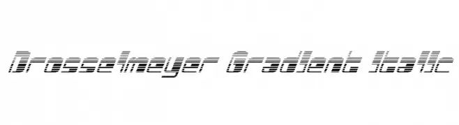
( Iconian Fonts - Daniel Zadorozny - www.iconian.com )
A futuristic italic font with a gradient effect created by horizontal lines.
 Scaricare 76 Downloads@WebFont
 -
( Intellecta Design - Paulo W - new.myfonts.com/foundry/Intellecta_Design/?refby=paulow )
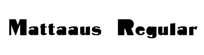
A bold, modern font with geometric and organic elements, perfect for impactful designs.
![Mattaaus Regular font caratteri gratis]() Scaricare 76 Downloads@WebFont
Scaricare 76 Downloads@WebFont -
( Fonts by Jipatype - Anupap Jaichumnan - Personal-use only. For commercial use please contact owner. )
A classic, elegant cursive font with a calligraphic style.
![Chanceri font caratteri gratis]() Scaricare 76 Downloads@WebFont
Scaricare 76 Downloads@WebFont -
( Helldunkel - www.helldunkel.com )
A playful, modern font with rounded edges and consistent stroke width.
![Paulchen Light font caratteri gratis]() Scaricare 76 Downloads@WebFont
Scaricare 76 Downloads@WebFont -
( Noto is a trademark of Google Inc. Noto fonts are open source. All Noto fonts are published under the SIL Open Font License, Version 1.1 )
A bold and robust font with thick strokes and strong presence.
![Noto Serif Tamil ExtraBold font caratteri gratis]() Scaricare 76 Downloads@WebFont
Scaricare 76 Downloads@WebFont -
( Fonts by Wino S Kadir - weknow - www.revolge.com/shop/weknow/ - Personal-use only. For commercial use please contact owner. )
A sleek, modern font with rounded, italicized characters.
![my font font caratteri gratis]() Scaricare 76 Downloads@WebFont
Scaricare 76 Downloads@WebFont -
( Fonts by Billy Argel - www.billyargel.com - Personal-use only. For commercial use please contact owner. )
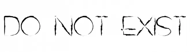
A distressed, grunge-style font with rough, jagged edges and a bold appearance.
![DO NOT EXIST font caratteri gratis]() Scaricare 76 Downloads@WebFont
Scaricare 76 Downloads@WebFont -
( Fonts by www.junkohanhero.com - Personal-use only. For commercial use please contact owner. )
A bold, decorative font with a unique outline effect and medium contrast.
![Trolle font caratteri gratis]() Scaricare 76 Downloads@WebFont
Scaricare 76 Downloads@WebFont -
( memesbruh03 - Aaron D. Chand )
A pixelated, blocky font with a retro digital style.
![Light font caratteri gratis]() Scaricare 76 Downloads@WebFont
Scaricare 76 Downloads@WebFont -
( Pi's Room - isweb13.infoseek.co.jp/diary/pi_/ )
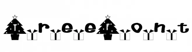
A festive font with Christmas tree-shaped letters and holiday-themed decorations.
![TreeFont font caratteri gratis]() Scaricare 76 Downloads@WebFont
Scaricare 76 Downloads@WebFont -
( Fonts by Zulfikar Ali - Personal-use only. For commercial use please contact owner. )
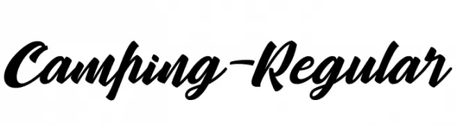
A bold, dynamic script font with fluid, connected letterforms.
![Camping-Regular font caratteri gratis]() Scaricare 76 Downloads@WebFont
Scaricare 76 Downloads@WebFont -
( Fonts by Edric Studio www.creativefabrica.com/designer/edricstudio/ - Personal-use only. For commercial use please contact owner. )
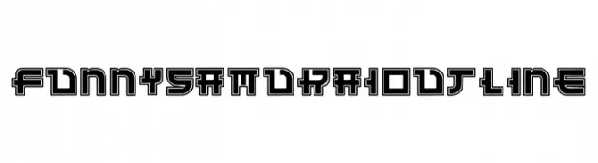
A bold, geometric font with a striking outline and modern appeal.
![Funny Samurai Outline font caratteri gratis]() Scaricare 76 Downloads@WebFont
Scaricare 76 Downloads@WebFont -
( Fonts by Daniel Zadorozny - www.iconian.com )
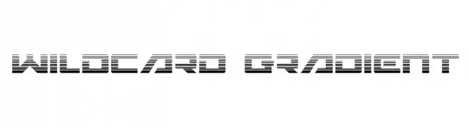
A futuristic, line-based font with a gradient effect and geometric design.
![Wildcard Gradient font caratteri gratis]() Scaricare 76 Downloads@WebFont
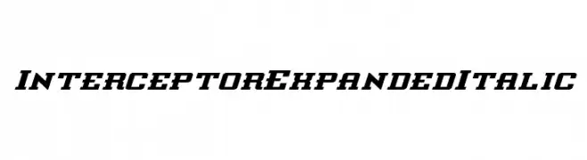
Scaricare 76 Downloads@WebFont -
![Interceptor Expanded Italic font caratteri gratis]() Scaricare 76 Downloads@WebFont
Scaricare 76 Downloads@WebFont -
( Fonts by www.selawetype.com - Personal-use only. FOR DONATION https://www.paypal.me/selawe . For commercial use please contact owner. )
An abstract, artistic font with fragmented, geometric letterforms and dynamic shapes.
![Moonline font caratteri gratis]() Scaricare 76 Downloads@WebFont
Scaricare 76 Downloads@WebFont -
( Iconian Fonts - Daniel Zadorozny - www.iconian.com )
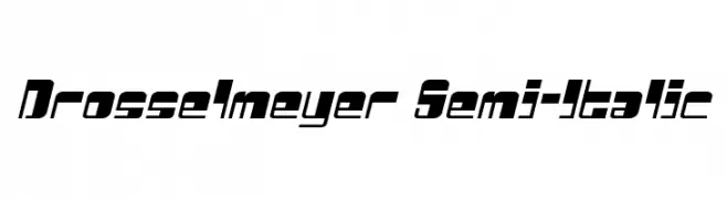
A bold, italicized font with a futuristic and geometric design.
![Drosselmeyer Semi-Italic font caratteri gratis]() Scaricare 76 Downloads@WebFont
Scaricare 76 Downloads@WebFont -
( Jeff Bensch - jbensch.deviantart.com )
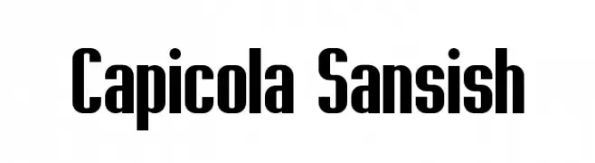
A bold, condensed font with a modern and impactful style.
![Capicola Sansish font caratteri gratis]() Scaricare 76 Downloads@WebFont
Scaricare 76 Downloads@WebFont -
( Fonts by Abo Daniel Studio )
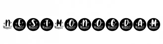
A decorative font with nest-like embellishments and framed characters.
![Nest Monogram font caratteri gratis]() Scaricare 76 Downloads@WebFont
Scaricare 76 Downloads@WebFont -
( Fonts by Syaf Rizal - Khurasan - Personal-use only. For commercial use please contact owner. )
A dynamic and fluid handwritten font with a cursive style.
![Rullent font caratteri gratis]() Scaricare 76 Downloads@WebFont
Scaricare 76 Downloads@WebFont -
( Fonts by Kong Font - https://fontkong.com/ - Personal-use only. For commercial use please contact owner. )
A playful and dynamic script font with flowing, cursive letterforms.
![Quanto font caratteri gratis]() Scaricare 76 Downloads@WebFont
Scaricare 76 Downloads@WebFont -
( Fonts by Daniel Zadorozny - www.iconian.com )
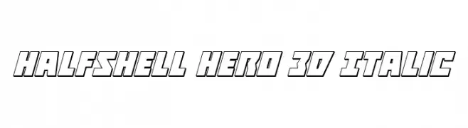
A bold, 3D italic font with a modern, geometric style.
![Halfshell Hero 3D Italic font caratteri gratis]() Scaricare 76 Downloads@WebFont
Scaricare 76 Downloads@WebFont -
( Fonts by Vunira Design - Personal-use only. For commercial use please contact owner. )
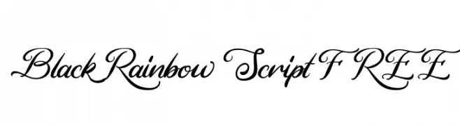
An elegant script font with flowing, ornate letters and medium contrast.
![Black Rainbow Script FREE font caratteri gratis]() Scaricare 76 Downloads@WebFont
Scaricare 76 Downloads@WebFont -
( Fonts by deFharo - Fernando Haro - Personal-use only. For commercial use please contact owner. )
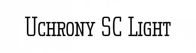
A modern, clean font with tall, narrow uppercase letters and consistent lowercase design.
![Uchrony SC Light font caratteri gratis]() Scaricare 76 Downloads@WebFont
Scaricare 76 Downloads@WebFont -
( Fonts by wep - Wahyu Eka Prasetya - Personal-use only. For commercial use please contact owner. )
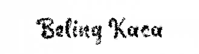
A highly decorative and chaotic font with swirling, organic patterns.
![Beling Kaca font caratteri gratis]() Scaricare 76 Downloads@WebFont
Scaricare 76 Downloads@WebFont -
( Fonts by Letterayu - Sri Rahayu - Personal-use only. For commercial use please contact owner. )
A modern, geometric font with clean lines and consistent stroke width.
![Fabrica font caratteri gratis]() Scaricare 76 Downloads@WebFont
Scaricare 76 Downloads@WebFont -
( Fonts by JoebRogers - Personal-use only. For commercial use please contact owner. )
A pixelated, retro-style font inspired by early digital displays.
![BitPotion font caratteri gratis]() Scaricare 76 Downloads@WebFont
Scaricare 76 Downloads@WebFont -
( Fonts by Dm Letter Studio )
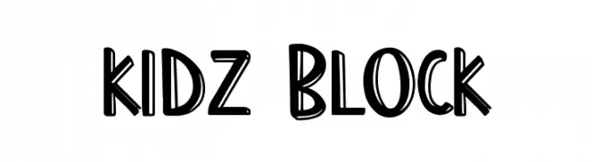
Playful, bold hand-drawn display font.
![Kidz Block font caratteri gratis]() Scaricare 76 Downloads@WebFont
Scaricare 76 Downloads@WebFont -
( Fonts by Vladimir Nikolic - https://www.creativefabrica.com/product/educated-deers/ref/144265/ - Personal-use only. For commercial use please contact owner. )
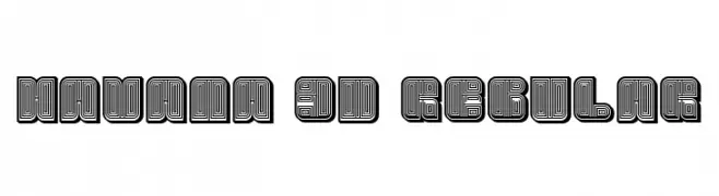
A bold, three-dimensional font with a layered, maze-like design for striking visual impact.
![Havana 3D Regular font caratteri gratis]() Scaricare 76 Downloads@WebFont
Scaricare 76 Downloads@WebFont -
( Fonts by Darrell Flood )
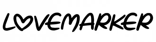
A bold, playful handwritten font with smooth, rounded strokes and a unique heart-shaped 'O'.
![Love Marker font caratteri gratis]() Scaricare 76 Downloads@WebFont
Scaricare 76 Downloads@WebFont -
( Fonts by Breh Creative - Vavad Harahap - Personal-use only. For commercial use please contact owner. )
A modern, geometric font with interconnected lines and a bold, artistic style.
![Aklirics font caratteri gratis]() Scaricare 76 Downloads@WebFont
Scaricare 76 Downloads@WebFont -
( Fonts by Wino S Kadir - weknow - www.revolge.com/shop/weknow/ - Personal-use only. For commercial use please contact owner. )
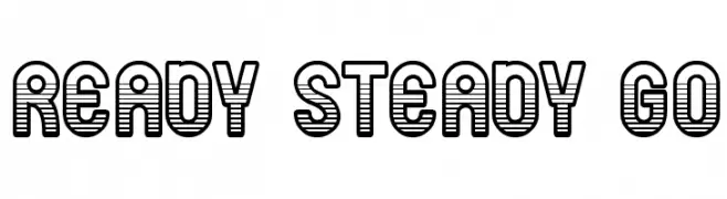
A bold, decorative font with a unique horizontal striped pattern.
![ready steady go font caratteri gratis]() Scaricare 76 Downloads@WebFont
Scaricare 76 Downloads@WebFont -
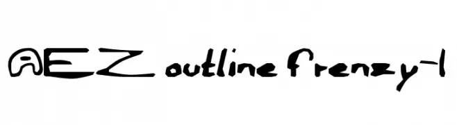
( Fonts by Adult Ramblings - Anastacia E. Zittel - Personal-use only. For commercial use please contact owner. )
A playful, hand-drawn outline font with a bold and whimsical style.
![AEZ outline frenzy-1 font caratteri gratis]() Scaricare 76 Downloads@WebFont
Scaricare 76 Downloads@WebFont -
( Jeff Bensch - jbensch.deviantart.com )
A bold, rounded font with a playful yet structured appearance.
![DSPLAID font caratteri gratis]() Scaricare 76 Downloads@WebFont
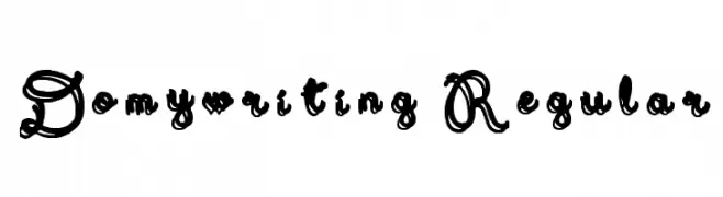
Scaricare 76 Downloads@WebFont -
( DoMyWriting - domywriting.com/ )
An ornate and decorative font with intricate swirls and high contrast strokes.
![Domywriting Regular font caratteri gratis]() Scaricare 76 Downloads@WebFont
Scaricare 76 Downloads@WebFont -
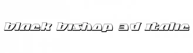
( Fonts by Daniel Zadorozny - www.iconian.com - Free for personal use )
A bold, 3D italic font with a modern, geometric style.
![Black Bishop 3D Italic font caratteri gratis]() Scaricare 76 Downloads@WebFont
Scaricare 76 Downloads@WebFont


Quali sono i font più popolari adesso?
Poppins, Roboto, Montserrat, Open Sans e Lato sono molto usati per le forme pulite e l'ampia applicabilità — dall'identità di marca alle landing page e ai poster.
Quali font si usano spesso nei loghi?
Le sans serif geometriche (es. Poppins, famiglie in stile Gotham) sono scelte comuni per un branding pulito e scalabile. Per un tocco personale restano valide script e stili manoscritti. Abbina un display deciso per i titoli a un corpo testo neutro per riconoscibilità ed equilibrio.
Ogni quanto si aggiorna la lista?
Con regolarità, in base ai download e all'attività reale. Torna spesso per scoprire in anticipo le nuove preferite.
💡 Consiglio: aggiungi ai preferiti — le tendenze cambiano in fretta e i font top di oggi possono ispirare il rebranding di domani.