Benvenuto nelle Font Più Popolari — dove popolarità e qualità si incontrano. Qui trovi i font più scaricati e usati dell'anno. Se cerchi scelte sicure per logo, web o social, inizia da qui.
Ogni font top si distingue per equilibrio, leggibilità e versatilità. Troverai sans serif moderne, script eleganti, serif vintage e display minimalisti.
-
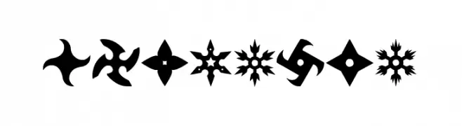
( Fonts by Woodcutter )
A bold decorative font featuring shuriken silhouettes as glyphs.
 Scaricare 475 Downloads@WebFont
 -
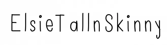
( Font by ElsieLarson - www.abeautifulmess.com )
A playful, hand-drawn font with tall, slender characters and a modern look.
![ElsieTallnSkinny font caratteri gratis]() Scaricare 475 Downloads@WebFont
Scaricare 475 Downloads@WebFont -
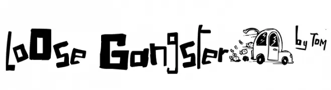
( Fonts by Tn2 - TOM )
A bold, graffiti-inspired font with a playful, rebellious edge.
![LoOse Gangsterµ* font caratteri gratis]() Scaricare 475 Downloads@WebFont
Scaricare 475 Downloads@WebFont -
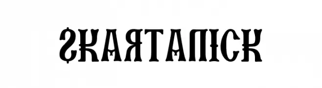
Caratteri di Skartanic. For commercial use please contact the owner.
![SKARTANICK font caratteri gratis]() Scaricare 475 Downloads@WebFont
Scaricare 475 Downloads@WebFont -
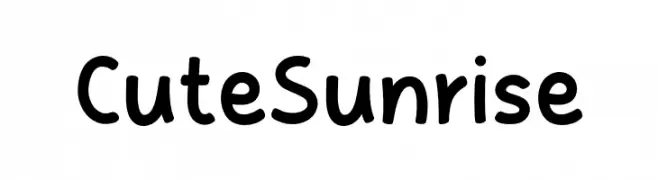
( Fonts by MJType )
A playful, rounded font with a hand-drawn feel and friendly appearance.
![Cute Sunrise font caratteri gratis]() Scaricare 475 Downloads@WebFont
Scaricare 475 Downloads@WebFont -
-
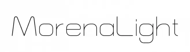
( Fonts by NirvanType - Personal-use only. For commercial use please contact owner. )
A sleek, modern font with thin, geometric lines and a minimalist style.
![Morena Light font caratteri gratis]() Scaricare 475 Downloads@WebFont
Scaricare 475 Downloads@WebFont -
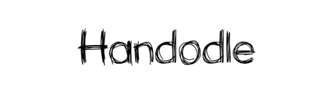
( Fonts by PutraCetol Studio - www.putracetol.com - Personal-use only. For commercial use please contact owner. )
A sketch-like, hand-drawn font with dynamic, jagged strokes.
![Handodle font caratteri gratis]() Scaricare 475 Downloads@WebFont
Scaricare 475 Downloads@WebFont -
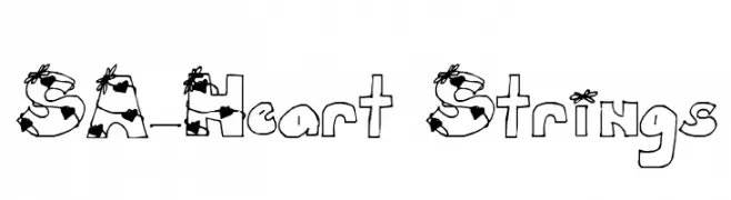
![SA-Heart Strings font caratteri gratis]() Scaricare 475 Downloads@WebFont
Scaricare 475 Downloads@WebFont -
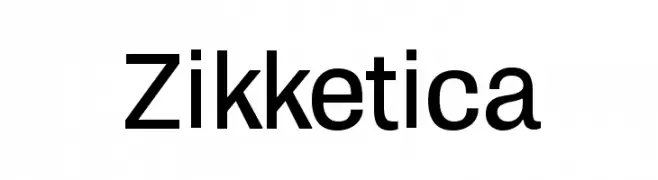
![Zikketica font caratteri gratis]() Scaricare 475 Downloads@WebFont
Scaricare 475 Downloads@WebFont -
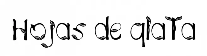
( Fonts by Jose Tijerín )
A decorative font with leaf-like embellishments on each character.
![Hojas de plata font caratteri gratis]() Scaricare 475 Downloads@WebFont
Scaricare 475 Downloads@WebFont
Quali sono i font più popolari adesso?
Poppins, Roboto, Montserrat, Open Sans e Lato sono molto usati per le forme pulite e l'ampia applicabilità — dall'identità di marca alle landing page e ai poster.
Quali font si usano spesso nei loghi?
Le sans serif geometriche (es. Poppins, famiglie in stile Gotham) sono scelte comuni per un branding pulito e scalabile. Per un tocco personale restano valide script e stili manoscritti. Abbina un display deciso per i titoli a un corpo testo neutro per riconoscibilità ed equilibrio.
Ogni quanto si aggiorna la lista?
Con regolarità, in base ai download e all'attività reale. Torna spesso per scoprire in anticipo le nuove preferite.
💡 Consiglio: aggiungi ai preferiti — le tendenze cambiano in fretta e i font top di oggi possono ispirare il rebranding di domani.