Benvenuto nelle Font Più Popolari — dove popolarità e qualità si incontrano. Qui trovi i font più scaricati e usati dell'anno. Se cerchi scelte sicure per logo, web o social, inizia da qui.
Ogni font top si distingue per equilibrio, leggibilità e versatilità. Troverai sans serif moderne, script eleganti, serif vintage e display minimalisti.
-
( Fonts by www.graphicartsunit.com - Personal-use only. For commercial use please contact owner. )
A bold, rounded font with a playful and modern style.
 Scaricare 471 Downloads@WebFont
 -
( Fonts by www.fontalicious.com )
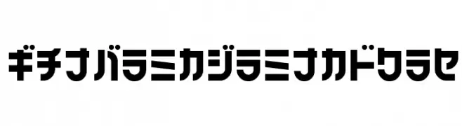
A futuristic, geometric font with bold, blocky letterforms and consistent stroke width.
![Alpha Niner font caratteri gratis]() Scaricare 471 Downloads@WebFont
Scaricare 471 Downloads@WebFont -
( Fonts by Diego Inacio - Personal-use only. For commercial use please contact owner. )
A bold, geometric font with sharp angles and a modern aesthetic.
![Victoire font caratteri gratis]() Scaricare 471 Downloads@WebFont
Scaricare 471 Downloads@WebFont -
( Fonts by Forberas Club )
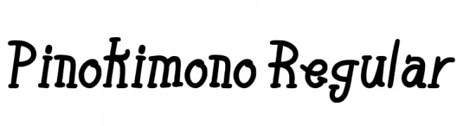
A playful, handwritten-style font with bold, rounded characters.
![Pinokimono Regular font caratteri gratis]() Scaricare 471 Downloads@WebFont
Scaricare 471 Downloads@WebFont -
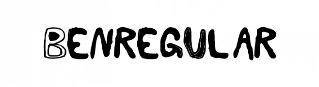
![BenRegular font caratteri gratis]() Scaricare 471 Downloads@WebFont
Scaricare 471 Downloads@WebFont -
-
( Fonts by Castcraft Software - OPTI Fonts Archive - opti.netii.net - Personal-use only. For commercial use please contact owner. )
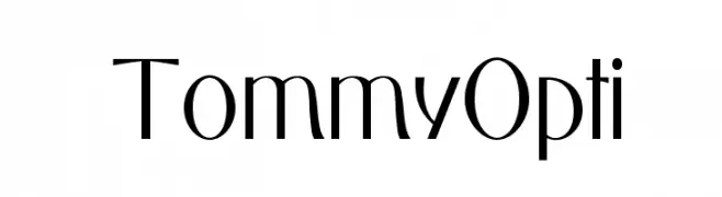
A modern, geometric font with elegant, sleek lines and a sophisticated style.
![TommyOpti font caratteri gratis]() Scaricare 471 Downloads@WebFont
Scaricare 471 Downloads@WebFont -
![Linux Biolinum O Italic font caratteri gratis]() Scaricare 471 Downloads@WebFont
Scaricare 471 Downloads@WebFont -
( Fonts by Paul Lloyd )
A bold, condensed font with a vintage style, perfect for impactful designs.
![DuvallSmallCapsCondensed font caratteri gratis]() Scaricare 471 Downloads@WebFont
Scaricare 471 Downloads@WebFont -
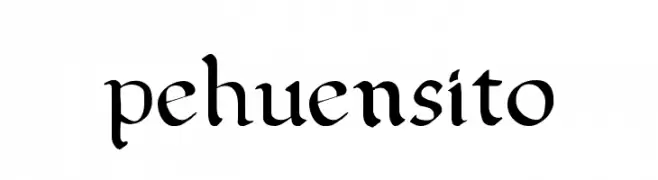
( Font by Pehuen Ciastkowski )
An elegant, calligraphic font with flowing, angular strokes.
![pehuensito font caratteri gratis]() Scaricare 471 Downloads@WebFont
Scaricare 471 Downloads@WebFont -
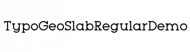
( Fonts by www.studiotypo.com - Personal-use only. For commercial use please contact owner. )
A geometric slab serif font with strong, block-like serifs and consistent stroke widths.
![Typo GeoSlab Regular Demo font caratteri gratis]() Scaricare 471 Downloads@WebFont
Scaricare 471 Downloads@WebFont


Quali sono i font più popolari adesso?
Poppins, Roboto, Montserrat, Open Sans e Lato sono molto usati per le forme pulite e l'ampia applicabilità — dall'identità di marca alle landing page e ai poster.
Quali font si usano spesso nei loghi?
Le sans serif geometriche (es. Poppins, famiglie in stile Gotham) sono scelte comuni per un branding pulito e scalabile. Per un tocco personale restano valide script e stili manoscritti. Abbina un display deciso per i titoli a un corpo testo neutro per riconoscibilità ed equilibrio.
Ogni quanto si aggiorna la lista?
Con regolarità, in base ai download e all'attività reale. Torna spesso per scoprire in anticipo le nuove preferite.
💡 Consiglio: aggiungi ai preferiti — le tendenze cambiano in fretta e i font top di oggi possono ispirare il rebranding di domani.