Benvenuto nelle Font Più Popolari — dove popolarità e qualità si incontrano. Qui trovi i font più scaricati e usati dell'anno. Se cerchi scelte sicure per logo, web o social, inizia da qui.
Ogni font top si distingue per equilibrio, leggibilità e versatilità. Troverai sans serif moderne, script eleganti, serif vintage e display minimalisti.
-
( Fonts by iqrotype - iqrologo - Personal-use only. For commercial use please contact owner. )
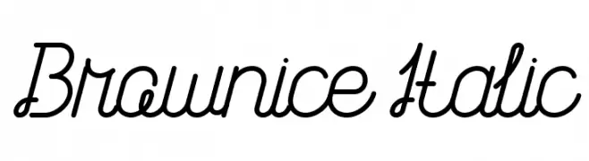
A playful, modern script font with smooth, connected characters and decorative loops.
 Scaricare 74 Downloads@WebFont
 -
( Hazel Abbiati - diamondidiocy.tumblr.com )
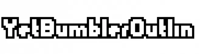
A bold, blocky, outlined font with a retro, pixelated style.
![YetBumblerOutlin font caratteri gratis]() Scaricare 74 Downloads@WebFont
Scaricare 74 Downloads@WebFont -
( Eva Barabasne Olasz - www.etsy.com/ie/shop/digitaltypefaces )
A whimsical, nature-inspired font with leaf embellishments and flowing strokes.
![Leafyction Demo font caratteri gratis]() Scaricare 74 Downloads@WebFont
Scaricare 74 Downloads@WebFont -
( Kinema Moon Graphics - www.kinemamoon.com/ )
A playful, bold font with rounded, loop-like terminals.
![Looper Regular E. font caratteri gratis]() Scaricare 74 Downloads@WebFont
Scaricare 74 Downloads@WebFont -
( Fonts by Alex Tomlinson - Skyhaven Fonts - shfonts.com )
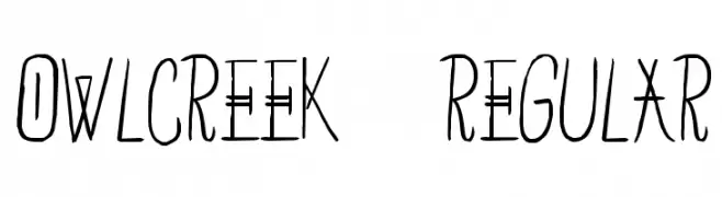
A playful, hand-drawn font with tall, narrow characters and a whimsical style.
![OwlCreek-Regular font caratteri gratis]() Scaricare 74 Downloads@WebFont
Scaricare 74 Downloads@WebFont -
( Out Of Step Font Company - outofstepfontco.com )
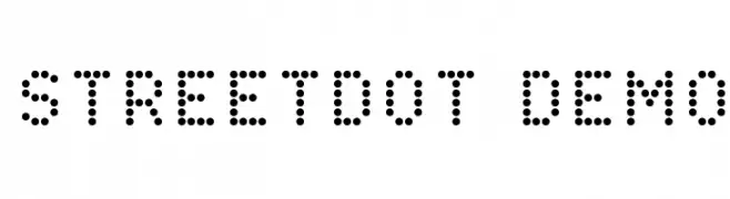
A modern, dotted font perfect for creative and playful designs.
![StreetDot Demo font caratteri gratis]() Scaricare 74 Downloads@WebFont
Scaricare 74 Downloads@WebFont -
( Fonts by Moh Amirulah )
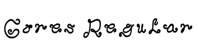
A decorative and whimsical font with intricate swirls and loops.
![Gores Regular font caratteri gratis]() Scaricare 74 Downloads@WebFont
Scaricare 74 Downloads@WebFont -
( Fonts by Lemon Studio Type - Herpin Maulana - Personal-use only. For commercial use please contact owner. )
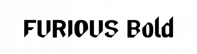
A bold, angular font with a modern and powerful aesthetic.
![FURIOUS-Bold font caratteri gratis]() Scaricare 74 Downloads@WebFont
Scaricare 74 Downloads@WebFont -
( Thirtypath - www.thirtypath.com )
An elegant, flowing script font with delicate, interconnected strokes.
![terranika font caratteri gratis]() Scaricare 74 Downloads@WebFont
Scaricare 74 Downloads@WebFont -
( Fonts by 212 fonts - Elizabeth - Personal-use only. For commercial use please contact owner. )
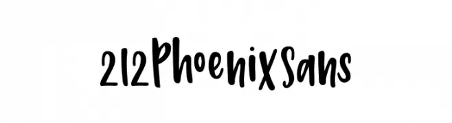
A bold, playful handwritten font with dynamic curves and a friendly style.
![212 Phoenix Sans font caratteri gratis]() Scaricare 74 Downloads@WebFont
Scaricare 74 Downloads@WebFont -
( Fonts by Moch Zaenal Abidin - Personal-use only. For commercial use please contact owner. )
A playful, handwritten font with rounded, consistent strokes and a casual feel.
![Human Right font caratteri gratis]() Scaricare 74 Downloads@WebFont
Scaricare 74 Downloads@WebFont -
( Iconian Fonts - Daniel Zadorozny - www.iconian.com )
A bold, geometric stencil-style font with a modern, industrial look.
![Questlok Condensed font caratteri gratis]() Scaricare 74 Downloads@WebFont
Scaricare 74 Downloads@WebFont -
( Vladimir Nikolic - www.coroflot.com/vladimirnikolic )
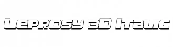
Bold, 3D italic font with a futuristic and dynamic style.
![Leprosy 3D Italic font caratteri gratis]() Scaricare 74 Downloads@WebFont
Scaricare 74 Downloads@WebFont -
( Fonts by Edric Studio www.creativefabrica.com/designer/edricstudio/ - Personal-use only. For commercial use please contact owner. )
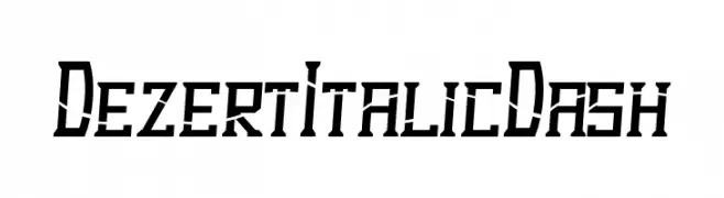
A bold, angular italic font with a futuristic and edgy design.
![Dezert Italic Dash font caratteri gratis]() Scaricare 74 Downloads@WebFont
Scaricare 74 Downloads@WebFont -
( Fonts by AlifRyanZulfikar - Personal-use only. For commercial use please contact owner. )
A playful, bold script font with a hand-drawn, whimsical style.
![Highlove -Personal Use font caratteri gratis]() Scaricare 74 Downloads@WebFont
Scaricare 74 Downloads@WebFont -
( Fonts by Elegantype Studio - Personal-use only. For commercial use please contact owner. )
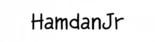
A playful, casual handwritten font with smooth, rounded edges and consistent stroke width.
![HamdanJr font caratteri gratis]() Scaricare 74 Downloads@WebFont
Scaricare 74 Downloads@WebFont -
( Fonts by Manuel Ramos - www.infinitismo.com - Personal-use only. For commercial use please contact owner. )
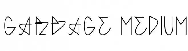
A modern, geometric font with angular, abstract letterforms.
![GARBAGE MEDIUM font caratteri gratis]() Scaricare 74 Downloads@WebFont
Scaricare 74 Downloads@WebFont -
( Fonts by Lemon Studio Type - Herpin Maulana - Personal-use only. For commercial use please contact owner. )
A bold, modern sans-serif font with clean lines and strong legibility.
![borneo Bold font caratteri gratis]() Scaricare 74 Downloads@WebFont
Scaricare 74 Downloads@WebFont -
( weknow - Wino S Kadir - www.creativefabrica.com/designer/weknow/ )
A bold, italicized retro font with an antique, decorative style.
![Antique Retro Bold Italic font caratteri gratis]() Scaricare 74 Downloads@WebFont
Scaricare 74 Downloads@WebFont -
( Fonts by Wahyu Eka Prasetya - wepfont.com - Personal-use only. For commercial use please contact owner. )
A bold, hand-drawn font with a playful and energetic style.
![Forgave font caratteri gratis]() Scaricare 74 Downloads@WebFont
Scaricare 74 Downloads@WebFont -
Caratteri di letterhanna. For commercial use please contact the owner.
( Free for personal use only. With only $25 You can purchase the basic desktop license: https://letterhanna.com/ )
A clean and elegant font with smooth curves and balanced structure.
![Geraline Free Regular font caratteri gratis]() Scaricare 74 Downloads@WebFont
Scaricare 74 Downloads@WebFont -
( Fonts by Nick Curtis - Personal-use only. For commercial use please contact owner. )
A classic serif font with elegant, well-defined characters and moderate contrast.
![KelmscottRomanNF font caratteri gratis]() Scaricare 74 Downloads@WebFont
Scaricare 74 Downloads@WebFont -
( Fonts by Zetafonts - Personal-use only. For commercial use please contact owner. )
A modern, thin, italicized font with wide letterforms.
![Heading Pro Wide Trial Thin Italic font caratteri gratis]() Scaricare 74 Downloads@WebFont
Scaricare 74 Downloads@WebFont -
( Fonts by Letteratom - Kurniawan Eko - Personal-use only. For commercial use please contact owner. )
A bold, handwritten font with a dynamic and energetic style.
![Ramphox font caratteri gratis]() Scaricare 74 Downloads@WebFont
Scaricare 74 Downloads@WebFont -
( Fonts by Situjuh Nazara - 7ntypes.com - Personal-use only. For commercial use please contact owner. )
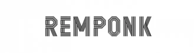
A modern, layered font with parallel lines creating a bold, geometric style.
![REMPONK font caratteri gratis]() Scaricare 74 Downloads@WebFont
Scaricare 74 Downloads@WebFont -
( Fonts by Khurasan - Syaf Rizal - Personal-use only. For commercial use please contact owner. )
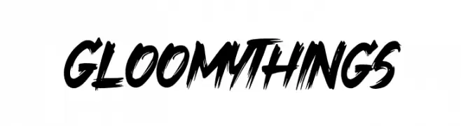
A bold, dynamic brush script font with energetic strokes and expressive forms.
![Gloomy Things font caratteri gratis]() Scaricare 74 Downloads@WebFont
Scaricare 74 Downloads@WebFont -
( Eva Barabasne Olasz - www.etsy.com/ie/shop/digitaltypefaces )
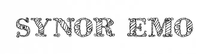
An ornate and decorative font with intricate swirls and embellishments.
![Zsynor Demo font caratteri gratis]() Scaricare 74 Downloads@WebFont
Scaricare 74 Downloads@WebFont -
( Fonts by Edric Studio www.creativefabrica.com/designer/edricstudio/ - Personal-use only. For commercial use please contact owner. )
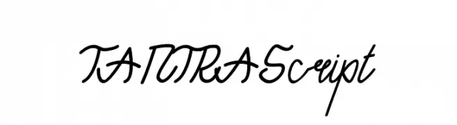
A dynamic, script-like font with fluid, interconnected letters and a personal touch.
![TANTRA Script font caratteri gratis]() Scaricare 74 Downloads@WebFont
Scaricare 74 Downloads@WebFont -
( Fonts by Wojciech Kalinowski "wmk69" (wmk69@o2.pl) - Personal-use only. For commercial use please contact owner. )
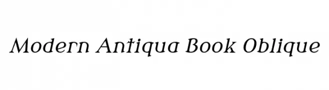
A modern oblique font with classic elegance and moderate stroke contrast.
![Modern Antiqua Book Oblique font caratteri gratis]() Scaricare 74 Downloads@WebFont
Scaricare 74 Downloads@WebFont -
( Fonts by Daniel Zadorozny - www.iconian.com - Personal-use only. For commercial use please contact owner. )
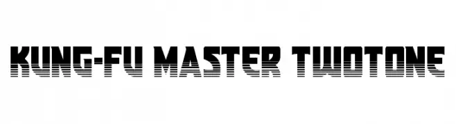
A bold, two-tone font with a retro, arcade-inspired design.
![Kung-Fu Master Twotone font caratteri gratis]() Scaricare 74 Downloads@WebFont
Scaricare 74 Downloads@WebFont -
( Fonts by andfonts - Andrii Shevchyk - Personal-use only. For commercial use please contact owner. )
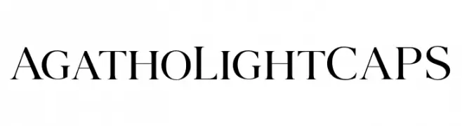
A classic serif font with elegant and refined letterforms.
![AgathoLightCAPS font caratteri gratis]() Scaricare 74 Downloads@WebFont
Scaricare 74 Downloads@WebFont -
( Fonts by Wahyu Eka Prasetya - wepfont.com - Personal-use only. For commercial use please contact owner. )
A bold, hand-drawn font with a rough, textured appearance and dynamic style.
![Ighty Mighty font caratteri gratis]() Scaricare 74 Downloads@WebFont
Scaricare 74 Downloads@WebFont -
( Noto is a trademark of Google Inc. Noto fonts are open source. All Noto fonts are published under the SIL Open Font License, Version 1.1 )
Condensed, bold sans-serif font with modern style.
![Noto Sans Ethiopic Condensed Black font caratteri gratis]() Scaricare 74 Downloads@WebFont
Scaricare 74 Downloads@WebFont -
( Fonts by Javatype Studio - Tio Yulianto - Personal-use only. For commercial use please contact owner. )
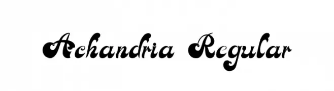
An ornate and decorative font with high contrast and elaborate details.
![Achandria Regular font caratteri gratis]() Scaricare 74 Downloads@WebFont
Scaricare 74 Downloads@WebFont -
( Fonts by Kong Font - fontkong.com - Personal-use only. For commercial use please contact owner. )
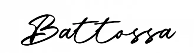
A dynamic and fluid cursive font with elegant, interconnected letters.
![Battossa font caratteri gratis]() Scaricare 74 Downloads@WebFont
Scaricare 74 Downloads@WebFont


Quali sono i font più popolari adesso?
Poppins, Roboto, Montserrat, Open Sans e Lato sono molto usati per le forme pulite e l'ampia applicabilità — dall'identità di marca alle landing page e ai poster.
Quali font si usano spesso nei loghi?
Le sans serif geometriche (es. Poppins, famiglie in stile Gotham) sono scelte comuni per un branding pulito e scalabile. Per un tocco personale restano valide script e stili manoscritti. Abbina un display deciso per i titoli a un corpo testo neutro per riconoscibilità ed equilibrio.
Ogni quanto si aggiorna la lista?
Con regolarità, in base ai download e all'attività reale. Torna spesso per scoprire in anticipo le nuove preferite.
💡 Consiglio: aggiungi ai preferiti — le tendenze cambiano in fretta e i font top di oggi possono ispirare il rebranding di domani.