Benvenuto nelle Font Più Popolari — dove popolarità e qualità si incontrano. Qui trovi i font più scaricati e usati dell'anno. Se cerchi scelte sicure per logo, web o social, inizia da qui.
Ogni font top si distingue per equilibrio, leggibilità e versatilità. Troverai sans serif moderne, script eleganti, serif vintage e display minimalisti.
-
 Scaricare 75 Downloads@WebFont
 -
( Fonts by Peter Wiegel - www.peter-wiegel.de - Personal-use only. For commercial use please contact owner. )
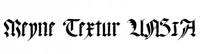
A traditional blackletter font with intricate, high-contrast strokes and ornate details.
![Meyne Textur UNZ1A font caratteri gratis]() Scaricare 75 Downloads@WebFont
Scaricare 75 Downloads@WebFont -
( Fonts by Wino S Kadir - weknow - www.revolge.com/shop/weknow/ - Personal-use only. For commercial use please contact owner. )
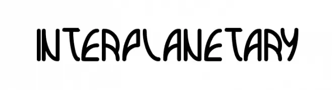
A futuristic, geometric font with bold, rounded letterforms.
![interplanetary font caratteri gratis]() Scaricare 75 Downloads@WebFont
Scaricare 75 Downloads@WebFont -
( Iconian Fonts - Daniel Zadorozny - www.iconian.com )
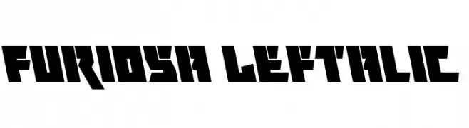
A bold, angular font with a futuristic and industrial design.
![Metal Storm Leftalic font caratteri gratis]() Scaricare 75 Downloads@WebFont
Scaricare 75 Downloads@WebFont -
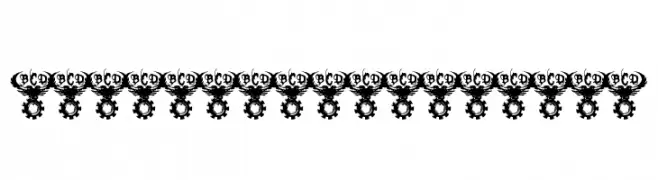
( Dingbat Dungeon )
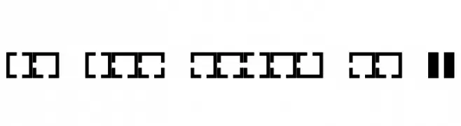
A decorative, maze-like font with bold, geometric patterns.
![Maze Maker Inverted Level 1F font caratteri gratis]() Scaricare 75 Downloads@WebFont
Scaricare 75 Downloads@WebFont -
( Gaut Fonts - moorstation.org/typoasis/designers/gaut/index.htm )
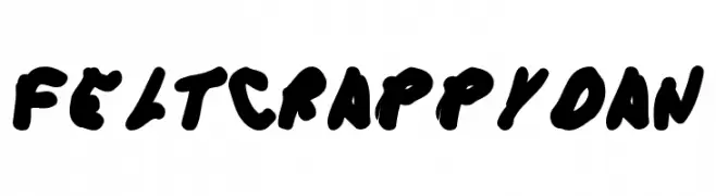
A bold, playful font with thick, rounded strokes and a hand-drawn feel.
![FeltCrappyDan font caratteri gratis]() Scaricare 75 Downloads@WebFont
Scaricare 75 Downloads@WebFont -
( Fonts by Fonta Benka )
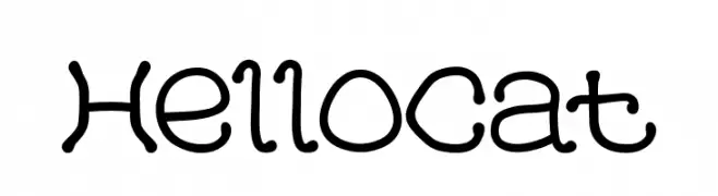
A playful, hand-drawn font with rounded edges and a whimsical style.
![HelloCat font caratteri gratis]() Scaricare 75 Downloads@WebFont
Scaricare 75 Downloads@WebFont -
( Fonts by Faqih Fawaji - Personal-use only. For commercial use please contact owner. )
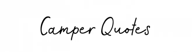
A casual, handwritten font with a playful and friendly style.
![Camper Quotes font caratteri gratis]() Scaricare 75 Downloads@WebFont
Scaricare 75 Downloads@WebFont -
( Fonts by Allouse Studio - Personal-use only. For commercial use please contact owner. )
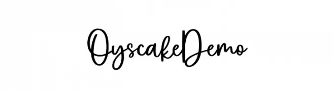
A playful handwritten font with flowing, connected letterforms.
![Oyscake Demo font caratteri gratis]() Scaricare 75 Downloads@WebFont
Scaricare 75 Downloads@WebFont -
( Fonts by Bangkit Tri Setiadi - Personal-use only. For commercial use please contact owner. )
A fluid and elegant script font with smooth, flowing lines.
![Heatting font caratteri gratis]() Scaricare 75 Downloads@WebFont
Scaricare 75 Downloads@WebFont -
( Fontscafe.com - fontscafe.com/ )
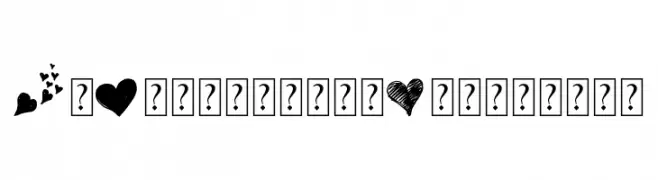
A decorative, heart-themed font with romantic symbols and phrases.
![MyValentinesLove-demo font caratteri gratis]() Scaricare 75 Downloads@WebFont
Scaricare 75 Downloads@WebFont -
( Iconian Fonts - Daniel Zadorozny - www.iconian.com )
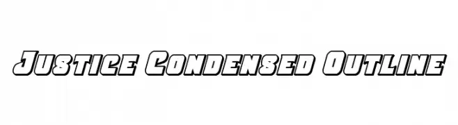
A bold, condensed font with an outlined style, perfect for impactful headlines.
![Justice Condensed Outline font caratteri gratis]() Scaricare 75 Downloads@WebFont
Scaricare 75 Downloads@WebFont -
( Iconian Fonts - Daniel Zadorozny - www.iconian.com )
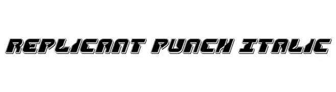
A bold, italicized font with a futuristic and mechanical design.
![Replicant Punch Italic font caratteri gratis]() Scaricare 75 Downloads@WebFont
Scaricare 75 Downloads@WebFont -
( Helldunkel - www.helldunkel.com )
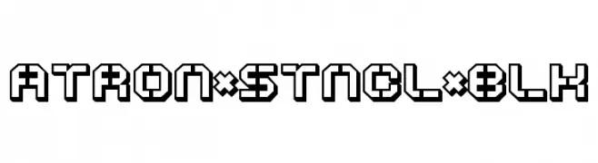
A bold, geometric stencil font with a futuristic, industrial style.
![ATRON*STNCL*BLK font caratteri gratis]() Scaricare 75 Downloads@WebFont
Scaricare 75 Downloads@WebFont -
( Fonts by nariswari_creative - Taufik Dwi Purnomo - Personal-use only. For commercial use please contact owner. )
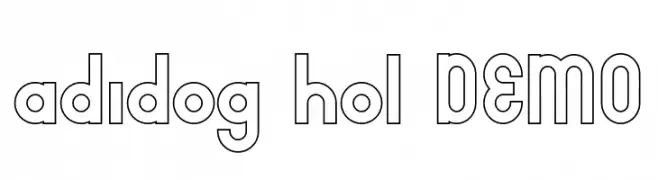
A bold, geometric outlined font with a modern and playful style.
![adidog hol DEMO font caratteri gratis]() Scaricare 75 Downloads@WebFont
Scaricare 75 Downloads@WebFont -
( Iconian Fonts - Daniel Zadorozny - www.iconian.com )
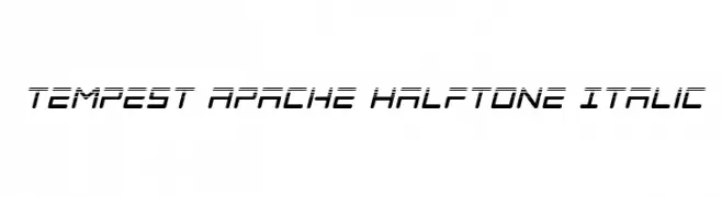
A futuristic, italicized font with a halftone effect and geometric design.
![Tempest Apache Halftone Italic font caratteri gratis]() Scaricare 75 Downloads@WebFont
Scaricare 75 Downloads@WebFont -
( Fonts by Daniel Zadorozny - www.iconian.com - Personal-use only. For commercial use please contact owner. )
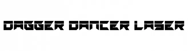
A bold, geometric font with a futuristic and modern aesthetic.
![Dagger Dancer Laser font caratteri gratis]() Scaricare 75 Downloads@WebFont
Scaricare 75 Downloads@WebFont -
( Fonts by Vladimir Nikolic - www.creativefabrica.com/designer/vladimirnikolic/ - Personal-use only. For commercial use please contact owner. )
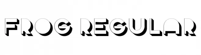
A bold, geometric font with a three-dimensional effect and clean lines.
![Frog Regular font caratteri gratis]() Scaricare 75 Downloads@WebFont
Scaricare 75 Downloads@WebFont -
( Fonts by Greg Medina - www.dcoxy.com - Personal-use only. For commercial use please contact owner. )
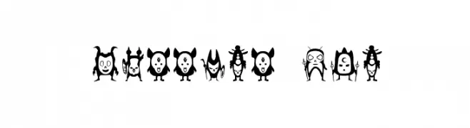
A decorative dingbat font of whimsical warrior and tribal characters.
![warrior dco font caratteri gratis]() Scaricare 75 Downloads@WebFont
Scaricare 75 Downloads@WebFont -
( Fonts by Bolt Cutter - www.boltcutterdesign.com - Personal-use only. For commercial use please contact owner. )
A bold, decorative font with a steampunk, industrial aesthetic.
![TEK HED AGGRESIVE font caratteri gratis]() Scaricare 75 Downloads@WebFont
Scaricare 75 Downloads@WebFont -
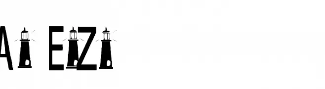
( Fonts by Adult Ramblings - Anastacia E. Zittel - Personal-use only. For commercial use please contact owner. )
A decorative font with a lighthouse motif integrated into each letter, ideal for nautical themes.
![AEZ seascape font caratteri gratis]() Scaricare 75 Downloads@WebFont
Scaricare 75 Downloads@WebFont -
( Font Emporium - web.archive.org/web/20020126112915/www.fontemporium.com/ )
A bold, rugged font with jagged edges and a distressed appearance.
![StinkFisty Small Caps font caratteri gratis]() Scaricare 75 Downloads@WebFont
Scaricare 75 Downloads@WebFont -
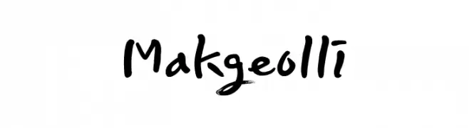
( Personal-use only. For commercial use please contact owner. )
Casual handwritten font with brush-like strokes.
![Makgeolli font caratteri gratis]() Scaricare 75 Downloads@WebFont
Scaricare 75 Downloads@WebFont -
( Levi Szekeres - www.loremipsum.ro )
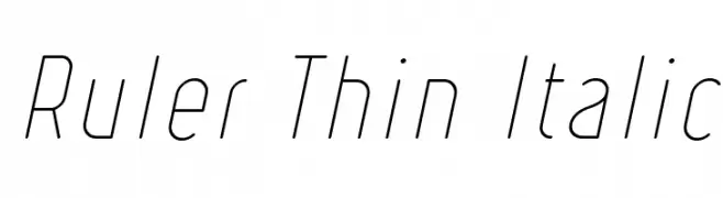
A sleek, modern, and thin italic font with elongated letterforms.
![Ruler Thin Italic font caratteri gratis]() Scaricare 75 Downloads@WebFont
Scaricare 75 Downloads@WebFont -
( Fonts by Daniel Zadorozny - www.iconian.com - Personal-use only. For commercial use please contact owner. )
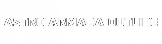
A futuristic, geometric outline font with a bold and angular design.
![Astro Armada Outline font caratteri gratis]() Scaricare 75 Downloads@WebFont
Scaricare 75 Downloads@WebFont -
( Fonts by Hanoded - David Kerkhoff - Personal-use only. For commercial use please contact owner. )
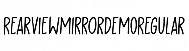
A playful, handwritten font with smooth, rounded edges and a casual style.
![Rearview Mirror DEMO Regular font caratteri gratis]() Scaricare 75 Downloads@WebFont
Scaricare 75 Downloads@WebFont -
( Fonts by Kurnia Setyadi - Personal-use only. For commercial use please contact owner. )
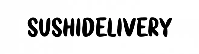
A bold, playful font with a hand-drawn, casual style.
![Sushi Delivery font caratteri gratis]() Scaricare 75 Downloads@WebFont
Scaricare 75 Downloads@WebFont -
( Iconian Fonts - Daniel Zadorozny - www.iconian.com )
A bold, futuristic font with a gradient effect created by horizontal lines.
![Ozda Gradient font caratteri gratis]() Scaricare 75 Downloads@WebFont
Scaricare 75 Downloads@WebFont -
( Fonts by Bexxtype - Personal-use only. For commercial use please contact owner. )
A decorative cursive font with elegant, flowing characters.
![flashlight font caratteri gratis]() Scaricare 75 Downloads@WebFont
Scaricare 75 Downloads@WebFont -
( Fonts by www.woodcutter.es - woodcutter Manero - Personal-use only. For commercial use please contact owner. )
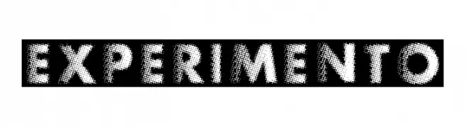
A bold, decorative font with a halftone dot pattern, ideal for vintage or pop art designs.
![Experimento font caratteri gratis]() Scaricare 75 Downloads@WebFont
Scaricare 75 Downloads@WebFont -
( Fonts by Letterafa Studio )
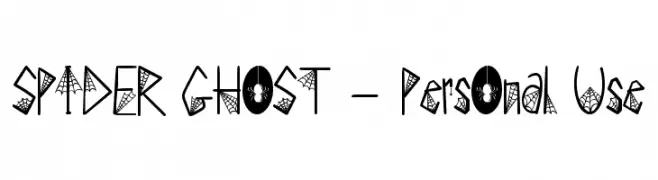
A spooky, web-themed decorative font perfect for Halloween designs.
![SPIDER GHOST - Personal Use font caratteri gratis]() Scaricare 75 Downloads@WebFont
Scaricare 75 Downloads@WebFont -
( Fonts by Daniel Zadorozny - www.iconian.com - Personal-use only. For commercial use please contact owner. )
A futuristic, bold, semi-italic font with sharp angles and smooth curves.
![Vertical Horizon Semi-Italic font caratteri gratis]() Scaricare 75 Downloads@WebFont
Scaricare 75 Downloads@WebFont -
( Motokiwo - Anton Cahyono - creativemarket.com/Motokiwo?u=Motokiwo )
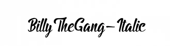
A bold, italic script font with dynamic curves and a lively style.
![BillyTheGang-Italic font caratteri gratis]() Scaricare 75 Downloads@WebFont
Scaricare 75 Downloads@WebFont -
( Copyright 2018 The Kodchasan Project Authors (https://github.com/cadsondemak/Kodchasan) )
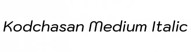
A modern, rounded italic font with a friendly and dynamic style.
![Kodchasan Medium Italic font caratteri gratis]() Scaricare 75 Downloads@WebFont
Scaricare 75 Downloads@WebFont -
( Fonts by Don Marciano - Personal-use only. For commercial use please contact owner. )
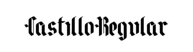
A bold blackletter font with intricate, angular letterforms and a gothic flair.
![CastilloRegular font caratteri gratis]() Scaricare 75 Downloads@WebFont
Scaricare 75 Downloads@WebFont


Quali sono i font più popolari adesso?
Poppins, Roboto, Montserrat, Open Sans e Lato sono molto usati per le forme pulite e l'ampia applicabilità — dall'identità di marca alle landing page e ai poster.
Quali font si usano spesso nei loghi?
Le sans serif geometriche (es. Poppins, famiglie in stile Gotham) sono scelte comuni per un branding pulito e scalabile. Per un tocco personale restano valide script e stili manoscritti. Abbina un display deciso per i titoli a un corpo testo neutro per riconoscibilità ed equilibrio.
Ogni quanto si aggiorna la lista?
Con regolarità, in base ai download e all'attività reale. Torna spesso per scoprire in anticipo le nuove preferite.
💡 Consiglio: aggiungi ai preferiti — le tendenze cambiano in fretta e i font top di oggi possono ispirare il rebranding di domani.