Benvenuto nelle Font Più Popolari — dove popolarità e qualità si incontrano. Qui trovi i font più scaricati e usati dell'anno. Se cerchi scelte sicure per logo, web o social, inizia da qui.
Ogni font top si distingue per equilibrio, leggibilità e versatilità. Troverai sans serif moderne, script eleganti, serif vintage e display minimalisti.
-
( Fonts by Edric Studio - Personal-use only. For commercial use please contact owner. )
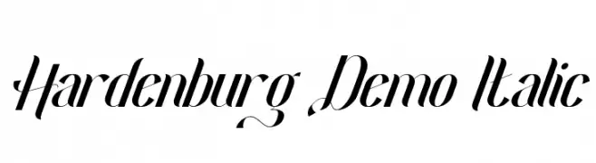
A sophisticated, elegant cursive script with modern and classic elements.
 Scaricare 75 Downloads@WebFont
 -
( Fonts by Aksoro 99 - Wahyu Nugroho - Personal-use only. For commercial use please contact owner. )
A playful, hand-drawn font with bold, flowing strokes and a whimsical style.
![Monash font caratteri gratis]() Scaricare 75 Downloads@WebFont
Scaricare 75 Downloads@WebFont -
( Fonts by Vunira Design - Personal-use only. For commercial use please contact owner. )
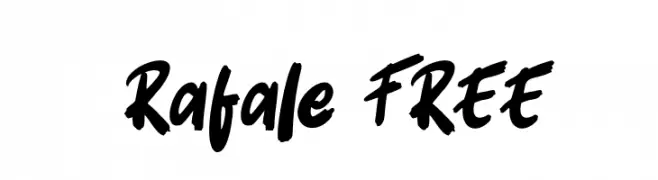
A bold, dynamic handwritten font with brush-like strokes and a casual, energetic style.
![Rafale FREE font caratteri gratis]() Scaricare 75 Downloads@WebFont
Scaricare 75 Downloads@WebFont -
( Fonts by Atjcloth Studio - Hanif Syahputra - Personal-use only. For commercial use please contact owner. )
A playful and elegant script font with fluid, connected letterforms.
![The Amstrong font caratteri gratis]() Scaricare 75 Downloads@WebFont
Scaricare 75 Downloads@WebFont -
( Fonts by a Max Infeld - XEROGRAPHER FONTS - xerographer.blogspot.com . Personal-use only. For commercial use please contact owner. )
A chaotic, distressed font with irregular, jagged strokes and a raw, emotional style.
![LoathingFear font caratteri gratis]() Scaricare 75 Downloads@WebFont
Scaricare 75 Downloads@WebFont -
( Fonts by Wino S Kadir - weknow - www.revolge.com/shop/weknow/ - Personal-use only. For commercial use please contact owner. )
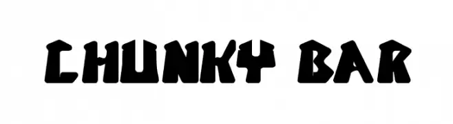
A bold, playful font with chunky, geometric letters.
![CHUNKY BAR font caratteri gratis]() Scaricare 75 Downloads@WebFont
Scaricare 75 Downloads@WebFont -
( Fonts by CannotIntoSpaceFonts - KineticPlasma Fonts - Personal-use only. For commercial use please contact owner. )
A bold, angular, and oblique font with a futuristic and edgy style.
![Stormning Bold Oblique font caratteri gratis]() Scaricare 75 Downloads@WebFont
Scaricare 75 Downloads@WebFont -
( Fonts by Muhammad Yafinuha )
Hand-drawn, sketch-style arrows and symbols with a casual, informal look.
![Ardot font caratteri gratis]() Scaricare 75 Downloads@WebFont
Scaricare 75 Downloads@WebFont -
( Fonts by Billy Argel Fonts ® )
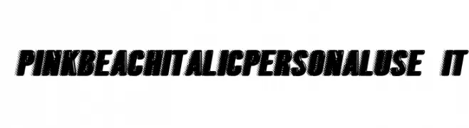
A bold, italic font with a halftone texture and dynamic style.
![PINKBEACHITALICPERSONALUSE-It font caratteri gratis]() Scaricare 75 Downloads@WebFont
Scaricare 75 Downloads@WebFont -
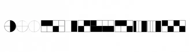
( kimberlygeswein.com )
Geometric pictogram font illustrating fractions with filled and outlined segments.
![KG Fractions font caratteri gratis]() Scaricare 75 Downloads@WebFont
Scaricare 75 Downloads@WebFont -
( Font Nook - www.geocities.com/weakestlink11/ )
A whimsical font with cherub illustrations accompanying each character.
![Cupidity font caratteri gratis]() Scaricare 75 Downloads@WebFont
Scaricare 75 Downloads@WebFont -
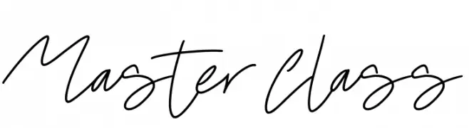
( Fonts by JSH creates )
Handwritten cursive script font.
![Master Class font caratteri gratis]() Scaricare 75 Downloads@WebFont
Scaricare 75 Downloads@WebFont -
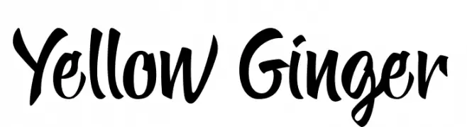
( Fonts by endemiqLabs - Personal-use only. For commercial use please contact owner. )
A bold, expressive handwritten font with a lively and energetic style.
![Yellow Ginger font caratteri gratis]() Scaricare 75 Downloads@WebFont
Scaricare 75 Downloads@WebFont -
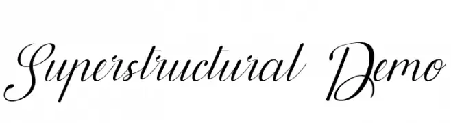
( Fonts by Noah Type - noahtype.com - Personal-use only. For commercial use please contact owner. )
An elegant script font with flowing, cursive letterforms and delicate swashes.
![Superstructural Demo font caratteri gratis]() Scaricare 75 Downloads@WebFont
Scaricare 75 Downloads@WebFont -
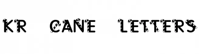
( Fonts by Kat`s Fun Fonts - Personal-use only. For commercial use please contact owner. )
A playful, candy cane-inspired decorative font with bold, striped letters.
![KR Cane Letters font caratteri gratis]() Scaricare 75 Downloads@WebFont
Scaricare 75 Downloads@WebFont -
( Fonts by Kat`s Fun Fonts - Personal-use only. For commercial use please contact owner. )
A decorative font with Valentine-themed illustrations.
![KR Valentines 2006 font caratteri gratis]() Scaricare 75 Downloads@WebFont
Scaricare 75 Downloads@WebFont -
( imagex - www.imagex-fonts.com )
Hand-drawn decorative font with playful tree illustrations.
![Trees Friends font caratteri gratis]() Scaricare 75 Downloads@WebFont
Scaricare 75 Downloads@WebFont -
( Fonts by Letterara - Thomas Aradea - Personal-use only. For commercial use please contact owner. )
An elegant, flowing script font with bold, expressive strokes.
![Mabelle font caratteri gratis]() Scaricare 75 Downloads@WebFont
Scaricare 75 Downloads@WebFont -
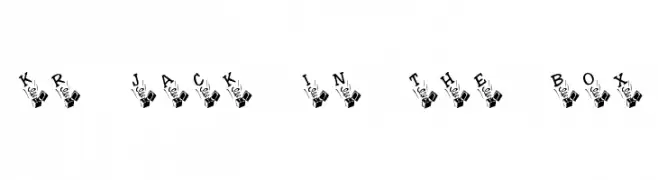
( Fonts by Kat`s Fun Fonts - Personal-use only. For commercial use please contact owner. )
A playful font with letters emerging from jack-in-the-boxes, perfect for whimsical designs.
![KR Jack In The Box font caratteri gratis]() Scaricare 75 Downloads@WebFont
Scaricare 75 Downloads@WebFont -
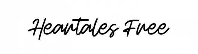
( Fonts by Maulana Creative - Gilang Maulana - Personal-use only. For commercial use please contact owner. )
A flowing, cursive script font with elegant, interconnected letters.
![Heartales Free font caratteri gratis]() Scaricare 75 Downloads@WebFont
Scaricare 75 Downloads@WebFont -
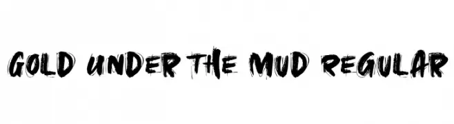
( Fonts by Roland Huse Design - Roland Huse - Personal-use only. For commercial use please contact owner. )
A bold, brushstroke-style font with dynamic and artistic flair.
![Gold Under The Mud Regular font caratteri gratis]() Scaricare 75 Downloads@WebFont
Scaricare 75 Downloads@WebFont -
( Fonts by Vladimir Nikolic - www.creativefabrica.com/designer/vladimirnikolic/ - Personal-use only. For commercial use please contact owner. )
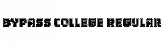
A bold, geometric font with a double-line effect, perfect for standout designs.
![Bypass College Regular font caratteri gratis]() Scaricare 75 Downloads@WebFont
Scaricare 75 Downloads@WebFont -
( Fonts by Wino S Kadir - weknow - www.revolge.com/shop/weknow/ - Personal-use only. For commercial use please contact owner. )
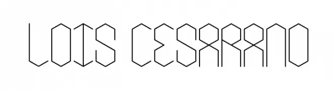
A geometric, hexagonal-themed font with a modern and futuristic style.
![lois Cesarano font caratteri gratis]() Scaricare 75 Downloads@WebFont
Scaricare 75 Downloads@WebFont -
( Fonts by Kat`s Fun Fonts - Personal-use only. For commercial use please contact owner. )
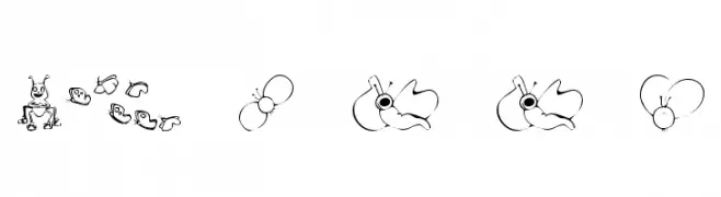
A whimsical font with insect illustrations replacing traditional characters.
![KR Cute As A Bug font caratteri gratis]() Scaricare 75 Downloads@WebFont
Scaricare 75 Downloads@WebFont -
( Fonts by CannotIntoSpaceFonts - KineticPlasma Fonts - Personal-use only. For commercial use please contact owner. )
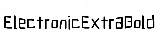
A bold, geometric font with a modern, digital aesthetic.
![Electronic ExtraBold font caratteri gratis]() Scaricare 75 Downloads@WebFont
Scaricare 75 Downloads@WebFont -
( Fonts by StringLabs - stringlabscreative.com - Personal-use only. For commercial use please contact owner. )
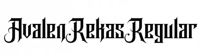
An ornate blackletter style font with decorative flourishes and bold structure.
![Avalen Rekas Regular font caratteri gratis]() Scaricare 75 Downloads@WebFont
Scaricare 75 Downloads@WebFont -
( Fonts by Typodermic Fonts - Raymond Larabie - Personal-use only. For commercial use please contact owner. )
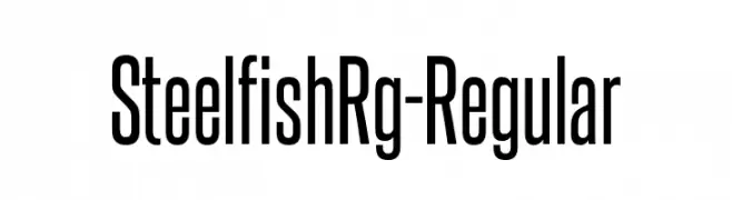
A tall, condensed, and modern font with a sleek and structured appearance.
![SteelfishRg-Regular font caratteri gratis]() Scaricare 75 Downloads@WebFont
Scaricare 75 Downloads@WebFont -
( Fonts by Al Ghul - Personal-use only. For commercial use please contact owner. )
A playful, casual handwritten font with smooth curves and a friendly appearance.
![Heartland font caratteri gratis]() Scaricare 75 Downloads@WebFont
Scaricare 75 Downloads@WebFont -
( Fonts by Azcreative Studio - Abdul Azis - Personal-use only. For commercial use please contact owner. )
A whimsical, angular font with decorative swirls and spikes, perfect for fantasy themes.
![My Witcher font caratteri gratis]() Scaricare 75 Downloads@WebFont
Scaricare 75 Downloads@WebFont -
( Fonts by Letterena Studios - letterena.com - Personal-use only. For commercial use please contact owner. )
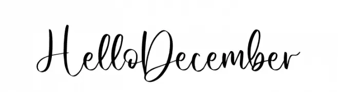
A playful and elegant script font with a handwritten style.
![Hello December font caratteri gratis]() Scaricare 75 Downloads@WebFont
Scaricare 75 Downloads@WebFont -
( Carpenter Type - web.archive.org/web/19981202193132/www.carpentertype.com/ )
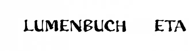
A bold, brush-style font with a hand-drawn, rustic appearance.
![Blumenbuch Beta font caratteri gratis]() Scaricare 75 Downloads@WebFont
Scaricare 75 Downloads@WebFont -
( Fonts by Allouse Studio - Personal-use only. For commercial use please contact owner. )
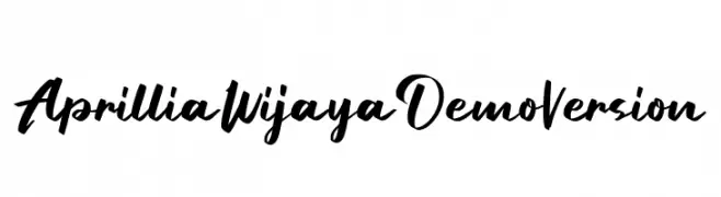
A bold, flowing script font with elegant, dynamic strokes.
![Aprillia Wijaya Demo Version font caratteri gratis]() Scaricare 75 Downloads@WebFont
Scaricare 75 Downloads@WebFont -
( Iconian Fonts - Daniel Zadorozny - www.iconian.com )
A modern, italicized font with a gradient effect and segmented lines.
![Promethean Gradient Italic font caratteri gratis]() Scaricare 75 Downloads@WebFont
Scaricare 75 Downloads@WebFont -
( Fonts by Madatype Studio - Andri Ardianto - Personal-use only. For commercial use please contact owner. )
A bold, dynamic brush script font with expressive, hand-painted strokes.
![Rocket Shield font caratteri gratis]() Scaricare 75 Downloads@WebFont
Scaricare 75 Downloads@WebFont -
( Rifan Asri )
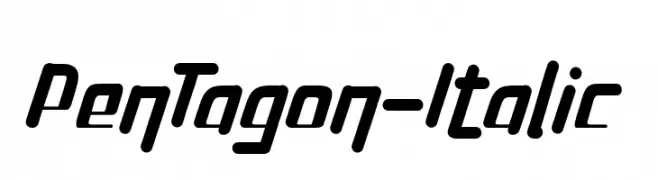
A bold, italic font with a dynamic and modern style.
![PenTagon-Italic font caratteri gratis]() Scaricare 75 Downloads@WebFont
Scaricare 75 Downloads@WebFont


Quali sono i font più popolari adesso?
Poppins, Roboto, Montserrat, Open Sans e Lato sono molto usati per le forme pulite e l'ampia applicabilità — dall'identità di marca alle landing page e ai poster.
Quali font si usano spesso nei loghi?
Le sans serif geometriche (es. Poppins, famiglie in stile Gotham) sono scelte comuni per un branding pulito e scalabile. Per un tocco personale restano valide script e stili manoscritti. Abbina un display deciso per i titoli a un corpo testo neutro per riconoscibilità ed equilibrio.
Ogni quanto si aggiorna la lista?
Con regolarità, in base ai download e all'attività reale. Torna spesso per scoprire in anticipo le nuove preferite.
💡 Consiglio: aggiungi ai preferiti — le tendenze cambiano in fretta e i font top di oggi possono ispirare il rebranding di domani.