Benvenuto nelle Font Più Popolari — dove popolarità e qualità si incontrano. Qui trovi i font più scaricati e usati dell'anno. Se cerchi scelte sicure per logo, web o social, inizia da qui.
Ogni font top si distingue per equilibrio, leggibilità e versatilità. Troverai sans serif moderne, script eleganti, serif vintage e display minimalisti.
-
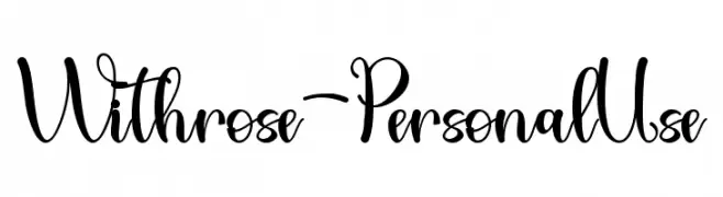
( Fonts by AlifRyanZulfikar - Personal-use only. For commercial use please contact owner. )
A graceful script font with elegant loops and flourishes.
 Scaricare 73 Downloads@WebFont
 -
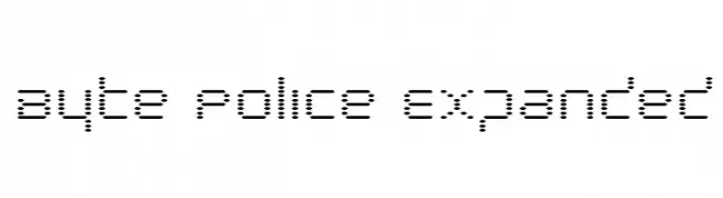
( Iconian Fonts - Daniel Zadorozny - www.iconian.com )
A dot matrix style font with a retro digital display aesthetic.
![Byte Police Expanded font caratteri gratis]() Scaricare 73 Downloads@WebFont
Scaricare 73 Downloads@WebFont -
( Fonts by Gassstype )
A bold, expressive handwritten font with a modern, dynamic style.
![Unofficial font caratteri gratis]() Scaricare 73 Downloads@WebFont
Scaricare 73 Downloads@WebFont -
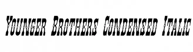
( Fonts by Daniel Zadorozny - www.iconian.com - Free for personal use )
A bold, condensed, and italic font with decorative elements.
![Younger Brothers Condensed Italic font caratteri gratis]() Scaricare 73 Downloads@WebFont
Scaricare 73 Downloads@WebFont -
( Joseph Garcia - www.mdlfngr.biz )
An ornate and decorative font with intricate swirls and flourishes.
![Juiced font caratteri gratis]() Scaricare 73 Downloads@WebFont
Scaricare 73 Downloads@WebFont -
( Fonts by Zetafonts - Personal-use only. For commercial use please contact owner. )
A modern, wide italic font with clean lines and a dynamic style.
![Heading Pro Wide Trial Book Italic font caratteri gratis]() Scaricare 73 Downloads@WebFont
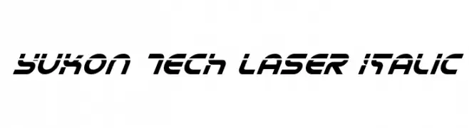
Scaricare 73 Downloads@WebFont -
![Yukon Tech Laser Italic font caratteri gratis]() Scaricare 73 Downloads@WebFont
Scaricare 73 Downloads@WebFont -
( Fonts by Dikas Studio - Andika Setiawan - Personal-use only. For commercial use please contact owner. )
A bold, hand-drawn font with a playful and energetic style.
![Baby Wildy font caratteri gratis]() Scaricare 73 Downloads@WebFont
Scaricare 73 Downloads@WebFont -
( Robert Pfeffer - robert-pfeffer.net/schriftarten/englisch/index.html )
A Gothic-inspired font with angular shapes and pronounced serifs.
![Ulfilas font caratteri gratis]() Scaricare 73 Downloads@WebFont
Scaricare 73 Downloads@WebFont -
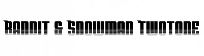
( Fonts by Daniel Zadorozny - www.iconian.com - Personal-use only. For commercial use please contact owner. )
A bold, modern font with a unique two-tone striped effect.
![Bandit & Snowman Twotone font caratteri gratis]() Scaricare 73 Downloads@WebFont
Scaricare 73 Downloads@WebFont -
( Fonts by Marwah Store - Alexe Crisna - Personal-use only. For commercial use please contact owner. )
A playful, artistic script font with flowing, cursive design.
![Andalan art design font caratteri gratis]() Scaricare 73 Downloads@WebFont
Scaricare 73 Downloads@WebFont -
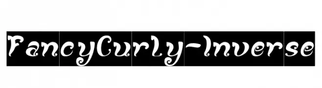
( Fonts by weknow - Wino S Kadir - Personal-use only. For commercial use please contact owner. )
An ornate, curly font with inverse contrast and whimsical design.
![Fancy Curly-Inverse font caratteri gratis]() Scaricare 73 Downloads@WebFont
Scaricare 73 Downloads@WebFont -
( Iconian Fonts - Daniel Zadorozny - www.iconian.com )
A bold, futuristic font with a distinctive striped pattern and geometric shapes.
![Lifeforce Gradient font caratteri gratis]() Scaricare 73 Downloads@WebFont
Scaricare 73 Downloads@WebFont -
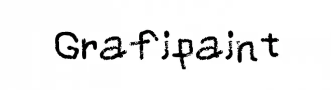
( Extram Studios )
A bold, textured font with a graffiti-like, hand-painted style.
![Grafipaint font caratteri gratis]() Scaricare 73 Downloads@WebFont
Scaricare 73 Downloads@WebFont -
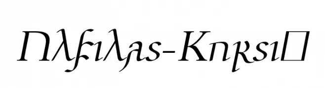
( Robert Pfeffer - robert-pfeffer.net/schriftarten/englisch/index.html )
An elegant cursive font with a dynamic and sophisticated style.
![Ulfilas-Kursiv font caratteri gratis]() Scaricare 73 Downloads@WebFont
Scaricare 73 Downloads@WebFont -
( Fonts by Xerographer Fonts - Max Infeld - Personal-use only. For commercial use please contact owner. )
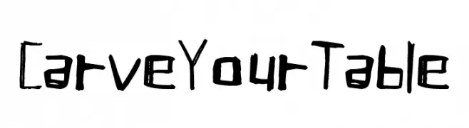
A rugged, hand-carved font with an organic, etched appearance.
![Carve Your Table font caratteri gratis]() Scaricare 73 Downloads@WebFont
Scaricare 73 Downloads@WebFont -
( Fonts by Bisho Sevillano )
A bold, graffiti-inspired font with a playful, hand-drawn style.
![Bisho Graffiti Stone Regular font caratteri gratis]() Scaricare 73 Downloads@WebFont
Scaricare 73 Downloads@WebFont -
( Fonts by Edric Studio www.creativefabrica.com/designer/edricstudio/ - Personal-use only. For commercial use please contact owner. )
An artistic script font with elegant loops and high contrast strokes.
![Nine tails inline font caratteri gratis]() Scaricare 73 Downloads@WebFont
Scaricare 73 Downloads@WebFont -
( Noto is a trademark of Google Inc. Noto fonts are open source. All Noto fonts are published under the SIL Open Font License, Version 1.1 )
A condensed, thin font with a clean and modern design.
![Noto Serif Armenian Condensed Thin font caratteri gratis]() Scaricare 73 Downloads@WebFont
Scaricare 73 Downloads@WebFont -
( Fonts by Eddy Goodboy )
A playful, hand-drawn font with bold, rounded characters and a decorative style.
![Fishing Trick font caratteri gratis]() Scaricare 73 Downloads@WebFont
Scaricare 73 Downloads@WebFont -
( Fonts by Darrell Flood - Personal-use only. For commercial use please contact owner. )
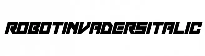
A bold, futuristic italic font with sharp angles and a sci-fi aesthetic.
![Robot Invaders Italic font caratteri gratis]() Scaricare 73 Downloads@WebFont
Scaricare 73 Downloads@WebFont -
( Fonts by Redy Studio - Nfajry Redy - Personal-use only. For commercial use please contact owner. )
A modern, handwritten font with a fluid and elegant style.
![Mortdecai Demo font caratteri gratis]() Scaricare 73 Downloads@WebFont
Scaricare 73 Downloads@WebFont -
( Fonts by Hyee Gun - Personal-use only. For commercial use please contact owner. )
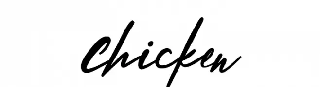
A lively, cursive handwritten font with smooth, flowing strokes.
![Chicken font caratteri gratis]() Scaricare 73 Downloads@WebFont
Scaricare 73 Downloads@WebFont -
( Iconian Fonts - Daniel Zadorozny - www.iconian.com )
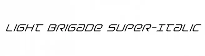
A modern, italicized font with a sleek and futuristic design.
![Light Brigade Super-Italic font caratteri gratis]() Scaricare 73 Downloads@WebFont
Scaricare 73 Downloads@WebFont -
( Fonts by Vladimir Nikolic )
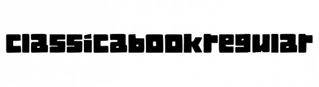
A bold, blocky font with rounded edges and consistent thickness.
![Classica Book Regular font caratteri gratis]() Scaricare 73 Downloads@WebFont
Scaricare 73 Downloads@WebFont -
( Fonts by StringLabs - stringlabscreative.com - Personal-use only. For commercial use please contact owner. )
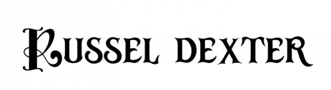
A bold, decorative font with ornate uppercase letters and clear, impactful numbers.
![Russel dexter font caratteri gratis]() Scaricare 73 Downloads@WebFont
Scaricare 73 Downloads@WebFont -
( Fonts by Daniel Zadorozny - www.iconian.com - Personal-use only. For commercial use please contact owner. )
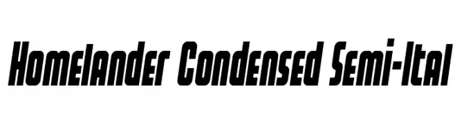
A bold, condensed, semi-italic font with a modern and dynamic style.
![Homelander Condensed Semi-Ital font caratteri gratis]() Scaricare 73 Downloads@WebFont
Scaricare 73 Downloads@WebFont -
( Fonts by Mans Greback - Personal-use only. For commercial use please contact owner. )
A bold, whimsical script font with decorative loops and flowing letterforms.
![Wonder Smile Bold PERSONAL USE Regular font caratteri gratis]() Scaricare 73 Downloads@WebFont
Scaricare 73 Downloads@WebFont -
( Iconian Fonts - Daniel Zadorozny - www.iconian.com )
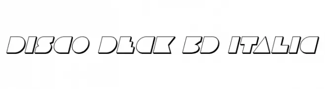
A bold, geometric 3D italic font with a dynamic and futuristic style.
![Disco Deck 3D Italic font caratteri gratis]() Scaricare 73 Downloads@WebFont
Scaricare 73 Downloads@WebFont -
( Fonts by Khurasan - Syaf Rizal - Personal-use only. For commercial use please contact owner. )
A playful, handwritten font with smooth, flowing lines and a casual style.
![Flyover font caratteri gratis]() Scaricare 73 Downloads@WebFont
Scaricare 73 Downloads@WebFont -
( Fonts by TypeType Foundry )
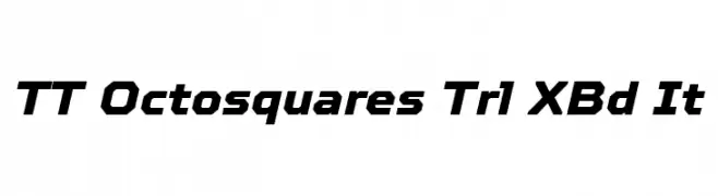
A bold, angular, and slightly italicized font with a modern geometric style.
![TT Octosquares Trl XBd It font caratteri gratis]() Scaricare 73 Downloads@WebFont
Scaricare 73 Downloads@WebFont -
![Joy Shark Semi-Condensed Italic font caratteri gratis]() Scaricare 73 Downloads@WebFont
Scaricare 73 Downloads@WebFont -
( Noto is a trademark of Google Inc. Noto fonts are open source. All Noto fonts are published under the SIL Open Font License, Version 1.1 )
A modern, condensed sans-serif font with an extra light weight.
![Noto Sans Sinhala UI Condensed ExtraLight font caratteri gratis]() Scaricare 73 Downloads@WebFont
Scaricare 73 Downloads@WebFont -
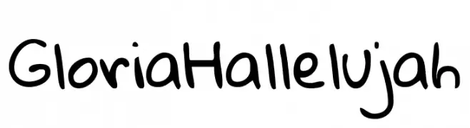
( Fonts by Kimberly Geswein - Personal-use only. For commercial use please contact owner. )
A playful, casual handwritten font with a fun and spontaneous style.
![Gloria Hallelujah font caratteri gratis]() Scaricare 73 Downloads@WebFont
Scaricare 73 Downloads@WebFont -
( Noto is a trademark of Google Inc. Noto fonts are open source. All Noto fonts are published under the SIL Open Font License, Version 1.1 )
The image contains placeholder boxes instead of a valid font.
![Noto Serif Lao ExtraCondensed font caratteri gratis]() Scaricare 73 Downloads@WebFont
Scaricare 73 Downloads@WebFont


Quali sono i font più popolari adesso?
Poppins, Roboto, Montserrat, Open Sans e Lato sono molto usati per le forme pulite e l'ampia applicabilità — dall'identità di marca alle landing page e ai poster.
Quali font si usano spesso nei loghi?
Le sans serif geometriche (es. Poppins, famiglie in stile Gotham) sono scelte comuni per un branding pulito e scalabile. Per un tocco personale restano valide script e stili manoscritti. Abbina un display deciso per i titoli a un corpo testo neutro per riconoscibilità ed equilibrio.
Ogni quanto si aggiorna la lista?
Con regolarità, in base ai download e all'attività reale. Torna spesso per scoprire in anticipo le nuove preferite.
💡 Consiglio: aggiungi ai preferiti — le tendenze cambiano in fretta e i font top di oggi possono ispirare il rebranding di domani.