Benvenuto nelle Font Più Popolari — dove popolarità e qualità si incontrano. Qui trovi i font più scaricati e usati dell'anno. Se cerchi scelte sicure per logo, web o social, inizia da qui.
Ogni font top si distingue per equilibrio, leggibilità e versatilità. Troverai sans serif moderne, script eleganti, serif vintage e display minimalisti.
-
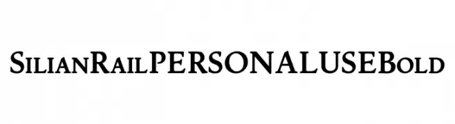
( Fonts by Mans Greback - Personal-use only. For commercial use please contact owner. )
A bold, classic serif font with strong, pronounced strokes.
 Scaricare 463 Downloads@WebFont
 -
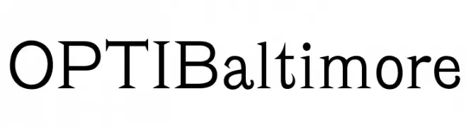
( Fonts by Castcraft Software - opti.netii.net - check the website before use )
A classic serif font with elegant strokes and balanced design.
![OPTIBaltimore font caratteri gratis]() Scaricare 463 Downloads@WebFont
Scaricare 463 Downloads@WebFont -
![Lydia font caratteri gratis]() Scaricare 463 Downloads@WebFont
Scaricare 463 Downloads@WebFont -
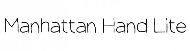
( Fonts by Taylor Baybutt - ikon3.com - Free for personal use only )
A casual, handwritten font with a playful and informal style.
![Manhattan Hand Lite font caratteri gratis]() Scaricare 463 Downloads@WebFont
Scaricare 463 Downloads@WebFont -
( Fonts by Maelle.K - Thomas Boucherie )
An elegant and artistic font with elongated, flowing letterforms.
![Anacondas font caratteri gratis]() Scaricare 463 Downloads@WebFont
Scaricare 463 Downloads@WebFont -
-
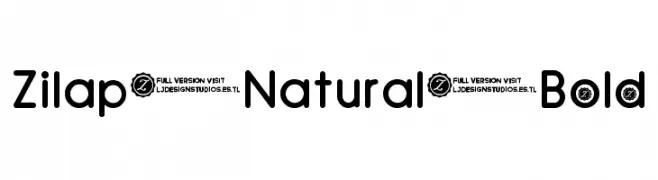
( Fonts by Benoit Sjoholm - www.benoitsjoholm.com - All my fonts are for sale )
A bold, rounded font with a playful and modern aesthetic.
![Judit font caratteri gratis]() Scaricare 463 Downloads@WebFont
Scaricare 463 Downloads@WebFont -
![Zilap Natural Bold font caratteri gratis]() Scaricare 463 Downloads@WebFont
Scaricare 463 Downloads@WebFont -
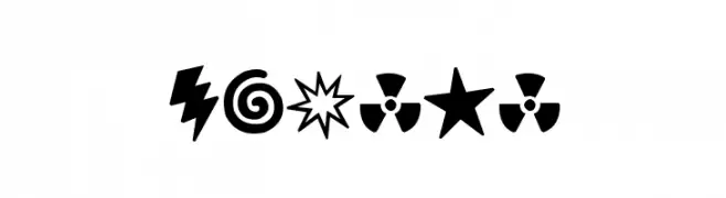
( Fonts by www.vicfieger.com )
A bold, playful set of expressive and dynamic symbols with a comic book style.
![Curses font caratteri gratis]() Scaricare 463 Downloads@WebFont
Scaricare 463 Downloads@WebFont -
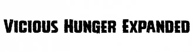
( Fonts by Daniel Zadorozny - www.iconian.com )
A bold, distressed font with a rugged, gritty appearance.
![Vicious Hunger Expanded font caratteri gratis]() Scaricare 463 Downloads@WebFont
Scaricare 463 Downloads@WebFont -
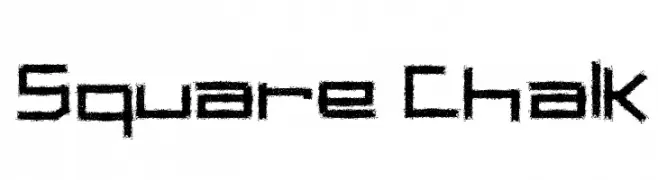
( Fonts by Galdino Otten - galdinootten.com )
A bold, chalk-textured font with a hand-drawn, informal style.
![Square Chalk font caratteri gratis]() Scaricare 463 Downloads@WebFont
Scaricare 463 Downloads@WebFont


Quali sono i font più popolari adesso?
Poppins, Roboto, Montserrat, Open Sans e Lato sono molto usati per le forme pulite e l'ampia applicabilità — dall'identità di marca alle landing page e ai poster.
Quali font si usano spesso nei loghi?
Le sans serif geometriche (es. Poppins, famiglie in stile Gotham) sono scelte comuni per un branding pulito e scalabile. Per un tocco personale restano valide script e stili manoscritti. Abbina un display deciso per i titoli a un corpo testo neutro per riconoscibilità ed equilibrio.
Ogni quanto si aggiorna la lista?
Con regolarità, in base ai download e all'attività reale. Torna spesso per scoprire in anticipo le nuove preferite.
💡 Consiglio: aggiungi ai preferiti — le tendenze cambiano in fretta e i font top di oggi possono ispirare il rebranding di domani.