Benvenuto nelle Font Più Popolari — dove popolarità e qualità si incontrano. Qui trovi i font più scaricati e usati dell'anno. Se cerchi scelte sicure per logo, web o social, inizia da qui.
Ogni font top si distingue per equilibrio, leggibilità e versatilità. Troverai sans serif moderne, script eleganti, serif vintage e display minimalisti.
-
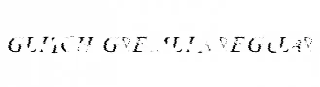
( Fonts by Blobify )
A glitch-inspired font with a fragmented, digital interference style.
 Scaricare 75 Downloads@WebFont
 -
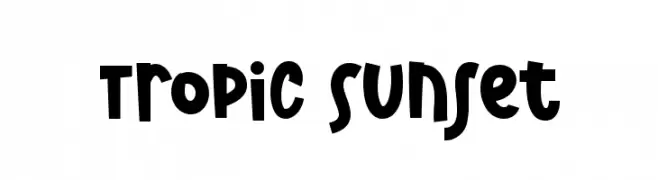
( Fonts by Dm Letter Studio )
Playful, bold, hand-drawn font.
![Tropic Sunset font caratteri gratis]() Scaricare 75 Downloads@WebFont
Scaricare 75 Downloads@WebFont -
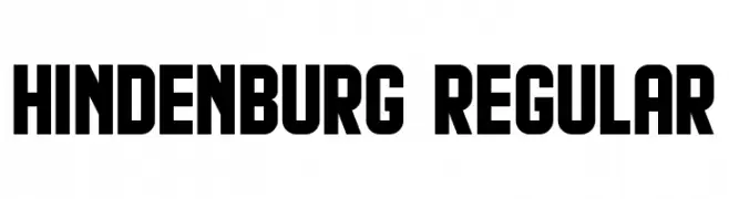
( Fonts by Vladimir Nikolic - https://www.creativefabrica.com/product/educated-deers/ref/144265/ - Personal-use only. For commercial use please contact owner. )
A bold, geometric font with a modern, industrial style.
![Hindenburg Regular font caratteri gratis]() Scaricare 75 Downloads@WebFont
Scaricare 75 Downloads@WebFont -
( Fonts by www.selawetype.com - Personal-use only. FOR DONATION https://www.paypal.me/selawe . For commercial use please contact owner. )
A dynamic handwritten font with fluid strokes and a lively, personal touch.
![Sukro-Regular font caratteri gratis]() Scaricare 75 Downloads@WebFont
Scaricare 75 Downloads@WebFont -
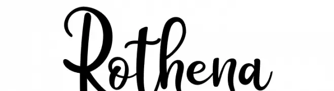
( Fonts by Haksen Studio - Sarwo Edhi Prayitno - Personal-use only. For commercial use please contact owner. )
A playful and artistic script font with bold, flowing letterforms.
![Rothena font caratteri gratis]() Scaricare 75 Downloads@WebFont
Scaricare 75 Downloads@WebFont -
( Fonts by Mozyen Studio - Personal-use only. For commercial use please contact owner. )
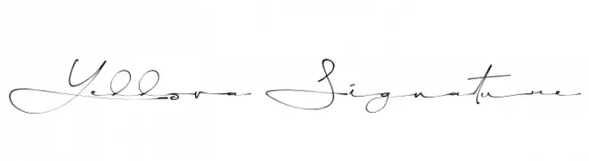
A modern, elegant handwritten script with fluid, artistic curves.
![Yellova Signature font caratteri gratis]() Scaricare 75 Downloads@WebFont
Scaricare 75 Downloads@WebFont -
( Fonts by madeDeduk - Personal-use only. For commercial use please contact owner. )
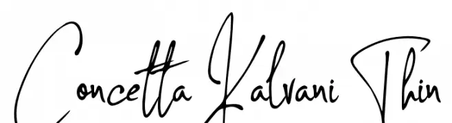
A thin, elegant handwritten script with flowing, dynamic strokes.
![Concetta Kalvani Thin font caratteri gratis]() Scaricare 75 Downloads@WebFont
Scaricare 75 Downloads@WebFont -
( Fonts by nomlimofont - Personal-use only. For commercial use please contact owner. )
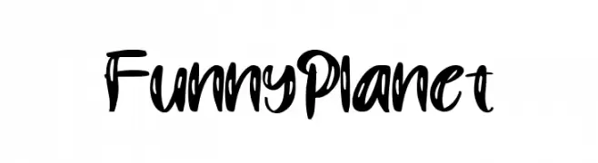
A playful, bold font with dynamic, sweeping strokes and a whimsical style.
![Funny Planet font caratteri gratis]() Scaricare 75 Downloads@WebFont
Scaricare 75 Downloads@WebFont -
( Fonts by twinletter - Rozikan - Personal-use only. For commercial use please contact owner. )
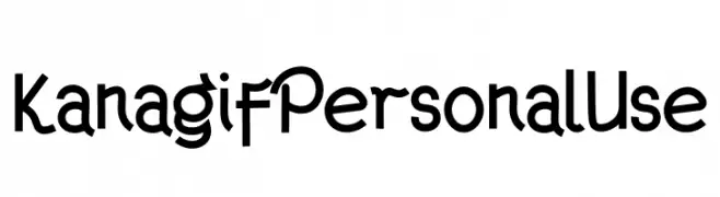
A playful and whimsical font with bold, dynamic characters and unique serifs.
![Kanagif Personal Use font caratteri gratis]() Scaricare 75 Downloads@WebFont
Scaricare 75 Downloads@WebFont -
( Fonts by Looseleaf Fonts - Personal-use only. For commercial use please contact owner. )
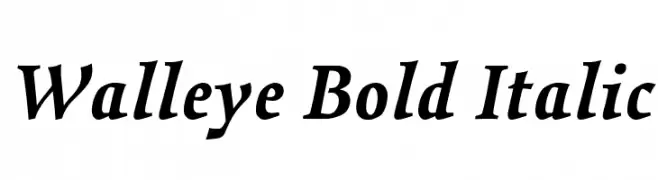
A bold, italic serif font with strong, dynamic letterforms.
![Walleye Bold Italic font caratteri gratis]() Scaricare 75 Downloads@WebFont
Scaricare 75 Downloads@WebFont -
( Fonts by Wino S Kadir - weknow - www.revolge.com/shop/weknow/ - Personal-use only. For commercial use please contact owner. )
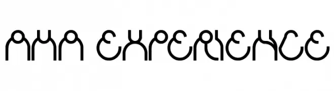
A modern, geometric font with continuous, flowing lines and a cohesive appearance.
![aha experience font caratteri gratis]() Scaricare 75 Downloads@WebFont
Scaricare 75 Downloads@WebFont -
( Fonts by Wino S Kadir - weknow - www.revolge.com/shop/weknow/ - Personal-use only. For commercial use please contact owner. )
A bold, rounded, and playful font with a chunky appearance.
![portable font caratteri gratis]() Scaricare 75 Downloads@WebFont
Scaricare 75 Downloads@WebFont -
( BRIDGEco - bridgeco.jp/ )
A pixelated, blocky font with a retro digital aesthetic.
![Shuttle BMP18 font caratteri gratis]() Scaricare 75 Downloads@WebFont
Scaricare 75 Downloads@WebFont -
( Fonts by SyncdeathWyvxrn )
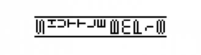
A dot matrix-inspired font with a digital, modern aesthetic.
![Kone KSS 470 [Wyvern Ver] Regular font caratteri gratis]() Scaricare 75 Downloads@WebFont
Scaricare 75 Downloads@WebFont -
( Fonts by Sahirul Iman - Personal-use only. For commercial use please contact owner. )
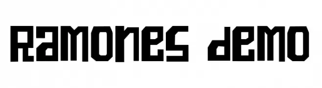
A bold, geometric font with sharp angles and a modern, edgy style.
![Ramones demo font caratteri gratis]() Scaricare 75 Downloads@WebFont
Scaricare 75 Downloads@WebFont -
( Fonts by Iconian Fonts )
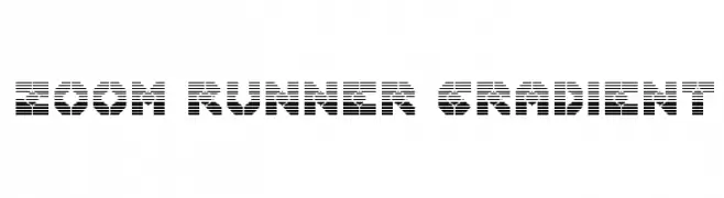
A bold, futuristic font with horizontal stripes and geometric shapes.
![Zoom Runner Gradient font caratteri gratis]() Scaricare 75 Downloads@WebFont
Scaricare 75 Downloads@WebFont -
( Liz Lawson - janepedia.com )
A bold, pixelated font with a retro, 8-bit video game aesthetic.
![Pixeliza20 font caratteri gratis]() Scaricare 75 Downloads@WebFont
Scaricare 75 Downloads@WebFont -
( Fonts by Vladimir Nikolic )
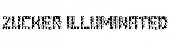
A bold, 3D cube-style font with high contrast and a playful geometric design.
![Zucker Illuminated font caratteri gratis]() Scaricare 75 Downloads@WebFont
Scaricare 75 Downloads@WebFont -
( Fonts by Fontfabric - Svetoslav Simov - Personal-use only. For commercial use please contact owner. )
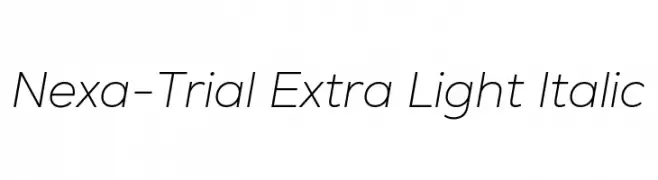
A sleek, extra-light italic sans-serif font with a modern and fluid design.
![Nexa-Trial Extra Light Italic font caratteri gratis]() Scaricare 75 Downloads@WebFont
Scaricare 75 Downloads@WebFont -
( Fonts by InspiraType )
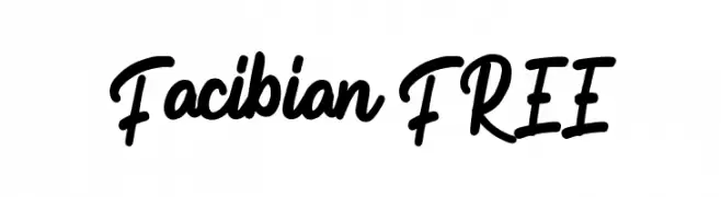
Casual handwritten script with rounded, playful strokes.
![Facibian FREE font caratteri gratis]() Scaricare 75 Downloads@WebFont
Scaricare 75 Downloads@WebFont -
( Fonts by Mans Greback - Personal-use only. For commercial use please contact owner. )
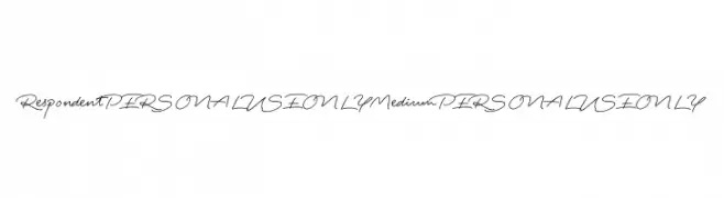
An elegant, flowing script font with a natural handwriting style.
![Respondent PERSONAL USE ONLY Medium PERSONAL USE ONLY font caratteri gratis]() Scaricare 75 Downloads@WebFont
Scaricare 75 Downloads@WebFont -
( Fonts by CannotIntoSpaceFonts - KineticPlasma Fonts - Personal-use only. For commercial use please contact owner. )
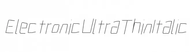
A modern, ultra-thin italic font with a futuristic, electronic style.
![Electronic UltraThin Italic font caratteri gratis]() Scaricare 75 Downloads@WebFont
Scaricare 75 Downloads@WebFont -
( Fonts by Zuhair Ahmed - Personal-use only. For commercial use please contact owner. )
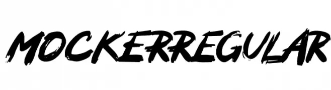
A bold, brush-style font with dynamic strokes and a graffiti-like appearance.
![MOCKERRegular font caratteri gratis]() Scaricare 75 Downloads@WebFont
Scaricare 75 Downloads@WebFont -
( Fonts by Marshmallow Creative - Personal-use only. For commercial use please contact owner. )
A bold, classic serif font with a vintage feel and strong legibility.
![LPEducational font caratteri gratis]() Scaricare 75 Downloads@WebFont
Scaricare 75 Downloads@WebFont -
( Fonts by The Jackal Animatronic )
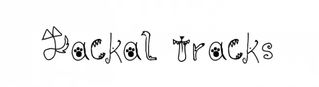
A playful, animal-themed decorative font with whimsical character designs.
![Jackal Tracks font caratteri gratis]() Scaricare 75 Downloads@WebFont
Scaricare 75 Downloads@WebFont -
( Fonts by Nick Curtis - Personal-use only. For commercial use please contact owner. )
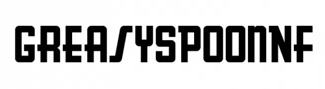
A bold, geometric font with a vintage, industrial style.
![GreasySpoonNF font caratteri gratis]() Scaricare 75 Downloads@WebFont
Scaricare 75 Downloads@WebFont -
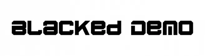
( Fonts by Edric Studio - Personal-use only. For commercial use please contact owner. )
A bold, geometric font with a futuristic and industrial design.
![Blacked Demo font caratteri gratis]() Scaricare 75 Downloads@WebFont
Scaricare 75 Downloads@WebFont -
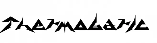
( Chung-Deh Tien - www.redbubble.com/people/Kaiju )
A futuristic, angular font with sharp, jagged edges and a bold, dynamic style.
![Thermobaric font caratteri gratis]() Scaricare 75 Downloads@WebFont
Scaricare 75 Downloads@WebFont -
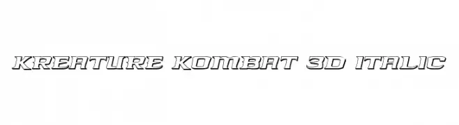
( Iconian Fonts - Daniel Zadorozny - www.iconian.com )
A bold, italicized 3D font with a modern, dynamic style.
![Kreature Kombat 3D Italic font caratteri gratis]() Scaricare 75 Downloads@WebFont
Scaricare 75 Downloads@WebFont -
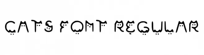
( Fonts by LauraGlinka )
A playful font with cat-like faces in each letter, perfect for fun and whimsical projects.
![Cats Font Regular font caratteri gratis]() Scaricare 75 Downloads@WebFont
Scaricare 75 Downloads@WebFont -
( Fonts by Rainkarnichi - Personal-use only. For commercial use please contact owner. )
A Morse code-inspired font using dots and dashes for each character.
![BukanMorse Too font caratteri gratis]() Scaricare 75 Downloads@WebFont
Scaricare 75 Downloads@WebFont -
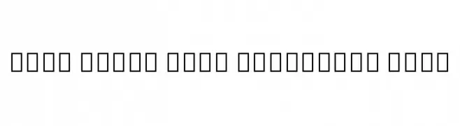
( Noto is a trademark of Google Inc. Noto fonts are open source. All Noto fonts are published under the SIL Open Font License, Version 1.1 )
A modern, condensed, and thin font with a clean and minimalistic design.
![Noto Serif Thai Condensed Thin font caratteri gratis]() Scaricare 75 Downloads@WebFont
Scaricare 75 Downloads@WebFont -
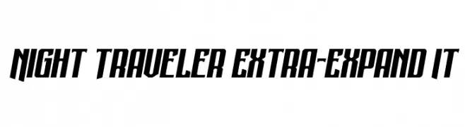
( Fonts by Daniel Zadorozny - www.iconian.com - Personal-use only. For commercial use please contact owner. )
A bold, angular font with a modern, dynamic style.
![Night Traveler Extra-Expand It font caratteri gratis]() Scaricare 75 Downloads@WebFont
Scaricare 75 Downloads@WebFont -
( Fonts by www.junkohanhero.com - Personal-use only. For commercial use please contact owner. )
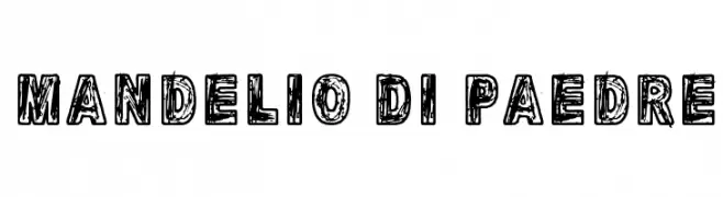
A bold, distressed font with a rugged, handcrafted appearance.
![Mandelio Di Paedre font caratteri gratis]() Scaricare 75 Downloads@WebFont
Scaricare 75 Downloads@WebFont -
( Fonts by cove703 - 703 Type ( Cundrawan ) - Personal-use only. For commercial use please contact owner. )
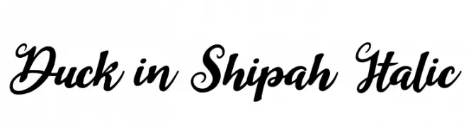
A dynamic and elegant script font with flowing, cursive letterforms.
![Duck in Shipah Italic font caratteri gratis]() Scaricare 75 Downloads@WebFont
Scaricare 75 Downloads@WebFont


![Kone KSS 470 [Wyvern Ver] Regular font caratteri gratis](https://d144mzi0q5mijx.cloudfront.net/img/K/O/Kone-KSS-470-Wyvern-Ver-Regular.webp)

Quali sono i font più popolari adesso?
Poppins, Roboto, Montserrat, Open Sans e Lato sono molto usati per le forme pulite e l'ampia applicabilità — dall'identità di marca alle landing page e ai poster.
Quali font si usano spesso nei loghi?
Le sans serif geometriche (es. Poppins, famiglie in stile Gotham) sono scelte comuni per un branding pulito e scalabile. Per un tocco personale restano valide script e stili manoscritti. Abbina un display deciso per i titoli a un corpo testo neutro per riconoscibilità ed equilibrio.
Ogni quanto si aggiorna la lista?
Con regolarità, in base ai download e all'attività reale. Torna spesso per scoprire in anticipo le nuove preferite.
💡 Consiglio: aggiungi ai preferiti — le tendenze cambiano in fretta e i font top di oggi possono ispirare il rebranding di domani.