Benvenuto nelle Font Più Popolari — dove popolarità e qualità si incontrano. Qui trovi i font più scaricati e usati dell'anno. Se cerchi scelte sicure per logo, web o social, inizia da qui.
Ogni font top si distingue per equilibrio, leggibilità e versatilità. Troverai sans serif moderne, script eleganti, serif vintage e display minimalisti.
-
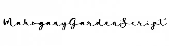
( Fonts by Abo Daniel Studio )
Elegant cursive script with a handwritten style.
 Scaricare 72 Downloads@WebFont
 -
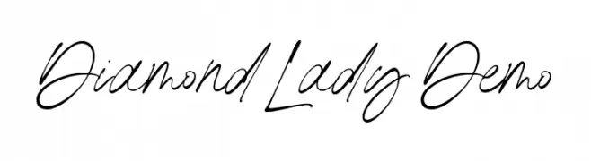
( Fonts by Redy Studio )
Handwritten script font with elegant, flowing strokes.
![Diamond Lady Demo font caratteri gratis]() Scaricare 72 Downloads@WebFont
Scaricare 72 Downloads@WebFont -
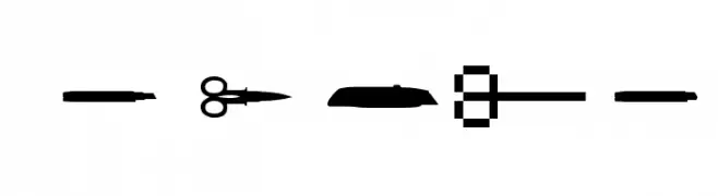
( ADT )
A pictographic tool-themed dingbat font with bold silhouettes.
![LesOutils font caratteri gratis]() Scaricare 72 Downloads@WebFont
Scaricare 72 Downloads@WebFont -
( Fonts by Arterfak Project - Ahmad Ramzi Fahruddin - Personal-use only. For commercial use please contact owner. )
A bold, vintage-style serif font with sharp, angular serifs.
![Hermona font caratteri gratis]() Scaricare 72 Downloads@WebFont
Scaricare 72 Downloads@WebFont -
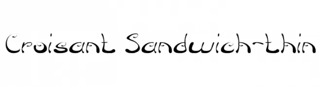
( weknow - Wino S Kadir - www.creativefabrica.com/designer/weknow/ )
A whimsical, decorative font with artistic curves and swirls.
![Croisant Sandwich-thin font caratteri gratis]() Scaricare 72 Downloads@WebFont
Scaricare 72 Downloads@WebFont -
( Fonts by Looseleaf Fonts - Personal-use only. For commercial use please contact owner. )
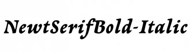
A bold, italic serif font with a classic yet modern appeal.
![NewtSerifBold-Italic font caratteri gratis]() Scaricare 72 Downloads@WebFont
Scaricare 72 Downloads@WebFont -
( Fonts by Greg Medina - www.dcoxy.com - Personal-use only. For commercial use please contact owner. )
Ornamental flourishes with intricate, vintage-inspired details.
![Ornaments soul font caratteri gratis]() Scaricare 72 Downloads@WebFont
Scaricare 72 Downloads@WebFont -
( Fonts by NanaNissa - Personal-use only. For commercial use please contact owner. )
An elegant script font with flowing, interconnected letters and ornate flourishes.
![Makayla font caratteri gratis]() Scaricare 72 Downloads@WebFont
Scaricare 72 Downloads@WebFont -
( Iconian Fonts - Daniel Zadorozny - www.iconian.com )
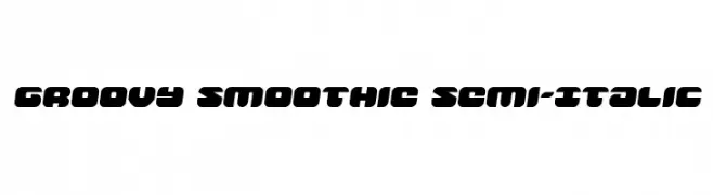
A bold, rounded, semi-italic font with a playful and modern style.
![Groovy Smoothie Semi-Italic font caratteri gratis]() Scaricare 72 Downloads@WebFont
Scaricare 72 Downloads@WebFont -
( London's Letters - www.londonsletters.com/ )
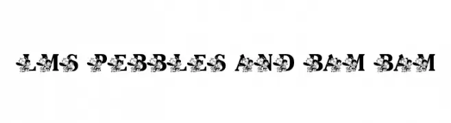
A playful, cartoon-themed decorative font with bold characters.
![LMS Pebbles and Bam Bam font caratteri gratis]() Scaricare 72 Downloads@WebFont
Scaricare 72 Downloads@WebFont -
( Fonts by Adega Design - Anisio Dega - Personal-use only. For commercial use please contact owner. )
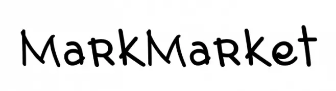
A playful, handwritten font with rounded, consistent strokes.
![Mark Market font caratteri gratis]() Scaricare 72 Downloads@WebFont
Scaricare 72 Downloads@WebFont -
( Fonts by Maulana Creative - Gilang Maulana - Personal-use only. For commercial use please contact owner. )
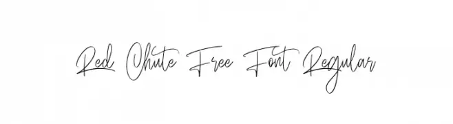
An elegant, flowing script font with intricate, looping letterforms.
![Red Chute Free Font Regular font caratteri gratis]() Scaricare 72 Downloads@WebFont
Scaricare 72 Downloads@WebFont -
( Fonts by weknow - Wino S Kadir - Personal-use only. For commercial use please contact owner. )
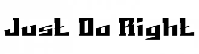
A bold, angular font with a strong geometric design.
![Just Do Right font caratteri gratis]() Scaricare 72 Downloads@WebFont
Scaricare 72 Downloads@WebFont -
( Fonts by Kong Font - https://fontkong.com/ - Personal-use only. For commercial use please contact owner. )
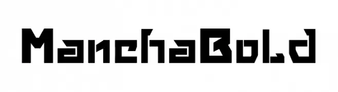
A bold, geometric font with sharp, angular edges and a modern industrial feel.
![Mancha Bold font caratteri gratis]() Scaricare 72 Downloads@WebFont
Scaricare 72 Downloads@WebFont -
( Fonts by Daniel Zadorozny - www.iconian.com - Personal-use only. For commercial use please contact owner. )
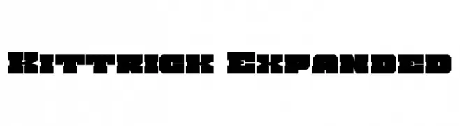
A bold, geometric font with a modern, industrial style.
![Kittrick Expanded font caratteri gratis]() Scaricare 72 Downloads@WebFont
Scaricare 72 Downloads@WebFont -
( Captain Jack Harkness - Barbara Lambert )
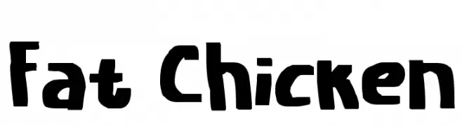
A bold, playful font with a hand-drawn, whimsical style.
![Fat Chicken font caratteri gratis]() Scaricare 72 Downloads@WebFont
Scaricare 72 Downloads@WebFont -
( Fonts by www.woodcutter.es - woodcutter Manero - Personal-use only. For commercial use please contact owner. )
A dingbat font of assorted video game icons and controllers.
![video games font caratteri gratis]() Scaricare 72 Downloads@WebFont
Scaricare 72 Downloads@WebFont -
( Fonts by Omaikraf Studio - Omaikraf - Personal-use only. For commercial use please contact owner. )
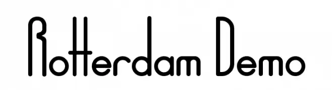
A modern, geometric font with tall, narrow uppercase letters and balanced lowercase characters.
![Rotterdam Demo font caratteri gratis]() Scaricare 72 Downloads@WebFont
Scaricare 72 Downloads@WebFont -
![Hong Kong Hustle Academy Italic Italic font caratteri gratis]() Scaricare 72 Downloads@WebFont
Scaricare 72 Downloads@WebFont -
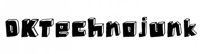
( Hanoded - David Kerkhoff - www.hanodedfonts.com )
A bold, 3D block-style font with a futuristic and dynamic appearance.
![DK Technojunk font caratteri gratis]() Scaricare 72 Downloads@WebFont
Scaricare 72 Downloads@WebFont -
( Fonts by Ghuroba Studio - Personal-use only. For commercial use please contact owner. )
A sophisticated script font with elegant loops and swashes, perfect for decorative uses.
![Madina font caratteri gratis]() Scaricare 72 Downloads@WebFont
Scaricare 72 Downloads@WebFont -
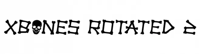
( Iconian Fonts - Daniel Zadorozny - www.iconian.com )
A bold, bone-themed font with a playful, hand-drawn style.
![xBONES Rotated 2 font caratteri gratis]() Scaricare 72 Downloads@WebFont
Scaricare 72 Downloads@WebFont -
( imagex - www.imagex-fonts.com )
A playful, hand-drawn font with a sketch-like, textured appearance.
![Fast Foont font caratteri gratis]() Scaricare 72 Downloads@WebFont
Scaricare 72 Downloads@WebFont -
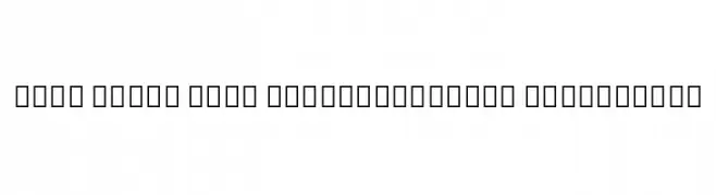
( Noto is a trademark of Google Inc. Noto fonts are open source. All Noto fonts are published under the SIL Open Font License, Version 1.1 )
Invalid font display with placeholder symbols.
![Noto Serif Thai ExtraCondensed ExtraLight font caratteri gratis]() Scaricare 72 Downloads@WebFont
Scaricare 72 Downloads@WebFont -
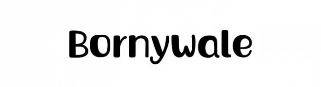
( Fonts by Adevio Studio - Personal-use only. For commercial use please contact owner. )
A playful, bold font with rounded edges and a modern, approachable style.
![Bornywale font caratteri gratis]() Scaricare 72 Downloads@WebFont
Scaricare 72 Downloads@WebFont -
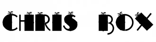
( CROLrene )
A festive, gift box-themed font with bold, geometric characters and ribbon accents.
![CHRIS BOX font caratteri gratis]() Scaricare 72 Downloads@WebFont
Scaricare 72 Downloads@WebFont -
( Fonts by Creatype Studio )
A delicate, cursive handwritten font with flowing lines and elegant strokes.
![Anastasya Regular font caratteri gratis]() Scaricare 72 Downloads@WebFont
Scaricare 72 Downloads@WebFont -
( Fonts by Sayed Musnazi )
A flowing, cursive script font with elegant, interconnected characters.
![Exchange font caratteri gratis]() Scaricare 72 Downloads@WebFont
Scaricare 72 Downloads@WebFont -
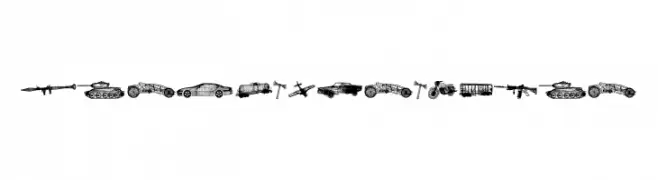
( Fonts by Vladimir Nikolic - https://www.creativefabrica.com/product/educated-deers/ref/144265/ - Personal-use only. For commercial use please contact owner. )
A detailed set of war-themed icons featuring military vehicles and weapons.
![War Items Regular font caratteri gratis]() Scaricare 72 Downloads@WebFont
Scaricare 72 Downloads@WebFont -
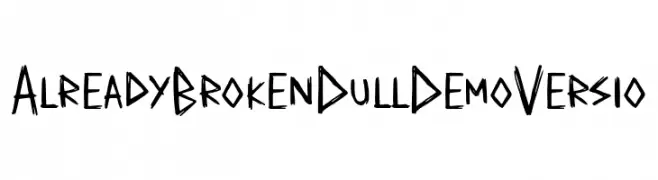
( Fonts by Allouse Studio - Personal-use only. For commercial use please contact owner. )
A bold, hand-drawn font with a raw, edgy style.
![Already Broken Dull Demo Versio font caratteri gratis]() Scaricare 72 Downloads@WebFont
Scaricare 72 Downloads@WebFont -
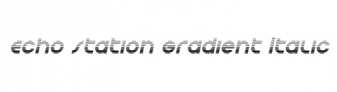
( Iconian Fonts - Daniel Zadorozny - www.iconian.com )
A modern, italicized font with a gradient line effect for a dynamic look.
![Echo Station Gradient Italic font caratteri gratis]() Scaricare 72 Downloads@WebFont
Scaricare 72 Downloads@WebFont -
( Fonts by Darrell Flood - Personal-use only. For commercial use please contact owner. )
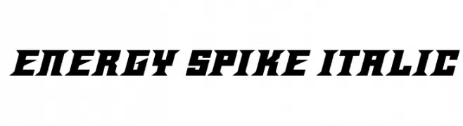
A bold, angular, and italicized font with a dynamic and energetic style.
![Energy Spike Italic font caratteri gratis]() Scaricare 72 Downloads@WebFont
Scaricare 72 Downloads@WebFont -
( Fonts by Wino S Kadir - weknow - www.revolge.com/shop/weknow/ - Personal-use only. For commercial use please contact owner. )
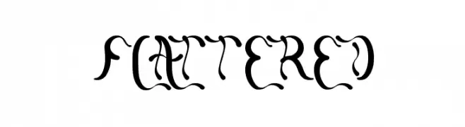
A decorative and whimsical serif font with elaborate curves and swirls.
![flattered font caratteri gratis]() Scaricare 72 Downloads@WebFont
Scaricare 72 Downloads@WebFont -
( Fonts by Kat`s Fun Fonts - Personal-use only. For commercial use please contact owner. )
A decorative font with heart-themed symbols perfect for Valentine's designs.
![KR Valentines 2006 Six font caratteri gratis]() Scaricare 72 Downloads@WebFont
Scaricare 72 Downloads@WebFont -
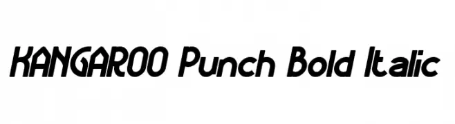
( weknow - Wino S Kadir - www.creativefabrica.com/designer/weknow/ )
A bold, italic font with a dynamic and modern style.
![KANGAROO Punch Bold Italic font caratteri gratis]() Scaricare 72 Downloads@WebFont
Scaricare 72 Downloads@WebFont


Quali sono i font più popolari adesso?
Poppins, Roboto, Montserrat, Open Sans e Lato sono molto usati per le forme pulite e l'ampia applicabilità — dall'identità di marca alle landing page e ai poster.
Quali font si usano spesso nei loghi?
Le sans serif geometriche (es. Poppins, famiglie in stile Gotham) sono scelte comuni per un branding pulito e scalabile. Per un tocco personale restano valide script e stili manoscritti. Abbina un display deciso per i titoli a un corpo testo neutro per riconoscibilità ed equilibrio.
Ogni quanto si aggiorna la lista?
Con regolarità, in base ai download e all'attività reale. Torna spesso per scoprire in anticipo le nuove preferite.
💡 Consiglio: aggiungi ai preferiti — le tendenze cambiano in fretta e i font top di oggi possono ispirare il rebranding di domani.