Benvenuto nelle Font Più Popolari — dove popolarità e qualità si incontrano. Qui trovi i font più scaricati e usati dell'anno. Se cerchi scelte sicure per logo, web o social, inizia da qui.
Ogni font top si distingue per equilibrio, leggibilità e versatilità. Troverai sans serif moderne, script eleganti, serif vintage e display minimalisti.
-
( Fonts by Looseleaf Fonts - Personal-use only. For commercial use please contact owner. )
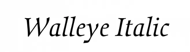
An elegant italic serif font with smooth curves and moderate slant.
 Scaricare 73 Downloads@WebFont
 -
( Fonts by The Branded Quotes )
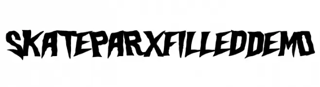
A bold, edgy font with sharp, angular lines and a rebellious style.
![Skateparx Filled Demo font caratteri gratis]() Scaricare 73 Downloads@WebFont
Scaricare 73 Downloads@WebFont -
( Fonts by Darrell Flood - Personal-use only. For commercial use please contact owner. )
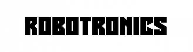
A bold, geometric font with a futuristic and industrial style.
![Robotronics font caratteri gratis]() Scaricare 73 Downloads@WebFont
Scaricare 73 Downloads@WebFont -
( Fonts by nomlimofont - Personal-use only. For commercial use please contact owner. )
A cursive, handwritten-style font with elegant, flowing strokes.
![Emykia font caratteri gratis]() Scaricare 73 Downloads@WebFont
Scaricare 73 Downloads@WebFont -
( Fonts by Runsell Studio - Personal-use only. For commercial use please contact owner. )
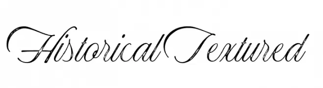
A textured, script-style font with a vintage, handwritten appearance.
![Historical-Textured font caratteri gratis]() Scaricare 73 Downloads@WebFont
Scaricare 73 Downloads@WebFont -
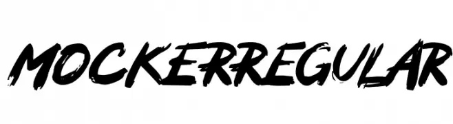
( Fonts by Zuhair Ahmed - Personal-use only. For commercial use please contact owner. )
A bold, brush-style font with dynamic strokes and a graffiti-like appearance.
![MOCKERRegular font caratteri gratis]() Scaricare 73 Downloads@WebFont
Scaricare 73 Downloads@WebFont -
( Fonts by Iconian Fonts - Daniel Zadorozny - Personal-use only. For commercial use please contact owner. )
A bold, futuristic font with geometric and industrial design elements.
![7th Service font caratteri gratis]() Scaricare 73 Downloads@WebFont
Scaricare 73 Downloads@WebFont -
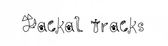
( Fonts by The Jackal Animatronic )
A playful, animal-themed decorative font with whimsical character designs.
![Jackal Tracks font caratteri gratis]() Scaricare 73 Downloads@WebFont
Scaricare 73 Downloads@WebFont -
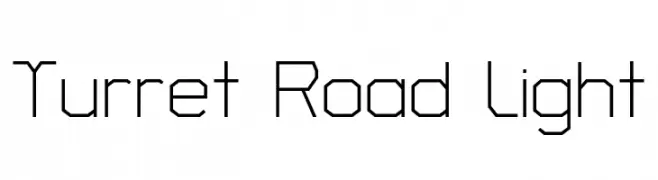
( Copyright 2018 The Turret Road Project Authors (https://github.com/noponies/turret-road) )
A geometric, angular font with a modern and futuristic style.
![Turret Road Light font caratteri gratis]() Scaricare 73 Downloads@WebFont
Scaricare 73 Downloads@WebFont -
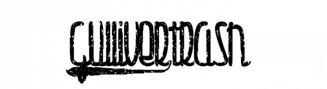
( Fonts by Maelle.K - Thomas Boucherie )
A distressed, grunge-style font with a bold, narrow, and condensed appearance.
![Gulliver-trash font caratteri gratis]() Scaricare 73 Downloads@WebFont
Scaricare 73 Downloads@WebFont -
( weknow - Wino S Kadir - www.creativefabrica.com/designer/weknow/ )
A bold, angular, and futuristic italic font with a digital aesthetic.
![GAMER Italic font caratteri gratis]() Scaricare 73 Downloads@WebFont
Scaricare 73 Downloads@WebFont -
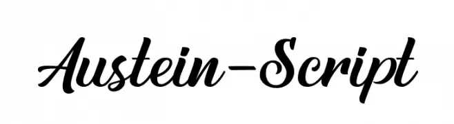
( Fonts by Letterflow - Personal-use only. For commercial use please contact owner. )
A flowing, elegant script font with high contrast and interconnected letters.
![Austein-Script font caratteri gratis]() Scaricare 73 Downloads@WebFont
Scaricare 73 Downloads@WebFont -
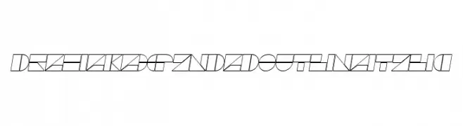
( Daniel Angermann - www.daniel-angermann.de/ )
A geometric, expanded outline font with an italic slant and modern style.
![DrebiekExpandedOutlineItalic font caratteri gratis]() Scaricare 73 Downloads@WebFont
Scaricare 73 Downloads@WebFont -
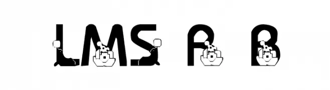
( London's Letters - www.londonsletters.com/ )
A playful, circus-themed decorative font with bold, intricate designs.
![LMS Ringling Brothers font caratteri gratis]() Scaricare 73 Downloads@WebFont
Scaricare 73 Downloads@WebFont -
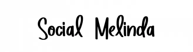
( Fonts by Allouse Studio - Personal-use only. For commercial use please contact owner. )
A playful, bold font with flowing letterforms and a modern, approachable style.
![Social Melinda font caratteri gratis]() Scaricare 73 Downloads@WebFont
Scaricare 73 Downloads@WebFont -
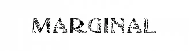
( Fonts by Harry Blakeman )
An intricate, decorative font with bold, patterned characters.
![Marginal font caratteri gratis]() Scaricare 73 Downloads@WebFont
Scaricare 73 Downloads@WebFont -
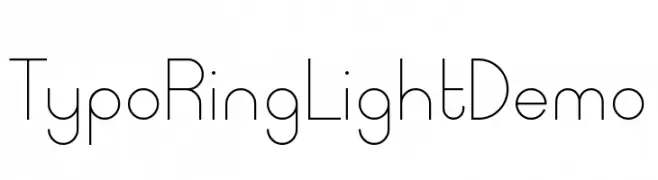
( Fonts by Studio Typo - Personal-use only. For commercial use please contact owner. )
A modern, geometric font with thin, uniform lines and a minimalist style.
![Typo Ring Light Demo font caratteri gratis]() Scaricare 73 Downloads@WebFont
Scaricare 73 Downloads@WebFont -
( Noto is a trademark of Google Inc. Noto fonts are open source. All Noto fonts are published under the SIL Open Font License, Version 1.1 )
A semi-condensed, semi-bold serif font with a modern yet classic style.
![Noto Serif Lao SemiCondensed SemiBold font caratteri gratis]() Scaricare 73 Downloads@WebFont
Scaricare 73 Downloads@WebFont -
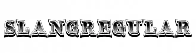
( Fonts by Vladimir Nikolic - www.creativefabrica.com/designer/vladimirnikolic/ - Personal-use only. For commercial use please contact owner. )
A bold, decorative font with vintage flair and intricate patterns.
![Slang Regular font caratteri gratis]() Scaricare 73 Downloads@WebFont
Scaricare 73 Downloads@WebFont -
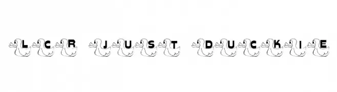
( LeChefRene - members.aol.com/lcrfonts/ )
A whimsical font with characters embedded in cartoon duck illustrations.
![LCR Just Duckie font caratteri gratis]() Scaricare 73 Downloads@WebFont
Scaricare 73 Downloads@WebFont -
( Fonts by Woodcutter )
A spooky, bone-themed decorative font perfect for Halloween designs.
![Dead Island Hotel font caratteri gratis]() Scaricare 73 Downloads@WebFont
Scaricare 73 Downloads@WebFont -
( Fonts by www.junkohanhero.com - Personal-use only. For commercial use please contact owner. )
A bold, playful font with a cartoonish, graffiti-like style and thick outlines.
![Firebug font caratteri gratis]() Scaricare 73 Downloads@WebFont
Scaricare 73 Downloads@WebFont -
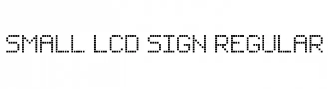
( myname5749 )
A dot matrix style font inspired by vintage LCD displays.
![Small LCD Sign Regular font caratteri gratis]() Scaricare 73 Downloads@WebFont
Scaricare 73 Downloads@WebFont -
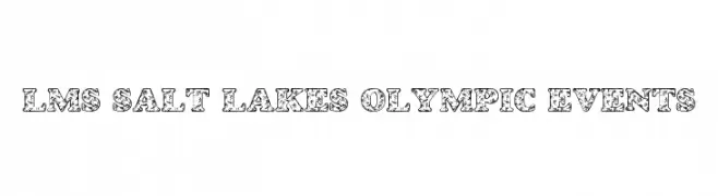
( London's Letters - www.londonsletters.com/ )
A bold, decorative font with an athletic and Olympic-inspired theme.
![LMS Salt Lake's Olympic Events font caratteri gratis]() Scaricare 73 Downloads@WebFont
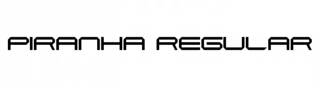
Scaricare 73 Downloads@WebFont -
![Piranha Regular font caratteri gratis]() Scaricare 73 Downloads@WebFont
Scaricare 73 Downloads@WebFont -
( Fonts by NihStudio )
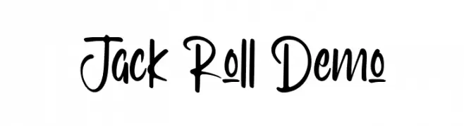
A tall, narrow, handwritten script with playful, casual energy.
![Jack Roll Demo font caratteri gratis]() Scaricare 73 Downloads@WebFont
Scaricare 73 Downloads@WebFont -
( Fonts by Edric Studio - Personal-use only. For commercial use please contact owner. )
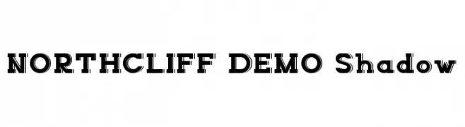
A bold, shadowed font with a modern and striking design.
![NORTHCLIFF DEMO Shadow font caratteri gratis]() Scaricare 73 Downloads@WebFont
Scaricare 73 Downloads@WebFont -
( Gaelleing )
A playful, dotted font with a hand-drawn aesthetic, perfect for creative projects.
![Oeillet font caratteri gratis]() Scaricare 73 Downloads@WebFont
Scaricare 73 Downloads@WebFont -
( Fonts by Maulana Creative - Gilang Maulana - Personal-use only. For commercial use please contact owner. )
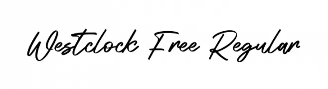
A flowing, cursive script font with elegant, connected characters.
![Westclock Free Regular font caratteri gratis]() Scaricare 73 Downloads@WebFont
Scaricare 73 Downloads@WebFont -
( Fonts by Scratch Design - Studio 41 - Personal-use only. For commercial use please contact owner. )
A dynamic handwritten font with expressive flourishes and elegant curves.
![Diamond Signature Regular font caratteri gratis]() Scaricare 73 Downloads@WebFont
Scaricare 73 Downloads@WebFont -
( Kiedra )
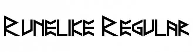
A bold, angular font inspired by ancient runic alphabets.
![Runelike Regular font caratteri gratis]() Scaricare 73 Downloads@WebFont
Scaricare 73 Downloads@WebFont -
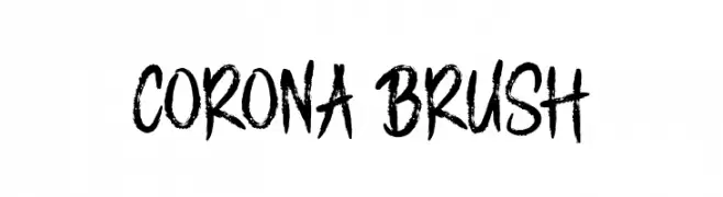
( Fonts by AminMario - Amin Mario - Personal-use only. For commercial use please contact owner. )
A bold, brush-style font with dynamic, hand-painted strokes.
![CORONA BRUSH font caratteri gratis]() Scaricare 73 Downloads@WebFont
Scaricare 73 Downloads@WebFont -
( Gaelleing )
A dynamic, brush-like font with expressive strokes and artistic flair.
![Pinceau font caratteri gratis]() Scaricare 73 Downloads@WebFont
Scaricare 73 Downloads@WebFont -
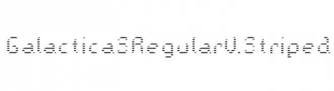
( Jens Cherukad )
A futuristic striped font with a digital and modern aesthetic.
![Galactica S Regular V. Striped font caratteri gratis]() Scaricare 73 Downloads@WebFont
Scaricare 73 Downloads@WebFont -
( Zulkhairi M Saleh - fontbundles.net/zulkhairilettering )
A creative, hand-drawn style font with elongated, artistic letterforms.
![NYOEHOKA font caratteri gratis]() Scaricare 73 Downloads@WebFont
Scaricare 73 Downloads@WebFont


Quali sono i font più popolari adesso?
Poppins, Roboto, Montserrat, Open Sans e Lato sono molto usati per le forme pulite e l'ampia applicabilità — dall'identità di marca alle landing page e ai poster.
Quali font si usano spesso nei loghi?
Le sans serif geometriche (es. Poppins, famiglie in stile Gotham) sono scelte comuni per un branding pulito e scalabile. Per un tocco personale restano valide script e stili manoscritti. Abbina un display deciso per i titoli a un corpo testo neutro per riconoscibilità ed equilibrio.
Ogni quanto si aggiorna la lista?
Con regolarità, in base ai download e all'attività reale. Torna spesso per scoprire in anticipo le nuove preferite.
💡 Consiglio: aggiungi ai preferiti — le tendenze cambiano in fretta e i font top di oggi possono ispirare il rebranding di domani.