Benvenuto nelle Font Più Popolari — dove popolarità e qualità si incontrano. Qui trovi i font più scaricati e usati dell'anno. Se cerchi scelte sicure per logo, web o social, inizia da qui.
Ogni font top si distingue per equilibrio, leggibilità e versatilità. Troverai sans serif moderne, script eleganti, serif vintage e display minimalisti.
-
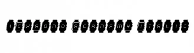
( Iconian Fonts - Daniel Zadorozny - www.iconian.com )
A futuristic, digital watch-inspired font with segmented characters in watch-like frames.
 Scaricare 68 Downloads@WebFont
 -
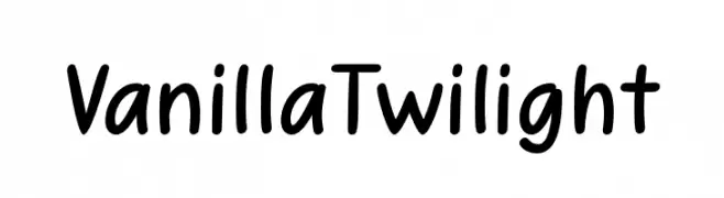
( Fonts by Eifetstype - Stefie Justprince - Personal-use only. For commercial use please contact owner. )
A playful, casual handwritten font with smooth curves and rounded edges.
![VanillaTwilight font caratteri gratis]() Scaricare 68 Downloads@WebFont
Scaricare 68 Downloads@WebFont -
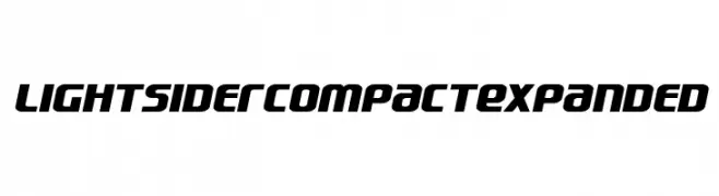
( Fonts by Iconian Fonts - Daniel Zadorozny - Personal-use only. For commercial use please contact owner. )
A bold, futuristic font with a dynamic, slanted design and geometric influence.
![Lightsider Compact Expanded font caratteri gratis]() Scaricare 68 Downloads@WebFont
Scaricare 68 Downloads@WebFont -
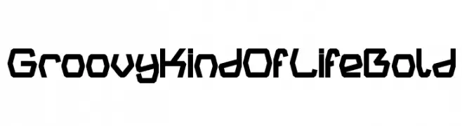
( weknow - Wino S Kadir - www.creativefabrica.com/designer/weknow/ )
A bold, geometric font with a modern, tech-inspired design.
![Groovy Kind Of Life Bold font caratteri gratis]() Scaricare 68 Downloads@WebFont
Scaricare 68 Downloads@WebFont -
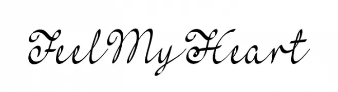
( Misti's Fonts - mistifonts.com/ )
An elegant and flowing script font with ornate, cursive letterforms.
![FeelMyHeart font caratteri gratis]() Scaricare 68 Downloads@WebFont
Scaricare 68 Downloads@WebFont -
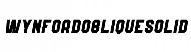
( Fonts by Kong Font - https://fontkong.com/ - Personal-use only. For commercial use please contact owner. )
A bold, oblique font with angular, solid letterforms for dynamic designs.
![Wynford Oblique Solid font caratteri gratis]() Scaricare 68 Downloads@WebFont
Scaricare 68 Downloads@WebFont -
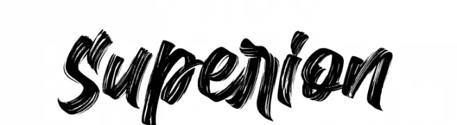
( Fonts by Subectype & Orenari - Rangga Subekti & Ari - Personal-use only. For commercial use please contact owner. )
A bold, brush-style font with dynamic, textured strokes.
![Superion font caratteri gratis]() Scaricare 68 Downloads@WebFont
Scaricare 68 Downloads@WebFont -
( Fonts by skillyasstudio.com - Ahmad Faizin - Personal-use only. For commercial use please contact owner. )
A cursive, handwritten font with elegant, flowing strokes.
![Juliyeta font caratteri gratis]() Scaricare 68 Downloads@WebFont
Scaricare 68 Downloads@WebFont -
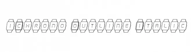
( Iconian Fonts - Daniel Zadorozny - www.iconian.com )
A modern, tech-inspired font with characters in digital watch outlines, featuring an italic style.
![iChrono Outline Italic font caratteri gratis]() Scaricare 68 Downloads@WebFont
Scaricare 68 Downloads@WebFont -
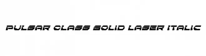
( Iconian Fonts - Daniel Zadorozny - www.iconian.com )
Futuristic, angular, and italicized font with a bold presence.
![Pulsar Class Solid Laser Italic font caratteri gratis]() Scaricare 68 Downloads@WebFont
Scaricare 68 Downloads@WebFont -
( Noto is a trademark of Google Inc. Noto fonts are open source. All Noto fonts are published under the SIL Open Font License, Version 1.1 )
No recognizable font is visible.
![Noto Serif Myanmar Thin font caratteri gratis]() Scaricare 68 Downloads@WebFont
Scaricare 68 Downloads@WebFont -
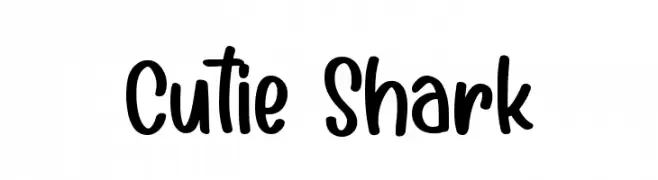
( Fonts by DmLetter31 - Dimas Prasetyo - Personal-use only. For commercial use please contact owner. )
A playful, handwritten font with smooth, rounded edges and a casual style.
![Cutie Shark font caratteri gratis]() Scaricare 68 Downloads@WebFont
Scaricare 68 Downloads@WebFont -
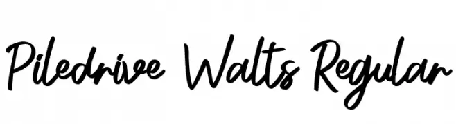
( Fonts by Yofi Aprilla - Personal-use only. For commercial use please contact owner. )
A dynamic and lively handwritten font with fluid strokes and a playful style.
![Piledrive Walts Regular font caratteri gratis]() Scaricare 68 Downloads@WebFont
Scaricare 68 Downloads@WebFont -
( Fonts by Mans Greback - Personal-use only. For commercial use please contact owner. )
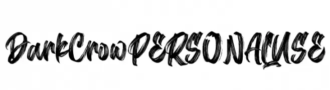
A bold, expressive brush-style font with dynamic strokes and a hand-painted look.
![Dark Crow PERSONAL USE font caratteri gratis]() Scaricare 68 Downloads@WebFont
Scaricare 68 Downloads@WebFont -
( Fonts by André Ramalho - Personal-use only. For commercial use please contact owner. )
A modern, elongated font with narrow, rounded characters.
![Bizarre font caratteri gratis]() Scaricare 68 Downloads@WebFont
Scaricare 68 Downloads@WebFont -
( Fonts by Kong Font - fontkong.com - Personal-use only. For commercial use please contact owner. )
A playful, bold script font with a handwritten style.
![Hoppe Dizzie font caratteri gratis]() Scaricare 68 Downloads@WebFont
Scaricare 68 Downloads@WebFont -
( Eutypoce - www.eutypoce.com/ )
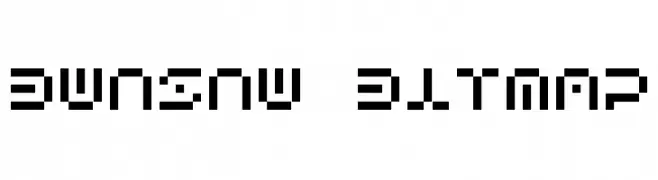
A pixelated, retro-style font with a blocky, geometric design.
![Bwnsnw Bitmap font caratteri gratis]() Scaricare 68 Downloads@WebFont
Scaricare 68 Downloads@WebFont -
( Fonts by Nick Curtis - Personal-use only. For commercial use please contact owner. )
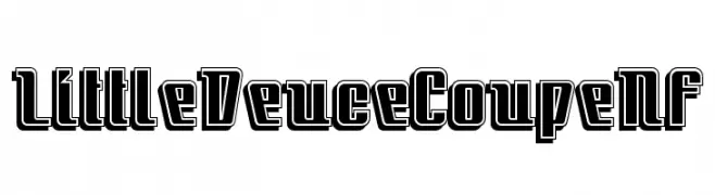
A bold, decorative font with outlined characters and a modern retro vibe.
![LittleDeuceCoupeNF font caratteri gratis]() Scaricare 68 Downloads@WebFont
Scaricare 68 Downloads@WebFont -
( Fonts by Typebae Foundry )
A fluid, handwritten style with elegant, flowing strokes.
![Jashel font caratteri gratis]() Scaricare 68 Downloads@WebFont
Scaricare 68 Downloads@WebFont -
( Typodermic Fonts - Ray Larabie - www.typodermicfonts.com/ )
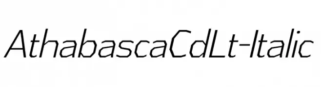
A modern, italicized font with a sleek, technical look and consistent stroke width.
![AthabascaCdLt-Italic font caratteri gratis]() Scaricare 68 Downloads@WebFont
Scaricare 68 Downloads@WebFont -
( Renny Murray - www.rennysniche.com )
A playful, bug-themed decorative font with characters inside beetle shapes.
![RMBuggy font caratteri gratis]() Scaricare 68 Downloads@WebFont
Scaricare 68 Downloads@WebFont -
( Graphicfresh - graphicfresh.com/ )
A playful and elegant script font with fluid, connected strokes.
![Sweet Yell font caratteri gratis]() Scaricare 68 Downloads@WebFont
Scaricare 68 Downloads@WebFont -
( Jonathan S. Harris - www.tattoowoo.com )
A bold, playful font with rounded edges and a hand-drawn style.
![Knackers font caratteri gratis]() Scaricare 68 Downloads@WebFont
Scaricare 68 Downloads@WebFont -
( Fonts by Letterative Studio - Personal-use only. For commercial use please contact owner. )
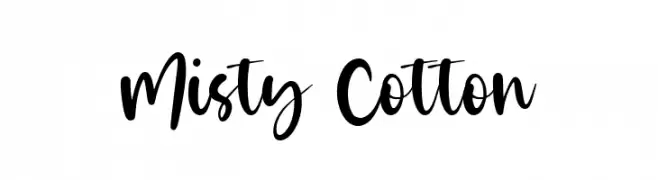
A bold, playful script font with flowing, energetic characters.
![Misty Cotton font caratteri gratis]() Scaricare 68 Downloads@WebFont
Scaricare 68 Downloads@WebFont -
( Iconian Fonts - Daniel Zadorozny - www.iconian.com )
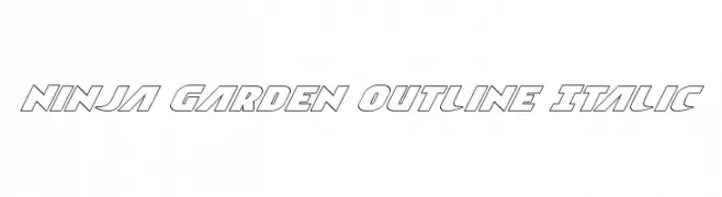
A bold, italic outline font with a modern, dynamic style.
![Ninja Garden Outline Italic font caratteri gratis]() Scaricare 68 Downloads@WebFont
Scaricare 68 Downloads@WebFont -
( Fonts by Woodcutter )
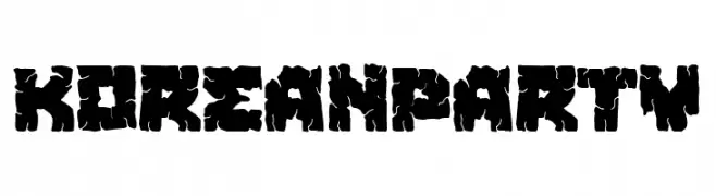
A bold, distressed font with a rugged, grunge aesthetic.
![Korean Party font caratteri gratis]() Scaricare 68 Downloads@WebFont
Scaricare 68 Downloads@WebFont -
( Fonts by Typefactoryco )
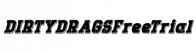
A bold, distressed font with a vintage, textured style.
![DIRTY DRAGS Free Trial font caratteri gratis]() Scaricare 68 Downloads@WebFont
Scaricare 68 Downloads@WebFont -
( Hazel Abbiati - diamondidiocy.tumblr.com )
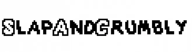
A bold, pixelated font with a retro, digital aesthetic.
![SlapAndCrumbly font caratteri gratis]() Scaricare 68 Downloads@WebFont
Scaricare 68 Downloads@WebFont -
( Thirtypath - www.thirtypath.com )
A bold, playful font with whimsical curves and decorative serifs.
![Ballistic font caratteri gratis]() Scaricare 68 Downloads@WebFont
Scaricare 68 Downloads@WebFont -
( Fonts by Edric Studio - Personal-use only. For commercial use please contact owner. )
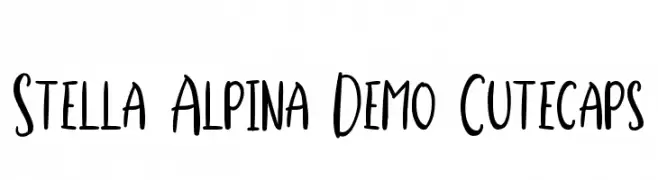
A playful handwritten font with tall, narrow letters and a casual style.
![Stella Alpina Demo Cutecaps font caratteri gratis]() Scaricare 68 Downloads@WebFont
Scaricare 68 Downloads@WebFont -
( Fonts by Guy Hall - Personal-use only. For commercial use please contact owner. )
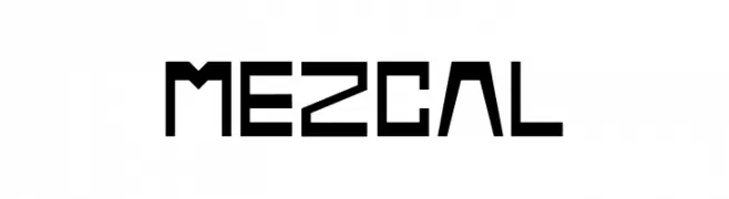
A bold, geometric font with a modern, industrial aesthetic.
![Mezcal font caratteri gratis]() Scaricare 68 Downloads@WebFont
Scaricare 68 Downloads@WebFont -
( Fonts by Sansakerta - DNArt Design - Personal-use only. For commercial use please contact owner. )
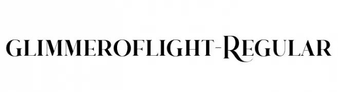
An elegant serif font with decorative swashes and a classic-modern blend.
![glimmeroflight-Regular font caratteri gratis]() Scaricare 68 Downloads@WebFont
Scaricare 68 Downloads@WebFont -
( Fonts by Tychitype - Afif alhabsi - Personal-use only. For commercial use please contact owner. )
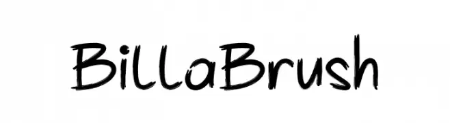
A lively brush script font with bold, dynamic strokes and a hand-painted appearance.
![Billa Brush font caratteri gratis]() Scaricare 68 Downloads@WebFont
Scaricare 68 Downloads@WebFont -
( Fonts by Letters --- Numbers - Ursula Hitz - Personal-use only. For commercial use please contact owner. )
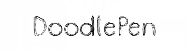
A playful, hand-drawn font with doodle-like strokes and an artistic flair.
![DoodlePen font caratteri gratis]() Scaricare 68 Downloads@WebFont
Scaricare 68 Downloads@WebFont -
( Fonts by Vunira Design - Personal-use only. For commercial use please contact owner. )
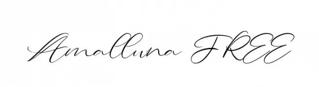
A graceful and sophisticated script font with flowing, interconnected letters.
![Amalluna FREE font caratteri gratis]() Scaricare 68 Downloads@WebFont
Scaricare 68 Downloads@WebFont


Quali sono i font più popolari adesso?
Poppins, Roboto, Montserrat, Open Sans e Lato sono molto usati per le forme pulite e l'ampia applicabilità — dall'identità di marca alle landing page e ai poster.
Quali font si usano spesso nei loghi?
Le sans serif geometriche (es. Poppins, famiglie in stile Gotham) sono scelte comuni per un branding pulito e scalabile. Per un tocco personale restano valide script e stili manoscritti. Abbina un display deciso per i titoli a un corpo testo neutro per riconoscibilità ed equilibrio.
Ogni quanto si aggiorna la lista?
Con regolarità, in base ai download e all'attività reale. Torna spesso per scoprire in anticipo le nuove preferite.
💡 Consiglio: aggiungi ai preferiti — le tendenze cambiano in fretta e i font top di oggi possono ispirare il rebranding di domani.