Benvenuto nelle Font Più Popolari — dove popolarità e qualità si incontrano. Qui trovi i font più scaricati e usati dell'anno. Se cerchi scelte sicure per logo, web o social, inizia da qui.
Ogni font top si distingue per equilibrio, leggibilità e versatilità. Troverai sans serif moderne, script eleganti, serif vintage e display minimalisti.
-
( Fonts by Jimtype Studio )
A casual, handwritten font with fluid, slightly slanted letterforms and a cohesive, organic feel.
 Scaricare 72 Downloads@WebFont
 -
( Fonts by M )
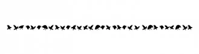
A display font of raven silhouettes and distressed symbols.
![Raven Storm Symbols PERSONAL Regular font caratteri gratis]() Scaricare 72 Downloads@WebFont
Scaricare 72 Downloads@WebFont -
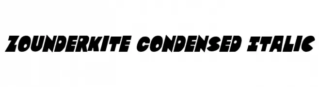
![Zounderkite Condensed Italic font caratteri gratis]() Scaricare 72 Downloads@WebFont
Scaricare 72 Downloads@WebFont -
( Fonts by www.junkohanhero.com - Personal-use only. For commercial use please contact owner. )
A bold, playful font with a cartoonish, graffiti-like style and thick outlines.
![Firebug font caratteri gratis]() Scaricare 72 Downloads@WebFont
Scaricare 72 Downloads@WebFont -
( Vladimir Nikolic - www.coroflot.com/vladimirnikolic )
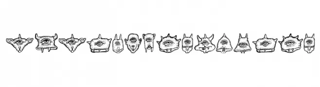
A whimsical, hand-drawn font featuring unique monster-like characters.
![Cyclopia Regular font caratteri gratis]() Scaricare 72 Downloads@WebFont
Scaricare 72 Downloads@WebFont -
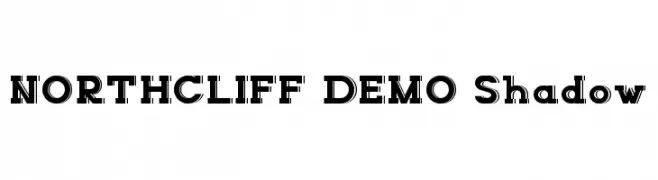
( Fonts by Edric Studio - Personal-use only. For commercial use please contact owner. )
A bold, shadowed font with a modern and striking design.
![NORTHCLIFF DEMO Shadow font caratteri gratis]() Scaricare 72 Downloads@WebFont
Scaricare 72 Downloads@WebFont -
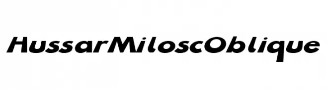
( Fonts by CannotIntoSpaceFonts - KineticPlasma Fonts - Personal-use only. For commercial use please contact owner. )
A bold, oblique font with a modern and dynamic style.
![Hussar Milosc Oblique font caratteri gratis]() Scaricare 72 Downloads@WebFont
Scaricare 72 Downloads@WebFont -
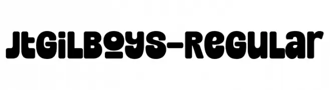
( Fonts by Jolicia Type Foundry )
A bold, rounded font with a playful and friendly style.
![JtGilboys-Regular font caratteri gratis]() Scaricare 72 Downloads@WebFont
Scaricare 72 Downloads@WebFont -
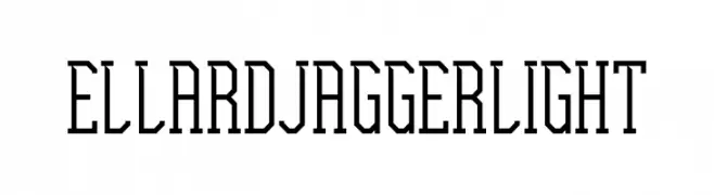
( Fonts by Edric Studio www.creativefabrica.com/designer/edricstudio/ - Personal-use only. For commercial use please contact owner. )
A geometric, angular font with tall, narrow letterforms and a modern, technical feel.
![Ellard Jagger Light font caratteri gratis]() Scaricare 72 Downloads@WebFont
Scaricare 72 Downloads@WebFont -
( Fonts by Din Studio - Donis Miftahudin - Personal-use only. For commercial use please contact owner. )
A dynamic handwritten font with fluid strokes and expressive style.
![Melenias Personal Use font caratteri gratis]() Scaricare 72 Downloads@WebFont
Scaricare 72 Downloads@WebFont -
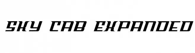
( Fonts by Iconian Fonts )
A bold, dynamic font with a futuristic and sporty aesthetic.
![Sky Cab Expanded font caratteri gratis]() Scaricare 72 Downloads@WebFont
Scaricare 72 Downloads@WebFont -
( Fonts by 39 )
A playful and energetic handwritten font with fluid, dynamic strokes.
![Hamster Sweety font caratteri gratis]() Scaricare 72 Downloads@WebFont
Scaricare 72 Downloads@WebFont -
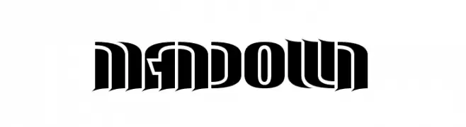
( Fonts by www.chequered.ink - Chequered Ink - Personal-use only. For commercial use please contact owner. )
A bold, dramatic font with sharp angles and geometric cutouts.
![Man Down font caratteri gratis]() Scaricare 72 Downloads@WebFont
Scaricare 72 Downloads@WebFont -
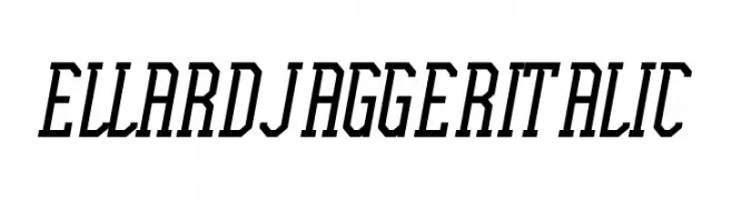
( Fonts by Edric Studio www.creativefabrica.com/designer/edricstudio/ - Personal-use only. For commercial use please contact owner. )
A bold, angular italic font with a modern and dynamic style.
![Ellard Jagger Italic font caratteri gratis]() Scaricare 72 Downloads@WebFont
Scaricare 72 Downloads@WebFont -
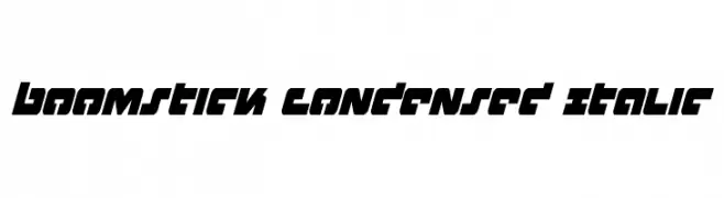
( Fonts by Iconian Fonts )
A bold, condensed, and italic font with a modern, angular design.
![Boomstick Condensed Italic font caratteri gratis]() Scaricare 72 Downloads@WebFont
Scaricare 72 Downloads@WebFont -
( Fonts by VPcreativeshop - Vladimir Fedotov - Personal-use only. For commercial use please contact owner. )
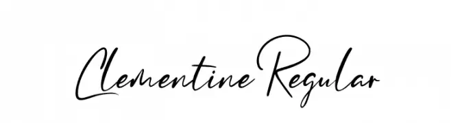
A dynamic and fluid handwritten font with elegant, flowing strokes.
![ClementineRegular font caratteri gratis]() Scaricare 72 Downloads@WebFont
Scaricare 72 Downloads@WebFont -
( DaShiz )
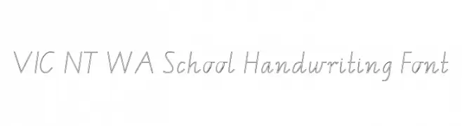
A clean, legible handwriting-style font ideal for educational use.
![VIC NT WA School Handwriting Font font caratteri gratis]() Scaricare 72 Downloads@WebFont
Scaricare 72 Downloads@WebFont -
( Fonts by Daniel Zadorozny - www.iconian.com - Personal-use only. For commercial use please contact owner. )
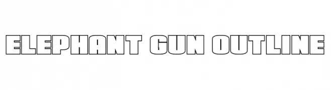
A bold, outlined font with a geometric, blocky style.
![Elephant Gun Outline font caratteri gratis]() Scaricare 72 Downloads@WebFont
Scaricare 72 Downloads@WebFont -
( Fonts by Daniel Zadorozny - www.iconian.com - Personal-use only. For commercial use please contact owner. )
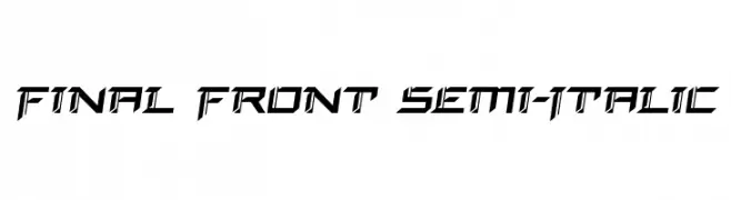
A futuristic, angular font with bold lines and dynamic slant.
![Final Front Semi-Italic font caratteri gratis]() Scaricare 72 Downloads@WebFont
Scaricare 72 Downloads@WebFont -
( Fonts by Letter Jos - Personal-use only. For commercial use please contact owner. )
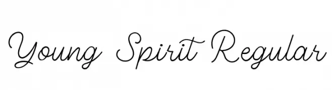
A lively and flowing cursive font with elegant connections and playful lowercase letters.
![Young Spirit Regular font caratteri gratis]() Scaricare 72 Downloads@WebFont
Scaricare 72 Downloads@WebFont -
( Fonts by twinletter - Rozikan - Personal-use only. For commercial use please contact owner. )
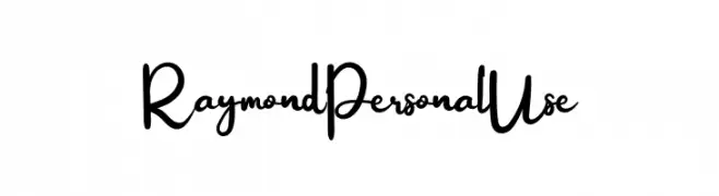
A playful and flowing script font with elegant curves and a handwritten feel.
![Raymond Personal Use font caratteri gratis]() Scaricare 72 Downloads@WebFont
Scaricare 72 Downloads@WebFont -
( Fonts by Neoqueto - Personal-use only. For commercial use please contact owner. )
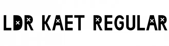
A bold, modern font with unique cross motifs in each character.
![LDR KAET Regular font caratteri gratis]() Scaricare 72 Downloads@WebFont
Scaricare 72 Downloads@WebFont -
( Fonts by Letterflow Studio - Personal-use only. For commercial use please contact owner. )
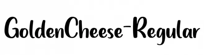
A playful handwritten font with smooth curves and a casual style.
![GoldenCheese-Regular font caratteri gratis]() Scaricare 72 Downloads@WebFont
Scaricare 72 Downloads@WebFont -
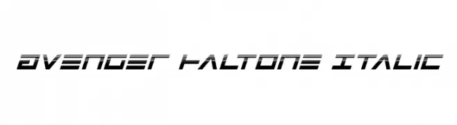
( Iconian Fonts - Daniel Zadorozny - www.iconian.com )
A bold, italicized font with a futuristic halftone effect and tight spacing.
![Avenger Haltone Italic font caratteri gratis]() Scaricare 72 Downloads@WebFont
Scaricare 72 Downloads@WebFont -
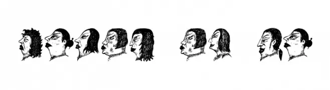
( Vladimir Nikolic - www.coroflot.com/vladimirnikolic )
A collection of artistic human profile illustrations, not a traditional font.
![Damen Regular font caratteri gratis]() Scaricare 72 Downloads@WebFont
Scaricare 72 Downloads@WebFont -
( Fonts by Nick Curtis - Personal-use only. For commercial use please contact owner. )
A bold, shadowed font with a vintage flair, perfect for standout headlines.
![MidlandRailShadowNF font caratteri gratis]() Scaricare 72 Downloads@WebFont
Scaricare 72 Downloads@WebFont -
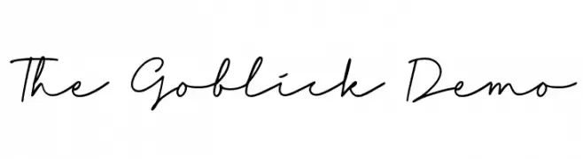
( Fonts by Allouse Studio - Personal-use only. For commercial use please contact owner. )
A fluid, cursive handwritten font with a delicate and elegant style.
![The Goblick Demo font caratteri gratis]() Scaricare 72 Downloads@WebFont
Scaricare 72 Downloads@WebFont -
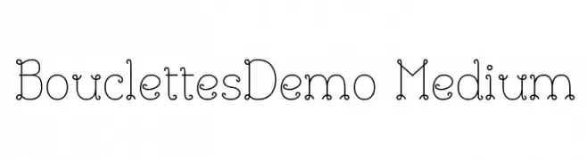
( JBFoundry - Jean Boyault - jean.boyault.pagesperso-orange.fr/ )
A whimsical, looped serif font with decorative elements and medium weight.
![BouclettesDemo Medium font caratteri gratis]() Scaricare 72 Downloads@WebFont
Scaricare 72 Downloads@WebFont -
( imagex - www.imagex-fonts.com )
A bold, geometric font with a strong, industrial style.
![Twent font caratteri gratis]() Scaricare 72 Downloads@WebFont
Scaricare 72 Downloads@WebFont -
( Intellecta Design - new.myfonts.com/search/intellecta/fonts/?sort=sales?refby=paulow )
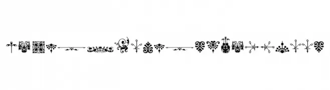
Ornamental floral and flourish dingbats with a vintage feel.
![Micro Fleurons Eighteen font caratteri gratis]() Scaricare 72 Downloads@WebFont
Scaricare 72 Downloads@WebFont -
( Fonts by Vladimir Nikolic - www.creativefabrica.com/designer/vladimirnikolic/ - Personal-use only. For commercial use please contact owner. )
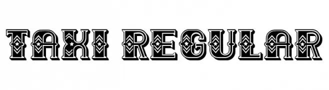
A bold, decorative font with intricate patterns and a vintage flair.
![Taxi Regular font caratteri gratis]() Scaricare 72 Downloads@WebFont
Scaricare 72 Downloads@WebFont -
( Fonts by Al Ghul - Personal-use only. For commercial use please contact owner. )
A playful, handwritten font with quirky loops and curves.
![Hello Miniy font caratteri gratis]() Scaricare 72 Downloads@WebFont
Scaricare 72 Downloads@WebFont -
( Fonts by Greg Medina - www.dcoxy.com - Personal-use only. For commercial use please contact owner. )
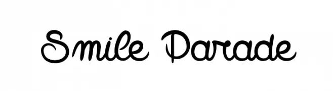
A playful, whimsical script font with interconnected letters and a casual feel.
![Smile Parade font caratteri gratis]() Scaricare 72 Downloads@WebFont
Scaricare 72 Downloads@WebFont -
( Fonts by Personal Design - Tri WIjayanto - Personal-use only. For commercial use please contact owner. )
A bold, cursive font with a pirate-inspired, adventurous style.
![BlackPirates font caratteri gratis]() Scaricare 72 Downloads@WebFont
Scaricare 72 Downloads@WebFont -
( Fonts by GorillaBlu - Personal-use only. For commercial use please contact owner. )
A decorative serif font with each letter encased in a shell-like design.
![Jenna's Shells font caratteri gratis]() Scaricare 72 Downloads@WebFont
Scaricare 72 Downloads@WebFont


Quali sono i font più popolari adesso?
Poppins, Roboto, Montserrat, Open Sans e Lato sono molto usati per le forme pulite e l'ampia applicabilità — dall'identità di marca alle landing page e ai poster.
Quali font si usano spesso nei loghi?
Le sans serif geometriche (es. Poppins, famiglie in stile Gotham) sono scelte comuni per un branding pulito e scalabile. Per un tocco personale restano valide script e stili manoscritti. Abbina un display deciso per i titoli a un corpo testo neutro per riconoscibilità ed equilibrio.
Ogni quanto si aggiorna la lista?
Con regolarità, in base ai download e all'attività reale. Torna spesso per scoprire in anticipo le nuove preferite.
💡 Consiglio: aggiungi ai preferiti — le tendenze cambiano in fretta e i font top di oggi possono ispirare il rebranding di domani.