Benvenuto nelle Font Più Popolari — dove popolarità e qualità si incontrano. Qui trovi i font più scaricati e usati dell'anno. Se cerchi scelte sicure per logo, web o social, inizia da qui.
Ogni font top si distingue per equilibrio, leggibilità e versatilità. Troverai sans serif moderne, script eleganti, serif vintage e display minimalisti.
-
( Mouser Fonts - www.mouserfonts.com/ )
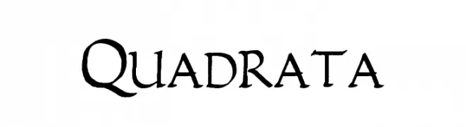
A bold, medieval-style font with sharp serifs and high contrast.
 Scaricare 453 Downloads@WebFont
 -
( Fonts by a Neale Davidson - www.pixelsagas.com. Personal-use only. For commercial use please contact owner. )
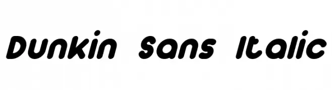
A playful, bold, and rounded italic font with a dynamic and energetic style.
![Dunkin Sans Italic font caratteri gratis]() Scaricare 453 Downloads@WebFont
Scaricare 453 Downloads@WebFont -
( 7NTypes - Situjuh Nazara - 7ntypes.com )
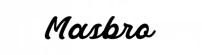
A bold, flowing script font with elegant, cursive letterforms.
![Masbro font caratteri gratis]() Scaricare 453 Downloads@WebFont
Scaricare 453 Downloads@WebFont -
( Fonts by Daniel Gauthier )
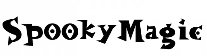
A whimsical and spooky font with bold, angular characters and playful curves.
![SpookyMagic font caratteri gratis]() Scaricare 453 Downloads@WebFont
Scaricare 453 Downloads@WebFont -
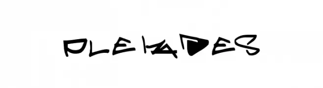
![Pleiades font caratteri gratis]() Scaricare 453 Downloads@WebFont
Scaricare 453 Downloads@WebFont -
-
( Font by kingthingsfonts.co.uk )
A playful, bold, and decorative font with high contrast and unique drop-like embellishments.
![Kingthings Lickorishe font caratteri gratis]() Scaricare 453 Downloads@WebFont
Scaricare 453 Downloads@WebFont -
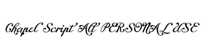
( Fonts by Måns Grebäck )
An elegant and flowing script font with ornate, decorative letterforms.
![Chapel Script Alt PERSONAL USE font caratteri gratis]() Scaricare 453 Downloads@WebFont
Scaricare 453 Downloads@WebFont -
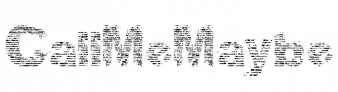
( www.facebook.com/eky.com.my )
A distressed, textured font with a rugged, vintage look.
![CallMeMaybe font caratteri gratis]() Scaricare 453 Downloads@WebFont
Scaricare 453 Downloads@WebFont -
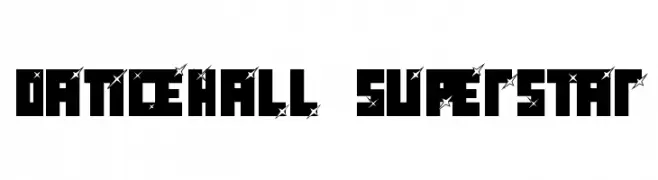
![dancehall superstar font caratteri gratis]() Scaricare 453 Downloads@WebFont
Scaricare 453 Downloads@WebFont -
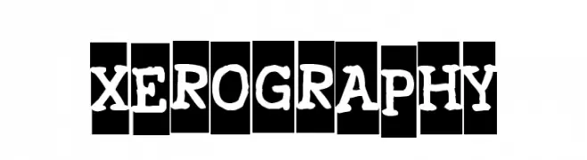
( Fonts by www.vicfieger.com )
A playful, hand-drawn font with thick, uneven strokes and a whimsical style.
![Xerography font caratteri gratis]() Scaricare 453 Downloads@WebFont
Scaricare 453 Downloads@WebFont

Quali sono i font più popolari adesso?
Poppins, Roboto, Montserrat, Open Sans e Lato sono molto usati per le forme pulite e l'ampia applicabilità — dall'identità di marca alle landing page e ai poster.
Quali font si usano spesso nei loghi?
Le sans serif geometriche (es. Poppins, famiglie in stile Gotham) sono scelte comuni per un branding pulito e scalabile. Per un tocco personale restano valide script e stili manoscritti. Abbina un display deciso per i titoli a un corpo testo neutro per riconoscibilità ed equilibrio.
Ogni quanto si aggiorna la lista?
Con regolarità, in base ai download e all'attività reale. Torna spesso per scoprire in anticipo le nuove preferite.
💡 Consiglio: aggiungi ai preferiti — le tendenze cambiano in fretta e i font top di oggi possono ispirare il rebranding di domani.