Benvenuto nelle Font Più Popolari — dove popolarità e qualità si incontrano. Qui trovi i font più scaricati e usati dell'anno. Se cerchi scelte sicure per logo, web o social, inizia da qui.
Ogni font top si distingue per equilibrio, leggibilità e versatilità. Troverai sans serif moderne, script eleganti, serif vintage e display minimalisti.
-
( Fonts by Walter E Stewart - Personal-use only. For commercial use please contact owner. )
A playful, hand-drawn italic font with rounded characters and consistent strokes.
 Scaricare 62 Downloads@WebFont
 -
( Electropithecus )
A bold, playful font with rounded edges and a blocky structure.
![Et BoogieBlocks Round font caratteri gratis]() Scaricare 62 Downloads@WebFont
Scaricare 62 Downloads@WebFont -
( London's Letters - www.londonsletters.com/ )
A bold, decorative font with tribal-inspired embellishments.
![LMS Survive The Island font caratteri gratis]() Scaricare 62 Downloads@WebFont
Scaricare 62 Downloads@WebFont -
( Press Gang Studios - www.pressgang-studios.com.com )
A bold, hand-drawn font with an energetic, graffiti-like style.
![Shank Bold font caratteri gratis]() Scaricare 62 Downloads@WebFont
Scaricare 62 Downloads@WebFont -
( Fonts by RaisProject )
A bold, italic, and geometric font with a futuristic style.
![Grandness Demo Italic font caratteri gratis]() Scaricare 62 Downloads@WebFont
Scaricare 62 Downloads@WebFont -
( Fonts by Daniel Zadorozny - www.iconian.com - Personal-use only. For commercial use please contact owner. )
A bold, italicized font with a futuristic and angular design.
![Laser Corps Super-Italic font caratteri gratis]() Scaricare 62 Downloads@WebFont
Scaricare 62 Downloads@WebFont -
( Fonts by Zuzulgo Studio - Muhammad Zulfani - Personal-use only. For commercial use please contact owner. )
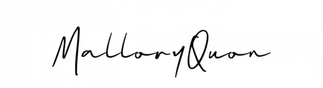
A lively, handwritten font with fluid, dynamic strokes and a casual style.
![Mallory Quon font caratteri gratis]() Scaricare 62 Downloads@WebFont
Scaricare 62 Downloads@WebFont -
( Fonts by Yumna Family )
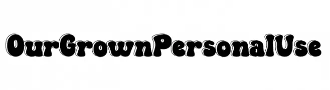
A bold, playful font with thick, rounded strokes and a bubble-like appearance.
![Our Grown Personal Use font caratteri gratis]() Scaricare 62 Downloads@WebFont
Scaricare 62 Downloads@WebFont -
( Fonts by twinletter - Rozikan - Personal-use only. For commercial use please contact owner. )
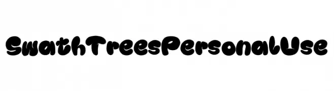
A playful, bold font with rounded, bubble-like characters perfect for creative projects.
![Swath Trees Personal Use font caratteri gratis]() Scaricare 62 Downloads@WebFont
Scaricare 62 Downloads@WebFont -
( Katz Fontz - katzfonts.50megs.com/kg.html )
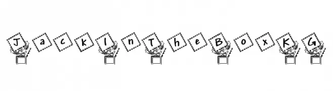
A playful, whimsical font with letters in dotted squares, tilted for a dynamic look.
![JackInTheBox_KG font caratteri gratis]() Scaricare 62 Downloads@WebFont
Scaricare 62 Downloads@WebFont -
( Fonts by Yeasin Kaji )
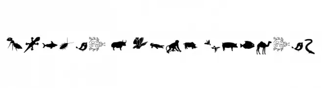
Animal-themed silhouette dingbat font.
![Animal Y Fobt Regular font caratteri gratis]() Scaricare 62 Downloads@WebFont
Scaricare 62 Downloads@WebFont -
( Fonts by Din Studio )
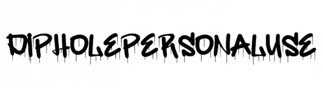
A bold graffiti-style font with a dripping paint effect, ideal for urban-themed designs.
![Diphole Personal Use font caratteri gratis]() Scaricare 62 Downloads@WebFont
Scaricare 62 Downloads@WebFont -
( Fonts by Daniel Zadorozny - www.iconian.com - Personal-use only. For commercial use please contact owner. )
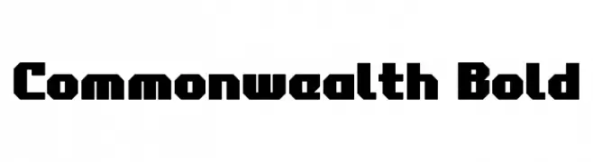
A bold, geometric font with strong, angular lines and a modern, blocky appearance.
![Commonwealth Bold font caratteri gratis]() Scaricare 62 Downloads@WebFont
Scaricare 62 Downloads@WebFont -
( Fonts by Kat`s Fun Fonts - Personal-use only. For commercial use please contact owner. )
A whimsical font with letters encased in blackbird silhouettes, perfect for playful designs.
![KR Blackbird font caratteri gratis]() Scaricare 62 Downloads@WebFont
Scaricare 62 Downloads@WebFont -
( weknow - Wino S Kadir - www.creativefabrica.com/designer/weknow/ )
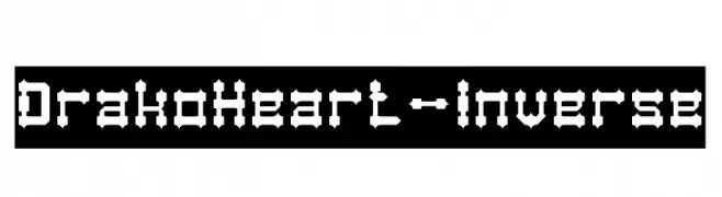
A bold, angular font with a gothic, geometric style.
![Drako Heart-Inverse font caratteri gratis]() Scaricare 62 Downloads@WebFont
Scaricare 62 Downloads@WebFont -
( Fonts by Woodcutter )
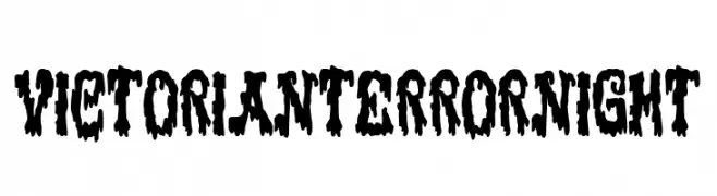
A bold, dripping font with a horror-inspired design.
![Victorian Terror Night font caratteri gratis]() Scaricare 62 Downloads@WebFont
Scaricare 62 Downloads@WebFont -
( Copyright 2017 The Inria Sans Project Authors (https://github.com/BlackFoundryCom/InriaFonts) )
A modern sans-serif font with an elegant italic slant and balanced proportions.
![Inria Sans Italic font caratteri gratis]() Scaricare 62 Downloads@WebFont
Scaricare 62 Downloads@WebFont -
( Fonts by Jroh Creative - jroh creative - Personal-use only. For commercial use please contact owner. )
An elegant script font with fluid, interconnected strokes and high contrast.
![Fitri font caratteri gratis]() Scaricare 62 Downloads@WebFont
Scaricare 62 Downloads@WebFont -
( Fonts by Vunira Design - Personal-use only. For commercial use please contact owner. )
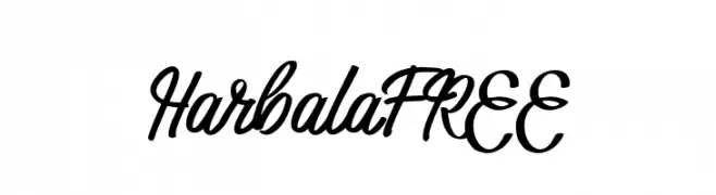
A bold, flowing script font with elegant, connected letterforms.
![HarbalaFREE font caratteri gratis]() Scaricare 62 Downloads@WebFont
Scaricare 62 Downloads@WebFont -
( Fonts by Wasisme Studio - Personal-use only. For commercial use please contact owner. )
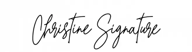
A flowing, elegant script font with a natural handwriting style.
![Christine Signature font caratteri gratis]() Scaricare 62 Downloads@WebFont
Scaricare 62 Downloads@WebFont -
( Fonts by Kat`s Fun Fonts - Personal-use only. For commercial use please contact owner. )
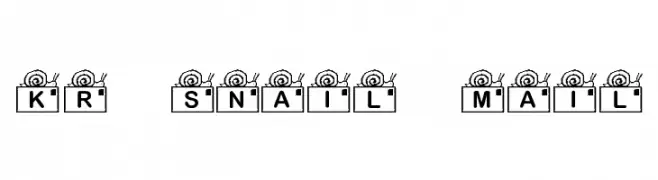
A whimsical font with bold letters and snail illustrations, perfect for playful designs.
![KR Snail Mail font caratteri gratis]() Scaricare 62 Downloads@WebFont
Scaricare 62 Downloads@WebFont -
( Nght's Place - www.crosswinds.net/~nghtmvs/font/fonts1.html )
A decorative font with characters enclosed in heart shapes topped with crosses.
![101! Thru My Heart font caratteri gratis]() Scaricare 62 Downloads@WebFont
Scaricare 62 Downloads@WebFont -
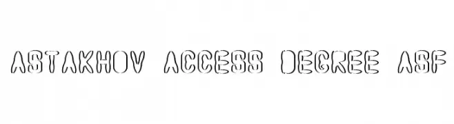
( Fonts by Dmitry Astakhov - www.behance.net/adonis-abe1e - Personal-use only. For commercial use please contact owner. )
A decorative, outline-style font with a playful, artistic flair.
![Astakhov Access Degree ASF font caratteri gratis]() Scaricare 62 Downloads@WebFont
Scaricare 62 Downloads@WebFont -
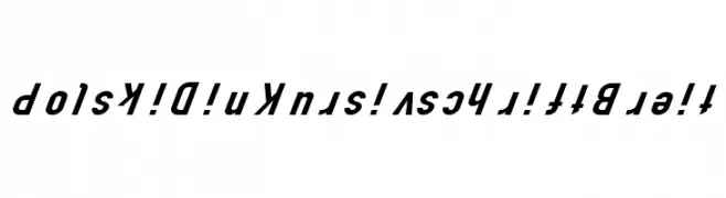
( Fonts by CannotIntoSpaceFonts - KineticPlasma Fonts - Personal-use only. For commercial use please contact owner. )
A bold, italicized font with a modern and dynamic style.
![Polski Din Kursivschrift Breit font caratteri gratis]() Scaricare 62 Downloads@WebFont
Scaricare 62 Downloads@WebFont -
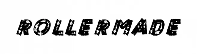
( LeoSupply.co - leosupply.co )
A bold, distressed font with a roller-printed, textured appearance.
![ROLLER MADE font caratteri gratis]() Scaricare 62 Downloads@WebFont
Scaricare 62 Downloads@WebFont -
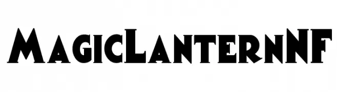
( Fonts by Nick Curtis - Personal-use only. For commercial use please contact owner. )
A bold, geometric font with a playful, vintage style.
![MagicLanternNF font caratteri gratis]() Scaricare 62 Downloads@WebFont
Scaricare 62 Downloads@WebFont -
( www.imagex-fonts.com )
A playful, bold font with irregular shapes and a hand-drawn style.
![Lazy Day font caratteri gratis]() Scaricare 62 Downloads@WebFont
Scaricare 62 Downloads@WebFont -
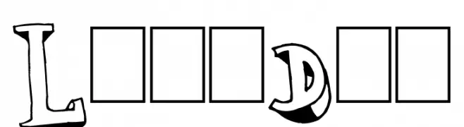
( Chanaka Liyanage )
![Daniel Radcliffe font caratteri gratis]() Scaricare 62 Downloads@WebFont
Scaricare 62 Downloads@WebFont -
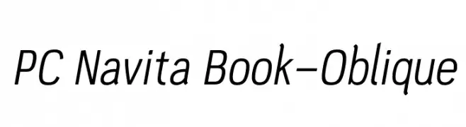
( Parker Creative - Alan Parker - fontbundles.net/parker-creative )
A modern, oblique sans-serif font with clean lines and a dynamic slant.
![PC Navita Book-Oblique font caratteri gratis]() Scaricare 62 Downloads@WebFont
Scaricare 62 Downloads@WebFont -
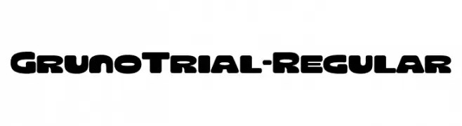
( Fonts by Eko Bimantara )
A bold, rounded font with a playful and impactful style.
![GrunoTrial-Regular font caratteri gratis]() Scaricare 62 Downloads@WebFont
Scaricare 62 Downloads@WebFont -
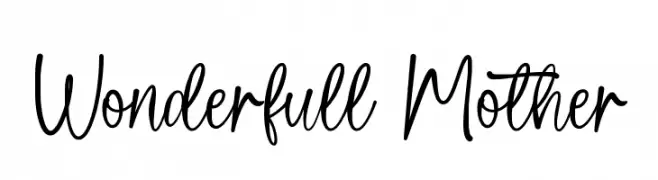
( Fonts by Wahyu Studio )
A playful, handwritten font with flowing, cursive-like strokes.
![Wonderfull Mother font caratteri gratis]() Scaricare 62 Downloads@WebFont
Scaricare 62 Downloads@WebFont -
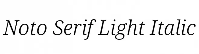
( Noto is a trademark of Google Inc. Noto fonts are open source. All Noto fonts are published under the SIL Open Font License, Version 1.1 )
A light, italic serif font with elegant, slanted characters and subtle serifs.
![Noto Serif Light Italic font caratteri gratis]() Scaricare 62 Downloads@WebFont
Scaricare 62 Downloads@WebFont -
( Fonts by FatmaStudio - Fatmawati - Personal-use only. For commercial use please contact owner. )
A lively, handwritten script font with bold, connected letters.
![Hellomate font caratteri gratis]() Scaricare 62 Downloads@WebFont
Scaricare 62 Downloads@WebFont -
( Fonts by www.chequered.ink - Chequered Ink - Personal-use only. For commercial use please contact owner. )
A bold, angular font with a geometric and futuristic style.
![Lovesauce font caratteri gratis]() Scaricare 62 Downloads@WebFont
Scaricare 62 Downloads@WebFont -
( Fonts by Iconian Fonts )
A futuristic, 3D italic font with bold, angular lines and a tech-inspired look.
![Starfighter 3D Italic font caratteri gratis]() Scaricare 62 Downloads@WebFont
Scaricare 62 Downloads@WebFont


Quali sono i font più popolari adesso?
Poppins, Roboto, Montserrat, Open Sans e Lato sono molto usati per le forme pulite e l'ampia applicabilità — dall'identità di marca alle landing page e ai poster.
Quali font si usano spesso nei loghi?
Le sans serif geometriche (es. Poppins, famiglie in stile Gotham) sono scelte comuni per un branding pulito e scalabile. Per un tocco personale restano valide script e stili manoscritti. Abbina un display deciso per i titoli a un corpo testo neutro per riconoscibilità ed equilibrio.
Ogni quanto si aggiorna la lista?
Con regolarità, in base ai download e all'attività reale. Torna spesso per scoprire in anticipo le nuove preferite.
💡 Consiglio: aggiungi ai preferiti — le tendenze cambiano in fretta e i font top di oggi possono ispirare il rebranding di domani.