Benvenuto nelle Font Più Popolari — dove popolarità e qualità si incontrano. Qui trovi i font più scaricati e usati dell'anno. Se cerchi scelte sicure per logo, web o social, inizia da qui.
Ogni font top si distingue per equilibrio, leggibilità e versatilità. Troverai sans serif moderne, script eleganti, serif vintage e display minimalisti.
-
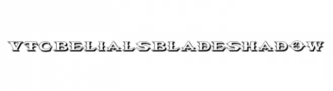
( Fonts by Vigilante Typeface Corporation Larry Yerkes. Personal-use only. For commercial use please contact owner. )
A bold, decorative font with sharp angles and a shadow effect, ideal for dramatic designs.
 Scaricare 62 Downloads@WebFont
 -
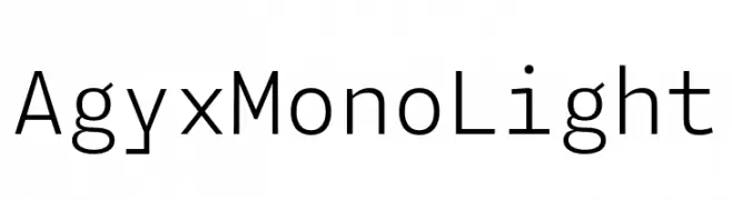
( Fonts by Fitrah Type )
A clean, monospaced font with a minimalist and modern design.
![Agyx Mono Light font caratteri gratis]() Scaricare 62 Downloads@WebFont
Scaricare 62 Downloads@WebFont -
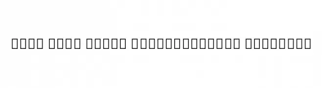
( Noto is a trademark of Google Inc. Noto fonts are open source. All Noto fonts are published under the SIL Open Font License, Version 1.1 )
A modern sans-serif font with semi-condensed, semi-bold characteristics.
![Noto Sans Tamil SemiCondensed SemiBold font caratteri gratis]() Scaricare 62 Downloads@WebFont
Scaricare 62 Downloads@WebFont -
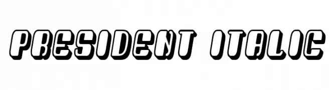
( Fonts by Vladimir Nikolic - https://www.creativefabrica.com/product/educated-deers/ref/144265/ - Personal-use only. For commercial use please contact owner. )
A bold, italic, 3D font with a modern and impactful style.
![President Italic font caratteri gratis]() Scaricare 62 Downloads@WebFont
Scaricare 62 Downloads@WebFont -
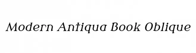
( Fonts by Wojciech Kalinowski "wmk69" (wmk69@o2.pl) - Personal-use only. For commercial use please contact owner. )
A modern oblique font with classic elegance and moderate stroke contrast.
![Modern Antiqua Book Oblique font caratteri gratis]() Scaricare 62 Downloads@WebFont
Scaricare 62 Downloads@WebFont -
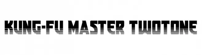
( Fonts by Daniel Zadorozny - www.iconian.com - Personal-use only. For commercial use please contact owner. )
A bold, two-tone font with a retro, arcade-inspired design.
![Kung-Fu Master Twotone font caratteri gratis]() Scaricare 62 Downloads@WebFont
Scaricare 62 Downloads@WebFont -
( Fonts by Ali Hamidi - Personal-use only. For commercial use please contact owner. )
A dynamic, brush-style font with expressive, energetic strokes.
![Shallows font caratteri gratis]() Scaricare 62 Downloads@WebFont
Scaricare 62 Downloads@WebFont -
( Fonts by Dasagani Ramesh - Personal-use only. For commercial use please contact owner. )
A playful, hand-drawn font with thin, elongated strokes and a whimsical style.
![Handypot font caratteri gratis]() Scaricare 62 Downloads@WebFont
Scaricare 62 Downloads@WebFont -
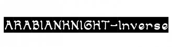
( weknow - Wino S Kadir - www.creativefabrica.com/designer/weknow/ )
A decorative font with Middle Eastern-inspired design elements and bold, rounded characters.
![ARABIAN KNIGHT-Inverse font caratteri gratis]() Scaricare 62 Downloads@WebFont
Scaricare 62 Downloads@WebFont -
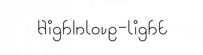
( weknow - Wino S Kadir - www.creativefabrica.com/designer/weknow/ )
A playful and modern font with rounded, looping strokes.
![High In love-light font caratteri gratis]() Scaricare 62 Downloads@WebFont
Scaricare 62 Downloads@WebFont -
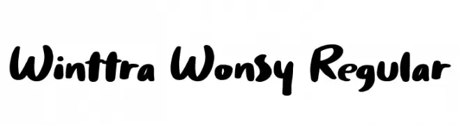
( Fonts by HandletterYean - Yean Aguste - Personal-use only. For commercial use please contact owner. )
A bold, handwritten-style font with smooth, rounded characters.
![Winttra Wonsy Regular font caratteri gratis]() Scaricare 62 Downloads@WebFont
Scaricare 62 Downloads@WebFont -
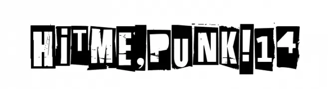
( Fonts by junkohanhero - Personal-use only. For commercial use please contact owner. )
A bold, grungy font with a distressed, cut-out style perfect for punk and DIY themes.
![Hit me, punk! 14 font caratteri gratis]() Scaricare 62 Downloads@WebFont
Scaricare 62 Downloads@WebFont -
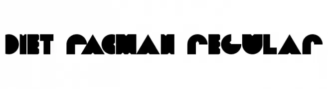
( Fino 3 )
A bold, geometric font with a playful and block-like design.
![Diet PacMan Regular font caratteri gratis]() Scaricare 62 Downloads@WebFont
Scaricare 62 Downloads@WebFont -
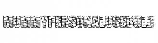
( Fonts by Billy Argel Fonts - www.billyargel.com - Personal-use only. For commercial use please contact owner. )
A bold, decorative font with a mummy wrapping design, ideal for Halloween themes.
![MUMMY PERSONAL USE Bold font caratteri gratis]() Scaricare 62 Downloads@WebFont
Scaricare 62 Downloads@WebFont -
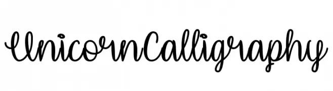
( Misti's Fonts - mistifonts.com/ )
A whimsical, cursive font with playful loops and magical elements.
![UnicornCalligraphy font caratteri gratis]() Scaricare 62 Downloads@WebFont
Scaricare 62 Downloads@WebFont -
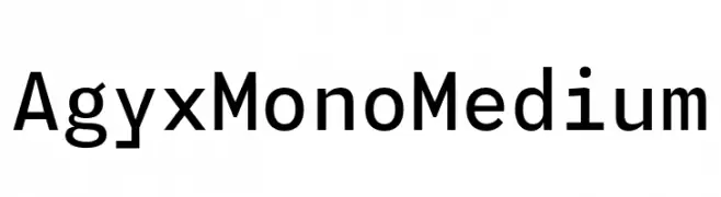
( Fonts by Fitrah Type )
A modern, monospaced font with a clean and minimalist design.
![Agyx Mono Medium font caratteri gratis]() Scaricare 62 Downloads@WebFont
Scaricare 62 Downloads@WebFont -
( Fonts by Farul Arjianto - creativemarket.com/typefar - Personal-use only. For commercial use please contact owner. )
A bold, decorative font with contrasting strokes and playful curves.
![Curtina font caratteri gratis]() Scaricare 62 Downloads@WebFont
Scaricare 62 Downloads@WebFont -
( Fonts by Vladimir Nikolic - https://www.creativefabrica.com/product/educated-deers/ref/144265/ - Personal-use only. For commercial use please contact owner. )
A whimsical, hand-drawn font featuring quirky, cartoon-like characters.
![Kinderskizzen Regular font caratteri gratis]() Scaricare 62 Downloads@WebFont
Scaricare 62 Downloads@WebFont -
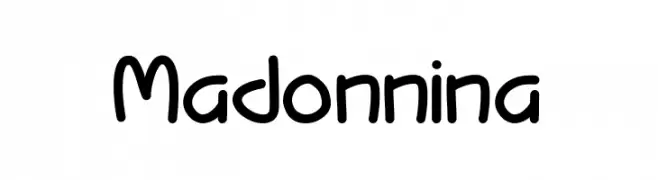
( Fonts by Nurf Designs - Personal-use only. For commercial use please contact owner. )
A playful, rounded font with a hand-drawn, whimsical style.
![Madonnina font caratteri gratis]() Scaricare 62 Downloads@WebFont
Scaricare 62 Downloads@WebFont -
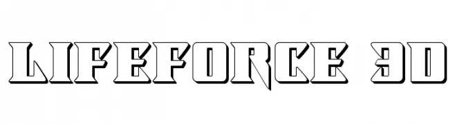
( Iconian Fonts - Daniel Zadorozny - www.iconian.com )
A bold, 3D font with angular, geometric shapes and a shadow effect.
![Lifeforce 3D font caratteri gratis]() Scaricare 62 Downloads@WebFont
Scaricare 62 Downloads@WebFont -
( Noto is a trademark of Google Inc. Noto fonts are open source. All Noto fonts are published under the SIL Open Font License, Version 1.1 )
A clean, extra light font designed for the Georgian script with a modern and minimalistic style.
![Noto Sans Georgian ExtraLight font caratteri gratis]() Scaricare 62 Downloads@WebFont
Scaricare 62 Downloads@WebFont -
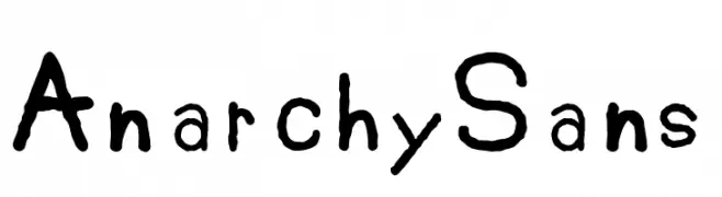
( Fonts by Doctor Wat - Personal-use only. For commercial use please contact owner. )
A rough, hand-drawn font with an edgy, rebellious style.
![AnarchySans font caratteri gratis]() Scaricare 62 Downloads@WebFont
Scaricare 62 Downloads@WebFont -
( Fonts by Wino S Kadir - weknow - www.revolge.com/shop/weknow/ - Personal-use only. For commercial use please contact owner. )
A playful, jagged font with an icy, adventurous feel.
![Eskimo and Polar Bear font caratteri gratis]() Scaricare 62 Downloads@WebFont
Scaricare 62 Downloads@WebFont -
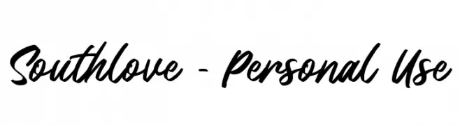
( Fonts by Fontherapy - Siti Anisa - Personal-use only. For commercial use please contact owner. )
A bold and expressive script font with fluid, connected letterforms.
![Southlove - Personal Use font caratteri gratis]() Scaricare 62 Downloads@WebFont
Scaricare 62 Downloads@WebFont -
( Fonts by andfonts - Andrii Shevchyk - Personal-use only. For commercial use please contact owner. )
A bold, italicized font with a modern and dynamic style.
![Xbka font caratteri gratis]() Scaricare 62 Downloads@WebFont
Scaricare 62 Downloads@WebFont -
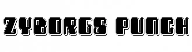
( Iconian Fonts - Daniel Zadorozny - www.iconian.com )
A bold, futuristic font with geometric shapes and thick outlines.
![Zyborgs Punch font caratteri gratis]() Scaricare 62 Downloads@WebFont
Scaricare 62 Downloads@WebFont -
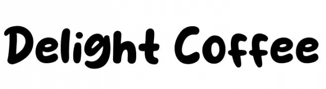
( Fonts by Syaf Rizal - Khurasan - Personal-use only. For commercial use please contact owner. )
A playful, bold font with rounded, thick strokes and a whimsical touch.
![Delight Coffee font caratteri gratis]() Scaricare 62 Downloads@WebFont
Scaricare 62 Downloads@WebFont -
( Noto is a trademark of Google Inc. Noto fonts are open source. All Noto fonts are published under the SIL Open Font License, Version 1.1 )
A condensed, thin font with a clean and modern design.
![Noto Serif Armenian Condensed Thin font caratteri gratis]() Scaricare 62 Downloads@WebFont
Scaricare 62 Downloads@WebFont -
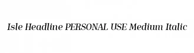
( Fonts by Mans Greback - Personal-use only. For commercial use please contact owner. )
A modern serif font with elegant italic styling and medium weight.
![Isle Headline PERSONAL USE Medium Italic font caratteri gratis]() Scaricare 62 Downloads@WebFont
Scaricare 62 Downloads@WebFont -
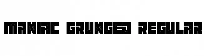
( Vladimir Nikolic - www.coroflot.com/vladimirnikolic )
A bold, grunge-textured font with a rugged, geometric style.
![Maniac Grunged Regular font caratteri gratis]() Scaricare 62 Downloads@WebFont
Scaricare 62 Downloads@WebFont -
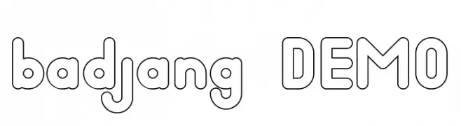
( Fonts by nariswari_creative - Taufik Dwi Purnomo - Personal-use only. For commercial use please contact owner. )
A playful, bold outline font with rounded, smooth characters.
![badjang DEMO font caratteri gratis]() Scaricare 62 Downloads@WebFont
Scaricare 62 Downloads@WebFont -
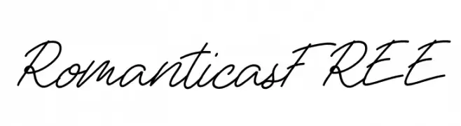
( Fonts by Vunira Design - Personal-use only. For commercial use please contact owner. )
A flowing, elegant script font with a cursive, handwritten style.
![RomanticasFREE font caratteri gratis]() Scaricare 62 Downloads@WebFont
Scaricare 62 Downloads@WebFont -
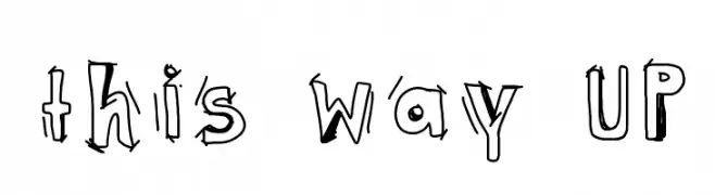
( Eddy Glyn Lucas - www.findingyogurt.blogspot.com )
A playful, hand-drawn font with quirky, uneven strokes and a whimsical style.
![this way UP font caratteri gratis]() Scaricare 62 Downloads@WebFont
Scaricare 62 Downloads@WebFont -
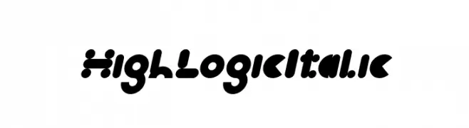
( weknow - Wino S Kadir - www.creativefabrica.com/designer/weknow/ )
A bold, playful font with rounded, bubble-like characters.
![High Logic Italic font caratteri gratis]() Scaricare 62 Downloads@WebFont
Scaricare 62 Downloads@WebFont -
( Fonts by 7NTypes - Personal-use only. For commercial use please contact owner. )
A cursive, italic font with a flowing, elegant style.
![Dohearts Italic font caratteri gratis]() Scaricare 62 Downloads@WebFont
Scaricare 62 Downloads@WebFont


Quali sono i font più popolari adesso?
Poppins, Roboto, Montserrat, Open Sans e Lato sono molto usati per le forme pulite e l'ampia applicabilità — dall'identità di marca alle landing page e ai poster.
Quali font si usano spesso nei loghi?
Le sans serif geometriche (es. Poppins, famiglie in stile Gotham) sono scelte comuni per un branding pulito e scalabile. Per un tocco personale restano valide script e stili manoscritti. Abbina un display deciso per i titoli a un corpo testo neutro per riconoscibilità ed equilibrio.
Ogni quanto si aggiorna la lista?
Con regolarità, in base ai download e all'attività reale. Torna spesso per scoprire in anticipo le nuove preferite.
💡 Consiglio: aggiungi ai preferiti — le tendenze cambiano in fretta e i font top di oggi possono ispirare il rebranding di domani.