Benvenuto nelle Font Più Popolari — dove popolarità e qualità si incontrano. Qui trovi i font più scaricati e usati dell'anno. Se cerchi scelte sicure per logo, web o social, inizia da qui.
Ogni font top si distingue per equilibrio, leggibilità e versatilità. Troverai sans serif moderne, script eleganti, serif vintage e display minimalisti.
-
( Noto is a trademark of Google Inc. Noto fonts are open source. All Noto fonts are published under the SIL Open Font License, Version 1.1 )
No valid font characters are visible.
 Scaricare 71 Downloads@WebFont
 -
( Fonts by Kat`s Fun Fonts - Personal-use only. For commercial use please contact owner. )
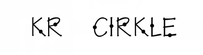
A playful, modern font with circular decorative elements.
![KR Cirkle font caratteri gratis]() Scaricare 71 Downloads@WebFont
Scaricare 71 Downloads@WebFont -
( Fonts by Maulana Creative - Gilang Maulana - Personal-use only. For commercial use please contact owner. )
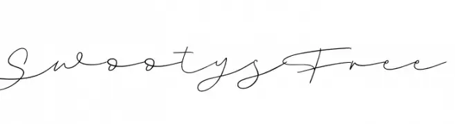
A delicate, flowing script font with elegant, continuous strokes.
![Swootys Free font caratteri gratis]() Scaricare 71 Downloads@WebFont
Scaricare 71 Downloads@WebFont -
( Fonts by Daniel Zadorozny - www.iconian.com - Personal-use only. For commercial use please contact owner. )
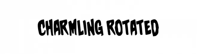
A playful, bold font with a hand-drawn, whimsical style.
![Charmling Rotated font caratteri gratis]() Scaricare 71 Downloads@WebFont
Scaricare 71 Downloads@WebFont -
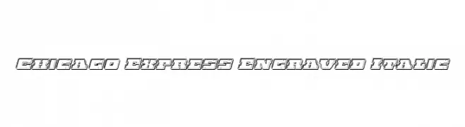
( Iconian Fonts - Daniel Zadorozny - www.iconian.com )
A bold, engraved, italic font with a three-dimensional outline effect.
![Chicago Express Engraved Italic font caratteri gratis]() Scaricare 71 Downloads@WebFont
Scaricare 71 Downloads@WebFont -
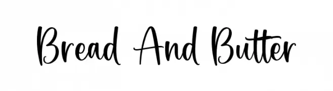
( Fonts by Graphix Line Studio )
![Bread And Butter font caratteri gratis]() Scaricare 71 Downloads@WebFont
Scaricare 71 Downloads@WebFont -
( Fonts by Asd Studio - Ghazi Humam Fauzan - Personal-use only. For commercial use please contact owner. )
A dynamic, cursive script font with a vintage, distressed texture.
![Automobile Contest font caratteri gratis]() Scaricare 71 Downloads@WebFont
Scaricare 71 Downloads@WebFont -
( Fonts by ingoFonts - Ingo Zimmermann - Personal-use only. For commercial use please contact owner. )
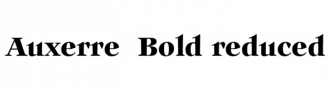
A bold serif font with sharp serifs and strong vertical stress.
![Auxerre 75 Bold reduced font caratteri gratis]() Scaricare 71 Downloads@WebFont
Scaricare 71 Downloads@WebFont -
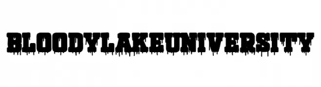
( Fonts by Woodcutter - woodcutter Manero - Personal-use only. For commercial use please contact owner. )
A bold, dripping font with a horror-themed aesthetic.
![Bloody Lake University font caratteri gratis]() Scaricare 71 Downloads@WebFont
Scaricare 71 Downloads@WebFont -
( Fonts by ingoFonts - Ingo Zimmermann - Personal-use only. For commercial use please contact owner. )
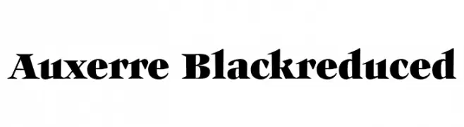
A bold, high-contrast serif font with a dramatic and elegant style.
![Auxerre-Blackreduced font caratteri gratis]() Scaricare 71 Downloads@WebFont
Scaricare 71 Downloads@WebFont -
( Fonts by Darrell Flood - Personal-use only. For commercial use please contact owner. )
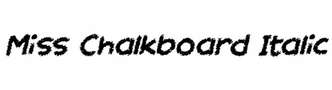
A playful, chalk-like font with bold, textured characters and a dynamic italic slant.
![Miss Chalkboard Italic font caratteri gratis]() Scaricare 71 Downloads@WebFont
Scaricare 71 Downloads@WebFont -
( Fonts by Figuree Studio - Icep Fadhil - Personal-use only. For commercial use please contact owner. )
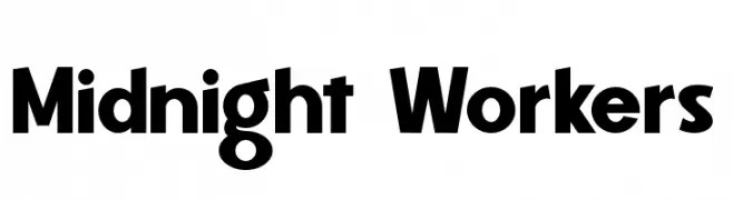
A bold, geometric font with a modern and assertive style.
![Midnight Workers font caratteri gratis]() Scaricare 71 Downloads@WebFont
Scaricare 71 Downloads@WebFont -
![Fidgety BRK font caratteri gratis]() Scaricare 71 Downloads@WebFont
Scaricare 71 Downloads@WebFont -
( Fonts by Hanoded - David Kerkhoff - Personal-use only. For commercial use please contact owner. )
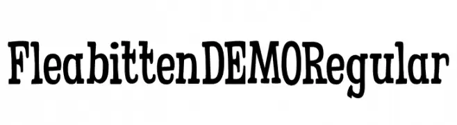
A bold, vintage-style font with playful, decorative elements.
![Fleabitten DEMO Regular font caratteri gratis]() Scaricare 71 Downloads@WebFont
Scaricare 71 Downloads@WebFont -
( Fonts by MJB Letters - Muhammad Mujibulloh - Personal-use only. For commercial use please contact owner. )
A whimsical, handwritten font with a playful and elegant style.
![Ballimore font caratteri gratis]() Scaricare 71 Downloads@WebFont
Scaricare 71 Downloads@WebFont -
( Iconian Fonts - Daniel Zadorozny - www.iconian.com )
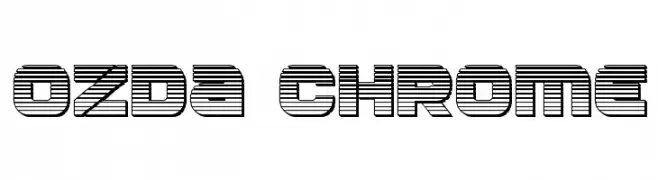
A bold, futuristic font with a unique striped pattern and geometric design.
![Ozda Chrome font caratteri gratis]() Scaricare 71 Downloads@WebFont
Scaricare 71 Downloads@WebFont -
( Fonts by Daniel Zadorozny - www.iconian.com - Personal-use only. For commercial use please contact owner. )
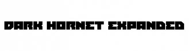
A bold, geometric font with a futuristic and industrial style.
![Dark Hornet Expanded font caratteri gratis]() Scaricare 71 Downloads@WebFont
Scaricare 71 Downloads@WebFont -
( Iconian Fonts - Daniel Zadorozny - www.iconian.com )
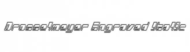
A bold, engraved italic font with a modern, dynamic style.
![Drosselmeyer Engraved Italic font caratteri gratis]() Scaricare 71 Downloads@WebFont
Scaricare 71 Downloads@WebFont -
( Fonts by scratchones )
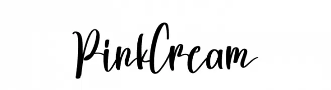
A lively and expressive script font with fluid, dynamic strokes and a handwritten quality.
![Pink Cream font caratteri gratis]() Scaricare 71 Downloads@WebFont
Scaricare 71 Downloads@WebFont -
( Fonts by Debut Studio - Ari Fadli - Personal-use only. For commercial use please contact owner. )
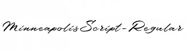
A fluid and graceful script font with interconnected cursive letters.
![MinneapolisScript-Regular font caratteri gratis]() Scaricare 71 Downloads@WebFont
Scaricare 71 Downloads@WebFont -
( Fonts by Balpirick Studio - https://www.creativefabrica.com/designer/balpirick/ref/308299/ - Personal-use only. For commercial use please contact owner. )
A fluid, cursive script font with elegant, interconnected strokes.
![Amertano font caratteri gratis]() Scaricare 71 Downloads@WebFont
Scaricare 71 Downloads@WebFont -
( Deconditoned Reflex Design - Roberto Dias da Silva - www.drx-design.nl )
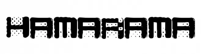
A bold, decorative font with a dotted pattern and rounded edges.
![Hamarama font caratteri gratis]() Scaricare 71 Downloads@WebFont
Scaricare 71 Downloads@WebFont -
( Fonts by Ardana Creative - Personal-use only. For commercial use please contact owner. )
A dynamic and expressive handwritten font with fluid cursive letterforms.
![Schrödinger's font caratteri gratis]() Scaricare 71 Downloads@WebFont
Scaricare 71 Downloads@WebFont -
( Fonts by Kat`s Fun Fonts - Personal-use only. For commercial use please contact owner. )
A playful, comic-style display font with a hand-drawn appearance.
![KR Driverz font caratteri gratis]() Scaricare 71 Downloads@WebFont
Scaricare 71 Downloads@WebFont -
( Fonts by DumadiStyle - Toni Dzulham - Personal-use only. For commercial use please contact owner. )
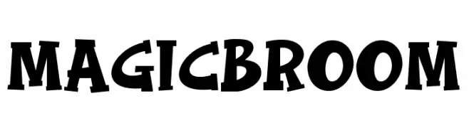
A bold, playful font with exaggerated serifs and a whimsical, decorative style.
![Magic Broom font caratteri gratis]() Scaricare 71 Downloads@WebFont
Scaricare 71 Downloads@WebFont -
( Fonts by Alit Design )
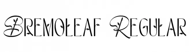
An elegant, nature-inspired font with decorative leaf accents.
![Bremoleaf Regular font caratteri gratis]() Scaricare 71 Downloads@WebFont
Scaricare 71 Downloads@WebFont -
( Fonts by Bexxtype - Personal-use only. For commercial use please contact owner. )
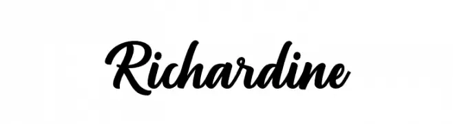
A bold, flowing script font with elegant curves and high contrast.
![Richardine font caratteri gratis]() Scaricare 71 Downloads@WebFont
Scaricare 71 Downloads@WebFont -
( Fonts by Wino S Kadir - weknow - www.revolge.com/shop/weknow/ - Personal-use only. For commercial use please contact owner. )
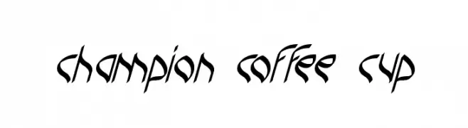
A dynamic, angular font with a modern calligraphic style.
![champion coffee cup font caratteri gratis]() Scaricare 71 Downloads@WebFont
Scaricare 71 Downloads@WebFont -
( Fonts by DumadiStyle - Toni Dzulham - Personal-use only. For commercial use please contact owner. )
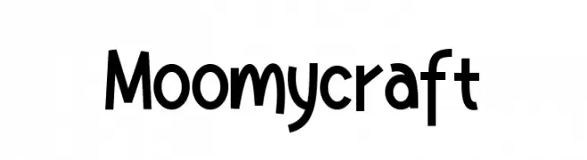
A playful, whimsical font with a hand-drawn, quirky style.
![Moomycraft font caratteri gratis]() Scaricare 71 Downloads@WebFont
Scaricare 71 Downloads@WebFont -
( Fonts by Iconian Fonts - Daniel Zadorozny - Personal-use only. For commercial use please contact owner. )
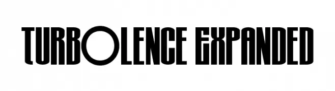
A bold, expanded font with a strong vertical emphasis and consistent stroke thickness.
![Turb0lence Expanded font caratteri gratis]() Scaricare 71 Downloads@WebFont
Scaricare 71 Downloads@WebFont -
( Fonts by OCSstudio - Oki Candra Setiawan - Personal-use only. For commercial use please contact owner. )
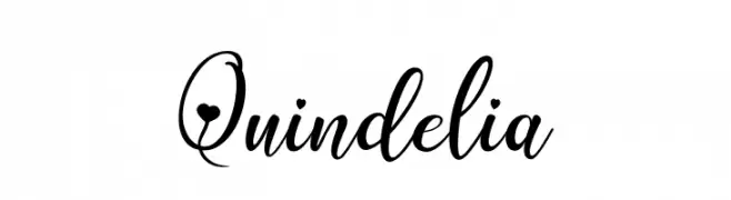
An elegant, flowing script font with cursive, connected letterforms and graceful flourishes.
![Quindelia font caratteri gratis]() Scaricare 71 Downloads@WebFont
Scaricare 71 Downloads@WebFont -
( Fonts by Zetafonts - Personal-use only. For commercial use please contact owner. )
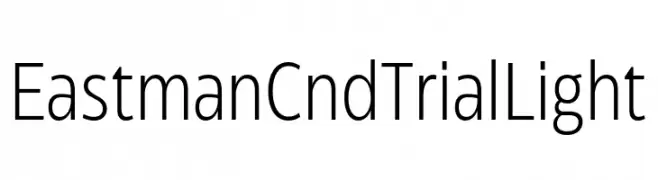
A modern, condensed sans-serif font with a clean and professional look.
![Eastman Cnd Trial Light font caratteri gratis]() Scaricare 71 Downloads@WebFont
Scaricare 71 Downloads@WebFont -
( Fonts by sronstudio - Yusron Billah - Personal-use only. For commercial use please contact owner. )
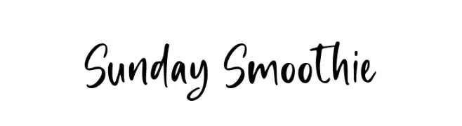
A playful, handwritten font with a casual and dynamic style.
![Sunday Smoothie font caratteri gratis]() Scaricare 71 Downloads@WebFont
Scaricare 71 Downloads@WebFont -
( Dingfontbats )
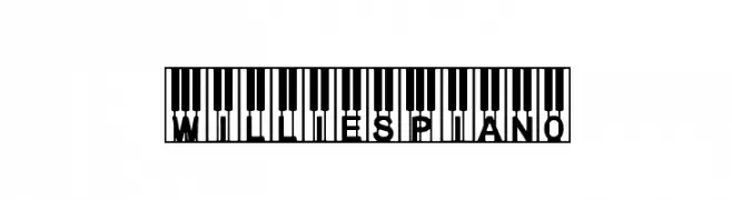
A decorative font featuring characters embedded in piano key designs.
![WilliesPiano font caratteri gratis]() Scaricare 71 Downloads@WebFont
Scaricare 71 Downloads@WebFont -
( London's Letters - www.londonsletters.com/ )
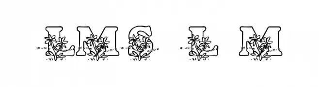
A decorative font with floral motifs integrated into each letter, perfect for artistic projects.
![LMS Loves Me font caratteri gratis]() Scaricare 71 Downloads@WebFont
Scaricare 71 Downloads@WebFont


Quali sono i font più popolari adesso?
Poppins, Roboto, Montserrat, Open Sans e Lato sono molto usati per le forme pulite e l'ampia applicabilità — dall'identità di marca alle landing page e ai poster.
Quali font si usano spesso nei loghi?
Le sans serif geometriche (es. Poppins, famiglie in stile Gotham) sono scelte comuni per un branding pulito e scalabile. Per un tocco personale restano valide script e stili manoscritti. Abbina un display deciso per i titoli a un corpo testo neutro per riconoscibilità ed equilibrio.
Ogni quanto si aggiorna la lista?
Con regolarità, in base ai download e all'attività reale. Torna spesso per scoprire in anticipo le nuove preferite.
💡 Consiglio: aggiungi ai preferiti — le tendenze cambiano in fretta e i font top di oggi possono ispirare il rebranding di domani.