Benvenuto nelle Font Più Popolari — dove popolarità e qualità si incontrano. Qui trovi i font più scaricati e usati dell'anno. Se cerchi scelte sicure per logo, web o social, inizia da qui.
Ogni font top si distingue per equilibrio, leggibilità e versatilità. Troverai sans serif moderne, script eleganti, serif vintage e display minimalisti.
-
( Fonts by Wino S Kadir - weknow - www.revolge.com/shop/weknow/ - Personal-use only. For commercial use please contact owner. )
A futuristic, geometric font with rounded edges and a stencil-like design.
 Scaricare 69 Downloads@WebFont
 -
( Fonts by Iconian Fonts )
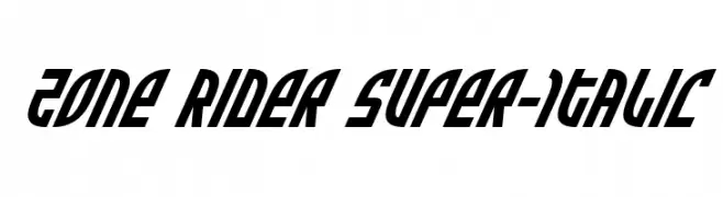
A bold, italicized font with a dynamic, angular design and a futuristic feel.
![Zone Rider Super-Italic font caratteri gratis]() Scaricare 69 Downloads@WebFont
Scaricare 69 Downloads@WebFont -
( Iconian Fonts - Daniel Zadorozny - www.iconian.com )
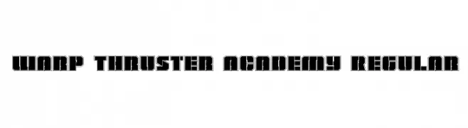
A bold, geometric font with a futuristic and industrial design.
![Warp Thruster Academy Regular font caratteri gratis]() Scaricare 69 Downloads@WebFont
Scaricare 69 Downloads@WebFont -
( Fonts by Kat`s Fun Fonts - Personal-use only. For commercial use please contact owner. )
A decorative font with festive Christmas-themed illustrations replacing characters.
![KR Christmas Jewels 2005 3 font caratteri gratis]() Scaricare 69 Downloads@WebFont
Scaricare 69 Downloads@WebFont -
( Fonts by www.chequered.ink - Chequered Ink - Personal-use only. For commercial use please contact owner. )
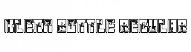
A geometric, maze-like font with a bold, digital aesthetic.
![Klein Bottle Regular font caratteri gratis]() Scaricare 69 Downloads@WebFont
Scaricare 69 Downloads@WebFont -
( Flö Rastbichler - www.elopedthought.com )
A classic slab serif font with an elegant italic slant.
![KorneuburgSlabRegular-Italic font caratteri gratis]() Scaricare 69 Downloads@WebFont
Scaricare 69 Downloads@WebFont -
( Fonts by FHFont - Ferry Hadriyan - Personal-use only. For commercial use please contact owner. )
A dynamic and elegant script font with fluid strokes and artistic flair.
![ShuttenReasonFree font caratteri gratis]() Scaricare 69 Downloads@WebFont
Scaricare 69 Downloads@WebFont -
( Fonts by Kat`s Fun Fonts - Personal-use only. For commercial use please contact owner. )
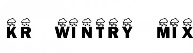
A bold, decorative font with cloud and snowflake motifs for a wintry feel.
![KR Wintry Mix font caratteri gratis]() Scaricare 69 Downloads@WebFont
Scaricare 69 Downloads@WebFont -
( Mike Iracheta )
A bold, geometric font with sharp angles and a modern, abstract style.
![Nudo font caratteri gratis]() Scaricare 69 Downloads@WebFont
Scaricare 69 Downloads@WebFont -
( imagex - www.imagex-fonts.com )
A bold, industrial-style font with a rugged, vintage appearance.
![Public Market font caratteri gratis]() Scaricare 69 Downloads@WebFont
Scaricare 69 Downloads@WebFont -
( Fonts by Tribby )
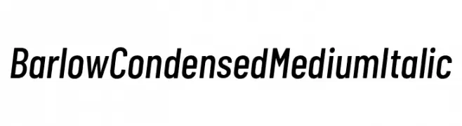
A modern, condensed italic font with medium weight and consistent stroke width.
![Barlow Condensed Medium Italic font caratteri gratis]() Scaricare 69 Downloads@WebFont
Scaricare 69 Downloads@WebFont -
( Fonts by Misti Hammers - mistifonts.com - Personal-use only. For commercial use please contact owner. )
A bold, textured handwritten font with vintage script flair.
![Texas Twilight font caratteri gratis]() Scaricare 69 Downloads@WebFont
Scaricare 69 Downloads@WebFont -
( Peggy J. Rose - www.spirit1.com/~pr/fonts/f_fonts01.html )
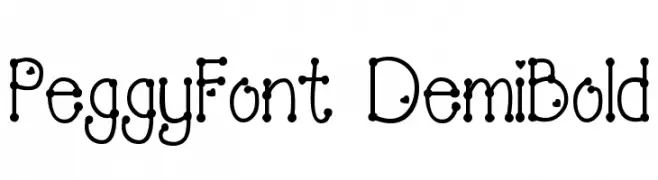
A playful, decorative font with rounded serifs and dot connections.
![PeggyFont DemiBold font caratteri gratis]() Scaricare 69 Downloads@WebFont
Scaricare 69 Downloads@WebFont -
![Samurai Terrapin Academy font caratteri gratis]() Scaricare 69 Downloads@WebFont
Scaricare 69 Downloads@WebFont -
( Fonts by Wino S Kadir - weknow - www.revolge.com/shop/weknow/ - Personal-use only. For commercial use please contact owner. )
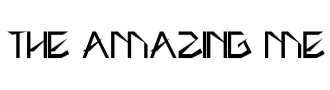
A bold, angular font with a futuristic and geometric design.
![THE AMAZING ME font caratteri gratis]() Scaricare 69 Downloads@WebFont
Scaricare 69 Downloads@WebFont -
( Iconian Fonts - Daniel Zadorozny - www.iconian.com )
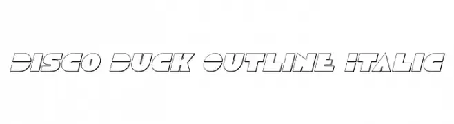
A bold, geometric, italicized outline font with a modern and dynamic style.
![Disco Duck Outline Italic font caratteri gratis]() Scaricare 69 Downloads@WebFont
Scaricare 69 Downloads@WebFont -
( Iconian Fonts - Daniel Zadorozny - www.iconian.com )
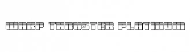
A futuristic, industrial font with bold, geometric shapes and layered line patterns.
![Warp Thruster Platinum font caratteri gratis]() Scaricare 69 Downloads@WebFont
Scaricare 69 Downloads@WebFont -
( Fonts by Wino S Kadir - weknow - www.revolge.com/shop/weknow/ - Personal-use only. For commercial use please contact owner. )
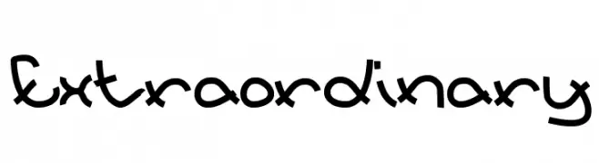
A playful, hand-drawn font with rounded, flowing lines and a whimsical style.
![Extraordinary font caratteri gratis]() Scaricare 69 Downloads@WebFont
Scaricare 69 Downloads@WebFont -
( Fonts by Kat`s Fun Fonts - Personal-use only. For commercial use please contact owner. )
A whimsical, decorative font featuring festive symbols and illustrations.
![KR Bits O'Shea font caratteri gratis]() Scaricare 69 Downloads@WebFont
Scaricare 69 Downloads@WebFont -
( Iconian Fonts - Daniel Zadorozny - www.iconian.com )
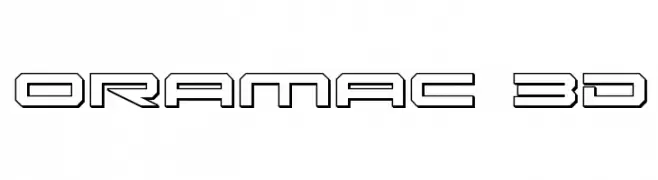
A 3D outline font with a bold, futuristic design and geometric shapes.
![Oramac 3D font caratteri gratis]() Scaricare 69 Downloads@WebFont
Scaricare 69 Downloads@WebFont -
( Rafael Hoffmann - www.rafaelhoffmann.com )
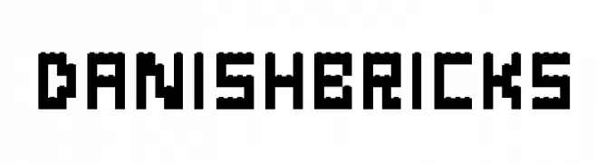
A playful, blocky font inspired by building bricks, perfect for bold and engaging designs.
![Danish-Bricks font caratteri gratis]() Scaricare 69 Downloads@WebFont
Scaricare 69 Downloads@WebFont -
( Fonts by fortunes co - Ramandhani Nugraha - Personal-use only. For commercial use please contact owner. )
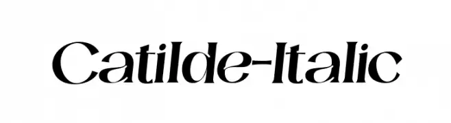
An elegant italic font with high contrast and flowing curves.
![Catilde-Italic font caratteri gratis]() Scaricare 69 Downloads@WebFont
Scaricare 69 Downloads@WebFont -
( weknow - Wino S Kadir - www.creativefabrica.com/designer/weknow/ )
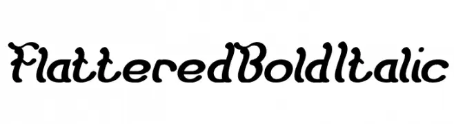
A bold, italicized decorative font with playful curves and swirls.
![Flattered Bold Italic font caratteri gratis]() Scaricare 69 Downloads@WebFont
Scaricare 69 Downloads@WebFont -
( Fonts by Almarkhatype - Abdul Malik Wisnu - Personal-use only. For commercial use please contact owner. )
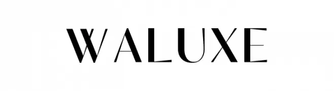
A modern, high-contrast font with elegant and sophisticated styling.
![Waluxe font caratteri gratis]() Scaricare 69 Downloads@WebFont
Scaricare 69 Downloads@WebFont -
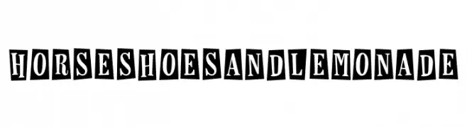
![Horseshoes and Lemonade font caratteri gratis]() Scaricare 69 Downloads@WebFont
Scaricare 69 Downloads@WebFont -
( Anigma New Media - www.anigma.fsnet.co.uk/an/anigma-fonts.html )
A bold, playful font with rounded, dynamic characters.
![Swink font caratteri gratis]() Scaricare 69 Downloads@WebFont
Scaricare 69 Downloads@WebFont -
( Fonts by GGBotNet )
A bold, hand-drawn font with a rough, textured appearance and angular lines.
![Correction Tape font caratteri gratis]() Scaricare 69 Downloads@WebFont
Scaricare 69 Downloads@WebFont -
( Fonts by Daniel Zadorozny - www.iconian.com - Free for personal use )
A bold, futuristic outline font with geometric shapes and rounded edges.
![Space Cruiser Outline font caratteri gratis]() Scaricare 69 Downloads@WebFont
Scaricare 69 Downloads@WebFont -
( Tioem - Thomas Ledin - tomledin.com )
A bold, distressed font with a rugged, weathered appearance.
![Tioem-Black-Distressed font caratteri gratis]() Scaricare 69 Downloads@WebFont
Scaricare 69 Downloads@WebFont -
( weknow - Wino S Kadir - www.creativefabrica.com/designer/weknow/ )
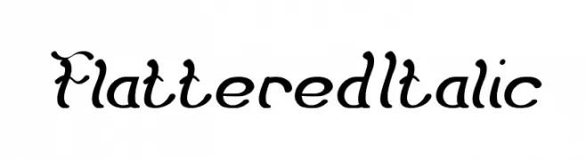
A whimsical, cursive font with elegant curves and decorative flourishes.
![Flattered Italic font caratteri gratis]() Scaricare 69 Downloads@WebFont
Scaricare 69 Downloads@WebFont -
( Fonts by GGBot - www.ggbot.net - Personal-use only. For commercial use please contact owner. )
A bold, modern font with clean lines and geometric shapes.
![Elevatia font caratteri gratis]() Scaricare 69 Downloads@WebFont
Scaricare 69 Downloads@WebFont -
( Fonts by Prioritype Co - Prio Nurokhim Aji - Personal-use only. For commercial use please contact owner. )
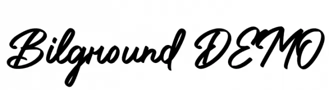
A flowing, cursive script font with elegant, sweeping strokes.
![Bilground DEMO font caratteri gratis]() Scaricare 69 Downloads@WebFont
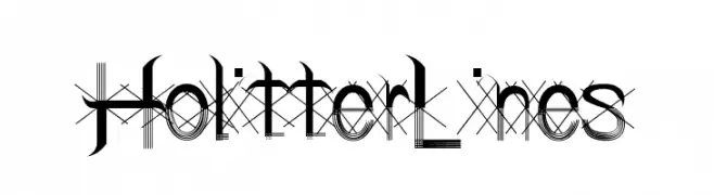
Scaricare 69 Downloads@WebFont -
![Holitter Lines font caratteri gratis]() Scaricare 69 Downloads@WebFont
Scaricare 69 Downloads@WebFont -
( Fonts by Kat`s Fun Fonts - Personal-use only. For commercial use please contact owner. )
A decorative font featuring intricate Celtic knot designs.
![KR Keltic Two font caratteri gratis]() Scaricare 69 Downloads@WebFont
Scaricare 69 Downloads@WebFont -
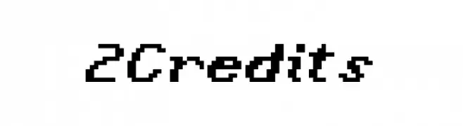
( Fonts by Winston - Personal-use only. For commercial use please contact owner. )
A pixelated, retro-style font inspired by early digital displays.
![2Credits font caratteri gratis]() Scaricare 69 Downloads@WebFont
Scaricare 69 Downloads@WebFont


Quali sono i font più popolari adesso?
Poppins, Roboto, Montserrat, Open Sans e Lato sono molto usati per le forme pulite e l'ampia applicabilità — dall'identità di marca alle landing page e ai poster.
Quali font si usano spesso nei loghi?
Le sans serif geometriche (es. Poppins, famiglie in stile Gotham) sono scelte comuni per un branding pulito e scalabile. Per un tocco personale restano valide script e stili manoscritti. Abbina un display deciso per i titoli a un corpo testo neutro per riconoscibilità ed equilibrio.
Ogni quanto si aggiorna la lista?
Con regolarità, in base ai download e all'attività reale. Torna spesso per scoprire in anticipo le nuove preferite.
💡 Consiglio: aggiungi ai preferiti — le tendenze cambiano in fretta e i font top di oggi possono ispirare il rebranding di domani.