Benvenuto nelle Font Più Popolari — dove popolarità e qualità si incontrano. Qui trovi i font più scaricati e usati dell'anno. Se cerchi scelte sicure per logo, web o social, inizia da qui.
Ogni font top si distingue per equilibrio, leggibilità e versatilità. Troverai sans serif moderne, script eleganti, serif vintage e display minimalisti.
-
( Noto is a trademark of Google Inc. Noto fonts are open source. All Noto fonts are published under the SIL Open Font License, Version 1.1 )
The image contains placeholder symbols instead of a valid font.
 Scaricare 67 Downloads@WebFont
 -
( Fonts by Skiiller Studio - Personal-use only. For commercial use please contact owner. )
A lively, expressive script font with fluid, cursive strokes.
![juliet font caratteri gratis]() Scaricare 67 Downloads@WebFont
Scaricare 67 Downloads@WebFont -
( Fonts by Zetafonts - Personal-use only. For commercial use please contact owner. )
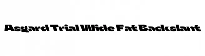
A bold, wide font with a unique backslant, perfect for impactful headlines.
![Asgard Trial Wide Fat Backslant font caratteri gratis]() Scaricare 67 Downloads@WebFont
Scaricare 67 Downloads@WebFont -
( WesLo Fonts - Wesley Pastrana - weslo11.deviantart.com/ )
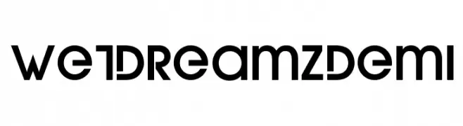
A bold, geometric font with sharp angles and a modern aesthetic.
![WetDreamzDemi font caratteri gratis]() Scaricare 67 Downloads@WebFont
Scaricare 67 Downloads@WebFont -
( Noto is a trademark of Google Inc. Noto fonts are open source. All Noto fonts are published under the SIL Open Font License, Version 1.1 )
A clean, modern sans-serif font with a semi-bold weight, offering clarity and readability.
![Noto Sans Tamil UI SemiBold font caratteri gratis]() Scaricare 67 Downloads@WebFont
Scaricare 67 Downloads@WebFont -
( Fonts by Peter Wiegel - www.peter-wiegel.de - Personal-use only. For commercial use please contact owner. )
A modern, geometric sans-serif font with clean lines and uniform strokes.
![TitilliumMaps29L-1wt font caratteri gratis]() Scaricare 67 Downloads@WebFont
Scaricare 67 Downloads@WebFont -
( Fonts by Getypes Studio - Muhammad Rizaldi - Personal-use only. For commercial use please contact owner. )
A graceful, cursive script font with flowing, connected characters.
![Loisbeauty font caratteri gratis]() Scaricare 67 Downloads@WebFont
Scaricare 67 Downloads@WebFont -
( Fonts by Hurufraktur - Fadly Pratama - Personal-use only. For commercial use please contact owner. )
An intricate Blackletter font with bold, angular letterforms and ornate detailing.
![Hurufraktur font caratteri gratis]() Scaricare 67 Downloads@WebFont
Scaricare 67 Downloads@WebFont -
( Fonts by www.chequered.ink - Chequered Ink - Personal-use only. For commercial use please contact owner. )
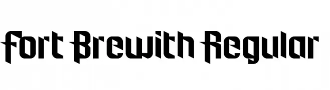
A bold, angular font with sharp edges and geometric forms.
![Fort Brewith Regular font caratteri gratis]() Scaricare 67 Downloads@WebFont
Scaricare 67 Downloads@WebFont -
( weknow - Wino S Kadir - www.creativefabrica.com/designer/weknow/ )
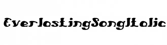
A bold, italic font with dynamic strokes and playful character.
![Everlasting Song Italic font caratteri gratis]() Scaricare 67 Downloads@WebFont
Scaricare 67 Downloads@WebFont -
( Fonts by Peter Wiegel - www.peter-wiegel.de - Personal-use only. For commercial use please contact owner. )
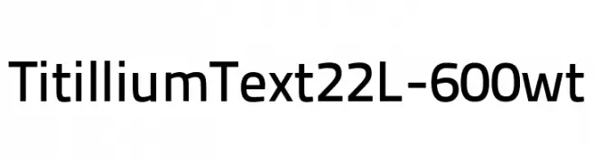
A modern sans-serif font with geometric shapes and uniform strokes.
![TitilliumText22L-600wt font caratteri gratis]() Scaricare 67 Downloads@WebFont
Scaricare 67 Downloads@WebFont -
( Fonts by pOPdOG fONTS - Dimitris Kolyris - popdog_fonts.tripod.com Commerciali Caratteri )
A bold, hand-drawn font with an expressive, distressed style.
![EVOL font caratteri gratis]() Scaricare 67 Downloads
Scaricare 67 Downloads -
( Fonts by Hendrick Rolandez - Personal-use only. For commercial use please contact owner. )
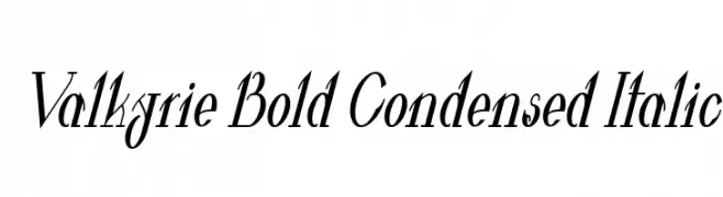
A bold, condensed, and italic font with high contrast and dynamic style.
![Valkyrie Bold Condensed Italic font caratteri gratis]() Scaricare 67 Downloads@WebFont
Scaricare 67 Downloads@WebFont -
( Fonts by Java Pep - Personal-use only. For commercial use please contact owner. )
A modern outline font with clean, structured characters and consistent stroke width.
![Garlic Outline Regular font caratteri gratis]() Scaricare 67 Downloads@WebFont
Scaricare 67 Downloads@WebFont -
( Fonts by Balpirick Studio - https://www.creativefabrica.com/designer/balpirick/ref/308299/ - Personal-use only. For commercial use please contact owner. )
A sophisticated cursive font with elegant, flowing lines.
![Lilybud font caratteri gratis]() Scaricare 67 Downloads@WebFont
Scaricare 67 Downloads@WebFont -
( Fonts by Analogous Studio - Muhammad Ilham - Personal-use only. For commercial use please contact owner. )
An elegant script font with flowing, cursive characters and intricate swashes.
![Designest font caratteri gratis]() Scaricare 67 Downloads@WebFont
Scaricare 67 Downloads@WebFont -
( Fonts by Vigilante Typeface Corporation Larry Yerkes. Personal-use only. For commercial use please contact owner. )
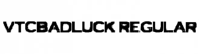
A bold, distressed font with a grunge aesthetic and rugged appearance.
![VTCBadLuck Regular font caratteri gratis]() Scaricare 67 Downloads@WebFont
Scaricare 67 Downloads@WebFont -
( Fonts by PutraCetol Studio )
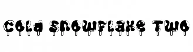
A playful, melting-style font with a bold, rounded design.
![Cold Snowflake Two font caratteri gratis]() Scaricare 67 Downloads@WebFont
Scaricare 67 Downloads@WebFont -
( Fonts by Zanatlija - Personal-use only. For commercial use please contact owner. )
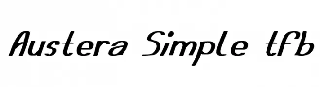
A dynamic and flowing script font with elegant curves and a slight slant.
![Austera Simple tfb font caratteri gratis]() Scaricare 67 Downloads@WebFont
Scaricare 67 Downloads@WebFont -
( Fonts by Daniel Zadorozny - www.iconian.com - Personal-use only. For commercial use please contact owner. )
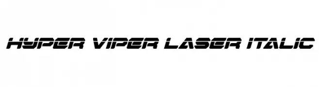
A bold, futuristic italic font with sharp angles and a dynamic style.
![Hyper Viper Laser Italic font caratteri gratis]() Scaricare 67 Downloads@WebFont
Scaricare 67 Downloads@WebFont -
( Fonts by Daniel Zadorozny - www.iconian.com - Personal-use only. For commercial use please contact owner. )
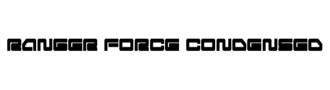
A bold, geometric font with a futuristic and industrial design.
![Ranger Force Condensed font caratteri gratis]() Scaricare 67 Downloads@WebFont
Scaricare 67 Downloads@WebFont -
( Fonts by Iconian Fonts - Daniel Zadorozny - Personal-use only. For commercial use please contact owner. )
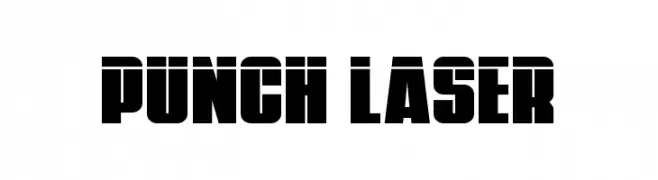
A bold, geometric font with a strong, industrial aesthetic.
![Punch Laser font caratteri gratis]() Scaricare 67 Downloads@WebFont
Scaricare 67 Downloads@WebFont -
( Fonts by Khaiuns - Personal-use only. For commercial use please contact owner. )
A sophisticated cursive script with elegant, flowing strokes and ornate flourishes.
![mightam font caratteri gratis]() Scaricare 67 Downloads@WebFont
Scaricare 67 Downloads@WebFont -
( Fonts by Lettersiro Studio - Muhammad Sirojuddin - Personal-use only. For commercial use please contact owner. )
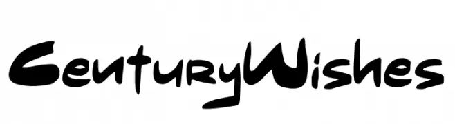
A bold, handwritten font with dynamic and expressive strokes.
![Century Wishes font caratteri gratis]() Scaricare 67 Downloads@WebFont
Scaricare 67 Downloads@WebFont -
( Fonts by Kat`s Fun Fonts - Personal-use only. For commercial use please contact owner. )
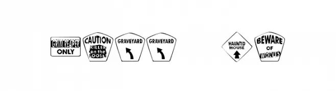
A decorative, Halloween-themed font with bold, sign-like characters.
![KR Halloween Signs Two font caratteri gratis]() Scaricare 67 Downloads@WebFont
Scaricare 67 Downloads@WebFont -
( Fonts by Wellscript Studio - Personal-use only. For commercial use please contact owner. )
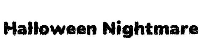
A spooky, dripping font ideal for Halloween themes.
![Halloween Nightmare font caratteri gratis]() Scaricare 67 Downloads@WebFont
Scaricare 67 Downloads@WebFont -
( Fonts by Mega Type - M Akmal - Personal-use only. For commercial use please contact owner. )
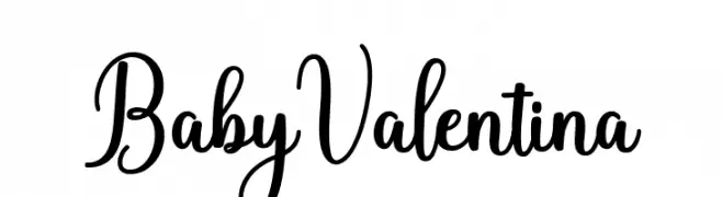
A charming and elegant script font with playful, whimsical curves.
![BabyValentina font caratteri gratis]() Scaricare 67 Downloads@WebFont
Scaricare 67 Downloads@WebFont -
( Fonts by Omnibus Type )
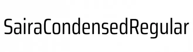
A modern, condensed font with clean, geometric lines and uniform stroke width.
![Saira Condensed Regular font caratteri gratis]() Scaricare 67 Downloads@WebFont
Scaricare 67 Downloads@WebFont -
( Maellekeita )
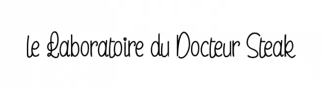
A playful, handwritten font with elongated, flowing characters.
![le Laboratoire du Docteur Steak font caratteri gratis]() Scaricare 67 Downloads@WebFont
Scaricare 67 Downloads@WebFont -
( Fonts by PutraCetol Studio )
A bold, decorative font with a snowflake pattern, perfect for festive themes.
![Cold Snowflake One font caratteri gratis]() Scaricare 67 Downloads@WebFont
Scaricare 67 Downloads@WebFont -
( Noto is a trademark of Google Inc. Noto fonts are open source. All Noto fonts are published under the SIL Open Font License, Version 1.1 )
A classic serif font with semi-bold weight, offering clarity and professionalism.
![Noto Serif Tamil SemiBold font caratteri gratis]() Scaricare 67 Downloads@WebFont
Scaricare 67 Downloads@WebFont -
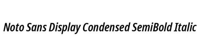
( Noto is a trademark of Google Inc. Noto fonts are open source. All Noto fonts are published under the SIL Open Font License, Version 1.1 )
A modern, condensed sans-serif font with semi-bold weight and italic style.
![Noto Sans Display Condensed SemiBold Italic font caratteri gratis]() Scaricare 67 Downloads@WebFont
Scaricare 67 Downloads@WebFont -
( Noto is a trademark of Google Inc. Noto fonts are open source. All Noto fonts are published under the SIL Open Font License, Version 1.1 )
A medium weight, extra condensed serif font with a classic and elegant style.
![Noto Serif Tamil ExtraCondensed Medium font caratteri gratis]() Scaricare 67 Downloads@WebFont
Scaricare 67 Downloads@WebFont -
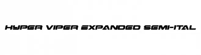
( Fonts by Daniel Zadorozny - www.iconian.com - Personal-use only. For commercial use please contact owner. )
A bold, expanded, and semi-italicized font with a futuristic, angular design.
![Hyper Viper Expanded Semi-Ital font caratteri gratis]() Scaricare 67 Downloads@WebFont
Scaricare 67 Downloads@WebFont -
( Fonts by AlifRyanZulfikar - Personal-use only. For commercial use please contact owner. )
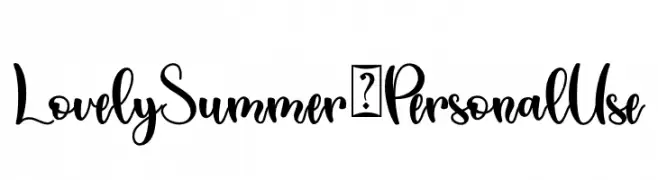
A playful and elegant script font with a handwritten style.
![Lovely Summer - Personal Use font caratteri gratis]() Scaricare 67 Downloads@WebFont
Scaricare 67 Downloads@WebFont


Quali sono i font più popolari adesso?
Poppins, Roboto, Montserrat, Open Sans e Lato sono molto usati per le forme pulite e l'ampia applicabilità — dall'identità di marca alle landing page e ai poster.
Quali font si usano spesso nei loghi?
Le sans serif geometriche (es. Poppins, famiglie in stile Gotham) sono scelte comuni per un branding pulito e scalabile. Per un tocco personale restano valide script e stili manoscritti. Abbina un display deciso per i titoli a un corpo testo neutro per riconoscibilità ed equilibrio.
Ogni quanto si aggiorna la lista?
Con regolarità, in base ai download e all'attività reale. Torna spesso per scoprire in anticipo le nuove preferite.
💡 Consiglio: aggiungi ai preferiti — le tendenze cambiano in fretta e i font top di oggi possono ispirare il rebranding di domani.