Benvenuto nelle Font Più Popolari — dove popolarità e qualità si incontrano. Qui trovi i font più scaricati e usati dell'anno. Se cerchi scelte sicure per logo, web o social, inizia da qui.
Ogni font top si distingue per equilibrio, leggibilità e versatilità. Troverai sans serif moderne, script eleganti, serif vintage e display minimalisti.
-
( Fonts by Artilkom - Personal-use only. For commercial use please contact owner. )
A playful, handwritten font with bold, rounded strokes and a casual style.
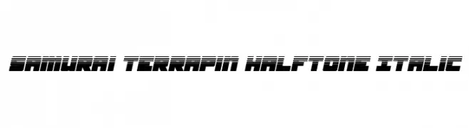
 Scaricare 67 Downloads@WebFont
 -
![Samurai Terrapin Halftone Italic font caratteri gratis]() Scaricare 67 Downloads@WebFont
Scaricare 67 Downloads@WebFont -
( weknow - Wino S Kadir - www.creativefabrica.com/designer/weknow/ )
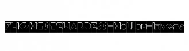
A futuristic, hollow, geometric font with sharp, angular lines.
![FLIGHT STEWARDESS-Hollow-Invers font caratteri gratis]() Scaricare 67 Downloads@WebFont
Scaricare 67 Downloads@WebFont -
( Fonts by Nirmana Visual )
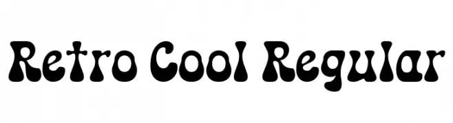
A playful, retro font with bold, rounded letterforms and a vintage vibe.
![Retro Cool Regular font caratteri gratis]() Scaricare 67 Downloads@WebFont
Scaricare 67 Downloads@WebFont -
( Fonts by Mr.Soon Design )
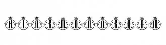
An ornate, regal font with crowned circular frames and intricate flourishes.
![King Monogram font caratteri gratis]() Scaricare 67 Downloads@WebFont
Scaricare 67 Downloads@WebFont -
( Fonts by Arterfak Project - Ahmad Ramzi Fahruddin - Personal-use only. For commercial use please contact owner. )
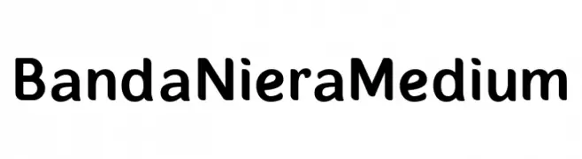
A modern sans-serif font with rounded edges and a friendly appearance.
![BandaNieraMedium font caratteri gratis]() Scaricare 67 Downloads@WebFont
Scaricare 67 Downloads@WebFont -
( Fonts by Kat`s Fun Fonts - Personal-use only. For commercial use please contact owner. )
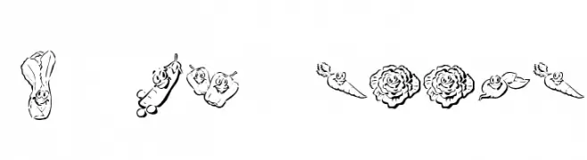
A playful decorative font with cartoon vegetable illustrations.
![KR Happy Veggies! font caratteri gratis]() Scaricare 67 Downloads@WebFont
Scaricare 67 Downloads@WebFont -
( Fonts by Mans Greback - Personal-use only. For commercial use please contact owner. )
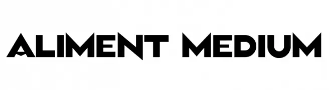
A bold, geometric font with a modern and impactful design.
![Aliment Medium font caratteri gratis]() Scaricare 67 Downloads@WebFont
Scaricare 67 Downloads@WebFont -
( Iconian Fonts - Daniel Zadorozny - www.iconian.com )
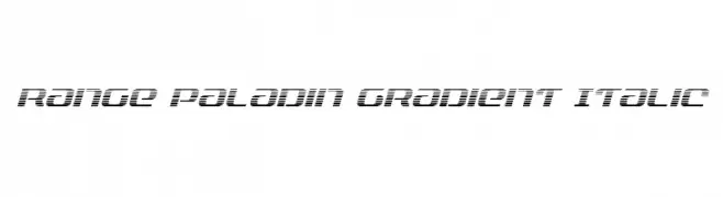
A futuristic, italicized font with a gradient effect created by horizontal lines.
![Range Paladin Gradient Italic font caratteri gratis]() Scaricare 67 Downloads@WebFont
Scaricare 67 Downloads@WebFont -
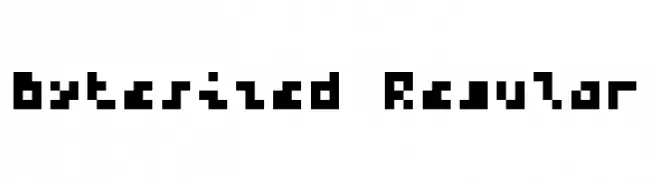
( Copyright 2024 The Bytesized Project Authors (https://github.com/balt-dev/bytesized-gf) )
![Bytesized Regular font caratteri gratis]() Scaricare 67 Downloads@WebFont
Scaricare 67 Downloads@WebFont -
( Fonts by Iconian Fonts - Daniel Zadorozny - Personal-use only. For commercial use please contact owner. )
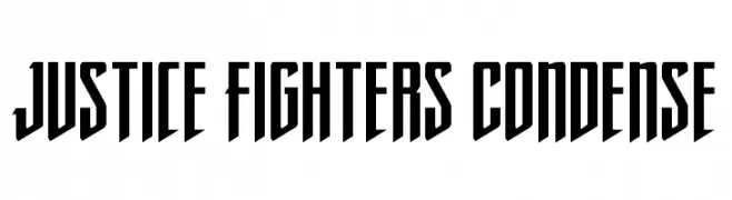
A bold, condensed font with sharp, angular edges for a modern, powerful look.
![Justice Fighters Condense font caratteri gratis]() Scaricare 67 Downloads@WebFont
Scaricare 67 Downloads@WebFont -
( Fonts by Linecreative - ARI JUANDA - Personal-use only. For commercial use please contact owner. )
A bold, layered font with a three-dimensional outline effect.
![Choir font caratteri gratis]() Scaricare 67 Downloads@WebFont
Scaricare 67 Downloads@WebFont -
( Fonts by Yoga Letter - Isroni Yoga Prasetya - Personal-use only. For commercial use please contact owner. )
An elegant, decorative script font with intricate swirls and flowing letters.
![Beautiful Monogram font caratteri gratis]() Scaricare 67 Downloads@WebFont
Scaricare 67 Downloads@WebFont -
( Fonts by LetterStock - Guguh Gumantoro - Personal-use only. For commercial use please contact owner. )
A bold, dynamic script font with a handwritten, energetic style.
![Buckles font caratteri gratis]() Scaricare 67 Downloads@WebFont
Scaricare 67 Downloads@WebFont -
( Anke-Art - www.anke-art.de/ )
A bold, festive font with Santa illustrations on each letter.
![Jolly Santa font caratteri gratis]() Scaricare 67 Downloads@WebFont
Scaricare 67 Downloads@WebFont -
( Fonts by Eddy Goodboy )
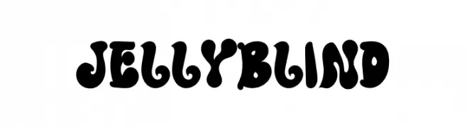
A bold, playful font with rounded, bulbous shapes and a whimsical retro style.
![Jelly Blind font caratteri gratis]() Scaricare 67 Downloads@WebFont
Scaricare 67 Downloads@WebFont -
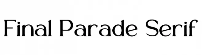
( Fonts by PutraCetol Studio )
![Final Parade Serif font caratteri gratis]() Scaricare 67 Downloads@WebFont
Scaricare 67 Downloads@WebFont -
( Noto is a trademark of Google Inc. Noto fonts are open source. All Noto fonts are published under the SIL Open Font License, Version 1.1 )
Bold, condensed sans-serif font with a modern and impactful design.
![Noto Sans Tamil UI Condensed Black font caratteri gratis]() Scaricare 67 Downloads@WebFont
Scaricare 67 Downloads@WebFont -
( Noto is a trademark of Google Inc. Noto fonts are open source. All Noto fonts are published under the SIL Open Font License, Version 1.1 )
A clean, extra-light sans-serif font ideal for modern and minimalist designs.
![Noto Sans Sinhala UI ExtraLight font caratteri gratis]() Scaricare 67 Downloads@WebFont
Scaricare 67 Downloads@WebFont -
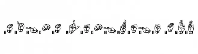
( Fonts by Zanatlija - Personal-use only. For commercial use please contact owner. )
A font depicting the alphabet and numbers through hand signs, inspired by sign language.
![signs language tfb font caratteri gratis]() Scaricare 67 Downloads@WebFont
Scaricare 67 Downloads@WebFont -
( Fonts by Garisman Studio - Risman Ginarwan - Personal-use only. For commercial use please contact owner. )
A playful, handwritten font with bold, flowing characters.
![Realova font caratteri gratis]() Scaricare 67 Downloads@WebFont
Scaricare 67 Downloads@WebFont -
( Fonts by Ibram Syah - Personal-use only. For commercial use please contact owner. )
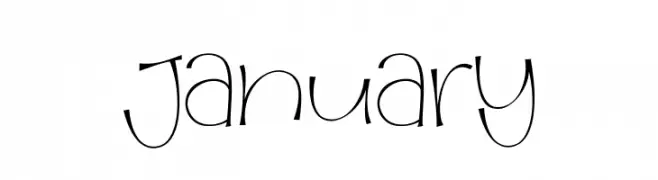
A playful, handwritten font with a whimsical and dynamic style.
![january font caratteri gratis]() Scaricare 67 Downloads@WebFont
Scaricare 67 Downloads@WebFont -
( Fonts by MJB Letters - Muhammad Mujibulloh - Personal-use only. For commercial use please contact owner. )
A playful handwritten font with a whimsical and creative style.
![Cute Molly font caratteri gratis]() Scaricare 67 Downloads@WebFont
Scaricare 67 Downloads@WebFont -
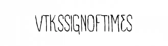
![VTKS SIGN OF TIMES font caratteri gratis]() Scaricare 67 Downloads@WebFont
Scaricare 67 Downloads@WebFont -
( Fonts by Daniel Zadorozny - www.iconian.com - Personal-use only. For commercial use please contact owner. )
A bold, outlined font with rounded, playful characters.
![Hula Hoop Girl Bold Outline font caratteri gratis]() Scaricare 67 Downloads@WebFont
Scaricare 67 Downloads@WebFont -
( Fonts by Kat`s Fun Fonts - Personal-use only. For commercial use please contact owner. )
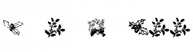
A decorative font with intricate holly-themed designs for festive projects.
![KR Lots Of Holly font caratteri gratis]() Scaricare 67 Downloads@WebFont
Scaricare 67 Downloads@WebFont -
( Fonts by dcoxy - Greg Medina - Personal-use only. For commercial use please contact owner. )
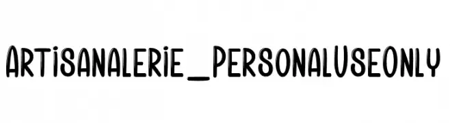
A bold, playful font with rounded edges and a modern, approachable style.
![Artisanalerie_PersonalUseOnly font caratteri gratis]() Scaricare 67 Downloads@WebFont
Scaricare 67 Downloads@WebFont -
( Fonts by Edric Studio - Personal-use only. For commercial use please contact owner. )
A playful, Halloween-themed font with bold, jagged edges and a carved appearance.
![Yellow Pumpkin Demo font caratteri gratis]() Scaricare 67 Downloads@WebFont
Scaricare 67 Downloads@WebFont -
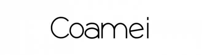
( Fonts by Jef Triforce - Francisco Arellano - Personal-use only. For commercial use please contact owner. )
A modern, geometric sans-serif font with clean lines and uniform strokes.
![Coamei font caratteri gratis]() Scaricare 67 Downloads@WebFont
Scaricare 67 Downloads@WebFont -
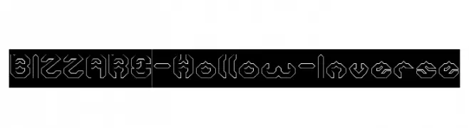
( weknow - Wino S Kadir - www.creativefabrica.com/designer/weknow/ )
A hollow, inverse, geometric font with a futuristic and edgy style.
![BIZZARE-Hollow-Inverse font caratteri gratis]() Scaricare 67 Downloads@WebFont
Scaricare 67 Downloads@WebFont -
( Personal-use only. For commercial use please contact owner. )
A bold, modern font with geometric structure and consistent line thickness.
![KacstTitleL font caratteri gratis]() Scaricare 67 Downloads@WebFont
Scaricare 67 Downloads@WebFont -
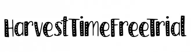
( Fonts by Typefactoryco )
A playful, dotted font with a hand-drawn, whimsical style.
![Harvest Time FreeTrial font caratteri gratis]() Scaricare 67 Downloads@WebFont
Scaricare 67 Downloads@WebFont -
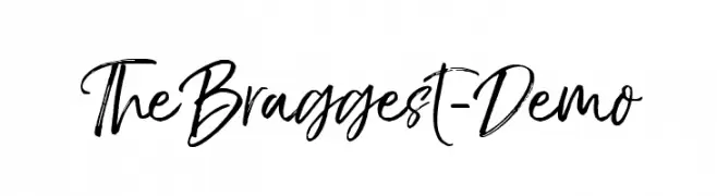
( Fonts by Ryan Prasetya - Personal-use only. For commercial use please contact owner. )
A dynamic and expressive handwritten font with fluid strokes and artistic flair.
![TheBraggest-Demo font caratteri gratis]() Scaricare 67 Downloads@WebFont
Scaricare 67 Downloads@WebFont -
( Fonts by Md Shohail Bhuian - Personal-use only. For commercial use please contact owner. )
A playful, handwritten-style font with consistent stroke width and casual appeal.
![Travel font caratteri gratis]() Scaricare 67 Downloads@WebFont
Scaricare 67 Downloads@WebFont -
( Iconian Fonts - Daniel Zadorozny - www.iconian.com )
A bold, futuristic font with a halftone effect and tech-inspired design.
![Drone Tracker Halftone font caratteri gratis]() Scaricare 67 Downloads@WebFont
Scaricare 67 Downloads@WebFont


Quali sono i font più popolari adesso?
Poppins, Roboto, Montserrat, Open Sans e Lato sono molto usati per le forme pulite e l'ampia applicabilità — dall'identità di marca alle landing page e ai poster.
Quali font si usano spesso nei loghi?
Le sans serif geometriche (es. Poppins, famiglie in stile Gotham) sono scelte comuni per un branding pulito e scalabile. Per un tocco personale restano valide script e stili manoscritti. Abbina un display deciso per i titoli a un corpo testo neutro per riconoscibilità ed equilibrio.
Ogni quanto si aggiorna la lista?
Con regolarità, in base ai download e all'attività reale. Torna spesso per scoprire in anticipo le nuove preferite.
💡 Consiglio: aggiungi ai preferiti — le tendenze cambiano in fretta e i font top di oggi possono ispirare il rebranding di domani.