Benvenuto nelle Font Più Popolari — dove popolarità e qualità si incontrano. Qui trovi i font più scaricati e usati dell'anno. Se cerchi scelte sicure per logo, web o social, inizia da qui.
Ogni font top si distingue per equilibrio, leggibilità e versatilità. Troverai sans serif moderne, script eleganti, serif vintage e display minimalisti.
-
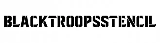
( Fonts by Mikrojihad Typography - Hendra Pratama - Personal-use only. For commercial use please contact owner. )
A bold, geometric stencil font with a military-industrial aesthetic.
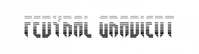
 Scaricare 58 Downloads@WebFont
 -
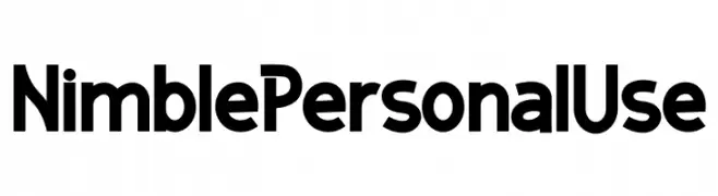
( Fonts by twinletter - Rozikan - Personal-use only. For commercial use please contact owner. )
A bold, modern font with geometric influences and clean lines.
![Nimble Personal Use font caratteri gratis]() Scaricare 58 Downloads@WebFont
Scaricare 58 Downloads@WebFont -
( Rodolfo Santos )
A playful, handwritten font with a whimsical and casual style.
![Ludiv1.0 font caratteri gratis]() Scaricare 58 Downloads@WebFont
Scaricare 58 Downloads@WebFont -
( Fonts by Wahyu Studio - Wahyu Setiyawan - Personal-use only. For commercial use please contact owner. )
A playful and elegant script font with a handwritten style.
![Livelove font caratteri gratis]() Scaricare 58 Downloads@WebFont
Scaricare 58 Downloads@WebFont -
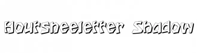
( Fonts by Typographer Mediengestaltung - Personal-use only. For commercial use please contact owner. )
A bold, shadowed font with a dynamic, graffiti-inspired style.
![Houtsneeletter Shadow font caratteri gratis]() Scaricare 58 Downloads@WebFont
Scaricare 58 Downloads@WebFont -
-
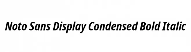
( Noto is a trademark of Google Inc. Noto fonts are open source. All Noto fonts are published under the SIL Open Font License, Version 1.1 )
A modern, bold, and italic sans-serif font with a condensed style.
![Noto Sans Display Condensed Bold Italic font caratteri gratis]() Scaricare 58 Downloads@WebFont
Scaricare 58 Downloads@WebFont -
![Fedyral Gradient font caratteri gratis]() Scaricare 58 Downloads@WebFont
Scaricare 58 Downloads@WebFont -
( Fonts by BLKBK Fonts Commerciali Caratteri )
A fluid and elegant handwritten style with smooth, connected letterforms.
![Touch Tone font caratteri gratis]() Scaricare 58 Downloads
Scaricare 58 Downloads -
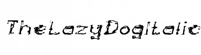
( weknow - Wino S Kadir - www.creativefabrica.com/designer/weknow/ )
A distressed, italic font with a grunge style and irregular, textured characters.
![The Lazy Dog Italic font caratteri gratis]() Scaricare 58 Downloads@WebFont
Scaricare 58 Downloads@WebFont -
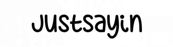
( Misti's Fonts - mistifonts.com/ )
A playful, handwritten font with rounded edges and a casual style.
![JustSayin font caratteri gratis]() Scaricare 58 Downloads@WebFont
Scaricare 58 Downloads@WebFont -
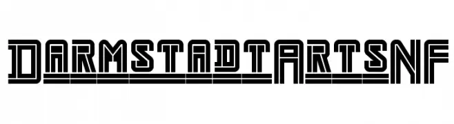
( Fonts by Nick Curtis - Personal-use only. For commercial use please contact owner. )
A bold, geometric font with a futuristic and industrial style.
![DarmstadtArtsNF font caratteri gratis]() Scaricare 58 Downloads@WebFont
Scaricare 58 Downloads@WebFont -
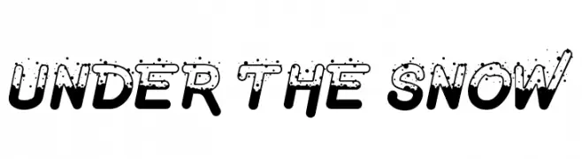
( Fonts by figuree - Personal-use only. For commercial use please contact owner. )
A bold, playful font with a snow-like texture, perfect for festive designs.
![Under The Snow font caratteri gratis]() Scaricare 58 Downloads@WebFont
Scaricare 58 Downloads@WebFont -
( Fonts by Amru ID - Personal-use only. For commercial use please contact owner. )
A modern, geometric sans-serif font with excellent readability.
![Aftetir font caratteri gratis]() Scaricare 58 Downloads@WebFont
Scaricare 58 Downloads@WebFont -
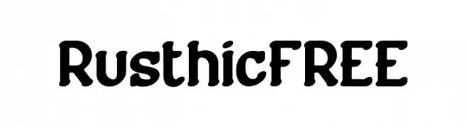
( Fonts by Vunira Design - Personal-use only. For commercial use please contact owner. )
A bold, rustic font with rounded strokes and a handcrafted feel.
![RusthicFREE font caratteri gratis]() Scaricare 58 Downloads@WebFont
Scaricare 58 Downloads@WebFont -
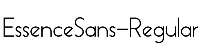
( Fonts by skomii - Personal-use only. For commercial use please contact owner. )
A modern, geometric sans-serif font with clean lines and uniform strokes.
![EssenceSans-Regular font caratteri gratis]() Scaricare 58 Downloads@WebFont
Scaricare 58 Downloads@WebFont -
( Noto is a trademark of Google Inc. Noto fonts are open source. All Noto fonts are published under the SIL Open Font License, Version 1.1 )
A thin, semi-condensed serif font with a refined and minimal look.
![Noto Serif Ethiopic SemiCondensed Thin font caratteri gratis]() Scaricare 58 Downloads@WebFont
Scaricare 58 Downloads@WebFont -
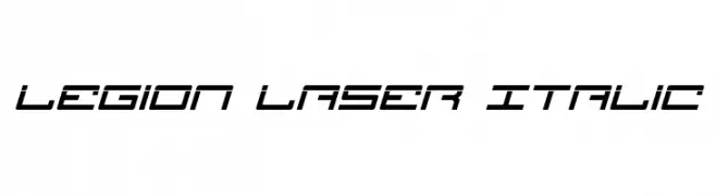
( Iconian Fonts - Daniel Zadorozny - www.iconian.com )
A futuristic, angular italic font with a high-tech, digital appearance.
![Legion Laser Italic font caratteri gratis]() Scaricare 58 Downloads@WebFont
Scaricare 58 Downloads@WebFont -
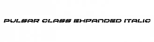
( Iconian Fonts - Daniel Zadorozny - www.iconian.com )
A bold, angular, and expanded italic font with a futuristic and dynamic style.
![Pulsar Class Expanded Italic font caratteri gratis]() Scaricare 58 Downloads@WebFont
Scaricare 58 Downloads@WebFont -
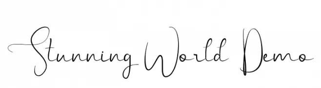
( Fonts by Edric Studio - Personal-use only. For commercial use please contact owner. )
An elegant and flowing script font with thin, delicate strokes and graceful curves.
![Stunning World Demo font caratteri gratis]() Scaricare 58 Downloads@WebFont
Scaricare 58 Downloads@WebFont -
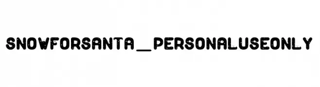
( Fonts by dcoxy - Greg Medina - Personal-use only. For commercial use please contact owner. )
A festive, bold font with snow and Santa hat accents, perfect for holiday themes.
![Snow for Santa_PersonalUseOnly font caratteri gratis]() Scaricare 58 Downloads@WebFont
Scaricare 58 Downloads@WebFont -
( Fonts by wep - Wahyu Eka Prasetya - Personal-use only. For commercial use please contact owner. )
A bold, distressed font with a rugged, textured appearance.
![Dinding font caratteri gratis]() Scaricare 58 Downloads@WebFont
Scaricare 58 Downloads@WebFont -
( Fonts by Garisman Studio - Risman Ginarwan - Personal-use only. For commercial use please contact owner. )
A lively and expressive handwritten font with fluid, flowing letterforms.
![Sanpaullo font caratteri gratis]() Scaricare 58 Downloads@WebFont
Scaricare 58 Downloads@WebFont -
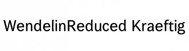
( Fonts by ingoFonts - Ingo Zimmermann - Personal-use only. For commercial use please contact owner. )
A modern, clean sans-serif typeface with balanced proportions and uniform stroke width.
![WendelinReduced-Kraeftig font caratteri gratis]() Scaricare 58 Downloads@WebFont
Scaricare 58 Downloads@WebFont -
( Fonts by Abas Creative - Farhan Ramadhika - Personal-use only. For commercial use please contact owner. )
An elegant, flowing script font with ornate uppercase and smooth lowercase letters.
![hi Mellati font caratteri gratis]() Scaricare 58 Downloads@WebFont
Scaricare 58 Downloads@WebFont -
( Fonts by Garisman Studio - Risman Ginarwan - Personal-use only. For commercial use please contact owner. )
A playful, hand-drawn style font with rounded edges and elongated forms.
![Kartoon font caratteri gratis]() Scaricare 58 Downloads@WebFont
Scaricare 58 Downloads@WebFont -
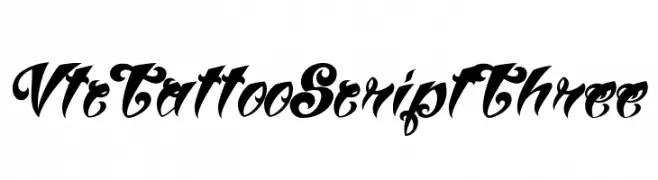
( Fonts by Vigilante Typeface Corporation Larry Yerkes. Personal-use only. For commercial use please contact owner. )
An ornate, tattoo-inspired script font with elaborate swirls.
![VtcTattooScriptThree font caratteri gratis]() Scaricare 58 Downloads@WebFont
Scaricare 58 Downloads@WebFont -
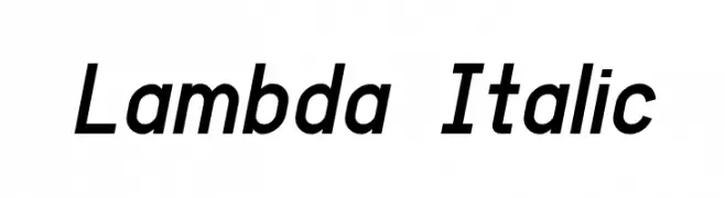
( Fonts by GGBotNet - Personal-use only. For commercial use please contact owner. )
A modern, italicized font with a sleek and dynamic style.
![Lambda Italic font caratteri gratis]() Scaricare 58 Downloads@WebFont
Scaricare 58 Downloads@WebFont -
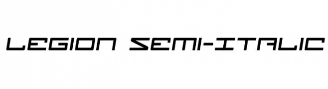
( Iconian Fonts - Daniel Zadorozny - www.iconian.com )
A futuristic, angular font with a geometric and dynamic style.
![Legion Semi-Italic font caratteri gratis]() Scaricare 58 Downloads@WebFont
Scaricare 58 Downloads@WebFont -
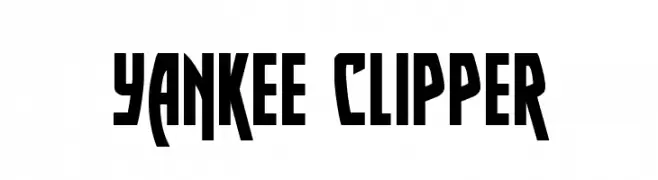
( Iconian Fonts - Daniel Zadorozny - www.iconian.com )
A bold, angular font with a dynamic, geometric style.
![Yankee Clipper font caratteri gratis]() Scaricare 58 Downloads@WebFont
Scaricare 58 Downloads@WebFont -
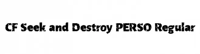
( Fonts by Cloutierfontes - Steve Cloutier - Personal-use only. For commercial use please contact owner. )
A bold, distressed font with a rugged, grunge aesthetic.
![CF Seek and Destroy PERSO Regular font caratteri gratis]() Scaricare 58 Downloads@WebFont
Scaricare 58 Downloads@WebFont -
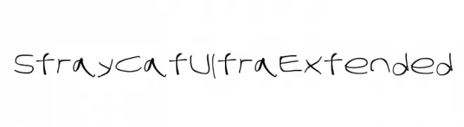
![Stray Cat UltraExtended font caratteri gratis]() Scaricare 58 Downloads@WebFont
Scaricare 58 Downloads@WebFont -
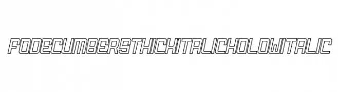
( Fonts by zamjump - Ahmad Zamzami - Personal-use only. For commercial use please contact owner. )
A bold, italic, hollow font with a modern, futuristic style.
![FODECUMBERS THICK ITALIC HOLOW Italic font caratteri gratis]() Scaricare 58 Downloads@WebFont
Scaricare 58 Downloads@WebFont -
( Fonts by Peter A - Personal-use only. For commercial use please contact owner. )
A bold, rounded font with a playful and approachable style.
![Distro Bold font caratteri gratis]() Scaricare 58 Downloads@WebFont
Scaricare 58 Downloads@WebFont -
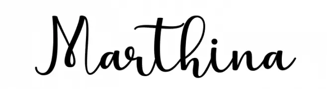
( Fonts by Uloel Design - Personal-use only. For commercial use please contact owner. )
A charming and elegant script font with flowing, cursive letterforms.
![Marthina font caratteri gratis]() Scaricare 58 Downloads@WebFont
Scaricare 58 Downloads@WebFont -
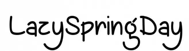
( Misti's Fonts - mistifonts.com/ )
A playful, handwritten font with rounded edges and a whimsical style.
![LazySpringDay font caratteri gratis]() Scaricare 58 Downloads@WebFont
Scaricare 58 Downloads@WebFont


Quali sono i font più popolari adesso?
Poppins, Roboto, Montserrat, Open Sans e Lato sono molto usati per le forme pulite e l'ampia applicabilità — dall'identità di marca alle landing page e ai poster.
Quali font si usano spesso nei loghi?
Le sans serif geometriche (es. Poppins, famiglie in stile Gotham) sono scelte comuni per un branding pulito e scalabile. Per un tocco personale restano valide script e stili manoscritti. Abbina un display deciso per i titoli a un corpo testo neutro per riconoscibilità ed equilibrio.
Ogni quanto si aggiorna la lista?
Con regolarità, in base ai download e all'attività reale. Torna spesso per scoprire in anticipo le nuove preferite.
💡 Consiglio: aggiungi ai preferiti — le tendenze cambiano in fretta e i font top di oggi possono ispirare il rebranding di domani.