Benvenuto nelle Font Più Popolari — dove popolarità e qualità si incontrano. Qui trovi i font più scaricati e usati dell'anno. Se cerchi scelte sicure per logo, web o social, inizia da qui.
Ogni font top si distingue per equilibrio, leggibilità e versatilità. Troverai sans serif moderne, script eleganti, serif vintage e display minimalisti.
-
( Robert Gotham - www.andeverythingisfine.com/ )
A whimsical, hand-drawn font with irregular lines and playful character.
 Scaricare 65 Downloads@WebFont
 -
( Fonts by Jroh Creative - jroh creative - Personal-use only. For commercial use please contact owner. )
An elegant script font with fluid, interconnected strokes and high contrast.
![Fitri font caratteri gratis]() Scaricare 65 Downloads@WebFont
Scaricare 65 Downloads@WebFont -
( Fonts by Iconian Fonts )
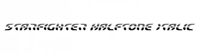
A futuristic, italic font with a halftone pattern and bold, dynamic style.
![Starfighter Halftone Italic font caratteri gratis]() Scaricare 65 Downloads@WebFont
Scaricare 65 Downloads@WebFont -
( Iconian Fonts - Daniel Zadorozny - www.iconian.com )
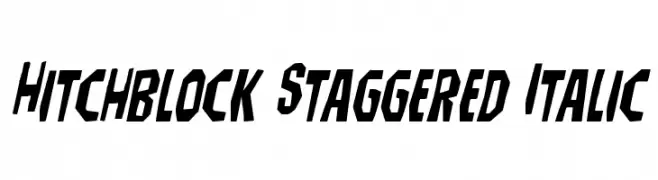
A bold, italicized font with a staggered, angular design.
![Hitchblock Staggered Italic font caratteri gratis]() Scaricare 65 Downloads@WebFont
Scaricare 65 Downloads@WebFont -
( JBFoundry - Jean Boyault - jean.boyault.pagesperso-orange.fr/ )
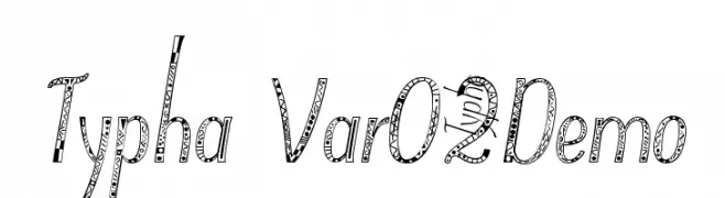
A playful, pattern-filled decorative font with a hand-drawn style.
![Typha Var02Demo font caratteri gratis]() Scaricare 65 Downloads@WebFont
Scaricare 65 Downloads@WebFont -
( London's Letters - www.londonsletters.com/ )
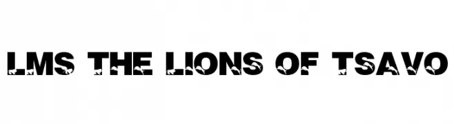
A bold, decorative font with integrated lion silhouettes in each letter.
![LMS The Lions of Tsavo font caratteri gratis]() Scaricare 65 Downloads@WebFont
Scaricare 65 Downloads@WebFont -
( Fonts by Brittney Murphy Design - Brittney Murphy - Personal-use only. For commercial use please contact owner. )
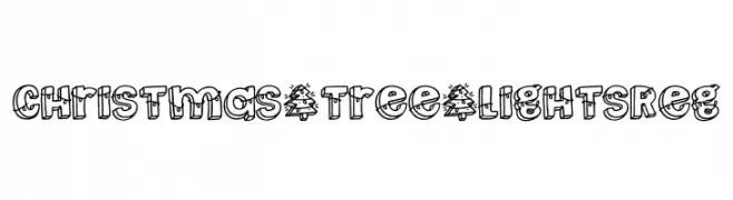
A festive, decorative font with holiday light details on each character.
![Christmas _ Tree _ Lights Reg font caratteri gratis]() Scaricare 65 Downloads@WebFont
Scaricare 65 Downloads@WebFont -
( Fonts by Nick Curtis - Personal-use only. For commercial use please contact owner. )
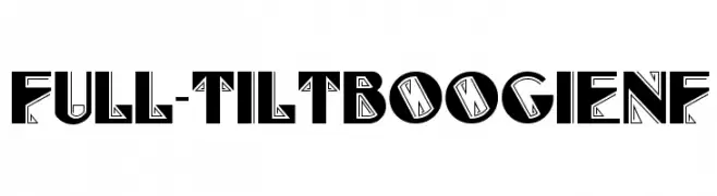
A bold, geometric font with intricate line patterns and sharp edges.
![Full-TiltBoogieNF font caratteri gratis]() Scaricare 65 Downloads@WebFont
Scaricare 65 Downloads@WebFont -
( Fonts by Vladimir Nikolic - https://www.creativefabrica.com/product/educated-deers/ref/144265/ - Personal-use only. For commercial use please contact owner. )
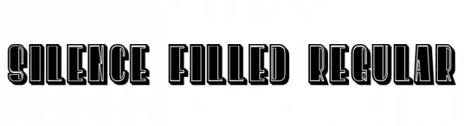
A bold, outlined font with a three-dimensional effect and geometric style.
![Silence Filled Regular font caratteri gratis]() Scaricare 65 Downloads@WebFont
Scaricare 65 Downloads@WebFont -
( fontvir.us - xero harrison - fontvir.us )
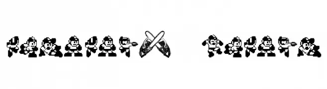
Pixel-art font using 8-bit video game character sprites.
![MegaMan2 .TheMang font caratteri gratis]() Scaricare 65 Downloads@WebFont
Scaricare 65 Downloads@WebFont -
( Fonts by Kong Font - https://fontkong.com/ - Personal-use only. For commercial use please contact owner. )
A bold, geometric font with blocky, angular characters for modern designs.
![Byorg font caratteri gratis]() Scaricare 65 Downloads@WebFont
Scaricare 65 Downloads@WebFont -
( Fonts by www.junkohanhero.com - Personal-use only. For commercial use please contact owner. )
A distressed, grunge-style font with a hand-drawn, organic appearance.
![Open your eyes font caratteri gratis]() Scaricare 65 Downloads@WebFont
Scaricare 65 Downloads@WebFont -
( Fonts by Ronin Design - Personal-use only. For commercial use please contact owner. )
A classic serif font with elegant strokes and balanced readability.
![Moonllys font caratteri gratis]() Scaricare 65 Downloads@WebFont
Scaricare 65 Downloads@WebFont -
( Shoko Halfmoon - shoko.halfmoon.jp/ )
A pixelated, outlined font with a retro video game style.
![KS-PetitHeartOutline10_4 font caratteri gratis]() Scaricare 65 Downloads@WebFont
Scaricare 65 Downloads@WebFont -
( Fonts by CalligraphyFonts - Personal-use only. For commercial use please contact owner. )
A bold, decorative font with a vintage style and intricate patterns.
![Ralins Demo font caratteri gratis]() Scaricare 65 Downloads@WebFont
Scaricare 65 Downloads@WebFont -
( Fonts by Asep Rendi )
A bold, playful font with dynamic curves and angles.
![Phoenix Midnight font caratteri gratis]() Scaricare 65 Downloads@WebFont
Scaricare 65 Downloads@WebFont -
( Fonts by DmLetter31 - Dimas Prasetyo - Personal-use only. For commercial use please contact owner. )
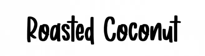
A bold, playful handwritten font with a casual and friendly style.
![Roasted Coconut font caratteri gratis]() Scaricare 65 Downloads@WebFont
Scaricare 65 Downloads@WebFont -
( Iconian Fonts - Daniel Zadorozny - www.iconian.com )
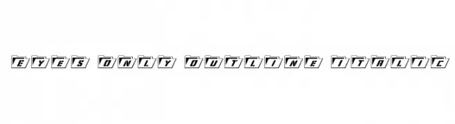
A modern, italicized font with bold folder-like outlines and medium contrast.
![Eyes Only Outline Italic font caratteri gratis]() Scaricare 65 Downloads@WebFont
Scaricare 65 Downloads@WebFont -
( Fonts by Vladimir Nikolic - https://www.creativefabrica.com/product/educated-deers/ref/144265/ - Personal-use only. For commercial use please contact owner. )
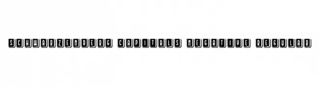
A bold, decorative font with a three-dimensional, framed design.
![Schwarzenberg Capitals Negative Regular font caratteri gratis]() Scaricare 65 Downloads@WebFont
Scaricare 65 Downloads@WebFont -
![bitstorm extraextended font caratteri gratis]() Scaricare 65 Downloads@WebFont
Scaricare 65 Downloads@WebFont -
( Fonts by Juan Sanchez - Personal-use only. For commercial use please contact owner. )
A bold, dynamic handwritten font with expressive strokes and a fluid style.
![Inclitodo font caratteri gratis]() Scaricare 65 Downloads@WebFont
Scaricare 65 Downloads@WebFont -
( Fonts by Zetafonts - Personal-use only. For commercial use please contact owner. )
A modern serif font with classic elements and a versatile design.
![Tarif Arabic Book font caratteri gratis]() Scaricare 65 Downloads@WebFont
Scaricare 65 Downloads@WebFont -
( Noto is a trademark of Google Inc. Noto fonts are open source. All Noto fonts are published under the SIL Open Font License, Version 1.1 )
A modern, thin, semi-condensed sans-serif font with a sleek and elegant design.
![Noto Sans Arabic UI SemiCondensed Thin font caratteri gratis]() Scaricare 65 Downloads@WebFont
Scaricare 65 Downloads@WebFont -
( Fonts by Al Ghul - Personal-use only. For commercial use please contact owner. )
A playful, bold handwritten font with rounded, informal letterforms.
![Smart Home font caratteri gratis]() Scaricare 65 Downloads@WebFont
Scaricare 65 Downloads@WebFont -
( Fonts by Wino S Kadir - weknow - www.revolge.com/shop/weknow/ - Personal-use only. For commercial use please contact owner. )
A futuristic, geometric font with rounded edges and consistent stroke width.
![Raynaliz font caratteri gratis]() Scaricare 65 Downloads@WebFont
Scaricare 65 Downloads@WebFont -
( Fonts by Khurasan )
A playful, bold font with rounded, chunky letters perfect for creative projects.
![Baberry font caratteri gratis]() Scaricare 65 Downloads@WebFont
Scaricare 65 Downloads@WebFont -
( Fonts by Typographer Mediengestaltung - Personal-use only. For commercial use please contact owner. )
A bold, decorative font with whimsical and sophisticated elements.
![TM Unicorn Regular font caratteri gratis]() Scaricare 65 Downloads@WebFont
Scaricare 65 Downloads@WebFont -
( Fonts by Typebae Foundry )
![Blustrue font caratteri gratis]() Scaricare 65 Downloads@WebFont
Scaricare 65 Downloads@WebFont -
![bitstorm ultracondensed oblique font caratteri gratis]() Scaricare 65 Downloads@WebFont
Scaricare 65 Downloads@WebFont -
( Vojtech Cizmar - www.bra3cizmar.com )
A bold, playful handwritten font with irregular strokes and a whimsical style.
![Peyote Handwrite font caratteri gratis]() Scaricare 65 Downloads@WebFont
Scaricare 65 Downloads@WebFont -
( Fonts by Woodcutter )
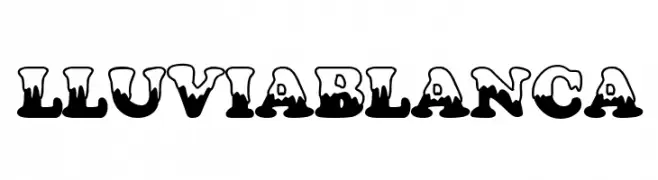
Bold decorative font with a dripping/melting effect on characters.
![Lluvia Blanca font caratteri gratis]() Scaricare 65 Downloads@WebFont
Scaricare 65 Downloads@WebFont -
( Fonts by LyonsType - Daniel Lyons - Personal-use only. For commercial use please contact owner. )
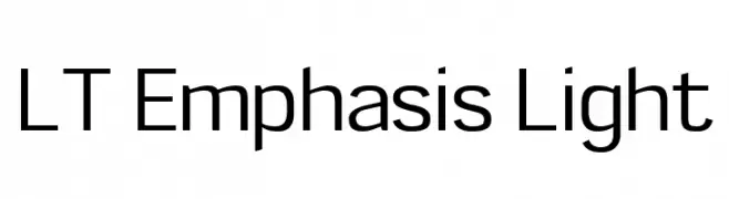
A modern, clean sans-serif font with consistent stroke width and high legibility.
![LT Emphasis Light font caratteri gratis]() Scaricare 65 Downloads@WebFont
Scaricare 65 Downloads@WebFont -
( Fonts by Vladimir Nikolic )
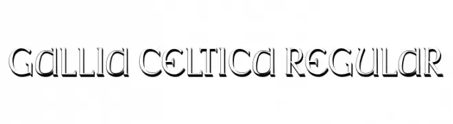
A bold, decorative font with a three-dimensional shadow effect and pronounced serifs.
![Gallia Celtica Regular font caratteri gratis]() Scaricare 65 Downloads@WebFont
Scaricare 65 Downloads@WebFont -
( Fonts by ReivNick )
A graceful script font with fluid, connected letters and a refined aesthetic.
![Haelynn font caratteri gratis]() Scaricare 65 Downloads@WebFont
Scaricare 65 Downloads@WebFont -
( Noto is a trademark of Google Inc. Noto fonts are open source. All Noto fonts are published under the SIL Open Font License, Version 1.1 )
A thin, modern sans-serif font for Hebrew script with clean lines and balanced spacing.
![Noto Sans Hebrew Thin font caratteri gratis]() Scaricare 65 Downloads@WebFont
Scaricare 65 Downloads@WebFont


Quali sono i font più popolari adesso?
Poppins, Roboto, Montserrat, Open Sans e Lato sono molto usati per le forme pulite e l'ampia applicabilità — dall'identità di marca alle landing page e ai poster.
Quali font si usano spesso nei loghi?
Le sans serif geometriche (es. Poppins, famiglie in stile Gotham) sono scelte comuni per un branding pulito e scalabile. Per un tocco personale restano valide script e stili manoscritti. Abbina un display deciso per i titoli a un corpo testo neutro per riconoscibilità ed equilibrio.
Ogni quanto si aggiorna la lista?
Con regolarità, in base ai download e all'attività reale. Torna spesso per scoprire in anticipo le nuove preferite.
💡 Consiglio: aggiungi ai preferiti — le tendenze cambiano in fretta e i font top di oggi possono ispirare il rebranding di domani.