Benvenuto nelle Font Più Popolari — dove popolarità e qualità si incontrano. Qui trovi i font più scaricati e usati dell'anno. Se cerchi scelte sicure per logo, web o social, inizia da qui.
Ogni font top si distingue per equilibrio, leggibilità e versatilità. Troverai sans serif moderne, script eleganti, serif vintage e display minimalisti.
-
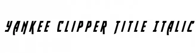
( Iconian Fonts - Daniel Zadorozny - www.iconian.com )
A bold, italicized font with sharp, angular edges and a dynamic, modern style.
 Scaricare 65 Downloads@WebFont
 -
( Fonts by Nick Curtis - Personal-use only. For commercial use please contact owner. )
A bold, geometric font with a distinctive shadow effect, perfect for modern and creative designs.
![MonicasSalonShadowNF font caratteri gratis]() Scaricare 65 Downloads@WebFont
Scaricare 65 Downloads@WebFont -
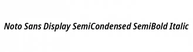
( Noto is a trademark of Google Inc. Noto fonts are open source. All Noto fonts are published under the SIL Open Font License, Version 1.1 )
A modern, semi-condensed sans-serif font with semi-bold weight and italic style.
![Noto Sans Display SemiCondensed SemiBold Italic font caratteri gratis]() Scaricare 65 Downloads@WebFont
Scaricare 65 Downloads@WebFont -
( Fonts by Peter Wiegel - www.peter-wiegel.de - Personal-use only. For commercial use please contact owner. )
A dynamic, italic font with medium contrast and a modern, expressive style.
![cbe Italic font caratteri gratis]() Scaricare 65 Downloads@WebFont
Scaricare 65 Downloads@WebFont -
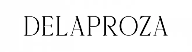
( Fonts by Almarkhatype - Abdul Malik Wisnu - Personal-use only. For commercial use please contact owner. )
A classic serif font with high contrast and elegant strokes.
![Delaproza font caratteri gratis]() Scaricare 65 Downloads@WebFont
Scaricare 65 Downloads@WebFont -
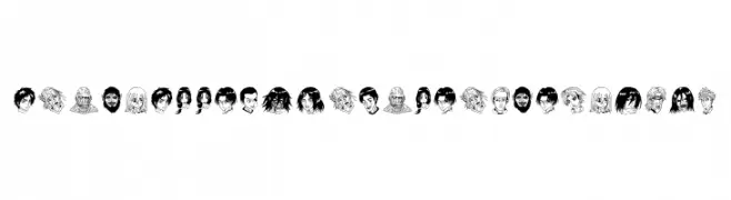
( Fonts by Haviz Fontanime - Personal-use only. For commercial use please contact owner. )
Bold, decorative font using anime character faces as glyphs.
![Anime Attack On Titan Image Bold font caratteri gratis]() Scaricare 65 Downloads@WebFont
Scaricare 65 Downloads@WebFont -
( Fonts by Minetype Studio - Personal-use only. For commercial use please contact owner. )
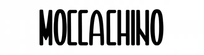
A bold, condensed font with high contrast and a modern, decorative style.
![MOCCACHINO font caratteri gratis]() Scaricare 65 Downloads@WebFont
Scaricare 65 Downloads@WebFont -
( Noto is a trademark of Google Inc. Noto fonts are open source. All Noto fonts are published under the SIL Open Font License, Version 1.1 )
A clean, modern sans-serif font with a light weight and minimalistic style.
![Noto Sans Hebrew Light font caratteri gratis]() Scaricare 65 Downloads@WebFont
Scaricare 65 Downloads@WebFont -
( Fonts by Letterative Studio - Personal-use only. For commercial use please contact owner. )
A delicate, flowing script font with elegant curves and interconnected letters.
![Bearline font caratteri gratis]() Scaricare 65 Downloads@WebFont
Scaricare 65 Downloads@WebFont -
( Fonts by Kat`s Fun Fonts - Personal-use only. For commercial use please contact owner. )
A whimsical font with teddy bear illustrations replacing letters.
![KR Scrap Teddies font caratteri gratis]() Scaricare 65 Downloads@WebFont
Scaricare 65 Downloads@WebFont -
( Fonts by Type Graphy - Personal-use only. For commercial use please contact owner. )
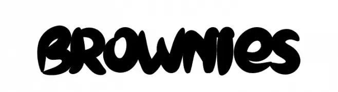
A bold, playful font with thick, rounded strokes and a lively appearance.
![BROWNIES font caratteri gratis]() Scaricare 65 Downloads@WebFont
Scaricare 65 Downloads@WebFont -
( Fonts by Daniel Zadorozny - www.iconian.com - Free for personal use )
A bold, 3D geometric font with a shadow effect.
![Zollern 3D Regular font caratteri gratis]() Scaricare 65 Downloads@WebFont
Scaricare 65 Downloads@WebFont -
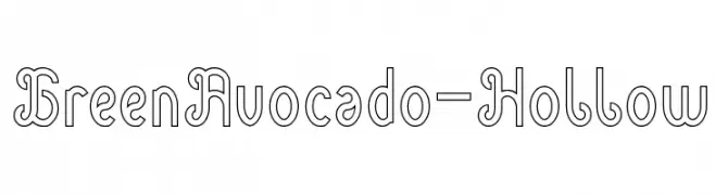
( weknow - Wino S Kadir - www.creativefabrica.com/designer/weknow/ )
A playful, hollow decorative font with rounded edges and a whimsical style.
![Green Avocado-Hollow font caratteri gratis]() Scaricare 65 Downloads@WebFont
Scaricare 65 Downloads@WebFont -
( Fonts by Wahyu Eka Prasetya - wepfont.com - Personal-use only. For commercial use please contact owner. )
A bold, hand-painted style font with dynamic, expressive strokes.
![Gilap font caratteri gratis]() Scaricare 65 Downloads@WebFont
Scaricare 65 Downloads@WebFont -
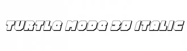
( Fonts by Daniel Zadorozny - www.iconian.com - Personal-use only. For commercial use please contact owner. )
A bold, 3D italic font with a geometric, shadowed design.
![Turtle Mode 3D Italic font caratteri gratis]() Scaricare 65 Downloads@WebFont
Scaricare 65 Downloads@WebFont -
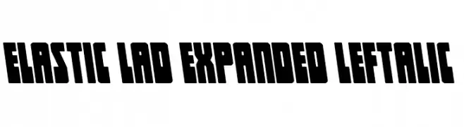
( Fonts by Daniel Zadorozny - www.iconian.com - Personal-use only. For commercial use please contact owner. )
A bold, expanded, and italicized font with a modern and dynamic style.
![Elastic Lad Expanded Leftalic font caratteri gratis]() Scaricare 65 Downloads@WebFont
Scaricare 65 Downloads@WebFont -
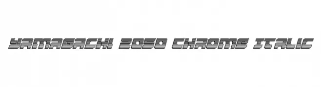
( Fonts by Daniel Zadorozny - www.iconian.com - Personal-use only. For commercial use please contact owner. )
A futuristic, chrome-like italic font with dynamic parallel lines.
![Yamagachi 2050 Chrome Italic font caratteri gratis]() Scaricare 65 Downloads@WebFont
Scaricare 65 Downloads@WebFont -
( Fonts by Vladimir Nikolic - Personal-use only. For commercial use please contact owner. )
A decorative font featuring airplane silhouettes as characters, ideal for thematic designs.
![Airplanes Regular font caratteri gratis]() Scaricare 65 Downloads@WebFont
Scaricare 65 Downloads@WebFont -
( Fonts by ingoFonts - Ingo Zimmermann - Personal-use only. For commercial use please contact owner. )
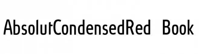
A modern, condensed font with clean lines and geometric shapes.
![AbsolutCondensedRed-Book font caratteri gratis]() Scaricare 65 Downloads@WebFont
Scaricare 65 Downloads@WebFont -
( Fonts by Masa Aska Sanurumi )
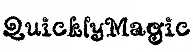
A whimsical, decorative font with curly embellishments and bold strokes.
![Quickly Magic font caratteri gratis]() Scaricare 65 Downloads@WebFont
Scaricare 65 Downloads@WebFont -
( Noto is a trademark of Google Inc. Noto fonts are open source. All Noto fonts are published under the SIL Open Font License, Version 1.1 )
A light, extra-condensed Devanagari font with modern, minimalistic design.
![Noto Sans Devanagari ExtraCondensed Light font caratteri gratis]() Scaricare 65 Downloads@WebFont
Scaricare 65 Downloads@WebFont -
( Fonts by Arendx Studio - Personal-use only. For commercial use please contact owner. )
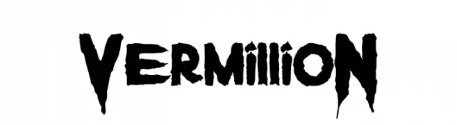
A bold, jagged font with a fierce and energetic style.
![VermillioN font caratteri gratis]() Scaricare 65 Downloads@WebFont
Scaricare 65 Downloads@WebFont -
( Fonts by Ryul Davidson - Personal-use only. For commercial use please contact owner. )
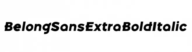
A bold, italicized sans-serif font with a modern and dynamic style.
![Belong Sans ExtraBoldItalic font caratteri gratis]() Scaricare 65 Downloads@WebFont
Scaricare 65 Downloads@WebFont -
( Iconian Fonts - Daniel Zadorozny - www.iconian.com )
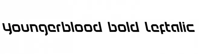
A bold, left-slanted font with a modern and edgy design.
![Youngerblood Bold Leftalic font caratteri gratis]() Scaricare 65 Downloads@WebFont
Scaricare 65 Downloads@WebFont -
( Renny Murray - www.rennysniche.com )
A playful, decorative font with characters enclosed in basket designs.
![RMBaskbn font caratteri gratis]() Scaricare 65 Downloads@WebFont
Scaricare 65 Downloads@WebFont -
( Fonts by NJ Studio )
Bold, playful handwritten script font.
![hello bella bold Bold font caratteri gratis]() Scaricare 65 Downloads@WebFont
Scaricare 65 Downloads@WebFont -
( Fonts by StringLabs - stringlabscreative.com - Personal-use only. For commercial use please contact owner. )
A lively handwritten font with fluid strokes and expressive flourishes.
![White Mellow font caratteri gratis]() Scaricare 65 Downloads@WebFont
Scaricare 65 Downloads@WebFont -
( Iconian Fonts - Daniel Zadorozny - www.iconian.com )
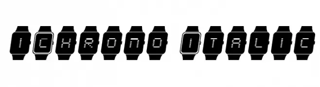
A modern, digital watch-inspired font with italicized, segmented characters.
![iChrono Italic font caratteri gratis]() Scaricare 65 Downloads@WebFont
Scaricare 65 Downloads@WebFont -
( Jaz - www.geocities.com/athens/pantheon/5812/carrollfont/ )
A whimsical dingbat font with imaginative symbols inspired by Lewis Carroll.
![LewisCarrollDings font caratteri gratis]() Scaricare 65 Downloads@WebFont
Scaricare 65 Downloads@WebFont -
( Fonts by Iconian Fonts - Daniel Zadorozny - Personal-use only. For commercial use please contact owner. )
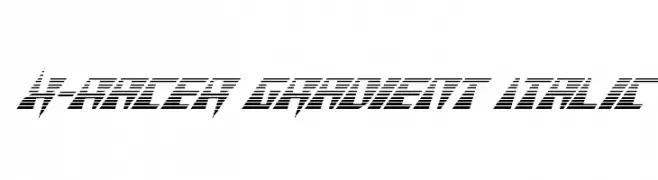
A dynamic, italicized font with a gradient line effect, exuding speed and modernity.
![X-Racer Gradient Italic font caratteri gratis]() Scaricare 65 Downloads@WebFont
Scaricare 65 Downloads@WebFont -
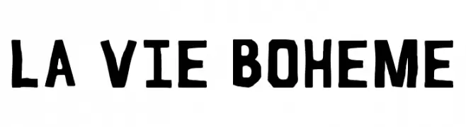
( Fonts by Mischa Pouyavand - Personal-use only. For commercial use please contact owner. )
A bold, hand-drawn font with a vintage, artistic style.
![La Vie Boheme font caratteri gratis]() Scaricare 65 Downloads@WebFont
Scaricare 65 Downloads@WebFont -
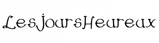
( -arnaud- )
A whimsical, hand-drawn style font with playful and irregular strokes.
![LesJoursHeureux font caratteri gratis]() Scaricare 65 Downloads@WebFont
Scaricare 65 Downloads@WebFont -
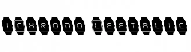
( Iconian Fonts - Daniel Zadorozny - www.iconian.com )
A pixelated, digital watch-inspired font with characters enclosed in watch outlines.
![iChrono Leftalic font caratteri gratis]() Scaricare 65 Downloads@WebFont
Scaricare 65 Downloads@WebFont -
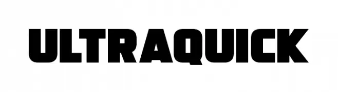
( Fonts by Darrell Flood - Personal-use only. For commercial use please contact owner. )
A bold, geometric font with thick strokes and a modern, impactful design.
![Ultraquick font caratteri gratis]() Scaricare 65 Downloads@WebFont
Scaricare 65 Downloads@WebFont -
( Fonts by JunCreative - Personal-use only. For commercial use please contact owner. )
A charming and elegant script font with flowing, cursive letters.
![lisalovely font caratteri gratis]() Scaricare 65 Downloads@WebFont
Scaricare 65 Downloads@WebFont


Quali sono i font più popolari adesso?
Poppins, Roboto, Montserrat, Open Sans e Lato sono molto usati per le forme pulite e l'ampia applicabilità — dall'identità di marca alle landing page e ai poster.
Quali font si usano spesso nei loghi?
Le sans serif geometriche (es. Poppins, famiglie in stile Gotham) sono scelte comuni per un branding pulito e scalabile. Per un tocco personale restano valide script e stili manoscritti. Abbina un display deciso per i titoli a un corpo testo neutro per riconoscibilità ed equilibrio.
Ogni quanto si aggiorna la lista?
Con regolarità, in base ai download e all'attività reale. Torna spesso per scoprire in anticipo le nuove preferite.
💡 Consiglio: aggiungi ai preferiti — le tendenze cambiano in fretta e i font top di oggi possono ispirare il rebranding di domani.