Benvenuto nelle Font Più Popolari — dove popolarità e qualità si incontrano. Qui trovi i font più scaricati e usati dell'anno. Se cerchi scelte sicure per logo, web o social, inizia da qui.
Ogni font top si distingue per equilibrio, leggibilità e versatilità. Troverai sans serif moderne, script eleganti, serif vintage e display minimalisti.
-
( Fonts by Ferry Ardana Putra - Personal-use only. For commercial use please contact owner. )
A bold, cursive script font with fluid, connected characters and elegant flourishes.
 Scaricare 65 Downloads@WebFont
 -
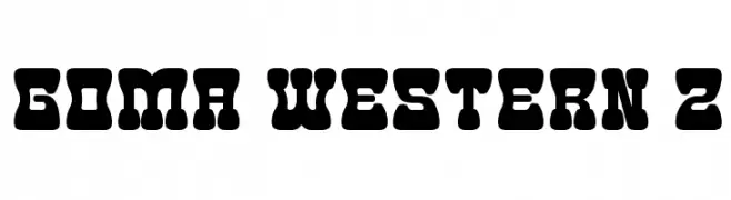
( Fonts by Goma Shin - www.geocities.jp/gomarice_font/ - Personal-use only. For commercial use please contact owner. )
A bold, playful font with rounded edges and thick strokes.
![Goma Western 2 font caratteri gratis]() Scaricare 65 Downloads@WebFont
Scaricare 65 Downloads@WebFont -
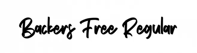
( Fonts by Maulana Creative - Gilang Maulana - Personal-use only. For commercial use please contact owner. )
A bold, expressive handwritten font with fluid strokes.
![Backers Free Regular font caratteri gratis]() Scaricare 65 Downloads@WebFont
Scaricare 65 Downloads@WebFont -
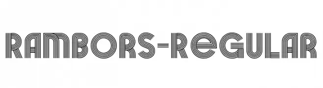
( Fonts by Arterfak Project )
A decorative font with multiple parallel lines creating a modern, geometric look.
![Rambors-Regular font caratteri gratis]() Scaricare 65 Downloads@WebFont
Scaricare 65 Downloads@WebFont -
( Noto is a trademark of Google Inc. Noto fonts are open source. All Noto fonts are published under the SIL Open Font License, Version 1.1 )
A bold, semi-condensed sans-serif font with a modern and clean design.
![Noto Sans Tamil SemiCondensed Bold font caratteri gratis]() Scaricare 65 Downloads@WebFont
Scaricare 65 Downloads@WebFont -
( Fonts by AukimVisuel - Audry Kitoko Makelele - Personal-use only. For commercial use please contact owner. )
A bold, modern font with a geometric and condensed design.
![YemeyiBold font caratteri gratis]() Scaricare 65 Downloads@WebFont
Scaricare 65 Downloads@WebFont -
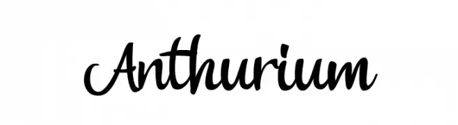
( Fonts by Lemonthe - Dwi Ahidian - Personal-use only. For commercial use please contact owner. )
A lively and flowing script font with elegant, cursive letterforms.
![Anthurium font caratteri gratis]() Scaricare 65 Downloads@WebFont
Scaricare 65 Downloads@WebFont -
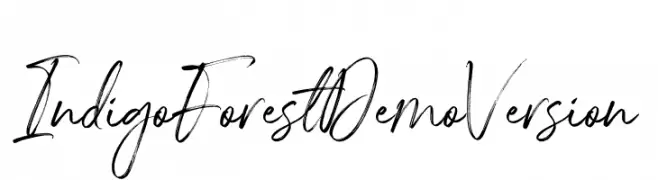
( Fonts by Letteralle Studios - Annas Yahya - Personal-use only. For commercial use please contact owner. )
A dynamic, expressive handwritten font with fluid, cursive strokes.
![IndigoForestDemoVersion font caratteri gratis]() Scaricare 65 Downloads@WebFont
Scaricare 65 Downloads@WebFont -
( Arterfak Project - Ahmad Ramzi Fahruddin - creativemarket.com/Arterfak )
A bold, geometric font with a shadow effect for a striking, modern look.
![Basenglah-Shadow font caratteri gratis]() Scaricare 65 Downloads@WebFont
Scaricare 65 Downloads@WebFont -
( Iconian Fonts - Daniel Zadorozny - www.iconian.com )
A modern, italicized font with a gradient effect and striped design.
![Oramac Gradient Italic font caratteri gratis]() Scaricare 65 Downloads@WebFont
Scaricare 65 Downloads@WebFont -
( Rafael Ramírez Lozano )
An artistic and elegant font with elongated, narrow letterforms and decorative elements.
![Kakawanga font caratteri gratis]() Scaricare 65 Downloads@WebFont
Scaricare 65 Downloads@WebFont -
( Fonts by Vultype - Candra Hamdani - Personal-use only. For commercial use please contact owner. )
A bold, brush-style font with dynamic and playful strokes.
![WILLDOM font caratteri gratis]() Scaricare 65 Downloads@WebFont
Scaricare 65 Downloads@WebFont -
( Fonts by wep )
Expressive, bold handwritten script with connected, flowing strokes.
![Hellaby Village font caratteri gratis]() Scaricare 65 Downloads@WebFont
Scaricare 65 Downloads@WebFont -
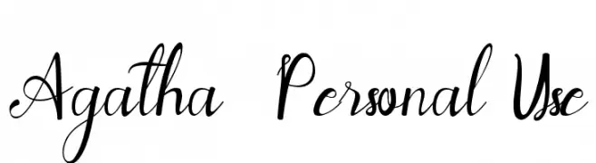
( Fonts by Yoga Letter - Isroni Yoga Prasetya - Personal-use only. For commercial use please contact owner. )
An elegant script font with flowing, intricate letterforms and artistic swashes.
![Agatha - Personal Use font caratteri gratis]() Scaricare 65 Downloads@WebFont
Scaricare 65 Downloads@WebFont -
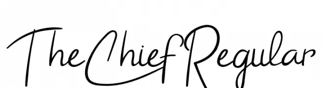
( Fonts by Airotype Studio - Personal-use only. For commercial use please contact owner. )
A casual, handwritten font with a dynamic and flowing style.
![TheChiefRegular font caratteri gratis]() Scaricare 65 Downloads@WebFont
Scaricare 65 Downloads@WebFont -
( Noto is a trademark of Google Inc. Noto fonts are open source. All Noto fonts are published under the SIL Open Font License, Version 1.1 )
Condensed extra bold serif font for Khmer script.
![Noto Serif Khmer Condensed ExtraBold font caratteri gratis]() Scaricare 65 Downloads@WebFont
Scaricare 65 Downloads@WebFont -
( Fonts by Wino S Kadir - weknow - www.revolge.com/shop/weknow/ - Personal-use only. For commercial use please contact owner. )
A bold, jagged font with sharp, irregular edges and a dynamic appearance.
![shake it off font caratteri gratis]() Scaricare 65 Downloads@WebFont
Scaricare 65 Downloads@WebFont -
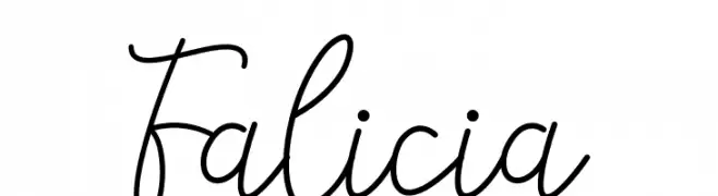
( Fonts by Fanastudio - Personal-use only. For commercial use please contact owner. )
A flowing, cursive font with a natural handwritten style.
![Falicia font caratteri gratis]() Scaricare 65 Downloads@WebFont
Scaricare 65 Downloads@WebFont -
( Fonts by Suby Studio - Teguh Subiyantoro - Personal-use only. For commercial use please contact owner. )
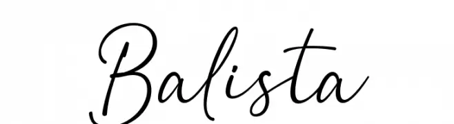
A graceful, cursive font with elegant loops and curves.
![Balista font caratteri gratis]() Scaricare 65 Downloads@WebFont
Scaricare 65 Downloads@WebFont -
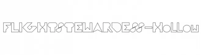
( weknow - Wino S Kadir - www.creativefabrica.com/designer/weknow/ )
A hollow, geometric font with a modern and futuristic style.
![FLIGHT STEWARDESS-Hollow font caratteri gratis]() Scaricare 65 Downloads@WebFont
Scaricare 65 Downloads@WebFont -
( Noto is a trademark of Google Inc. Noto fonts are open source. All Noto fonts are published under the SIL Open Font License, Version 1.1 )
A bold, condensed sans-serif font with high contrast and modern style.
![Noto Sans Devanagari UI Condensed Black font caratteri gratis]() Scaricare 65 Downloads@WebFont
Scaricare 65 Downloads@WebFont -
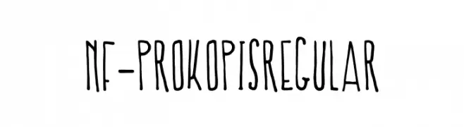
( Fonts by nantia.co - Konstantina Louka - Personal-use only. For commercial use please contact owner. )
A hand-drawn, playful font with elongated, irregular letterforms.
![NF-Prokopis Regular font caratteri gratis]() Scaricare 65 Downloads@WebFont
Scaricare 65 Downloads@WebFont -
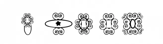
( Digital Magic - www.graphicdesignplus.com/helen/digitalmagic/ )
An ornate and decorative font with intricate swirls and flourishes.
![HD_GEMS4 font caratteri gratis]() Scaricare 65 Downloads@WebFont
Scaricare 65 Downloads@WebFont -
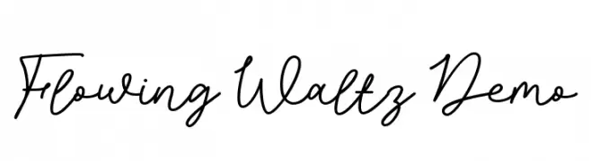
( Fonts by epiclinez )
Elegant, flowing script font with a handwritten style.
![Flowing Waltz Demo font caratteri gratis]() Scaricare 65 Downloads@WebFont
Scaricare 65 Downloads@WebFont -
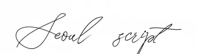
( Fonts by Letterara - Thomas Aradea - Personal-use only. For commercial use please contact owner. )
A graceful script font with flowing, interconnected letters and high contrast strokes.
![Seoul script font caratteri gratis]() Scaricare 65 Downloads@WebFont
Scaricare 65 Downloads@WebFont -
( Fonts by Muksal Creative - Personal-use only. For commercial use please contact owner. )
A modern, elegant font with thin, elongated letterforms and high contrast strokes.
![Bangfel font caratteri gratis]() Scaricare 65 Downloads@WebFont
Scaricare 65 Downloads@WebFont -
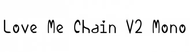
( Personal-use only. For commercial use please contact owner. )
A playful, hand-drawn font with a whimsical and quirky style.
![Love Me Chain V2 Mono font caratteri gratis]() Scaricare 65 Downloads@WebFont
Scaricare 65 Downloads@WebFont -
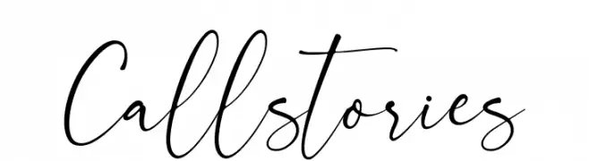
( Fonts by BrandSemut - A Sidiq - Personal-use only. For commercial use please contact owner. )
A flowing, elegant script font with a handwritten style.
![Callstories font caratteri gratis]() Scaricare 65 Downloads@WebFont
Scaricare 65 Downloads@WebFont -
( Fonts by Saridezra - Personal-use only. For commercial use please contact owner. )
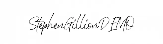
A lively, cursive font with fluid, connected characters and a dynamic style.
![StephenGillionDEMO font caratteri gratis]() Scaricare 65 Downloads@WebFont
Scaricare 65 Downloads@WebFont -
( Fonts by Iconian Fonts - Daniel Zadorozny - Personal-use only. For commercial use please contact owner. )
A bold, slightly italicized font with a modern, industrial feel.
![Hammer Scout Slight-Italic font caratteri gratis]() Scaricare 65 Downloads@WebFont
Scaricare 65 Downloads@WebFont -
( Fonts by Motokiwo - Anton Cahyono - Personal-use only. For commercial use please contact owner. )
A playful, handwritten script with a casual and whimsical style.
![LastKids font caratteri gratis]() Scaricare 65 Downloads@WebFont
Scaricare 65 Downloads@WebFont -
( imagex - www.imagex-fonts.com )
A bold, sketch-like font with a dynamic, hand-drawn appearance.
![Quicker font caratteri gratis]() Scaricare 65 Downloads@WebFont
Scaricare 65 Downloads@WebFont -
( Noto is a trademark of Google Inc. Noto fonts are open source. All Noto fonts are published under the SIL Open Font License, Version 1.1 )
No valid font glyphs are visible.
![Noto Serif Lao SemiCondensed Light font caratteri gratis]() Scaricare 65 Downloads@WebFont
Scaricare 65 Downloads@WebFont -
( Fonts by BrandSemut - A Sidiq - Personal-use only. For commercial use please contact owner. )
A playful, hand-drawn font with tall, narrow letters and a modern, whimsical style.
![Better Unicorn font caratteri gratis]() Scaricare 65 Downloads@WebFont
Scaricare 65 Downloads@WebFont -
( Personal-use only. For commercial use please contact owner. )
A bold, modern font with clean, geometric shapes and consistent line thickness.
![Vazir Bold WOL font caratteri gratis]() Scaricare 65 Downloads@WebFont
Scaricare 65 Downloads@WebFont


Quali sono i font più popolari adesso?
Poppins, Roboto, Montserrat, Open Sans e Lato sono molto usati per le forme pulite e l'ampia applicabilità — dall'identità di marca alle landing page e ai poster.
Quali font si usano spesso nei loghi?
Le sans serif geometriche (es. Poppins, famiglie in stile Gotham) sono scelte comuni per un branding pulito e scalabile. Per un tocco personale restano valide script e stili manoscritti. Abbina un display deciso per i titoli a un corpo testo neutro per riconoscibilità ed equilibrio.
Ogni quanto si aggiorna la lista?
Con regolarità, in base ai download e all'attività reale. Torna spesso per scoprire in anticipo le nuove preferite.
💡 Consiglio: aggiungi ai preferiti — le tendenze cambiano in fretta e i font top di oggi possono ispirare il rebranding di domani.