Benvenuto nelle Font Più Popolari — dove popolarità e qualità si incontrano. Qui trovi i font più scaricati e usati dell'anno. Se cerchi scelte sicure per logo, web o social, inizia da qui.
Ogni font top si distingue per equilibrio, leggibilità e versatilità. Troverai sans serif moderne, script eleganti, serif vintage e display minimalisti.
-
( Pretty Little Line Designs - prettylittlelinedesigns.com )
A playful font with teddy bear illustrations, perfect for children's themes.
 Scaricare 64 Downloads@WebFont
 -
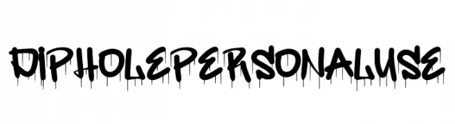
( Fonts by Din Studio )
A bold graffiti-style font with a dripping paint effect, ideal for urban-themed designs.
![Diphole Personal Use font caratteri gratis]() Scaricare 64 Downloads@WebFont
Scaricare 64 Downloads@WebFont -
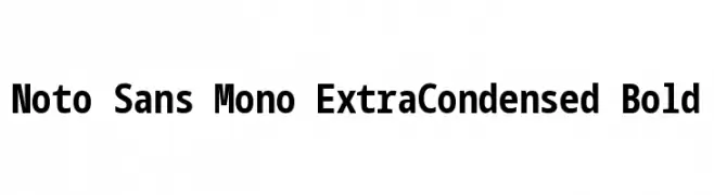
( Noto is a trademark of Google Inc. Noto fonts are open source. All Noto fonts are published under the SIL Open Font License, Version 1.1 )
A bold, extra-condensed monospaced sans-serif font ideal for coding and data alignment.
![Noto Sans Mono ExtraCondensed Bold font caratteri gratis]() Scaricare 64 Downloads@WebFont
Scaricare 64 Downloads@WebFont -
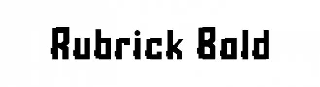
( Fonts by Kong Font - https://fontkong.com/ - Personal-use only. For commercial use please contact owner. )
A bold, geometric font with a pixelated, retro video game style.
![Rubrick Bold font caratteri gratis]() Scaricare 64 Downloads@WebFont
Scaricare 64 Downloads@WebFont -
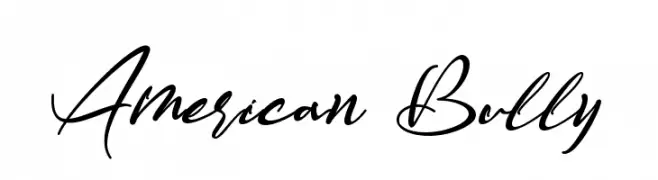
( Fonts by Letterara - Thomas Aradea - Personal-use only. For commercial use please contact owner. )
A dynamic cursive script with sweeping, connected strokes.
![American Bully font caratteri gratis]() Scaricare 64 Downloads@WebFont
Scaricare 64 Downloads@WebFont -
( AdriFonts )
A playful, hand-drawn font with bold, irregular strokes and a whimsical style.
![Blocky_Letters font caratteri gratis]() Scaricare 64 Downloads@WebFont
Scaricare 64 Downloads@WebFont -
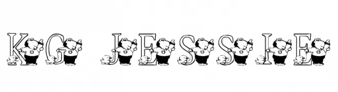
( Katz Fontz - katzfonts.50megs.com/kg.html )
A whimsical font with characters integrated into each letter, perfect for playful designs.
![KG JESSIE font caratteri gratis]() Scaricare 64 Downloads@WebFont
Scaricare 64 Downloads@WebFont -
( Fonts by www.selawetype.com - Personal-use only. FOR DONATION https://www.paypal.me/selawe . For commercial use please contact owner. )
A dynamic, cursive handwritten font with medium contrast and fluid strokes.
![PinSign font caratteri gratis]() Scaricare 64 Downloads@WebFont
Scaricare 64 Downloads@WebFont -
( Fonts by Jimtype Studio - Personal-use only. For commercial use please contact owner. )
A graceful and ornate script font with flowing, cursive letterforms.
![Magtina font caratteri gratis]() Scaricare 64 Downloads@WebFont
Scaricare 64 Downloads@WebFont -
( Fonts by Kat`s Fun Fonts - Personal-use only. For commercial use please contact owner. )
Whimsical dingbat font of cartoon girl faces.
![KR Barb's Class Girls font caratteri gratis]() Scaricare 64 Downloads@WebFont
Scaricare 64 Downloads@WebFont -
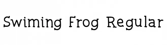
( Fonts by Mightyfire - Agustian Eko Saputro - Personal-use only. For commercial use please contact owner. )
A playful, rounded font with a whimsical and friendly style.
![Swiming Frog Regular font caratteri gratis]() Scaricare 64 Downloads@WebFont
Scaricare 64 Downloads@WebFont -
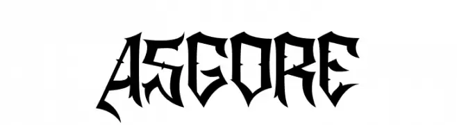
( Fonts by Sealoung - Saiful Anwar - Personal-use only. For commercial use please contact owner. )
A bold, gothic font with sharp, angular lines and dramatic serifs.
![ASGORE font caratteri gratis]() Scaricare 64 Downloads@WebFont
Scaricare 64 Downloads@WebFont -
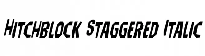
( Iconian Fonts - Daniel Zadorozny - www.iconian.com )
A bold, italicized font with a staggered, angular design.
![Hitchblock Staggered Italic font caratteri gratis]() Scaricare 64 Downloads@WebFont
Scaricare 64 Downloads@WebFont -
( Fonts by Luxima Creative Studio - Susilo Hidayat - Personal-use only. For commercial use please contact owner. )
A modern sans-serif font with clean lines and uniform stroke widths.
![Luxima font caratteri gratis]() Scaricare 64 Downloads@WebFont
Scaricare 64 Downloads@WebFont -
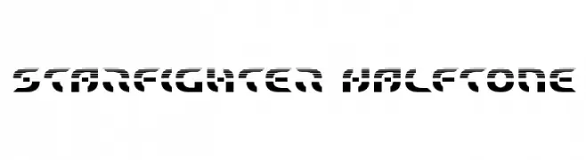
( Fonts by Iconian Fonts )
A futuristic, halftone-effect font with bold, geometric letters.
![Starfighter Halftone font caratteri gratis]() Scaricare 64 Downloads@WebFont
Scaricare 64 Downloads@WebFont -
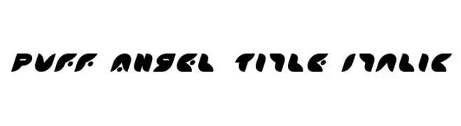
( Iconian Fonts - Daniel Zadorozny - www.iconian.com )
A bold, playful, and modern italic font with a puffed, rounded style.
![Puff Angel Title Italic font caratteri gratis]() Scaricare 64 Downloads@WebFont
Scaricare 64 Downloads@WebFont -
( Fonts by Vladimir Nikolic - https://www.creativefabrica.com/product/educated-deers/ref/144265/ - Personal-use only. For commercial use please contact owner. )
A bold, geometric font with characters enclosed in decorative octagonal frames, ideal for impactful designs.
![Capitalismo 6 Regular font caratteri gratis]() Scaricare 64 Downloads@WebFont
Scaricare 64 Downloads@WebFont -
( Fonts by Denny Subagja - Personal-use only. For commercial use please contact owner. )
A modern, handwritten font with a casual and flowing style.
![Baselliost font caratteri gratis]() Scaricare 64 Downloads@WebFont
Scaricare 64 Downloads@WebFont -
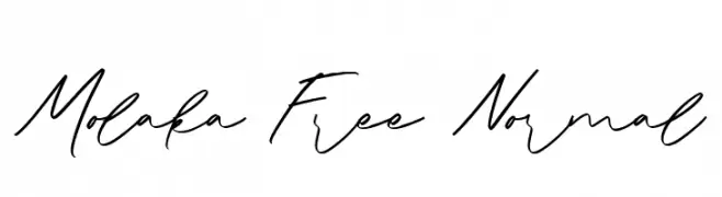
( Fonts by Maulana Creative - Gilang Maulana - Personal-use only. For commercial use please contact owner. )
A dynamic and fluid handwritten script with elegant, flowing strokes.
![Molaka Free Normal font caratteri gratis]() Scaricare 64 Downloads@WebFont
Scaricare 64 Downloads@WebFont -
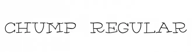
( AdultHuman - Alex - twitter.com/AdultHumanType )
A playful, hand-drawn font with whimsical, irregular strokes.
![Chump-Regular font caratteri gratis]() Scaricare 64 Downloads@WebFont
Scaricare 64 Downloads@WebFont -
( Iconian Fonts - Daniel Zadorozny - www.iconian.com )
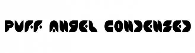
A bold, geometric font with a modern, futuristic style and efficient use of space.
![Puff Angel Condensed font caratteri gratis]() Scaricare 64 Downloads@WebFont
Scaricare 64 Downloads@WebFont -
( Fonts by Eko Bimantara )
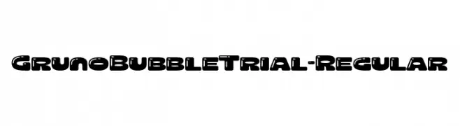
A bold, playful typeface with rounded, bubble-like characters.
![GrunoBubbleTrial-Regular font caratteri gratis]() Scaricare 64 Downloads@WebFont
Scaricare 64 Downloads@WebFont -
( Fonts by Vladimir Nikolic - www.creativefabrica.com/designer/vladimirnikolic/ - Personal-use only. For commercial use please contact owner. )
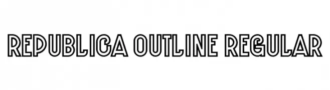
A bold, outlined font with a modern, geometric style.
![Republica Outline Regular font caratteri gratis]() Scaricare 64 Downloads@WebFont
Scaricare 64 Downloads@WebFont -
( Fonts by Daniel Zadorozny - www.iconian.com )
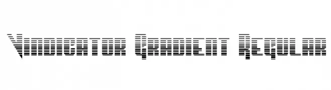
A bold, geometric font with a gradient effect created by horizontal lines.
![Vindicator Gradient Regular font caratteri gratis]() Scaricare 64 Downloads@WebFont
Scaricare 64 Downloads@WebFont -
( Fonts by Al Ghul - Personal-use only. For commercial use please contact owner. )
A playful, handwritten font with bold, rounded characters and a whimsical style.
![Baby Alone font caratteri gratis]() Scaricare 64 Downloads@WebFont
Scaricare 64 Downloads@WebFont -
( Fonts by PutraCetol Studio - www.putracetol.com - Personal-use only. For commercial use please contact owner. )
An elegant script font with flowing, cursive letterforms and a sophisticated style.
![Melodious Script Free font caratteri gratis]() Scaricare 64 Downloads@WebFont
Scaricare 64 Downloads@WebFont -
( Fonts by Wahyu Studio )
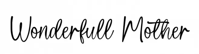
A playful, handwritten font with flowing, cursive-like strokes.
![Wonderfull Mother font caratteri gratis]() Scaricare 64 Downloads@WebFont
Scaricare 64 Downloads@WebFont -
( Fonts by Abdurrahman Hanif - Personal-use only. For commercial use please contact owner. )
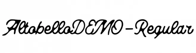
A flowing, cursive font with interconnected characters and elegant style.
![AltobelloDEMO-Regular font caratteri gratis]() Scaricare 64 Downloads@WebFont
Scaricare 64 Downloads@WebFont -
( Fonts by FatmaStudio - Fatmawati - Personal-use only. For commercial use please contact owner. )
A lively, handwritten script font with bold, connected letters.
![Hellomate font caratteri gratis]() Scaricare 64 Downloads@WebFont
Scaricare 64 Downloads@WebFont -
( Fonts by Grabstein - Honza Steiner - Personal-use only. For commercial use please contact owner. )
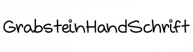
A playful handwritten font with a casual, friendly style.
![Grabstein HandSchrift font caratteri gratis]() Scaricare 64 Downloads@WebFont
Scaricare 64 Downloads@WebFont -
( Fonts by wep - Wahyu Eka Prasetya - Personal-use only. For commercial use please contact owner. )
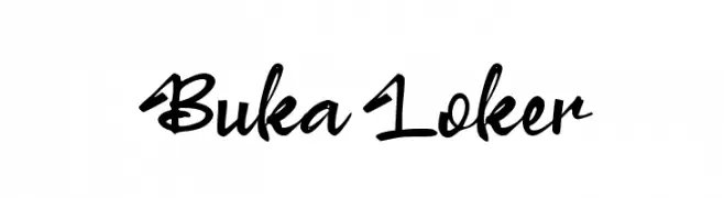
A lively, handwritten script font with a modern and expressive style.
![Buka Loker font caratteri gratis]() Scaricare 64 Downloads@WebFont
Scaricare 64 Downloads@WebFont -
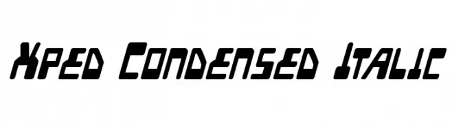
( Iconian Fonts - Daniel Zadorozny - www.iconian.com )
A bold, condensed, and italicized font with a modern, dynamic style.
![Xped Condensed Italic font caratteri gratis]() Scaricare 64 Downloads@WebFont
Scaricare 64 Downloads@WebFont -
( Fonts by Noah Type - noahtype.com - Personal-use only. For commercial use please contact owner. )
A dynamic, edgy italic font with sharp, jagged edges and high contrast.
![Vaulcate Demo Italic font caratteri gratis]() Scaricare 64 Downloads@WebFont
Scaricare 64 Downloads@WebFont -
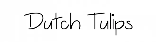
( Misti's Fonts - mistifonts.com/ )
A playful, handwritten font with a casual and friendly appearance.
![Dutch Tulips font caratteri gratis]() Scaricare 64 Downloads@WebFont
Scaricare 64 Downloads@WebFont -
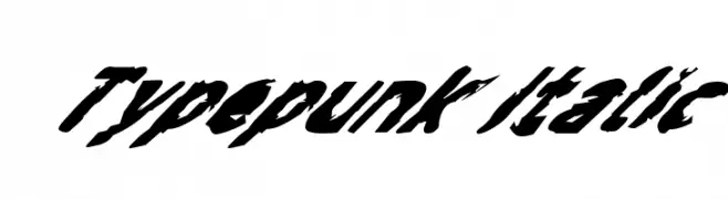
( Fonts by GGBotNet )
A bold, italic, punk-inspired font with jagged edges and dynamic energy.
![Typepunk Italic font caratteri gratis]() Scaricare 64 Downloads@WebFont
Scaricare 64 Downloads@WebFont


Quali sono i font più popolari adesso?
Poppins, Roboto, Montserrat, Open Sans e Lato sono molto usati per le forme pulite e l'ampia applicabilità — dall'identità di marca alle landing page e ai poster.
Quali font si usano spesso nei loghi?
Le sans serif geometriche (es. Poppins, famiglie in stile Gotham) sono scelte comuni per un branding pulito e scalabile. Per un tocco personale restano valide script e stili manoscritti. Abbina un display deciso per i titoli a un corpo testo neutro per riconoscibilità ed equilibrio.
Ogni quanto si aggiorna la lista?
Con regolarità, in base ai download e all'attività reale. Torna spesso per scoprire in anticipo le nuove preferite.
💡 Consiglio: aggiungi ai preferiti — le tendenze cambiano in fretta e i font top di oggi possono ispirare il rebranding di domani.