Benvenuto nelle Font Più Popolari — dove popolarità e qualità si incontrano. Qui trovi i font più scaricati e usati dell'anno. Se cerchi scelte sicure per logo, web o social, inizia da qui.
Ogni font top si distingue per equilibrio, leggibilità e versatilità. Troverai sans serif moderne, script eleganti, serif vintage e display minimalisti.
-
( imagex - www.imagex-fonts.com )
A bold, dynamic font with playful, brush-like patterns.
 Scaricare 64 Downloads@WebFont
 -
( Fonts by Balpirick Studio - Personal-use only. For commercial use please contact owner. )
A decorative cursive font with elegant loops and swirls.
![Sisterli font caratteri gratis]() Scaricare 64 Downloads@WebFont
Scaricare 64 Downloads@WebFont -
( Fonts by Kong Font - Personal-use only. For commercial use please contact owner. )
A bold and italic font with high contrast and elegant curves.
![Luimp Bold Italic font caratteri gratis]() Scaricare 64 Downloads@WebFont
Scaricare 64 Downloads@WebFont -
( Fonts by Mans Greback - Personal-use only. For commercial use please contact owner. )
Elegant serif font with italic style, perfect for formal and creative uses.
![Blaak Regular PERSONAL USE Italic font caratteri gratis]() Scaricare 64 Downloads@WebFont
Scaricare 64 Downloads@WebFont -
( Fonts by www.chequered.ink - Chequered Ink - Personal-use only. For commercial use please contact owner. )
A bold, geometric font with a modern, futuristic style.
![Plack the Hanet font caratteri gratis]() Scaricare 64 Downloads@WebFont
Scaricare 64 Downloads@WebFont -
( Fonts by Prioritype Co - Prio Nurokhim Aji - Personal-use only. For commercial use please contact owner. )
A playful, whimsical font with flowing cursive lowercase and tall, narrow uppercase letters.
![Frangstton font caratteri gratis]() Scaricare 64 Downloads@WebFont
Scaricare 64 Downloads@WebFont -
( Jay Mann )
A bold, 3D font with a playful, hand-drawn style and shadow effects.
![YES_3D Book font caratteri gratis]() Scaricare 64 Downloads@WebFont
Scaricare 64 Downloads@WebFont -
( Fonts by Kong Font - fontkong.com - Personal-use only. For commercial use please contact owner. )
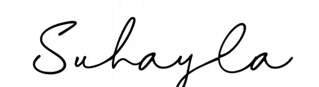
A flowing, cursive script font with elegant, handwritten characteristics.
![Suhayla font caratteri gratis]() Scaricare 64 Downloads@WebFont
Scaricare 64 Downloads@WebFont -
( Fonts by Rich Gast - www.greywolfwebworks.com Commerciali Caratteri )
A bold, outlined font with angular, slanted characters for a dynamic look.
![Great American League Baseline font caratteri gratis]() Scaricare 64 Downloads
Scaricare 64 Downloads -
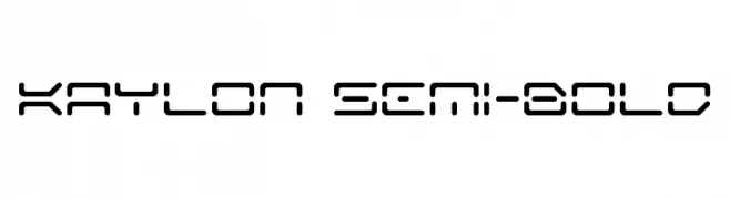
![Kaylon Semi-Bold font caratteri gratis]() Scaricare 64 Downloads@WebFont
Scaricare 64 Downloads@WebFont -
( Fonts by DmLetter31 - Dimas Prasetyo - Personal-use only. For commercial use please contact owner. )
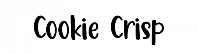
A playful, hand-drawn font with bold, rounded characters.
![Cookie Crisp font caratteri gratis]() Scaricare 64 Downloads@WebFont
Scaricare 64 Downloads@WebFont -
( Fonts by KineticPlasma Fonts - Robert Jablonski - Personal-use only. For commercial use please contact owner. )
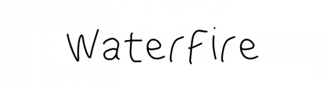
A playful, handwritten font with a casual and friendly vibe.
![WaterFire font caratteri gratis]() Scaricare 64 Downloads@WebFont
Scaricare 64 Downloads@WebFont -
( Fonts by Kong Font )
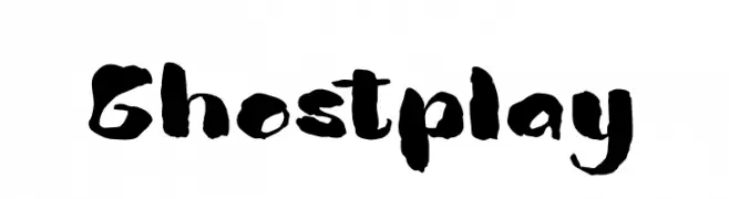
A bold, brush-style font with dynamic and artistic flair.
![Ghostplay font caratteri gratis]() Scaricare 64 Downloads@WebFont
Scaricare 64 Downloads@WebFont -
( Fonts by Rendi Radiandi - Personal-use only. For commercial use please contact owner. )
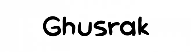
A playful, handwritten font with bold, rounded characters and a casual vibe.
![Ghusrak font caratteri gratis]() Scaricare 64 Downloads@WebFont
Scaricare 64 Downloads@WebFont -
( Falexoo - en.fakoo.de )
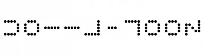
A dot-based, geometric font with a futuristic and digital aesthetic.
![Dotty-Moon font caratteri gratis]() Scaricare 64 Downloads@WebFont
Scaricare 64 Downloads@WebFont -
( Fonts by Tension Type )
A bold, italicized handwritten font with a dynamic and playful style.
![She Said Jiffy Italic font caratteri gratis]() Scaricare 64 Downloads@WebFont
Scaricare 64 Downloads@WebFont -
( Fonts by GGBot - www.ggbot.net - Personal-use only. For commercial use please contact owner. )
A bold, modern font with tall, slightly condensed characters.
![Sagewold font caratteri gratis]() Scaricare 64 Downloads@WebFont
Scaricare 64 Downloads@WebFont -
( Fonts by Rich Gast - www.greywolfwebworks.com Commerciali Caratteri )
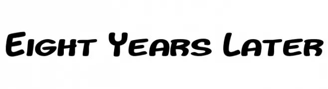
A bold, rounded font with a playful and friendly style.
![Eight Years Later font caratteri gratis]() Scaricare 64 Downloads
Scaricare 64 Downloads -
( Fonts by Peter Wiegel - www.peter-wiegel.de - Personal-use only. For commercial use please contact owner. )
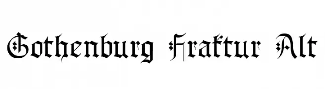
A traditional blackletter font with ornate, angular strokes and a medieval aesthetic.
![Gothenburg Fraktur Alt font caratteri gratis]() Scaricare 64 Downloads@WebFont
Scaricare 64 Downloads@WebFont -
( Fonts by Elbanadha Creative - Personal-use only. For commercial use please contact owner. )
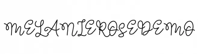
A charming, elegant handwritten script with flowing, interconnected letters.
![MELANIE ROSE DEMO font caratteri gratis]() Scaricare 64 Downloads@WebFont
Scaricare 64 Downloads@WebFont -
( Fonts by Creakokun Studio - Personal-use only. For commercial use please contact owner. )
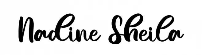
A bold, playful script font with a handwritten, fluid style.
![Nadine Sheila font caratteri gratis]() Scaricare 64 Downloads@WebFont
Scaricare 64 Downloads@WebFont -
( Fonts by Nurul Kamal - Personal-use only. For commercial use please contact owner. )
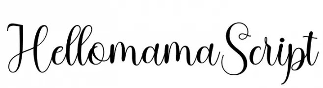
An elegant and fluid script font with graceful curves and a dynamic slant.
![HellomamaScript font caratteri gratis]() Scaricare 64 Downloads@WebFont
Scaricare 64 Downloads@WebFont -
( Fonts by Yoga Letter - Isroni Yoga Prasetya - Personal-use only. For commercial use please contact owner. )
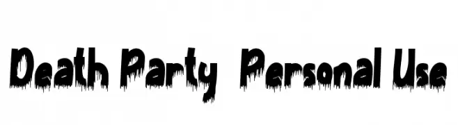
A bold, dripping font with a horror-themed aesthetic.
![Death Party - Personal Use font caratteri gratis]() Scaricare 64 Downloads@WebFont
Scaricare 64 Downloads@WebFont -
( Fonts by Kong Font )
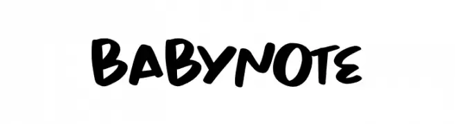
![Babynote font caratteri gratis]() Scaricare 64 Downloads@WebFont
Scaricare 64 Downloads@WebFont -
( Fonts by Ferry Ardana Putra - Personal-use only. For commercial use please contact owner. )
A bold, cursive script font with fluid, connected characters and elegant flourishes.
![Skyfall font caratteri gratis]() Scaricare 64 Downloads@WebFont
Scaricare 64 Downloads@WebFont -
( Fonts by Lhotive Studio - Chairul Fuadi - Personal-use only. For commercial use please contact owner. )
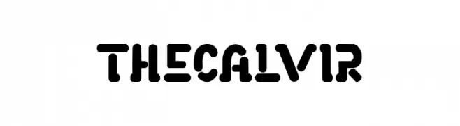
A bold, rounded font with a modern and playful style.
![THECALVIR font caratteri gratis]() Scaricare 64 Downloads@WebFont
Scaricare 64 Downloads@WebFont -
( Fonts by www.junkohanhero.com - Personal-use only. For commercial use please contact owner. )
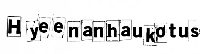
A distressed, cut-out style font with a chaotic, edgy appearance.
![Hyeenan haukotus font caratteri gratis]() Scaricare 64 Downloads@WebFont
Scaricare 64 Downloads@WebFont -
( CrazeCo.com.au - Craze™ Co - CrazeCo.com.au )
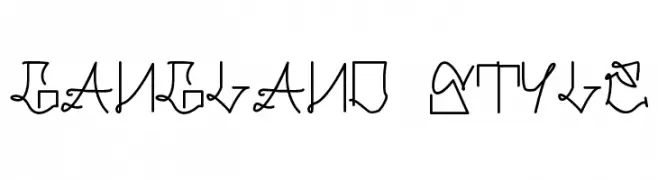
A decorative, gangland-inspired font with intricate loops and angular lines.
![Gangland Style font caratteri gratis]() Scaricare 64 Downloads@WebFont
Scaricare 64 Downloads@WebFont -
( Fonts by Madatype Studio - Andri Ardianto - Personal-use only. For commercial use please contact owner. )
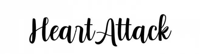
A bold, flowing script font with elegant, cursive letterforms.
![Heart Attack font caratteri gratis]() Scaricare 64 Downloads@WebFont
Scaricare 64 Downloads@WebFont -
( Fonts by StringLabs - stringlabscreative.com - Personal-use only. For commercial use please contact owner. )
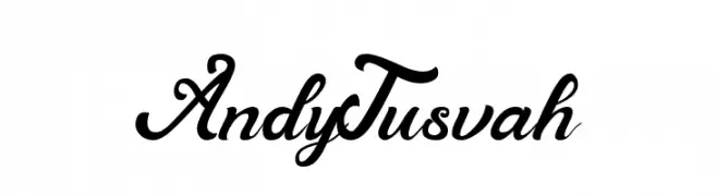
A classic, elegant script font with flowing cursive letters and ornate details.
![Andy Tusvah font caratteri gratis]() Scaricare 64 Downloads@WebFont
Scaricare 64 Downloads@WebFont -
( Iconian Fonts - Daniel Zadorozny - www.iconian.com )
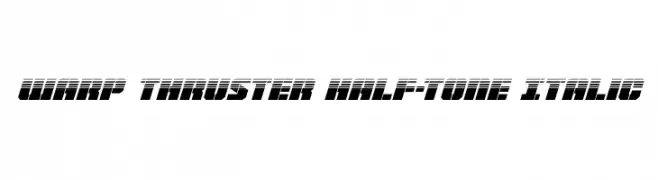
A bold, italicized font with a futuristic half-tone effect, ideal for dynamic designs.
![Warp Thruster Half-Tone Italic font caratteri gratis]() Scaricare 64 Downloads@WebFont
Scaricare 64 Downloads@WebFont -
( Fonts by Iconian Fonts - Daniel Zadorozny - Personal-use only. For commercial use please contact owner. )
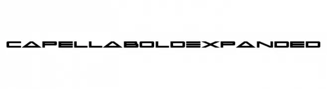
A bold, expanded, and futuristic font with geometric shapes and sharp edges.
![Capella Bold Expanded font caratteri gratis]() Scaricare 64 Downloads@WebFont
Scaricare 64 Downloads@WebFont -
( Fonts by zone108.main.jp - Personal-use only. For commercial use please contact owner. )
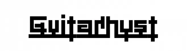
A bold, geometric font with a digital, pixelated style.
![Guitarhyst font caratteri gratis]() Scaricare 64 Downloads@WebFont
Scaricare 64 Downloads@WebFont -
( Fonts by Jonathan S. Harris - Personal-use only. For commercial use please contact owner. )
A bold, brush-style script font with dynamic, flowing strokes.
![Brushy Script font caratteri gratis]() Scaricare 64 Downloads@WebFont
Scaricare 64 Downloads@WebFont -
( Fonts by sronstudio - Yusron Billah - Personal-use only. For commercial use please contact owner. )
A dynamic and expressive handwritten script font.
![Anastacy font caratteri gratis]() Scaricare 64 Downloads@WebFont
Scaricare 64 Downloads@WebFont


Quali sono i font più popolari adesso?
Poppins, Roboto, Montserrat, Open Sans e Lato sono molto usati per le forme pulite e l'ampia applicabilità — dall'identità di marca alle landing page e ai poster.
Quali font si usano spesso nei loghi?
Le sans serif geometriche (es. Poppins, famiglie in stile Gotham) sono scelte comuni per un branding pulito e scalabile. Per un tocco personale restano valide script e stili manoscritti. Abbina un display deciso per i titoli a un corpo testo neutro per riconoscibilità ed equilibrio.
Ogni quanto si aggiorna la lista?
Con regolarità, in base ai download e all'attività reale. Torna spesso per scoprire in anticipo le nuove preferite.
💡 Consiglio: aggiungi ai preferiti — le tendenze cambiano in fretta e i font top di oggi possono ispirare il rebranding di domani.