Benvenuto nelle Font Più Popolari — dove popolarità e qualità si incontrano. Qui trovi i font più scaricati e usati dell'anno. Se cerchi scelte sicure per logo, web o social, inizia da qui.
Ogni font top si distingue per equilibrio, leggibilità e versatilità. Troverai sans serif moderne, script eleganti, serif vintage e display minimalisti.
-
( Fonts by Mans Greback - www.mansgreback.com - Personal-use only. For commercial use please contact owner. )
A playful, casual handwritten font with smooth, flowing strokes.
 Scaricare 64 Downloads@WebFont
 -
( Fonts by Graphicfresh - Personal-use only. For commercial use please contact owner. )
A bold, brush-style font with dynamic and expressive strokes.
![Sketching font caratteri gratis]() Scaricare 64 Downloads@WebFont
Scaricare 64 Downloads@WebFont -
( Fonts by Vunira Design - Personal-use only. For commercial use please contact owner. )
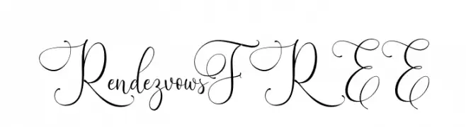
An elegant script font with intricate swirls and flourishes.
![RendezvowsFREE font caratteri gratis]() Scaricare 64 Downloads@WebFont
Scaricare 64 Downloads@WebFont -
( Fonts by Cadson Demak )
A modern, geometric sans-serif font with clean lines and balanced spacing.
![Kanit-ExtraLight font caratteri gratis]() Scaricare 64 Downloads@WebFont
Scaricare 64 Downloads@WebFont -
( Fonts by Graphicfresh - Personal-use only. For commercial use please contact owner. )
A fluid and elegant script font with interconnected cursive strokes.
![Brown Carlson font caratteri gratis]() Scaricare 64 Downloads@WebFont
Scaricare 64 Downloads@WebFont -
( Fonts by GulioSt - Wahy Sapt - Personal-use only. For commercial use please contact owner. )
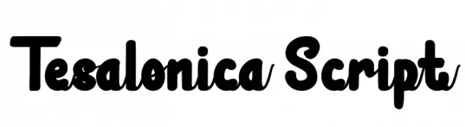
A bold, playful script font with rounded strokes and smooth curves.
![Tesalonica Script font caratteri gratis]() Scaricare 64 Downloads@WebFont
Scaricare 64 Downloads@WebFont -
( Fonts by Java Pep - Personal-use only. For commercial use please contact owner. )
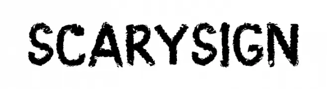
A bold, textured font with a spooky, hand-drawn appearance.
![Scary Sign font caratteri gratis]() Scaricare 64 Downloads@WebFont
Scaricare 64 Downloads@WebFont -
( Fonts by Yanuar Antabua - Personal-use only. For commercial use please contact owner. )
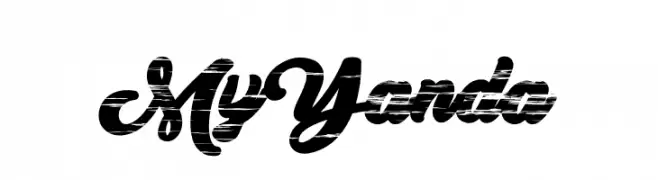
A bold, cursive font with a distressed, vintage texture.
![My Yanda font caratteri gratis]() Scaricare 64 Downloads@WebFont
Scaricare 64 Downloads@WebFont -
( Fonts by Barry Schwartz - Personal-use only. For commercial use please contact owner. )
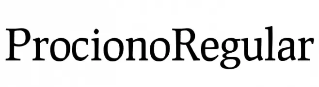
A classic serif font with elegant, well-proportioned characters and moderate contrast.
![Prociono Regular font caratteri gratis]() Scaricare 64 Downloads@WebFont
Scaricare 64 Downloads@WebFont -
( Fonts by Kong Font - https://fontkong.com/ - Personal-use only. For commercial use please contact owner. )
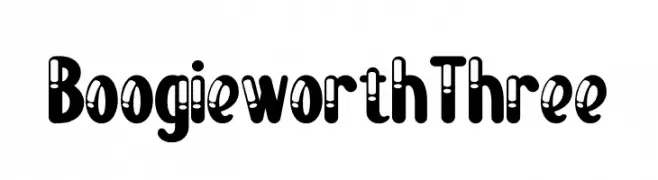
A bold, playful display font with retro cut-out details.
![Boogie worth Three font caratteri gratis]() Scaricare 64 Downloads@WebFont
Scaricare 64 Downloads@WebFont -
( Fonts by alphArtype - Agung Rohmat - Personal-use only. For commercial use please contact owner. )
An elegant, flowing script font with a cursive, handwritten style.
![Theloved font caratteri gratis]() Scaricare 64 Downloads@WebFont
Scaricare 64 Downloads@WebFont -
( Iconian Fonts - Daniel Zadorozny - www.iconian.com )
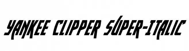
A bold, italicized font with sharp angles and a dynamic slant.
![Yankee Clipper Super-Italic font caratteri gratis]() Scaricare 64 Downloads@WebFont
Scaricare 64 Downloads@WebFont -
( Fonts by Vigilante Typeface Corporation Larry Yerkes. Personal-use only. For commercial use please contact owner. )
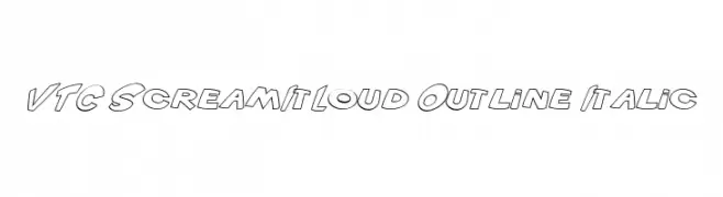
A bold, outlined, italic font with a playful and dynamic style.
![VTC ScreamItLoud Outline Italic font caratteri gratis]() Scaricare 64 Downloads@WebFont
Scaricare 64 Downloads@WebFont -
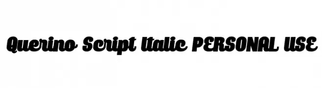
( Fonts by Mans Greback - Personal-use only. For commercial use please contact owner. )
A bold, italic script font with a dynamic and flowing style.
![Querino Script Italic PERSONAL USE font caratteri gratis]() Scaricare 64 Downloads@WebFont
Scaricare 64 Downloads@WebFont -
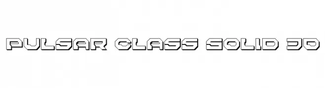
( Iconian Fonts - Daniel Zadorozny - www.iconian.com )
A bold, 3D geometric font with a futuristic style.
![Pulsar Class Solid 3D font caratteri gratis]() Scaricare 64 Downloads@WebFont
Scaricare 64 Downloads@WebFont -
( GraphicsBam - www.creativefabrica.com/ref/186/ )
A bold, graffiti-inspired font with dynamic, angular characters.
![Dopebam_demo Regular font caratteri gratis]() Scaricare 64 Downloads@WebFont
Scaricare 64 Downloads@WebFont -
![Siberia Outline Oblique font caratteri gratis]() Scaricare 64 Downloads@WebFont
Scaricare 64 Downloads@WebFont -
( Jacqueline Bantad - www.twitter.com/jacquelinejedi )
A whimsical, playful font with elongated ascenders and descenders.
![ZeaMaysEverta font caratteri gratis]() Scaricare 64 Downloads@WebFont
Scaricare 64 Downloads@WebFont -
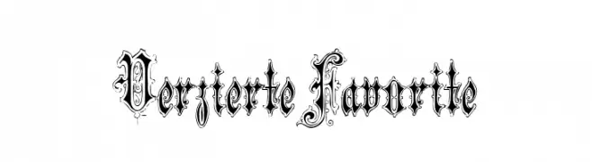
( Fonts by Peter Wiegel - www.peter-wiegel.de - Personal-use only. For commercial use please contact owner. )
An ornate and decorative blackletter-style font with intricate flourishes.
![VerzierteFavorite font caratteri gratis]() Scaricare 64 Downloads@WebFont
Scaricare 64 Downloads@WebFont -
( Fonts by Analogous Studio - Muhammad Ilham - Personal-use only. For commercial use please contact owner. )
A fluid, cursive script font with elegant, slanted characters.
![July it font caratteri gratis]() Scaricare 64 Downloads@WebFont
Scaricare 64 Downloads@WebFont -
( Fonts by LetterStuff Typefoundry - Personal-use only. For commercial use please contact owner. )
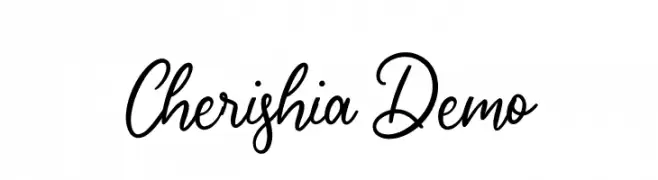
An elegant and flowing script font with ornate uppercase letters and smooth lowercase connections.
![Cherishia Demo font caratteri gratis]() Scaricare 64 Downloads@WebFont
Scaricare 64 Downloads@WebFont -
( Fonts by Dharmas Studio - Jamaludin Ahmad - Personal-use only. For commercial use please contact owner. )
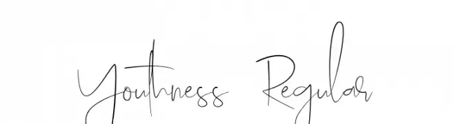
A playful, handwritten font with tall, slender letterforms and dynamic strokes.
![Youthness-Regular font caratteri gratis]() Scaricare 64 Downloads@WebFont
Scaricare 64 Downloads@WebFont -
( Noto is a trademark of Google Inc. Noto fonts are open source. All Noto fonts are published under the SIL Open Font License, Version 1.1 )
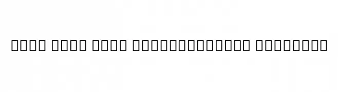
A clean, modern semi-condensed font with semi-bold weight and excellent readability.
![Noto Sans Thai SemiCondensed SemiBold font caratteri gratis]() Scaricare 64 Downloads@WebFont
Scaricare 64 Downloads@WebFont -
( Fonts by Vladimir Nikolic - https://www.creativefabrica.com/product/educated-deers/ref/144265/ - Personal-use only. For commercial use please contact owner. )
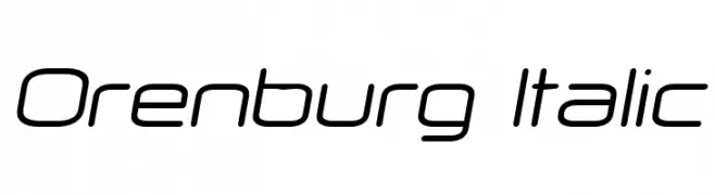
A sleek, modern italic font with smooth curves and consistent stroke width.
![Orenburg Italic font caratteri gratis]() Scaricare 64 Downloads@WebFont
Scaricare 64 Downloads@WebFont -
( weknow - Wino S Kadir - www.creativefabrica.com/designer/weknow/ )
A bold, playful font with rounded edges and a handwritten script style.
![Enjoy The Time Bold font caratteri gratis]() Scaricare 64 Downloads@WebFont
Scaricare 64 Downloads@WebFont -
( Character )
A playful, clothing-themed decorative font with a hand-drawn style.
![SketchClothes font caratteri gratis]() Scaricare 64 Downloads@WebFont
Scaricare 64 Downloads@WebFont -
( Fonts by 177Studio )
A bold, fingerprint-patterned font with a modern and artistic style.
![identify demo Regular font caratteri gratis]() Scaricare 64 Downloads@WebFont
Scaricare 64 Downloads@WebFont -
( Fonts by twinletter - Rozikan - Personal-use only. For commercial use please contact owner. )
A playful and bold script font with rounded, flowing letterforms.
![GreatSafiraRegular font caratteri gratis]() Scaricare 64 Downloads@WebFont
Scaricare 64 Downloads@WebFont -
( Iconian Fonts - Daniel Zadorozny - www.iconian.com )
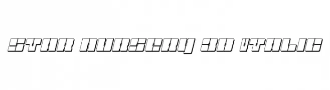
A bold, 3D italic font with a futuristic and geometric style.
![Star Nursery 3D Italic font caratteri gratis]() Scaricare 64 Downloads@WebFont
Scaricare 64 Downloads@WebFont -
( Fonts by typeformerstudio.com - Personal-use only. For commercial use please contact owner. )
A bold, geometric font with modern flair and strong presence.
![RUMIKON font caratteri gratis]() Scaricare 64 Downloads@WebFont
Scaricare 64 Downloads@WebFont -
( Personal-use only. For commercial use please contact owner. )
A bold, geometric font with enclosed letterforms, ideal for modern designs.
![KacstPoster font caratteri gratis]() Scaricare 64 Downloads@WebFont
Scaricare 64 Downloads@WebFont -
( Fonts by AdanteCreative - Personal-use only. For commercial use please contact owner. )
A bold, brush-style font with a dynamic and expressive handwritten appearance.
![Crowtig font caratteri gratis]() Scaricare 64 Downloads@WebFont
Scaricare 64 Downloads@WebFont -
( Fonts by Kong Font - Personal-use only. For commercial use please contact owner. )
A decorative font with elegant swashes and flourishes, perfect for artistic projects.
![Agustin Swash font caratteri gratis]() Scaricare 64 Downloads@WebFont
Scaricare 64 Downloads@WebFont -
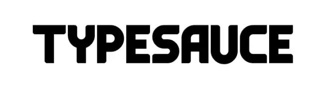
( Fonts by MaxiGamer - Maxime Maynard - Personal-use only. For commercial use please contact owner. )
A bold, geometric font with unique cutouts and rounded edges.
![Typesauce font caratteri gratis]() Scaricare 64 Downloads@WebFont
Scaricare 64 Downloads@WebFont -
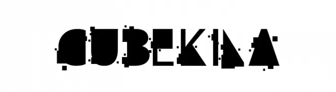
( Qkila - Quentin Aquila - www.creativefabrica.com/designer/qkila/ )
A bold, geometric font with angular, blocky letterforms.
![cube kila font caratteri gratis]() Scaricare 64 Downloads@WebFont
Scaricare 64 Downloads@WebFont


Quali sono i font più popolari adesso?
Poppins, Roboto, Montserrat, Open Sans e Lato sono molto usati per le forme pulite e l'ampia applicabilità — dall'identità di marca alle landing page e ai poster.
Quali font si usano spesso nei loghi?
Le sans serif geometriche (es. Poppins, famiglie in stile Gotham) sono scelte comuni per un branding pulito e scalabile. Per un tocco personale restano valide script e stili manoscritti. Abbina un display deciso per i titoli a un corpo testo neutro per riconoscibilità ed equilibrio.
Ogni quanto si aggiorna la lista?
Con regolarità, in base ai download e all'attività reale. Torna spesso per scoprire in anticipo le nuove preferite.
💡 Consiglio: aggiungi ai preferiti — le tendenze cambiano in fretta e i font top di oggi possono ispirare il rebranding di domani.