Benvenuto nelle Font Più Popolari — dove popolarità e qualità si incontrano. Qui trovi i font più scaricati e usati dell'anno. Se cerchi scelte sicure per logo, web o social, inizia da qui.
Ogni font top si distingue per equilibrio, leggibilità e versatilità. Troverai sans serif moderne, script eleganti, serif vintage e display minimalisti.
-
( Fonts by Edric Studio - Personal-use only. For commercial use please contact owner. )
A modern, handwritten font with a casual and flowing style.
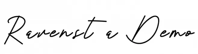 Scaricare 55 Downloads@WebFont
 -
( Fonts by Johandika Syahputra Lubis - Personal-use only. For commercial use please contact owner. )
A modern, bold italic font with a sleek and dynamic style.
![BrandingPro-BoldItalic font caratteri gratis]() Scaricare 55 Downloads@WebFont
Scaricare 55 Downloads@WebFont -
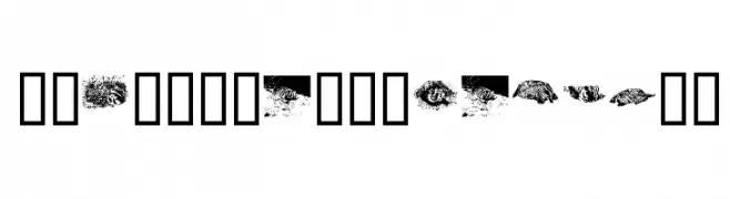
( Fonts by Kat`s Fun Fonts - Personal-use only. For commercial use please contact owner. )
Animal-themed decorative font with badger illustrations.
![KR Crystal's Badgers font caratteri gratis]() Scaricare 55 Downloads@WebFont
Scaricare 55 Downloads@WebFont -
( Fonts by wep - Wahyu Eka Prasetya - Personal-use only. For commercial use please contact owner. )
A bold, brush-style font with dynamic, irregular strokes.
![Coreng font caratteri gratis]() Scaricare 55 Downloads@WebFont
Scaricare 55 Downloads@WebFont -
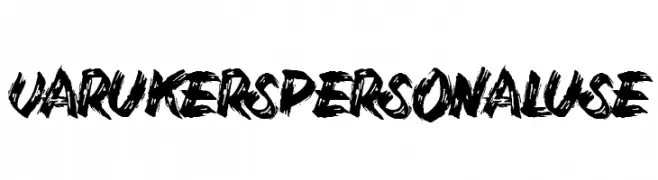
( Fonts by Billy Argel Fonts - www.billyargel.com - Personal-use only. For commercial use please contact owner. )
A bold, brush-stroke style font with a raw, energetic, and artistic flair.
![Varukers Personal Use font caratteri gratis]() Scaricare 55 Downloads@WebFont
Scaricare 55 Downloads@WebFont -
-
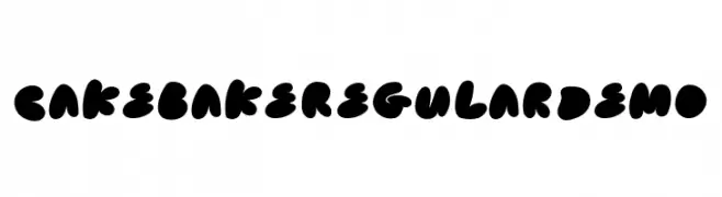
( Fonts by ColtTypeCo - Personal-use only. For commercial use please contact owner. )
A playful, bold font with rounded, bubble-like characters.
![Cake Bake Regular Demo font caratteri gratis]() Scaricare 55 Downloads@WebFont
Scaricare 55 Downloads@WebFont -
( Fonts by Agni Ardi Rein Prasetyo - Personal-use only. For commercial use please contact owner. )
A casual, handwritten font with a playful and relaxed style.
![Chillout font caratteri gratis]() Scaricare 55 Downloads@WebFont
Scaricare 55 Downloads@WebFont -
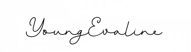
( Fonts by Almarkhatype - Abdul Malik Wisnu - Personal-use only. For commercial use please contact owner. )
A flowing, cursive font with elegant, script-like characteristics.
![Young Evaline font caratteri gratis]() Scaricare 55 Downloads@WebFont
Scaricare 55 Downloads@WebFont -
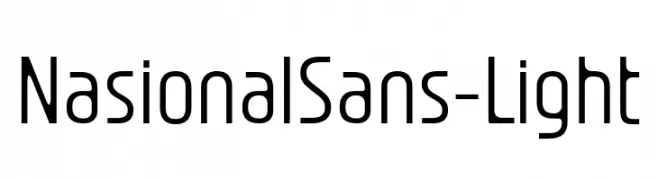
( Fonts by Jetsmax.com - Personal-use only. For commercial use please contact owner. )
A modern, light sans-serif font with a clean and minimalistic design.
![NasionalSans-Light font caratteri gratis]() Scaricare 55 Downloads@WebFont
Scaricare 55 Downloads@WebFont -
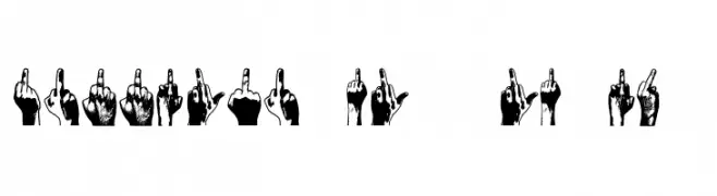
( Fonts by Vladimir Nikolic - https://www.creativefabrica.com/product/educated-deers/ref/144265/ - Personal-use only. For commercial use please contact owner. )
A display font using illustrated hands making an obscene gesture for each character.
![Middle Finger Regular font caratteri gratis]() Scaricare 55 Downloads@WebFont
Scaricare 55 Downloads@WebFont -
( Fonts by Agni Ardi Rein Prasetyo - Personal-use only. For commercial use please contact owner. )
A fluid, handwritten font with a natural, signature-like style.
![Natural Signature font caratteri gratis]() Scaricare 55 Downloads@WebFont
Scaricare 55 Downloads@WebFont -
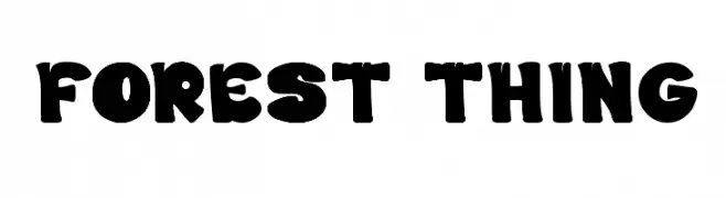
( Fonts by Wino S Kadir - weknow - www.revolge.com/shop/weknow/ - Personal-use only. For commercial use please contact owner. )
A playful, bold font with rounded, thick strokes and a whimsical style.
![FOREST THING font caratteri gratis]() Scaricare 55 Downloads@WebFont
Scaricare 55 Downloads@WebFont -
( Fonts by Java Pep - Personal-use only. For commercial use please contact owner. )
An artistic swash font with fluid, decorative strokes.
![Yackien Swash font caratteri gratis]() Scaricare 55 Downloads@WebFont
Scaricare 55 Downloads@WebFont -
( Fonts by Mindtype Co. - Putra Khan - Personal-use only. For commercial use please contact owner. )
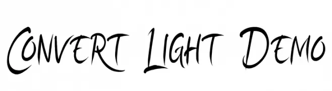
A dynamic, brush-style font with expressive, fluid strokes.
![Convert Light Demo font caratteri gratis]() Scaricare 55 Downloads@WebFont
Scaricare 55 Downloads@WebFont -
( Fonts by Kong Font - fontkong.com - Personal-use only. For commercial use please contact owner. )
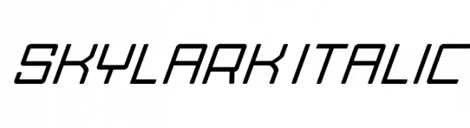
A sleek, italicized font with a modern, geometric design.
![Skylark Italic font caratteri gratis]() Scaricare 55 Downloads@WebFont
Scaricare 55 Downloads@WebFont -
( Fonts by Daniel Zadorozny - www.iconian.com - Personal-use only. For commercial use please contact owner. )
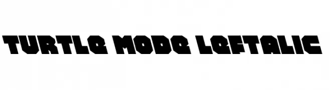
A bold, geometric font with a futuristic, industrial style.
![Turtle Mode Leftalic font caratteri gratis]() Scaricare 55 Downloads@WebFont
Scaricare 55 Downloads@WebFont -
( Fonts by Jonathan S. Harris - www.tattoowoo.com. Personal-use only. For commercial use please contact owner. )
An elegant, artistic script font with flowing, elongated lines and a calligraphic style.
![Today People font caratteri gratis]() Scaricare 55 Downloads@WebFont
Scaricare 55 Downloads@WebFont -
( Fonts by Letternun - Saeful Bahri - Personal-use only. For commercial use please contact owner. )
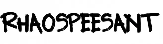
A bold, hand-painted style font with dynamic strokes and a unique blend of expressive letters and classic numerals.
![RHAOS PEESANT font caratteri gratis]() Scaricare 55 Downloads@WebFont
Scaricare 55 Downloads@WebFont -
( Fonts by Vunira Design - Personal-use only. For commercial use please contact owner. )
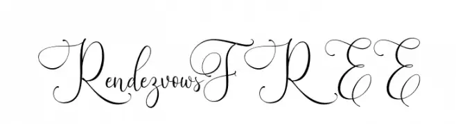
An elegant script font with intricate swirls and flourishes.
![RendezvowsFREE font caratteri gratis]() Scaricare 55 Downloads@WebFont
Scaricare 55 Downloads@WebFont -
( Fonts by Studiorazi - Muhammad Razi - Personal-use only. For commercial use please contact owner. )
An elegant, flowing script font with decorative flourishes.
![Absolute font caratteri gratis]() Scaricare 55 Downloads@WebFont
Scaricare 55 Downloads@WebFont -
( Walter Paggioro - www.raptuscreativi.com/site/fields/type-design/ )
A constellation-themed font with characters formed by dots and connecting lines.
![chirone font caratteri gratis]() Scaricare 55 Downloads@WebFont
Scaricare 55 Downloads@WebFont -
( Fonts by wep - Wahyu Eka Prasetya - Personal-use only. For commercial use please contact owner. )
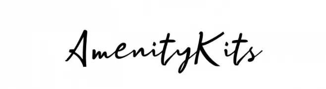
A dynamic handwritten font with expressive cursive letterforms.
![Amenity Kits font caratteri gratis]() Scaricare 55 Downloads@WebFont
Scaricare 55 Downloads@WebFont -
( Fonts by Design Vector10 )
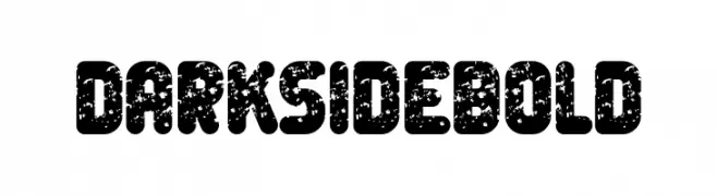
A bold, distressed font with a rugged, vintage appearance.
![Dark Side Bold font caratteri gratis]() Scaricare 55 Downloads@WebFont
Scaricare 55 Downloads@WebFont -
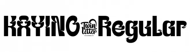
( Fonts by twinletter )
A bold, decorative font with intricate curves and flourishes.
![KAYINO-Regular font caratteri gratis]() Scaricare 55 Downloads@WebFont
Scaricare 55 Downloads@WebFont -
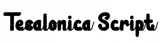
( Fonts by GulioSt - Wahy Sapt - Personal-use only. For commercial use please contact owner. )
A bold, playful script font with rounded strokes and smooth curves.
![Tesalonica Script font caratteri gratis]() Scaricare 55 Downloads@WebFont
Scaricare 55 Downloads@WebFont -
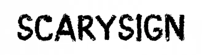
( Fonts by Java Pep - Personal-use only. For commercial use please contact owner. )
A bold, textured font with a spooky, hand-drawn appearance.
![Scary Sign font caratteri gratis]() Scaricare 55 Downloads@WebFont
Scaricare 55 Downloads@WebFont -
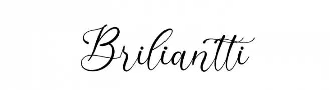
( Fonts by Ketikata Studio - Fuad Hasan - Personal-use only. For commercial use please contact owner. )
A sophisticated script font with elegant, flowing characters and calligraphic style.
![Briliantti font caratteri gratis]() Scaricare 55 Downloads@WebFont
Scaricare 55 Downloads@WebFont -
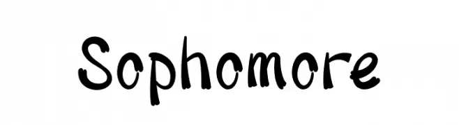
( Fonts by Prioritype Co - Prio Nurokhim Aji - Personal-use only. For commercial use please contact owner. )
A playful, bold handwritten font with dynamic strokes and a casual style.
![Sophomore font caratteri gratis]() Scaricare 55 Downloads@WebFont
Scaricare 55 Downloads@WebFont -
( Xerographer Fonts - Max Infeld - xerographer.blogspot.com )
A geometric, angular font with a modern, futuristic style.
![Pelanquier font caratteri gratis]() Scaricare 55 Downloads@WebFont
Scaricare 55 Downloads@WebFont -
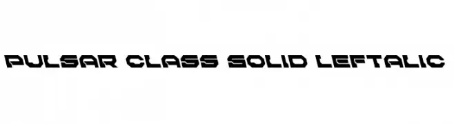
( Iconian Fonts - Daniel Zadorozny - www.iconian.com )
A bold, futuristic font with angular, geometric shapes and a left-leaning italic slant.
![Pulsar Class Solid Leftalic font caratteri gratis]() Scaricare 55 Downloads@WebFont
Scaricare 55 Downloads@WebFont -
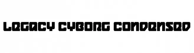
( Fonts by Daniel Zadorozny - www.iconian.com - Personal-use only. For commercial use please contact owner. )
A bold, angular, and futuristic font with a condensed, geometric style.
![Legacy Cyborg Condensed font caratteri gratis]() Scaricare 55 Downloads@WebFont
Scaricare 55 Downloads@WebFont -
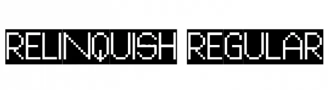
( Fonts by Vladimir Nikolic - www.creativefabrica.com/designer/vladimirnikolic/ - Personal-use only. For commercial use please contact owner. )
A pixelated, retro-style font with a digital, geometric design.
![Relinquish Regular font caratteri gratis]() Scaricare 55 Downloads@WebFont
Scaricare 55 Downloads@WebFont -
( Fonts by alphArtype - Agung Rohmat - Personal-use only. For commercial use please contact owner. )
An elegant, flowing script font with a cursive, handwritten style.
![Theloved font caratteri gratis]() Scaricare 55 Downloads@WebFont
Scaricare 55 Downloads@WebFont -
( Roland Huse Design - Roland Huse - rolandhuse.com )
A modern sans-serif font with clean lines and balanced proportions.
![YellowPeas-Regular font caratteri gratis]() Scaricare 55 Downloads@WebFont
Scaricare 55 Downloads@WebFont -
( Fonts by Mans Greback - www.mansgreback.com - Personal-use only. For commercial use please contact owner. )
A bold, modern sans-serif font with clean lines and strong readability.
![Workforce Sans PERSONAL USE Regular font caratteri gratis]() Scaricare 55 Downloads@WebFont
Scaricare 55 Downloads@WebFont


Quali sono i font più popolari adesso?
Poppins, Roboto, Montserrat, Open Sans e Lato sono molto usati per le forme pulite e l'ampia applicabilità — dall'identità di marca alle landing page e ai poster.
Quali font si usano spesso nei loghi?
Le sans serif geometriche (es. Poppins, famiglie in stile Gotham) sono scelte comuni per un branding pulito e scalabile. Per un tocco personale restano valide script e stili manoscritti. Abbina un display deciso per i titoli a un corpo testo neutro per riconoscibilità ed equilibrio.
Ogni quanto si aggiorna la lista?
Con regolarità, in base ai download e all'attività reale. Torna spesso per scoprire in anticipo le nuove preferite.
💡 Consiglio: aggiungi ai preferiti — le tendenze cambiano in fretta e i font top di oggi possono ispirare il rebranding di domani.