Benvenuto nelle Font Più Popolari — dove popolarità e qualità si incontrano. Qui trovi i font più scaricati e usati dell'anno. Se cerchi scelte sicure per logo, web o social, inizia da qui.
Ogni font top si distingue per equilibrio, leggibilità e versatilità. Troverai sans serif moderne, script eleganti, serif vintage e display minimalisti.
-
( Font Nook - www.geocities.com/weakestlink11/ )
A novelty font with presidential and historical figure illustrations for each character.
 Scaricare 61 Downloads@WebFont
 -
( Fonts by Vladimir Nikolic - https://www.creativefabrica.com/product/educated-deers/ref/144265/ - Personal-use only. For commercial use please contact owner. )
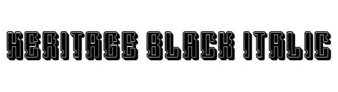
A bold, outlined font with a vintage yet modern appeal.
![Heritage Black Italic font caratteri gratis]() Scaricare 61 Downloads@WebFont
Scaricare 61 Downloads@WebFont -
( Fonts by CannotIntoSpaceFonts - KineticPlasma Fonts - Personal-use only. For commercial use please contact owner. )
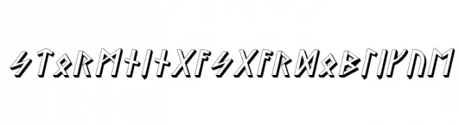
A bold, angular font with a 3D effect, inspired by ancient runes.
![Stormning Asgard Oblique font caratteri gratis]() Scaricare 61 Downloads@WebFont
Scaricare 61 Downloads@WebFont -
( Fonts by Woodcutter )
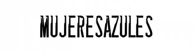
A bold, condensed font with a modern industrial style and high contrast.
![Mujeres Azules font caratteri gratis]() Scaricare 61 Downloads@WebFont
Scaricare 61 Downloads@WebFont -
( Fonts by Miyawaki Yuki )
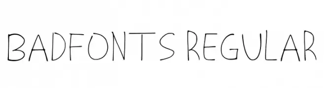
Playful handwritten font with irregular strokes.
![Badfonts Regular font caratteri gratis]() Scaricare 61 Downloads@WebFont
Scaricare 61 Downloads@WebFont -
( Fonts by Hendra Pratama - Personal-use only. For commercial use please contact owner. )
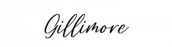
A dynamic and elegant script font with fluid, connected letterforms.
![Gillimore font caratteri gratis]() Scaricare 61 Downloads@WebFont
Scaricare 61 Downloads@WebFont -
( Dan Smith's Fantasy Fonts - www.acondia.com/fonts/index.html )
A bold, abstract font with geometric and artistic elements.
![DS_Aqua 1 font caratteri gratis]() Scaricare 61 Downloads
Scaricare 61 Downloads -
( LeChefRene - members.aol.com/lcrfonts/ )
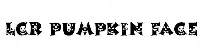
A Halloween-themed font with jack-o'-lantern faces in each character.
![LCR Pumpkin Face font caratteri gratis]() Scaricare 61 Downloads@WebFont
Scaricare 61 Downloads@WebFont -
( Fonts by Perspectype Studio )
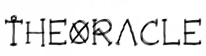
A hand-drawn, sketch-like font with an edgy and artistic style.
![The Oracle font caratteri gratis]() Scaricare 61 Downloads@WebFont
Scaricare 61 Downloads@WebFont -
![Discordance BRK font caratteri gratis]() Scaricare 61 Downloads@WebFont
Scaricare 61 Downloads@WebFont -
( Iconian Fonts - Daniel Zadorozny - www.iconian.com )
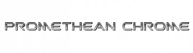
A futuristic, multi-line font with a geometric and industrial design.
![Promethean Chrome font caratteri gratis]() Scaricare 61 Downloads@WebFont
Scaricare 61 Downloads@WebFont -
( Fonts by Scratch Design - Studio 41 - Personal-use only. For commercial use please contact owner. )
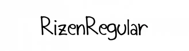
A playful, handwritten-style font with a casual and friendly appearance.
![Rizen Regular font caratteri gratis]() Scaricare 61 Downloads@WebFont
Scaricare 61 Downloads@WebFont -
( Fonts by Typeting Studio - Tatang Iskandar - Personal-use only. For commercial use please contact owner. )
A modern, elegant script font with flowing curves and decorative swashes.
![sleeper font caratteri gratis]() Scaricare 61 Downloads@WebFont
Scaricare 61 Downloads@WebFont -
( Caveras - Cliff Modes - caveras.net )
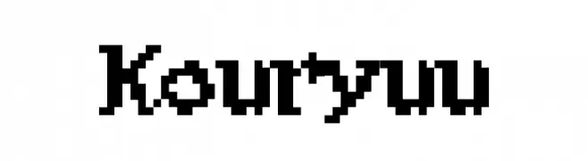
A pixelated, retro-style font with a bold, blocky design.
![Kouryuu font caratteri gratis]() Scaricare 61 Downloads@WebFont
Scaricare 61 Downloads@WebFont -
( Iconian Fonts - Daniel Zadorozny - www.iconian.com )
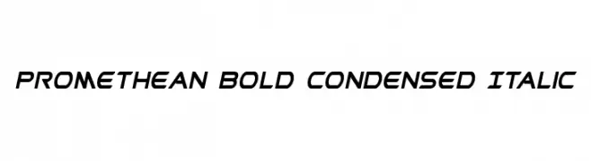
A bold, condensed, and italic font with a modern, dynamic style.
![Promethean Bold Condensed Italic font caratteri gratis]() Scaricare 61 Downloads@WebFont
Scaricare 61 Downloads@WebFont -
( Fonts by Ditoollis Project - Muhammad Faizal Said - Personal-use only. For commercial use please contact owner. )
A dynamic script font with elegant, flowing strokes and a modern calligraphic style.
![Bankitte Personal Use font caratteri gratis]() Scaricare 61 Downloads@WebFont
Scaricare 61 Downloads@WebFont -
( Fonts by Pineungtype Missinklab - Personal-use only. For commercial use please contact owner. )
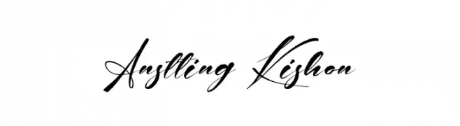
An elegant, flowing script font with graceful curves and fluid strokes.
![Anstting Kishon font caratteri gratis]() Scaricare 61 Downloads@WebFont
Scaricare 61 Downloads@WebFont -
( Fonts by Xerographer Fonts - Max Infeld - Personal-use only. For commercial use please contact owner. )
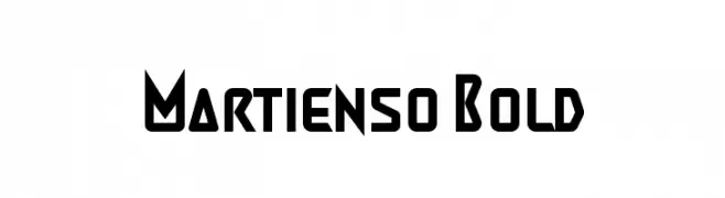
A bold, geometric font with a futuristic and modern design.
![Martienso Bold font caratteri gratis]() Scaricare 61 Downloads@WebFont
Scaricare 61 Downloads@WebFont -
( Fonts by elharrak )
Ornamental geometric borders with pointed, Islamic-inspired edges.
![Borders islamic 1444 font caratteri gratis]() Scaricare 61 Downloads@WebFont
Scaricare 61 Downloads@WebFont -
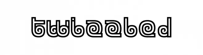
( Fonts by www.chequered.ink - Chequered Ink - Personal-use only. For commercial use please contact owner. )
A playful, double-line decorative font with a whimsical and dynamic style.
![Twizzled font caratteri gratis]() Scaricare 61 Downloads@WebFont
Scaricare 61 Downloads@WebFont -
( Noto is a trademark of Google Inc. Noto fonts are open source. All Noto fonts are published under the SIL Open Font License, Version 1.1 )
Invalid font image.
![Noto Serif Ethiopic ExtraCondensed Medium font caratteri gratis]() Scaricare 61 Downloads@WebFont
Scaricare 61 Downloads@WebFont -
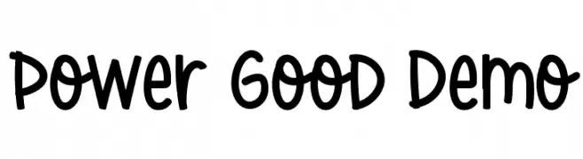
( Fonts by CalligraphyFonts - Personal-use only. For commercial use please contact owner. )
A playful, hand-drawn font with rounded, informal letterforms.
![Power Good Demo font caratteri gratis]() Scaricare 61 Downloads@WebFont
Scaricare 61 Downloads@WebFont -
( Fonts by Kat`s Fun Fonts - Personal-use only. For commercial use please contact owner. )
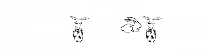
A decorative set of bunny illustrations in a playful, cartoonish style.
![KR Five Bunnies font caratteri gratis]() Scaricare 61 Downloads@WebFont
Scaricare 61 Downloads@WebFont -
( Fonts by Walkeren - Didi Syarif - Personal-use only. For commercial use please contact owner. )
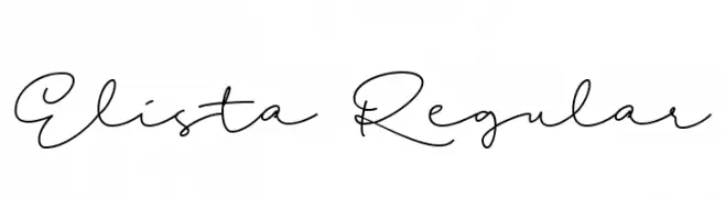
A graceful, flowing script font with elegant, interconnected letters.
![Elista Regular font caratteri gratis]() Scaricare 61 Downloads@WebFont
Scaricare 61 Downloads@WebFont -
( Fonts by Nick Curtis - Personal-use only. For commercial use please contact owner. )
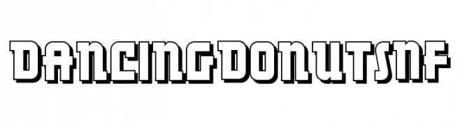
A bold, playful font with a 3D effect and blocky geometric design.
![DancingDonutsNF font caratteri gratis]() Scaricare 61 Downloads@WebFont
Scaricare 61 Downloads@WebFont -
( Fonts by Edignwn Type )
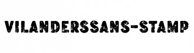
A bold, distressed font with a textured, vintage stamp-like appearance.
![VilandersSans-Stamp font caratteri gratis]() Scaricare 61 Downloads@WebFont
Scaricare 61 Downloads@WebFont -
( Fonts by Display Studio )
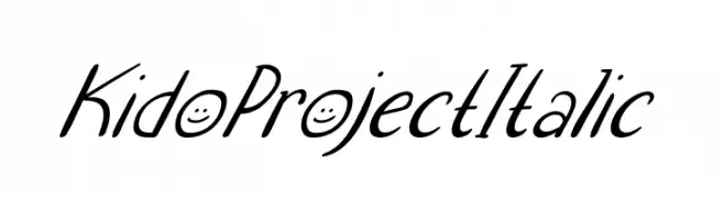
A playful, handwritten italic font with a lively and dynamic style.
![Kido Project Italic font caratteri gratis]() Scaricare 61 Downloads@WebFont
Scaricare 61 Downloads@WebFont -
( Fonts by Creatype Studio - Rian Rahardi - Personal-use only. For commercial use please contact owner. )
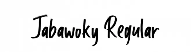
A bold, energetic handwritten font with dynamic strokes and playful character.
![Jabawoky Regular font caratteri gratis]() Scaricare 61 Downloads@WebFont
Scaricare 61 Downloads@WebFont -
( Fonts by Maulana Creative )
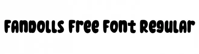
A playful, bold font with rounded edges and a bubbly appearance.
![Fandolls Free Font Regular font caratteri gratis]() Scaricare 61 Downloads@WebFont
Scaricare 61 Downloads@WebFont -
( Fonts by Vladimir Nikolic - https://www.creativefabrica.com/product/educated-deers/ref/144265/ - Personal-use only. For commercial use please contact owner. )
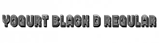
A bold, 3D font with a striped, geometric design for a vintage look.
![Yogurt Black 3D Regular font caratteri gratis]() Scaricare 61 Downloads@WebFont
Scaricare 61 Downloads@WebFont -
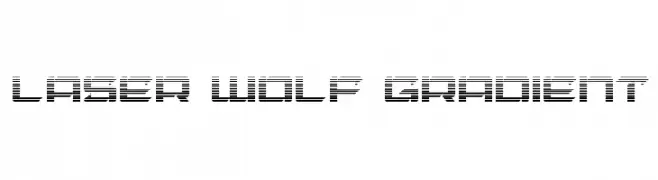
( Iconian Fonts - Daniel Zadorozny - www.iconian.com )
A futuristic font with a gradient effect and geometric shapes, perfect for digital themes.
![Laser Wolf Gradient font caratteri gratis]() Scaricare 61 Downloads@WebFont
Scaricare 61 Downloads@WebFont -
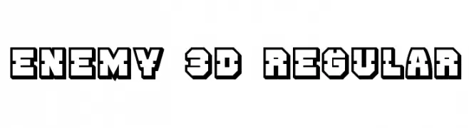
( Vladimir Nikolic - www.coroflot.com/vladimirnikolic )
A bold, 3D geometric font with a futuristic, industrial style.
![Enemy 3D Regular font caratteri gratis]() Scaricare 61 Downloads@WebFont
Scaricare 61 Downloads@WebFont -
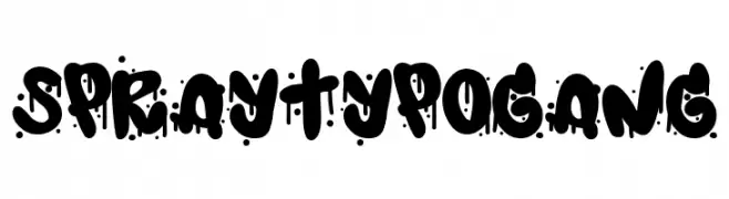
( Fonts by Woodcutter )
Graffiti-style, bold display font with dripping paint effects.
![Spray Typo Gang font caratteri gratis]() Scaricare 61 Downloads@WebFont
Scaricare 61 Downloads@WebFont -
( www.behance.net/takuminokami )
A bold, scribbled font with a hand-drawn, textured appearance.
![Scribbled Regular font caratteri gratis]() Scaricare 61 Downloads@WebFont
Scaricare 61 Downloads@WebFont -
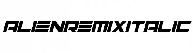
( Fonts by Darrell Flood - Personal-use only. For commercial use please contact owner. )
A futuristic, angular italic font with a bold, dynamic style.
![Alien Remix Italic font caratteri gratis]() Scaricare 61 Downloads@WebFont
Scaricare 61 Downloads@WebFont


Quali sono i font più popolari adesso?
Poppins, Roboto, Montserrat, Open Sans e Lato sono molto usati per le forme pulite e l'ampia applicabilità — dall'identità di marca alle landing page e ai poster.
Quali font si usano spesso nei loghi?
Le sans serif geometriche (es. Poppins, famiglie in stile Gotham) sono scelte comuni per un branding pulito e scalabile. Per un tocco personale restano valide script e stili manoscritti. Abbina un display deciso per i titoli a un corpo testo neutro per riconoscibilità ed equilibrio.
Ogni quanto si aggiorna la lista?
Con regolarità, in base ai download e all'attività reale. Torna spesso per scoprire in anticipo le nuove preferite.
💡 Consiglio: aggiungi ai preferiti — le tendenze cambiano in fretta e i font top di oggi possono ispirare il rebranding di domani.