Benvenuto nelle Font Più Popolari — dove popolarità e qualità si incontrano. Qui trovi i font più scaricati e usati dell'anno. Se cerchi scelte sicure per logo, web o social, inizia da qui.
Ogni font top si distingue per equilibrio, leggibilità e versatilità. Troverai sans serif moderne, script eleganti, serif vintage e display minimalisti.
-
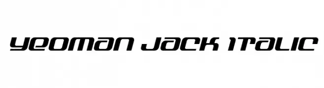
( Fonts by Daniel Zadorozny - www.iconian.com - Personal-use only. For commercial use please contact owner. )
A modern, italic font with a sleek, futuristic design.
 Scaricare 54 Downloads@WebFont
 -
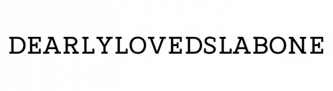
( Fonts by 7NTypes - Situjuh Nazara - Personal-use only. For commercial use please contact owner. )
A bold slab serif font with strong, block-like serifs and balanced spacing.
![Dearly loved Slab One font caratteri gratis]() Scaricare 54 Downloads@WebFont
Scaricare 54 Downloads@WebFont -
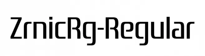
( Fonts by Typodermic Fonts - Raymond Larabie - Personal-use only. For commercial use please contact owner. )
A modern, geometric font with clean lines and a structured, slightly condensed appearance.
![ZrnicRg-Regular font caratteri gratis]() Scaricare 54 Downloads@WebFont
Scaricare 54 Downloads@WebFont -
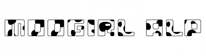
( Flop Design - www.flopdesign.com/ )
A playful, cow-patterned font with bold, blocky letters and rounded edges.
![MOOGIRL ALP font caratteri gratis]() Scaricare 54 Downloads@WebFont
Scaricare 54 Downloads@WebFont -
( Fonts by Perspectype Studio )
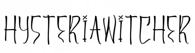
A whimsical, hand-drawn font with tall, narrow characters and an artistic flair.
![Hysteria Witcher font caratteri gratis]() Scaricare 54 Downloads@WebFont
Scaricare 54 Downloads@WebFont -
-
( Fonts by Jadatype )
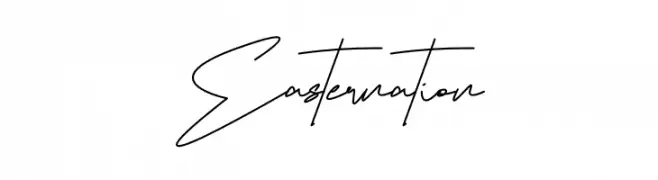
Loose, airy handwritten script with tall, thin characters.
![Easternation font caratteri gratis]() Scaricare 54 Downloads@WebFont
Scaricare 54 Downloads@WebFont -
( Fonts by Cooldesignlab - Kurniadi Saputra - Personal-use only. For commercial use please contact owner. )
An elegant script font with flowing, cursive strokes and intricate flourishes.
![Letterline font caratteri gratis]() Scaricare 54 Downloads@WebFont
Scaricare 54 Downloads@WebFont -
( Fonts by Dikas Studio - Andika Setiawan - Personal-use only. For commercial use please contact owner. )
A lively, expressive handwritten font with fluid, dynamic strokes.
![Wildy Sign Personal Use font caratteri gratis]() Scaricare 54 Downloads@WebFont
Scaricare 54 Downloads@WebFont -
( Fonts by Md Shohail Bhuian - Personal-use only. For commercial use please contact owner. )
A bold, playful handwritten font with rounded strokes and uniform height.
![Journey Planner font caratteri gratis]() Scaricare 54 Downloads@WebFont
Scaricare 54 Downloads@WebFont -
( Fonts by ReyreyBlue - Reyrey Blue - Personal-use only. For commercial use please contact owner. )
A dynamic, brush-style handwritten font with expressive strokes and fluid movement.
![Bombast font caratteri gratis]() Scaricare 54 Downloads@WebFont
Scaricare 54 Downloads@WebFont -
( Fonts by www.junkohanhero.com - Personal-use only. For commercial use please contact owner. )
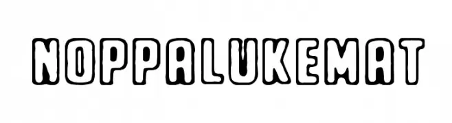
A bold, playful font with rounded edges and a hand-drawn look.
![Noppalukemat font caratteri gratis]() Scaricare 54 Downloads@WebFont
Scaricare 54 Downloads@WebFont -
( Fonts by Motokiwo - Anton Cahyono - Personal-use only. For commercial use please contact owner. )
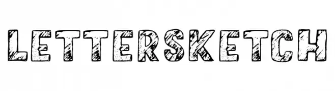
A bold, sketch-style font with a hand-drawn, textured appearance.
![LetterSketch font caratteri gratis]() Scaricare 54 Downloads@WebFont
Scaricare 54 Downloads@WebFont -
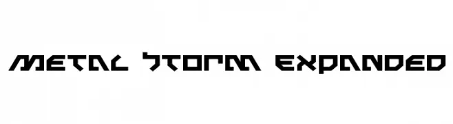
( Iconian Fonts - Daniel Zadorozny - www.iconian.com )
A bold, angular font with a futuristic and industrial design.
![Metal Storm Expanded font caratteri gratis]() Scaricare 54 Downloads@WebFont
Scaricare 54 Downloads@WebFont -
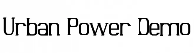
( Fonts by Edric Studio - Personal-use only. For commercial use please contact owner. )
A modern, geometric font with bold, angular letterforms and a strong, industrial aesthetic.
![Urban Power Demo font caratteri gratis]() Scaricare 54 Downloads@WebFont
Scaricare 54 Downloads@WebFont -
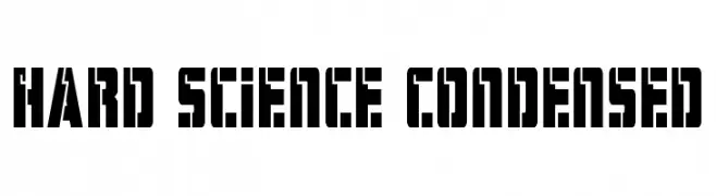
( Fonts by Daniel Zadorozny - www.iconian.com - Personal-use only. For commercial use please contact owner. )
A bold, futuristic font with a condensed, geometric design.
![Hard Science Condensed font caratteri gratis]() Scaricare 54 Downloads@WebFont
Scaricare 54 Downloads@WebFont -
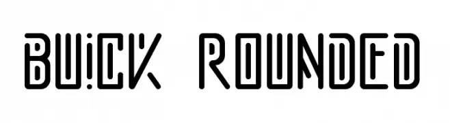
( Fonts by Faqih Fawaji - Personal-use only. For commercial use please contact owner. )
A modern, geometric font with rounded edges and a futuristic style.
![buick rounded font caratteri gratis]() Scaricare 54 Downloads@WebFont
Scaricare 54 Downloads@WebFont -
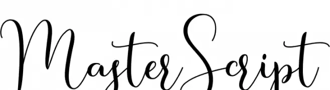
( Fonts by WDfont - WD font - Personal-use only. For commercial use please contact owner. )
An elegant, flowing script font with graceful loops and smooth connections.
![MasterScript font caratteri gratis]() Scaricare 54 Downloads@WebFont
Scaricare 54 Downloads@WebFont -
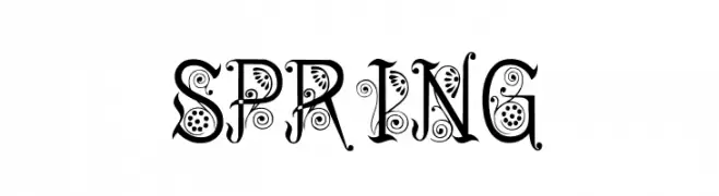
( Fonts by DmLetter31 - Dimas Prasetyo - Personal-use only. For commercial use please contact owner. )
An ornate, decorative font with intricate floral and spiral embellishments.
![Spring font caratteri gratis]() Scaricare 54 Downloads@WebFont
Scaricare 54 Downloads@WebFont -
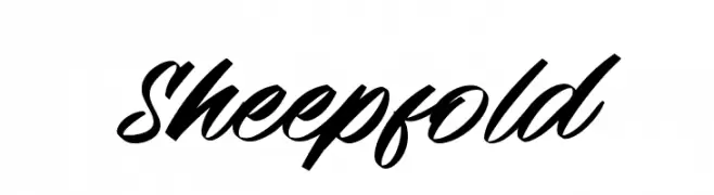
( Fonts by Letterara - Thomas Aradea - Personal-use only. For commercial use please contact owner. )
A bold, cursive script font with flowing, connected strokes.
![Sheepfold font caratteri gratis]() Scaricare 54 Downloads@WebFont
Scaricare 54 Downloads@WebFont -
( Fonts by MJB Letters - Muhammad Mujibulloh - Personal-use only. For commercial use please contact owner. )
A dynamic, brush-style font with expressive strokes and fluid forms.
![Malister font caratteri gratis]() Scaricare 54 Downloads@WebFont
Scaricare 54 Downloads@WebFont -
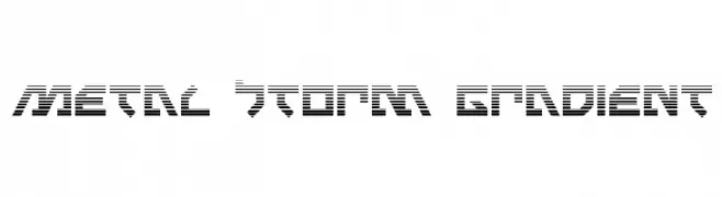
( Iconian Fonts - Daniel Zadorozny - www.iconian.com )
A bold, futuristic font with horizontal stripes and geometric shapes.
![Metal Storm Gradient font caratteri gratis]() Scaricare 54 Downloads@WebFont
Scaricare 54 Downloads@WebFont -
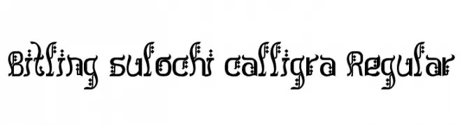
( Rajendra Bitling - www.rbitling.com )
An ornate, calligraphic font with decorative elements.
![Bitling sulochi calligra Regular font caratteri gratis]() Scaricare 54 Downloads@WebFont
Scaricare 54 Downloads@WebFont -
( Noto is a trademark of Google Inc. Noto fonts are open source. All Noto fonts are published under the SIL Open Font License, Version 1.1 )
Modern sans-serif Hebrew font with semi-condensed style.
![Noto Sans Hebrew SemiCondensed Medium font caratteri gratis]() Scaricare 54 Downloads@WebFont
Scaricare 54 Downloads@WebFont -
( Fonts by Ishmael Studio - Ismail Abdurrasyid - Personal-use only. For commercial use please contact owner. )
A geometric and modern font with decorative dots and consistent line thickness.
![Star Medina font caratteri gratis]() Scaricare 54 Downloads@WebFont
Scaricare 54 Downloads@WebFont -
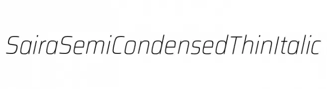
( Fonts by Omnibus Type )
A sleek, modern semi-condensed italic font with thin strokes.
![Saira SemiCondensed Thin Italic font caratteri gratis]() Scaricare 54 Downloads@WebFont
Scaricare 54 Downloads@WebFont -
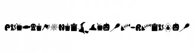
( Fonts by Lettersweet Studio )
A playful, spooky font ideal for Halloween themes.
![PumpkinsNightmare-Regular font caratteri gratis]() Scaricare 54 Downloads@WebFont
Scaricare 54 Downloads@WebFont -
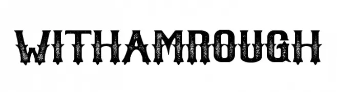
( Fonts by BrandSemut - A Sidiq - Personal-use only. For commercial use please contact owner. )
A bold, distressed font with a vintage, weathered look.
![Witham Rough font caratteri gratis]() Scaricare 54 Downloads@WebFont
Scaricare 54 Downloads@WebFont -
( Fonts by www.junkohanhero.com - Personal-use only. For commercial use please contact owner. )
A playful, hand-drawn font with bold, wavy outlines and a cartoonish style.
![BwheroGreeZero font caratteri gratis]() Scaricare 54 Downloads@WebFont
Scaricare 54 Downloads@WebFont -
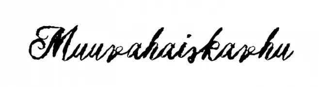
( Fonts by www.junkohanhero.com - Personal-use only. For commercial use please contact owner. )
A bold, expressive script font with a hand-drawn, textured style.
![Muurahaiskarhu font caratteri gratis]() Scaricare 54 Downloads@WebFont
Scaricare 54 Downloads@WebFont -
( Fonts by Vigilante Typeface Corporation Larry Yerkes. Personal-use only. For commercial use please contact owner. )
A bold, hand-drawn font with irregular strokes and a playful, edgy style.
![VTCGoblinHandBold font caratteri gratis]() Scaricare 54 Downloads@WebFont
Scaricare 54 Downloads@WebFont -
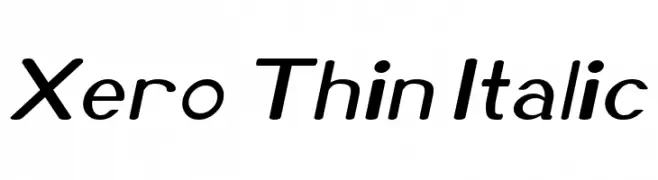
( Megami Studios - incstonedesign.com/ )
A sleek, modern, thin italic font with a clean and professional appearance.
![Xero Thin Italic font caratteri gratis]() Scaricare 54 Downloads@WebFont
Scaricare 54 Downloads@WebFont -
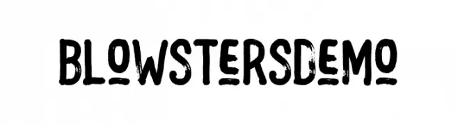
( Fonts by Letterhend Studio )
A bold, distressed font with a hand-painted, artistic style.
![BlowstersDemo font caratteri gratis]() Scaricare 54 Downloads@WebFont
Scaricare 54 Downloads@WebFont -
( Fonts by Woodcutter )
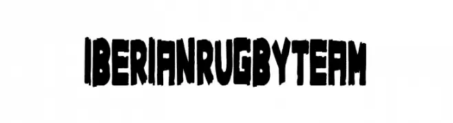
A bold, rugged font with a handcrafted, distressed style.
![Iberian Rugby Team font caratteri gratis]() Scaricare 54 Downloads@WebFont
Scaricare 54 Downloads@WebFont -
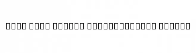
( Noto is a trademark of Google Inc. Noto fonts are open source. All Noto fonts are published under the SIL Open Font License, Version 1.1 )
Invalid font representation with placeholder symbols.
![Noto Sans Lao Condensed Medium font caratteri gratis]() Scaricare 54 Downloads@WebFont
Scaricare 54 Downloads@WebFont -
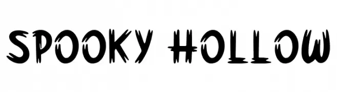
( Fonts by Forberas Club - Personal-use only. For commercial use please contact owner. )
A bold, jagged font with a spooky, horror-inspired design.
![Spooky Hollow font caratteri gratis]() Scaricare 54 Downloads@WebFont
Scaricare 54 Downloads@WebFont


Quali sono i font più popolari adesso?
Poppins, Roboto, Montserrat, Open Sans e Lato sono molto usati per le forme pulite e l'ampia applicabilità — dall'identità di marca alle landing page e ai poster.
Quali font si usano spesso nei loghi?
Le sans serif geometriche (es. Poppins, famiglie in stile Gotham) sono scelte comuni per un branding pulito e scalabile. Per un tocco personale restano valide script e stili manoscritti. Abbina un display deciso per i titoli a un corpo testo neutro per riconoscibilità ed equilibrio.
Ogni quanto si aggiorna la lista?
Con regolarità, in base ai download e all'attività reale. Torna spesso per scoprire in anticipo le nuove preferite.
💡 Consiglio: aggiungi ai preferiti — le tendenze cambiano in fretta e i font top di oggi possono ispirare il rebranding di domani.