Benvenuto nelle Font Più Popolari — dove popolarità e qualità si incontrano. Qui trovi i font più scaricati e usati dell'anno. Se cerchi scelte sicure per logo, web o social, inizia da qui.
Ogni font top si distingue per equilibrio, leggibilità e versatilità. Troverai sans serif moderne, script eleganti, serif vintage e display minimalisti.
-
( Iconian Fonts - Daniel Zadorozny - www.iconian.com )
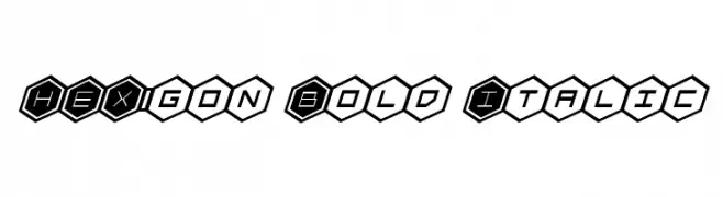
A bold, italicized font with characters in hexagonal shapes, offering a futuristic and tech-inspired look.
 Scaricare 60 Downloads@WebFont
 -
( Fonts by Daniel Zadorozny - www.iconian.com - Personal-use only. For commercial use please contact owner. )
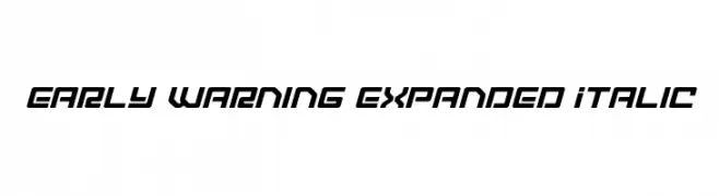
A futuristic, expanded italic font with bold, angular letterforms.
![Early Warning Expanded Italic font caratteri gratis]() Scaricare 60 Downloads@WebFont
Scaricare 60 Downloads@WebFont -
( Fonts by Iconian Fonts )
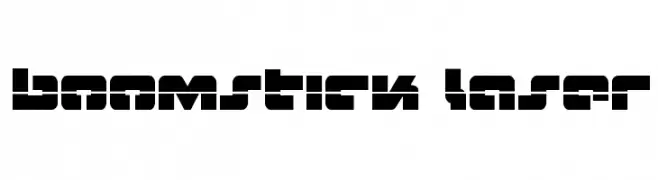
A bold, geometric font with a futuristic and industrial design.
![Boomstick Laser font caratteri gratis]() Scaricare 60 Downloads@WebFont
Scaricare 60 Downloads@WebFont -
( Fonts by Mans Greback - www.mansgreback.com - Personal-use only. For commercial use please contact owner. )
A bold, medieval-style font with Gothic influences and intricate detailing.
![Ransite Medieval PERSONAL USE Regular font caratteri gratis]() Scaricare 60 Downloads@WebFont
Scaricare 60 Downloads@WebFont -
( Fonts by Vladimir Nikolic - https://www.creativefabrica.com/product/educated-deers/ref/144265/ - Personal-use only. For commercial use please contact owner. )
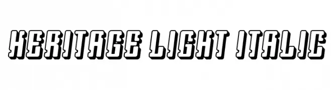
A bold, three-dimensional font with a strong shadow effect and geometric design.
![Heritage Light Italic font caratteri gratis]() Scaricare 60 Downloads@WebFont
Scaricare 60 Downloads@WebFont -
( Fonts by Perspectype Studio - Personal-use only. For commercial use please contact owner. )
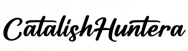
A bold, expressive script font with fluid, cursive strokes and dynamic flow.
![Catalish Huntera font caratteri gratis]() Scaricare 60 Downloads@WebFont
Scaricare 60 Downloads@WebFont -
( Intellecta Design - new.myfonts.com/search/intellecta/fonts/?sort=sales?refby=paulow )
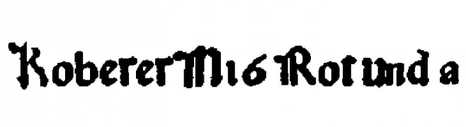
A traditional blackletter font with ornate, angular lines and bold strokes.
![KobergerN16Rotunda font caratteri gratis]() Scaricare 60 Downloads@WebFont
Scaricare 60 Downloads@WebFont -
( Fonts by Greg Medina - www.dcoxy.com - Personal-use only. For commercial use please contact owner. )
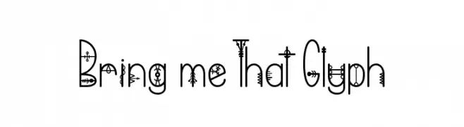
A decorative font with intricate, symbolic designs within each character.
![Bring me That Glyph font caratteri gratis]() Scaricare 60 Downloads@WebFont
Scaricare 60 Downloads@WebFont -
( Fonts by Iordanis Passas - Personal-use only. For commercial use please contact owner. )
A bold, decorative font with rounded, thick characters.
![Dpopper font caratteri gratis]() Scaricare 60 Downloads@WebFont
Scaricare 60 Downloads@WebFont -
( Fonts by StringLabs - stringlabscreative.com - Personal-use only. For commercial use please contact owner. )
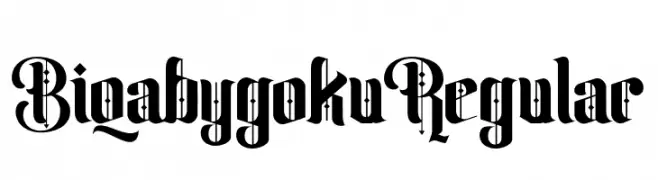
A bold, blackletter-style font with intricate, angular designs.
![Biqabygoku Regular font caratteri gratis]() Scaricare 60 Downloads@WebFont
Scaricare 60 Downloads@WebFont -
( Fonts by ingoFonts - Ingo Zimmermann - Personal-use only. For commercial use please contact owner. )
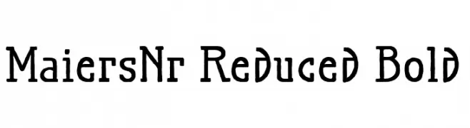
A bold, textured serif font with a handcrafted appearance.
![MaiersNr.Reduced-Bold font caratteri gratis]() Scaricare 60 Downloads@WebFont
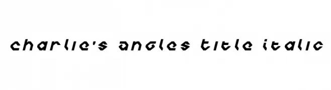
Scaricare 60 Downloads@WebFont -
![Charlie's Angles Title Italic font caratteri gratis]() Scaricare 60 Downloads@WebFont
Scaricare 60 Downloads@WebFont -
( Noto is a trademark of Google Inc. Noto fonts are open source. All Noto fonts are published under the SIL Open Font License, Version 1.1 )
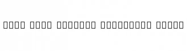
A clean, modern, and condensed font with a light weight for enhanced readability.
![Noto Sans Sinhala Condensed Light font caratteri gratis]() Scaricare 60 Downloads@WebFont
Scaricare 60 Downloads@WebFont -
( Fonts by Maulana Creative - Gilang Maulana - Personal-use only. For commercial use please contact owner. )
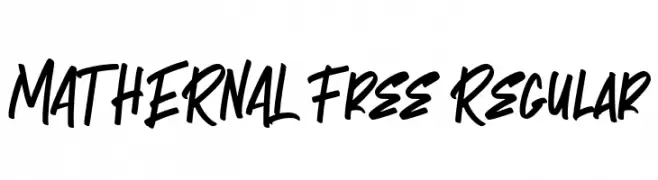
A bold, energetic script font with fluid, interconnected strokes.
![MATHERNAL Free Regular font caratteri gratis]() Scaricare 60 Downloads@WebFont
Scaricare 60 Downloads@WebFont -
( Fonts by Zetafonts - Personal-use only. For commercial use please contact owner. )
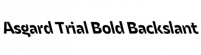
A bold, backslant font with a modern and dynamic style.
![Asgard Trial Bold Backslant font caratteri gratis]() Scaricare 60 Downloads@WebFont
Scaricare 60 Downloads@WebFont -
( Fonts by twinletter - Rozikan - Personal-use only. For commercial use please contact owner. )
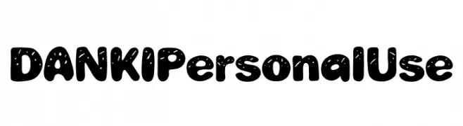
A playful, bold, and bubbly font with a whimsical, hand-drawn style.
![DANKI Personal Use font caratteri gratis]() Scaricare 60 Downloads@WebFont
Scaricare 60 Downloads@WebFont -
( Fonts by Toto - Personal-use only. For commercial use please contact owner. )
A geometric, modern font with clean, rounded edges.
![K22 Karnak Deco font caratteri gratis]() Scaricare 60 Downloads@WebFont
Scaricare 60 Downloads@WebFont -
( Fonts by Daniel Zadorozny - www.iconian.com - Personal-use only. For commercial use please contact owner. )
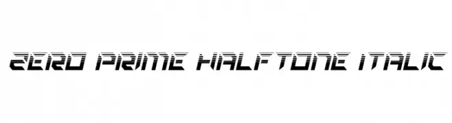
A bold, italicized font with a futuristic halftone design and angular shapes.
![Zero Prime Halftone Italic font caratteri gratis]() Scaricare 60 Downloads@WebFont
Scaricare 60 Downloads@WebFont -
( Fonts by CannotIntoSpaceFonts - KineticPlasma Fonts - Personal-use only. For commercial use please contact owner. )
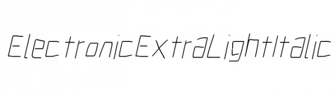
A sleek, modern font with an electronic, extra-light, italicized style.
![Electronic ExtraLight Italic font caratteri gratis]() Scaricare 60 Downloads@WebFont
Scaricare 60 Downloads@WebFont -
( Fonts by ingoFonts - Ingo Zimmermann - Personal-use only. For commercial use please contact owner. )
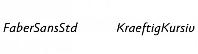
A modern, italic sans-serif font with clean lines and a dynamic slant.
![FaberSansStd-66KraeftigKursiv font caratteri gratis]() Scaricare 60 Downloads@WebFont
Scaricare 60 Downloads@WebFont -
( Fonts by Khurasan - Syaf Rizal - Personal-use only. For commercial use please contact owner. )
A lively, cursive font with a handwritten feel, perfect for creative projects.
![Anjhay font caratteri gratis]() Scaricare 60 Downloads@WebFont
Scaricare 60 Downloads@WebFont -
( paintblack - www.paintblackeditions.org/ )
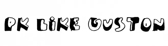
A bold, playful, hand-drawn font with irregular, quirky characters.
![PK Like Guston font caratteri gratis]() Scaricare 60 Downloads@WebFont
Scaricare 60 Downloads@WebFont -
( weknow - Wino S Kadir - www.creativefabrica.com/designer/weknow/ )
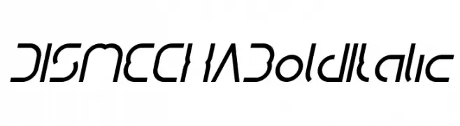
A bold, italicized font with a futuristic and dynamic design.
![DISMECHA Bold Italic font caratteri gratis]() Scaricare 60 Downloads@WebFont
Scaricare 60 Downloads@WebFont -
( LeChefRene - members.aol.com/lcrfonts/ )
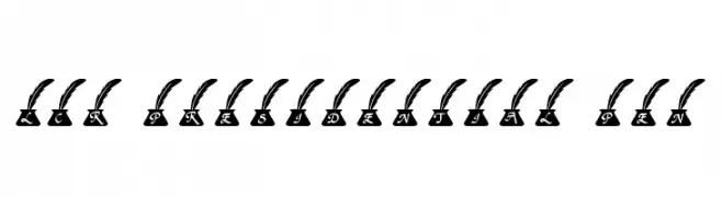
A decorative serif font with characters in ink pots topped by quills.
![LCR Presidential Pen font caratteri gratis]() Scaricare 60 Downloads@WebFont
Scaricare 60 Downloads@WebFont -
( Fonts by Galdino Otten - Personal-use only. For commercial use please contact owner. )
A handwritten, italic font with elongated, flowing characters.
![Coffee Written Italic font caratteri gratis]() Scaricare 60 Downloads@WebFont
Scaricare 60 Downloads@WebFont -
( Fonts by Attype Studio )
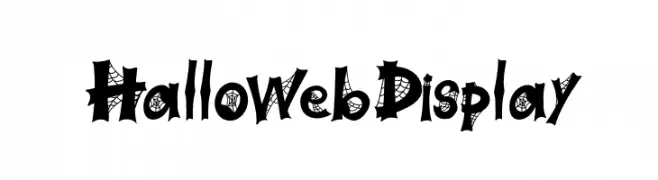
A spooky, cobweb-themed font perfect for Halloween designs.
![Halloweb Display font caratteri gratis]() Scaricare 60 Downloads@WebFont
Scaricare 60 Downloads@WebFont -
( Fonts by Daniel Zadorozny - www.iconian.com - Personal-use only. For commercial use please contact owner. )
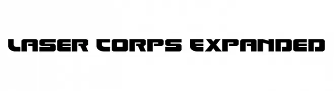
A bold, futuristic font with angular, geometric characters and an expanded width.
![Laser Corps Expanded font caratteri gratis]() Scaricare 60 Downloads@WebFont
Scaricare 60 Downloads@WebFont -
( Fonts by Kong Font - Personal-use only. For commercial use please contact owner. )
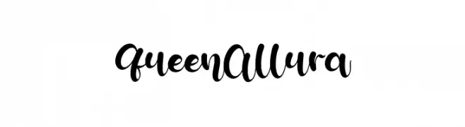
A flowing, cursive script with elegant loops and swashes.
![Queen Allura font caratteri gratis]() Scaricare 60 Downloads@WebFont
Scaricare 60 Downloads@WebFont -
( Fonts by Maulana Creative - Gilang Maulana - Personal-use only. For commercial use please contact owner. )
A bold, hand-drawn script font with dynamic, interconnected strokes.
![Torches Free Regular font caratteri gratis]() Scaricare 60 Downloads@WebFont
Scaricare 60 Downloads@WebFont -
( weknow - Wino S Kadir - www.creativefabrica.com/designer/weknow/ )
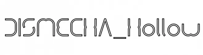
A futuristic, hollow font with a mechanical and geometric design.
![DISMECHA_Hollow font caratteri gratis]() Scaricare 60 Downloads@WebFont
Scaricare 60 Downloads@WebFont -
( Fonts by AEN Creative Studio - Personal-use only. For commercial use please contact owner. )
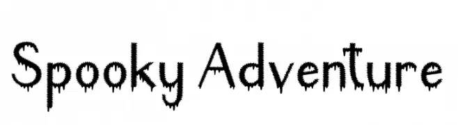
A jagged, dripping font ideal for spooky themes.
![Spooky Adventure font caratteri gratis]() Scaricare 60 Downloads@WebFont
Scaricare 60 Downloads@WebFont -
( Fonts by Silverdav Studio - David Kasidi - Personal-use only. For commercial use please contact owner. )
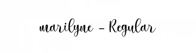
A flowing, cursive script with elegant loops and swashes.
![marilyne-Regular font caratteri gratis]() Scaricare 60 Downloads@WebFont
Scaricare 60 Downloads@WebFont -
( weknow - Wino S Kadir - www.creativefabrica.com/designer/weknow/ )
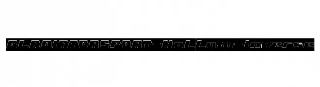
A bold, hollow, inverse font with a modern, sporty aesthetic.
![GLADIATOR SPORT-Hollow-Inverse font caratteri gratis]() Scaricare 60 Downloads@WebFont
Scaricare 60 Downloads@WebFont -
( Fonts by Daniel Zadorozny - www.iconian.com - Free for personal use )
A bold, striped font with a modern, gradient effect.
![Shining Herald Gradient Regular font caratteri gratis]() Scaricare 60 Downloads@WebFont
Scaricare 60 Downloads@WebFont -
( Fonts by Font Monger - Chris Vile - Personal-use only. For commercial use please contact owner. )
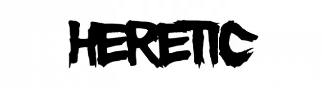
A bold, edgy font with a hand-painted, rebellious style.
![Heretic font caratteri gratis]() Scaricare 60 Downloads@WebFont
Scaricare 60 Downloads@WebFont


Quali sono i font più popolari adesso?
Poppins, Roboto, Montserrat, Open Sans e Lato sono molto usati per le forme pulite e l'ampia applicabilità — dall'identità di marca alle landing page e ai poster.
Quali font si usano spesso nei loghi?
Le sans serif geometriche (es. Poppins, famiglie in stile Gotham) sono scelte comuni per un branding pulito e scalabile. Per un tocco personale restano valide script e stili manoscritti. Abbina un display deciso per i titoli a un corpo testo neutro per riconoscibilità ed equilibrio.
Ogni quanto si aggiorna la lista?
Con regolarità, in base ai download e all'attività reale. Torna spesso per scoprire in anticipo le nuove preferite.
💡 Consiglio: aggiungi ai preferiti — le tendenze cambiano in fretta e i font top di oggi possono ispirare il rebranding di domani.